
34

Notepad++ 新 Logo 出炉,官网全新改版采用自适应设计 - OSCHINA
source link: https://www.oschina.net/news/110597/new-logo-of-notepadplusplus-n-new-responsive-site
Go to the source link to view the article. You can view the picture content, updated content and better typesetting reading experience. If the link is broken, please click the button below to view the snapshot at that time.
Notepad++ 新 Logo 出炉,官网全新改版采用自适应设计
发布于 2019年10月16日
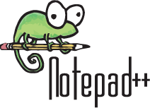
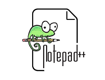
Notepad++ 的推特帐号发布了关于 Notepad++ 新 Logo 的消息。与旧版 Logo 相比,新 Logo 整体的变化不大,不过官方则表示新版 Logo 比旧版的更吸引人,也更加简洁且更具意义。
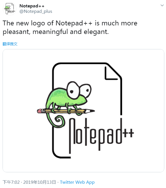
新旧 Logo 对比如下(左边为旧版 Logo):
除了使用新 Logo,我们还发现其官网也进行了全新改版,并采用流行的自适应响应式设计。Notepad++ 作者表示,自 2011 年 7 月以来,网站的外观保持了 8 年不改变样式,现在是时候更改并采用响应式网页设计了。
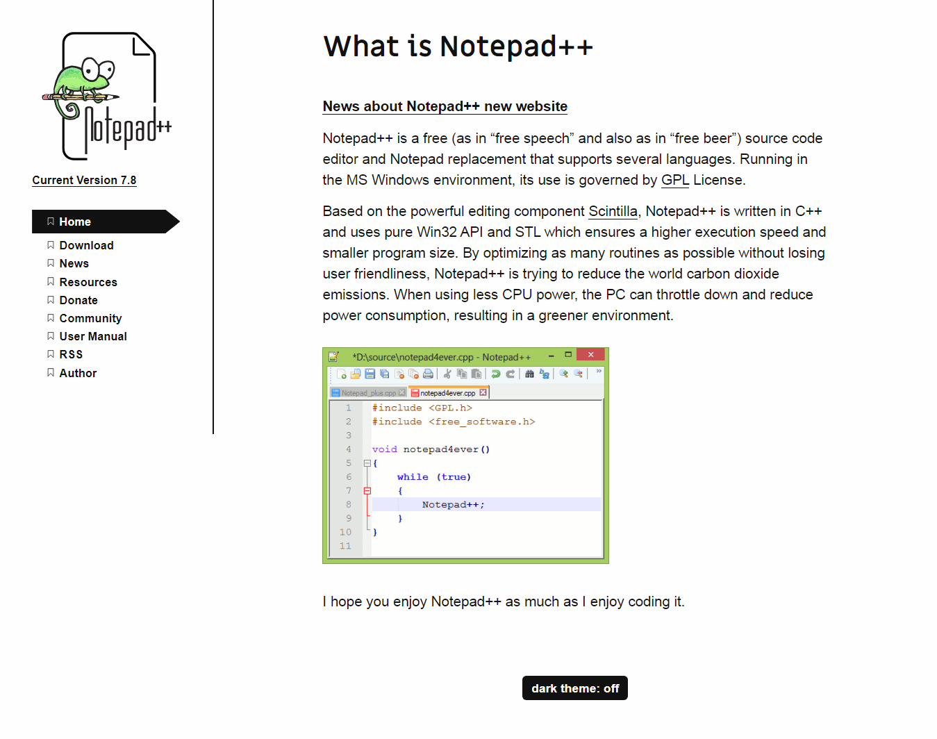
另外,Notepad++ 作者表示并非所有内容都会放在新的重建站点中,他只会将最重要的(符合他的口味)内容展示出来。
最后,新版本的官网还新增了一个略为粗糙的暗黑模式。

Recommend
About Joyk
Aggregate valuable and interesting links.
Joyk means Joy of geeK