

Modern Collection Views with Compositional Layouts [FREE]
source link: https://www.tuicool.com/articles/2Y7NneE
Go to the source link to view the article. You can view the picture content, updated content and better typesetting reading experience. If the link is broken, please click the button below to view the snapshot at that time.
The iOS Photos and App Store apps feature some complex layouts that are not possible out of the box with UICollectionViewFlowLayout
, with multiple scrolling sections and variably size tiled layouts. You’re going to learn how to create those features in your own photo browsing app!


Note : The screenshots of the project in this tutorial use iOS 13’s new dark mode . It isn’t necessary to do the same to follow the tutorial, but your app will look different from the screenshots if you don’t.
Getting Started
Download the project materials using the Download Materials button at the top or bottom of this tutorial. Open the starter project in Xcode. Build and run.
You will see a functional, but very simple, app displaying a photo album. You can scroll the list to view the photos in the album and tap on any individual photo to view the image in more detail.


Switch to Xcode and take a quick look around the project. Open AppDelegate.swift
. When the app starts, it sets an AlbumDetailViewController
as the initial view controller. The initializer for AlbumDetailViewController
takes a URL
to a folder containing images.
Open AlbumDetailViewController.swift
. viewDidLoad()
sets up a basic UICollectionView
to display PhotoItemCell
s by calling configureCollectionView()
, which configures the collection view data source using iOS 13’s new UICollectionViewDiffableDataSource
.
Don’t worry if you haven’t come across UICollectionViewDiffableDataSource
before! The important part to notice is that configureDataSource()
calls snapshotForCurrentState()
, which builds a data source snapshot from a list of photo URLs. It then applies the snapshot to the collection view data source.
Finally, in the UICollectionViewDelegate
extension at the bottom of the file, you can see that the app navigates to a PhotoDetailViewController
when the user selects an item.
If you’re interested, open PhotoDetailViewController.swift . It’s a very simple view controller class to display an image, nothing exciting going on there. :]
Why UICollectionViews? A Brief Recap
If you’ve never used UICollectionView
before, it might be worth familiarizing yourself with the basics before continuing.This tutorial is a great place to start.
If you just need a quick recap, remember that UIKit provides two view classes for efficiently displaying large numbers of similar items: UITableView
and UICollectionView
. At first glance they appear very similar — both display a list of items optionally grouped into sections.
However, while table view can only display items in a vertical list, a collection view has a UICollectionViewLayout
which controls how items display on-screen.
Since its introduction in iOS 6, UIKit has provided a single collection view layout implementation, UICollectionViewFlowLayout
. More complex layouts were possible, but not necessarily easy to make.
UICollectionViewCompositionalLayout
changes that by providing a simple, flexible, declarative API for building complex layouts.
Breaking Down a Layout
Before you get started building your Photos app, you need to learn about some core layout concepts.
A collection view displays repeated Items . For example, a contact in the Contacts app.
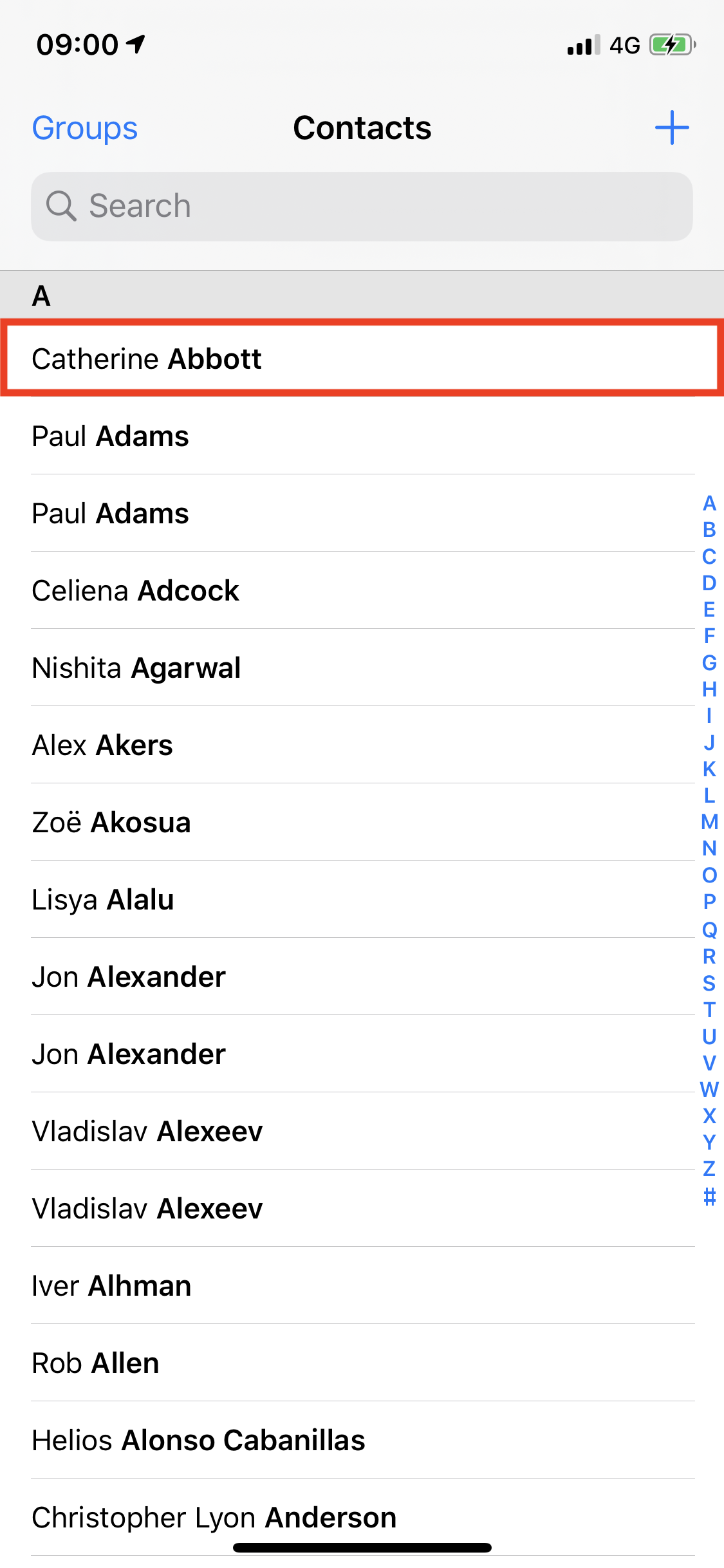
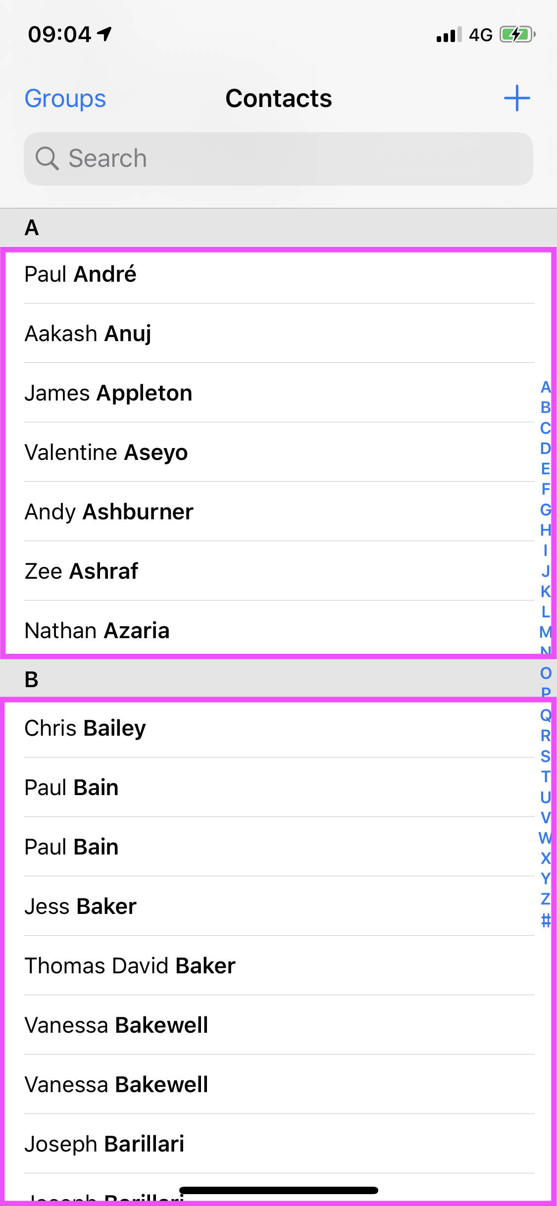
Many apps group Items into Sections , collections of items that logically belong together. In the case of the Contacts app, different sections contain all contacts whose surnames start with the same letter.
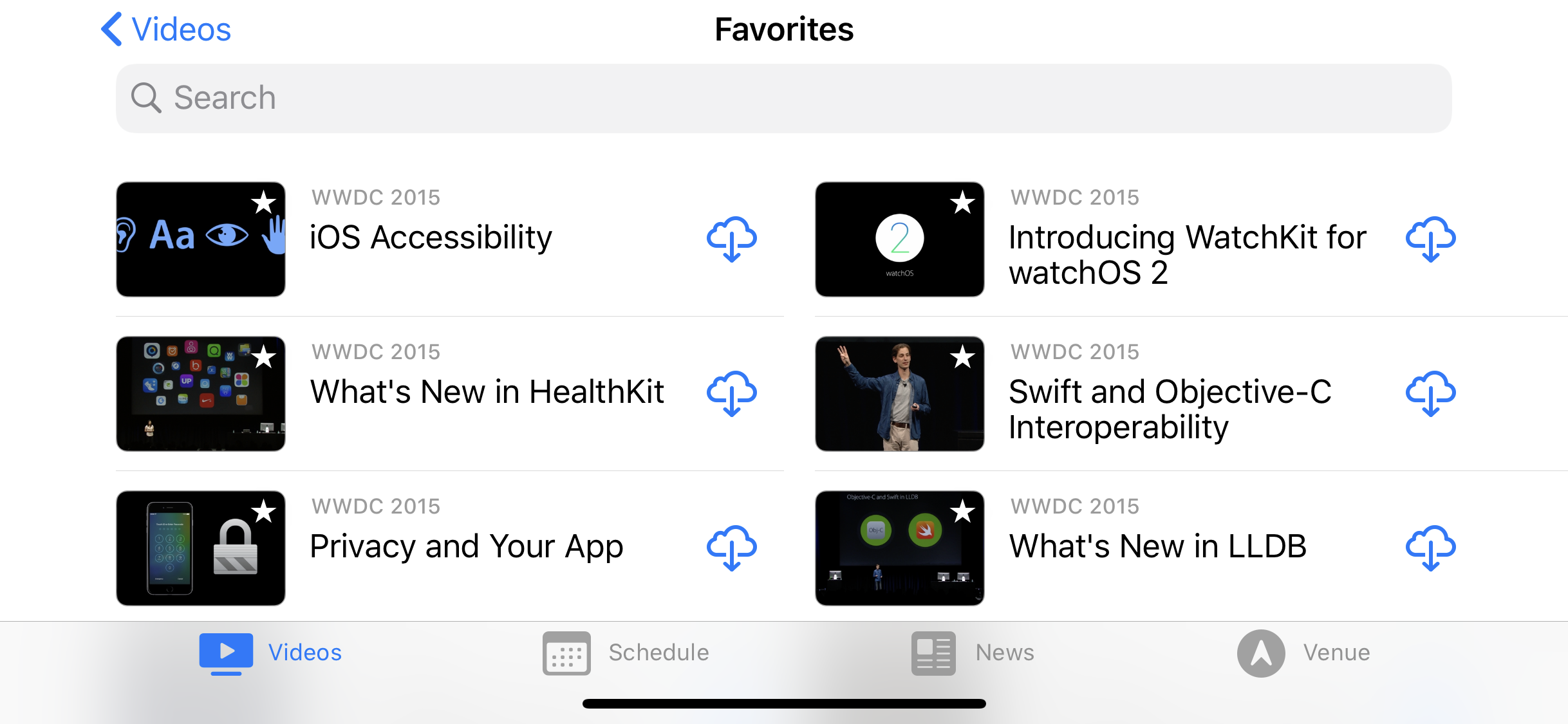
In the Contacts app, that’s as complicated as it gets. But it’s possible to create much more complex layouts. For example, the WWDC videos app uses a two-column layout on wider displays and the Dropbox app uses a three-column layout when viewing files in a folder.

Prior to iOS 13, UIKit shipped with a single layout class: UICollectionViewFlowLayout
. Any layout that was beyond the abilities of the built-in flow layout required building a custom layout class, often requiring hundreds of lines of code.
Now, with UICollectionViewCompositionalLayout
, Apple has introduced the concept of Groups
. This enables much more sophisticated layouts with very minimal amounts of code.

Consider the layout above from the built-in Photos app. At first glance, this looks like a three-column layout. But, on closer inspection, notice how the large image takes the space of four photos from the three-column layout. Clearly, something more sophisticated is going on here, and the answer is Groups !
Groups sit between Items and Sections and allow you to apply different layouts within a section. Neat!
Building Your First Layout
OK, enough with the theory. Time to build a layout!
Open AlbumDetailViewController.swift
and navigate to generateLayout()
. This method is responsible for generating the instance of UICollectionViewCompositionalLayout
that your collection view uses to lay out its items.
Here’s the method as it stands in the starter project:
func generateLayout() -> UICollectionViewLayout {
  //1
  let itemSize = NSCollectionLayoutSize(
    widthDimension: .fractionalWidth(1.0),
    heightDimension: .fractionalHeight(1.0))
  let fullPhotoItem = NSCollectionLayoutItem(layoutSize: itemSize)
  //2
  let groupSize = NSCollectionLayoutSize(
    widthDimension: .fractionalWidth(1.0),
    heightDimension: .fractionalWidth(2/3))
  let group = NSCollectionLayoutGroup.horizontal(
    layoutSize: groupSize,
    subitem: fullPhotoItem,
    count: 1)
  //3
  let section = NSCollectionLayoutSection(group: group)
  let layout = UICollectionViewCompositionalLayout(section: section)
  return layout
}
Here’s what’s happening in the code above:
-
The
fullPhotoItemis anNSCollectionLayoutItemwith a fractional width and height of 1, which will mean it will fill the Group that contains it. -
Next, create an
NSCollectionLayoutGroupwith a a fractional width of 1 but height 2/3 the width — the standard aspect ratio for a photo. The group contains a single horizontal item. -
The final part of the layout is the
NSCollectionLayoutSection, which in this case contains the single group created in the line above.
This matches the layout you see in the app. Each photo is full width and 2/3 of the width high.
But what if you want a two-column layout? Replace the Group layout code as below, updating the height of the Group size and the number of items in the layout Group:
let groupSize = NSCollectionLayoutSize(
  widthDimension: .fractionalWidth(1.0),
  heightDimension: .fractionalWidth(1/3))
let group = NSCollectionLayoutGroup.horizontal(
  layoutSize: groupSize,
  subitem: fullPhotoItem,
  count: 2
)
You have now set the group to half its original height, but made it contain two items. Build and run the project and see how the layout has changed. Easy, huh? :]

This is starting to look better already, but wouldn’t it be nicer if each photo had a space to call its own? UICollectionViewCompositionalLayout
has support for this out of the box using content insets. Add the following to generateLayout()
after the creation of fullPhotoItem
:
fullPhotoItem.contentInsets = NSDirectionalEdgeInsets(
  top: 2,
  leading: 2,
  bottom: 2,
  trailing: 2)
That’s all it takes! Build and run your app.

The Power of Groups
About now you’re probably thinking: Columns and insets are good and all, but that was already easy with UICollectionViewFlowLayout
. Show me something cool! Don’t worry, UICollectionViewCompositionalLayout
has your back.
One of the fanciest parts of the album detail view in the stock Photos apps is the effect with photos of different sizes. Building this layout is surprisingly easy once you realize that you can nest Groups within other Groups . This is the effect you’re shooting for.

At first glance, this looks very complicated, but you can break it down into four distinct layouts, two of which are just mirrored examples of each other:
- A full width photo.
- A ‘main’ photo with a pair of vertically stacked smaller photos.
- Three smaller photos in a row.
- The reverse of the second style.

Replace everything before let groupSize = ...
in generateLayout()
with the following:
// We have three row styles
// Style 1: 'Full'
// A full width photo
// Style 2: 'Main with pair'
// A 2/3 width photo with two 1/3 width photos stacked vertically
// Style 3: 'Triplet'
// Three 1/3 width photos stacked horizontally

// First type. Full
let fullPhotoItem = NSCollectionLayoutItem(
  layoutSize: NSCollectionLayoutSize(
    widthDimension: .fractionalWidth(1.0),
    heightDimension: .fractionalWidth(2/3)))

fullPhotoItem.contentInsets = NSDirectionalEdgeInsets(
  top: 2,
  leading: 2,
  bottom: 2,
  trailing: 2)
The first layout type is simple: A single image that is the full width of the screen. You make this by creating a single item with a fractional width of 1.0 (full-width) and a height 2/3 of the width.
Below this, add the second layout type:
// Second type: Main with pair
// 3
let mainItem = NSCollectionLayoutItem(
  layoutSize: NSCollectionLayoutSize(
    widthDimension: .fractionalWidth(2/3),
    heightDimension: .fractionalHeight(1.0)))

mainItem.contentInsets = NSDirectionalEdgeInsets(
  top: 2,
  leading: 2,
  bottom: 2,
  trailing: 2)

// 2
let pairItem = NSCollectionLayoutItem(
  layoutSize: NSCollectionLayoutSize(
    widthDimension: .fractionalWidth(1.0),
    heightDimension: .fractionalHeight(0.5)))

pairItem.contentInsets = NSDirectionalEdgeInsets(
  top: 2,
  leading: 2,
  bottom: 2,
  trailing: 2)

let trailingGroup = NSCollectionLayoutGroup.vertical(
  layoutSize: NSCollectionLayoutSize(
    widthDimension: .fractionalWidth(1/3),
    heightDimension: .fractionalHeight(1.0)),
  subitem: pairItem,
  count: 2)

// 1
let mainWithPairGroup = NSCollectionLayoutGroup.horizontal(
  layoutSize: NSCollectionLayoutSize(
    widthDimension: .fractionalWidth(1.0),
    heightDimension: .fractionalWidth(4/9)),
  subitems: [mainItem, trailingGroup])
The second group consists of a mainItem
and a pair of smaller items. The smaller items are themselves a Group laid out vertically, contained within a horizontally laid out Group consisting of the main item and the Group containing the pair of smaller items.
The math here gets a little tricky. You have to remember that each size is relative to its parent. You may find it easier to start from the outer layer and work backward — bottom to top in the code.
-
The outer Group,
mainWithPairGroup, should be full width so it has a fractional width of1.0. The height of the main item dictates its height. This is 2/3 the width of the screen, so the height needs to be 2/3 of the height of the full-width photo from the first layout. If you remember high school math, you’ll know that 2/3 of 2/3 is 4/9! - The trailing Group containing the two vertically stacked smaller items should then be 1/3rd the width and the full height of its containing Group. Each of the smaller items should be the full width of the trailing Group and half its height.
- Finally, the main item should be 2/3rd the width and the full height of its containing Group.
Next, add the triplet group below the second group:
// Third type. Triplet
let tripletItem = NSCollectionLayoutItem(
  layoutSize: NSCollectionLayoutSize(
    widthDimension: .fractionalWidth(1/3),
    heightDimension: .fractionalHeight(1.0)))

tripletItem.contentInsets = NSDirectionalEdgeInsets(
  top: 2,
  leading: 2,
  bottom: 2,
  trailing: 2)

let tripletGroup = NSCollectionLayoutGroup.horizontal(
  layoutSize: NSCollectionLayoutSize(
    widthDimension: .fractionalWidth(1.0),
    heightDimension: .fractionalWidth(2/9)),
  subitems: [tripletItem, tripletItem, tripletItem])
This third Group contains three horizontally laid out photos across the width. This means the Group should have a full fractional width, but a height 1/3 that of the full-sized photo — or 2/9. Within the Group, each Item should be the full height and 1/3 of the width.
And now, add the fourth and final style:
// Fourth type. Reversed main with pair
let mainWithPairReversedGroup = NSCollectionLayoutGroup.horizontal(
  layoutSize: NSCollectionLayoutSize(
    widthDimension: .fractionalWidth(1.0),
    heightDimension: .fractionalWidth(4/9)),
  subitems: [trailingGroup, mainItem])
Given the fourth layout is the inverse of the second, you can achieve this easily by changing the order of subitems in the Group. :]
To finish the new layout, replace the groupSize
, group
and section
definitions with the following:
let nestedGroup = NSCollectionLayoutGroup.vertical(
  layoutSize: NSCollectionLayoutSize(
    widthDimension: .fractionalWidth(1.0),
    heightDimension: .fractionalWidth(16/9)),
  subitems: [
    fullPhotoItem,
    mainWithPairGroup,
    tripletGroup,
    mainWithPairReversedGroup
  ]
)

let section = NSCollectionLayoutSection(group: nestedGroup)
Here, you add the four Group types to a container Group of vertically stacked items. These should take up the full width and, if you run through the numbers, a height equivalent to 1 and 7/9 the normal height or 16/9.
Phew! That was a lot of layout. But each part is simple when you break it down, and you didn’t have to build any complex logic for this layout to support multiple devices or orientations. Go on, build and run the project. Give it a whirl and try it out. Try rotating the device too!

Adding Supplementary Items
A common feature of modern apps is to add additional context to the items in a collection view at the Item or Section level. For example, an item representing an app on your home screen may have a little red badge on the top-right corner showing the number of unread notifications. Or, a section in the Contacts app may have a header indicating which letter of the alphabet this section is displaying.
UICollectionViewCompositionalLayout
provides the Supplementary Items
API for exactly these types of additional items. You’ll now use it to add a badge to a photo that indicates it’s syncing with a cloud storage system.
In AlbumDetailViewController.swift
, navigate to configureCollectionView()
and add the following after registering the photo item cell:
collectionView.register(
  SyncingBadgeView.self,
  forSupplementaryViewOfKind: AlbumDetailViewController.syncingBadgeKind,
  withReuseIdentifier: SyncingBadgeView.reuseIdentifier)
This code tells the collection view that it should use the SyncingBadgeView
class when requested to add a supplementary view of a certain kind with the relevant reuse identifier. You have probably come across reuse identifiers before, but the supplementary view kind may be new to you. Like a reuse identifier, this is simply a string that acts as a key to tell UIKit which type of view you want to add.
If you’re interested in checking out the implementation of the syncing badge view, open SyncingBadgeView.swift
in the SharedViews
group. It’s just a simple UICollectionReusableView
subclass which displays an image.
Head back to AlbumDetailViewController.swift
. Next, you need to configure your data source with a SupplementaryViewProvider
. This is a simple method that, when passed a collection view, kind and index path, returns an optional view. Add the following to configureDataSource()
, directly after creating the data source:
dataSource.supplementaryViewProvider = {
  (
  collectionView: UICollectionView,
  kind: String,
  indexPath: IndexPath)
    -> UICollectionReusableView? in
  // 1
  if let badgeView = collectionView.dequeueReusableSupplementaryView(
    ofKind: kind,
    withReuseIdentifier: SyncingBadgeView.reuseIdentifier,
    for: indexPath) as? SyncingBadgeView {
    // 2
    let hasSyncBadge = indexPath.row % Int.random(in: 1...6) == 0
    badgeView.isHidden = !hasSyncBadge
    return badgeView
  } else {
    fatalError("Cannot create new supplementary")
  }
}
This code:
- Asks the collection view to dequeue a supplementary view of the right kind.
- Determines if a photo is syncing, in this case at random, and hides the badge if you don’t want to display it.
Now there’s one more part you need to add to show the syncing view. You need to tell the collection view where to show it!
At the top of generateLayout()
, add the following code:
// Syncing badge
let syncingBadgeAnchor = NSCollectionLayoutAnchor(
  edges: [.top, .trailing],
  fractionalOffset: CGPoint(x: -0.3, y: 0.3))
let syncingBadge = NSCollectionLayoutSupplementaryItem(
  layoutSize: NSCollectionLayoutSize(
    widthDimension: .absolute(20),
    heightDimension: .absolute(20)),
  elementKind: AlbumDetailViewController.syncingBadgeKind,
  containerAnchor: syncingBadgeAnchor)
This code defines the layout for the syncing view as anchored 30% from the top and trailing edges with an absolute width and height of 20 points.
Finally, you need to add this layout to any item that you want to display the syncing badge. In our case, that is to any of the items representing photos. NSCollectionLayoutItem
has a convenience initializer that accepts an array of supplementary items. Update fullPhotoItem
to take advantage of this initializer as follows:
let fullPhotoItem = NSCollectionLayoutItem(
  layoutSize: NSCollectionLayoutSize(
    widthDimension: .fractionalWidth(1.0),
    heightDimension: .fractionalWidth(2/3)),
  supplementaryItems: [syncingBadge])
Build and run the project. Remember, the supplementary syncing item is visible randomly, so you may not see it every time!

Browsing Albums
The album detail view is starting to look good. Of course, most people have more than one album so, in this next section, you’ll add an album viewing view to the app.
Open AppDelegate.swift and replace the four lines that fetch the bundle and set the initial view controller with the following code:
guard let bundleURL = Bundle.main.url(
  forResource: "PhotoData",
  withExtension: "bundle") else {
    return false
}
let initialViewController =
  AlbumsViewController(withAlbumsFromDirectory: bundleURL)
This sets AlbumsViewController
as the initial view controller. Open AlbumsViewController.swift
. Structurally this class is very similar to the AlbumDetailViewController
class you already modified.
The primary difference is this class displays three sections rather than just one. snapshotForCurrentState()
handles the logic for adding each section and the relevant items. Build and run the project.
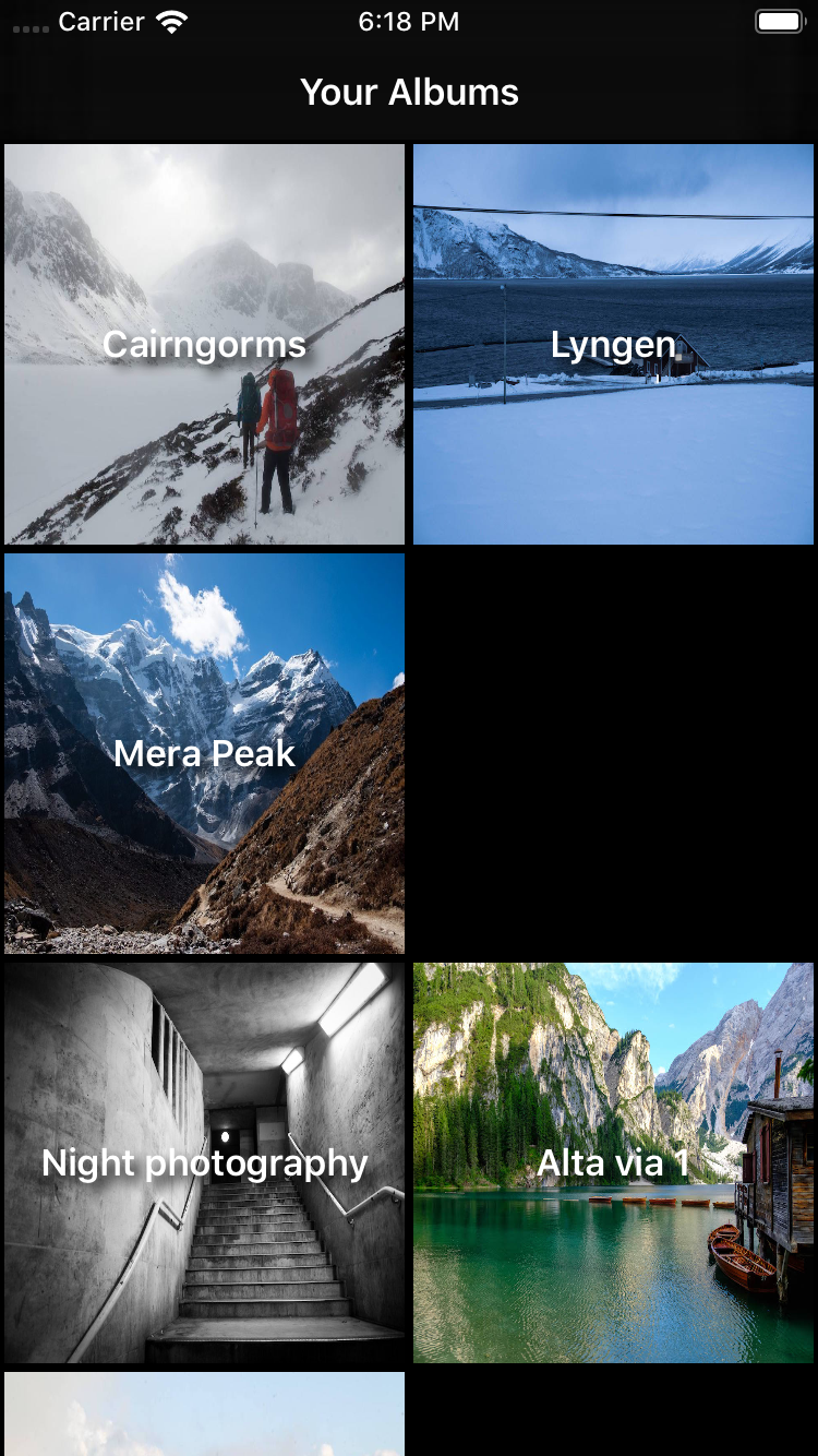
The initial view controller shows a list of six albums, with each album representing a folder in the PhotoData bundle. Some albums appear in multiple sections. Tapping on a thumbnail opens the album detail view as you would expect.
As it currently stands, there is no way of telling what each section represents. To fix that, you’re going to add a header to each section. In configureCollectionView()
, register the HeaderView
class by adding the following code after registering the AlbumItemCell
:
collectionView.register(
  HeaderView.self,
  forSupplementaryViewOfKind: AlbumsViewController.sectionHeaderElementKind,
  withReuseIdentifier: HeaderView.reuseIdentifier)
As before, with the supplementary syncing view, you need to tell the collection view’s data source how to generate the header. Add the following to configureDataSource()
after it is initialized:
dataSource.supplementaryViewProvider = { (
  collectionView: UICollectionView,
  kind: String,
  indexPath: IndexPath)
    -> UICollectionReusableView? in

  guard let supplementaryView = collectionView.dequeueReusableSupplementaryView(
    ofKind: kind,
    withReuseIdentifier: HeaderView.reuseIdentifier,
    for: indexPath) as? HeaderView else {
      fatalError("Cannot create header view")
  }

  supplementaryView.label.text = Section.allCases[indexPath.section].rawValue
  return supplementaryView
}
As before, you set the supplementary view provider to a closure that returns a supplementary view given a collection view, a kind and an index path. In this case, it returns HeaderView
— another simple view from the starter project.
Finally, replace the section initialization code in generateMyAlbumsLayout()
with:
let headerSize = NSCollectionLayoutSize(
  widthDimension: .fractionalWidth(1.0),
  heightDimension: .estimated(44))
let sectionHeader = NSCollectionLayoutBoundarySupplementaryItem(
  layoutSize: headerSize,
  elementKind: AlbumsViewController.sectionHeaderElementKind,
  alignment: .top)

let section = NSCollectionLayoutSection(group: group)
section.boundarySupplementaryItems = [sectionHeader]
This code sets up a layout size for your header of the full width and estimated to be 44 points high. You use an estimated height because Dynamic Type settings mean users may see the heading text larger than you expect.
Next, the code defines a section header and, finally, sets it as a supplementary item on the section. Build and run the project to see the headers added to the top of each section:

More Complex Layouts
Cast your mind back to the very beginning of this tutorial, and you’ll remember the album browsing view used different layouts for each section. Time to add that!
Start by registering two new cell classes in configureCollectionView()
, directly after registering AlbumItemCell
.
collectionView.register(
  FeaturedAlbumItemCell.self,
  forCellWithReuseIdentifier: FeaturedAlbumItemCell.reuseIdentifer)
collectionView.register(
  SharedAlbumItemCell.self,
  forCellWithReuseIdentifier: SharedAlbumItemCell.reuseIdentifer)
Replace the contents of the data source trailing closure in configureDataSource()
with the following code:
let sectionType = Section.allCases[indexPath.section]
switch sectionType {
case .featuredAlbums:
  guard let cell = collectionView.dequeueReusableCell(
    withReuseIdentifier: FeaturedAlbumItemCell.reuseIdentifer,
    for: indexPath) as? FeaturedAlbumItemCell
  else { fatalError("Could not create new cell") }

  cell.featuredPhotoURL = albumItem.imageItems[0].thumbnailURL
  cell.title = albumItem.albumTitle
  cell.totalNumberOfImages = albumItem.imageItems.count
  return cell

case .sharedAlbums:
  guard let cell = collectionView.dequeueReusableCell(
    withReuseIdentifier: SharedAlbumItemCell.reuseIdentifer,
    for: indexPath) as? SharedAlbumItemCell
  else { fatalError("Could not create new cell") }

  cell.featuredPhotoURL = albumItem.imageItems[0].thumbnailURL
  cell.title = albumItem.albumTitle
  return cell

case .myAlbums:
  guard let cell = collectionView.dequeueReusableCell(
    withReuseIdentifier: AlbumItemCell.reuseIdentifer,
    for: indexPath) as? AlbumItemCell
  else { fatalError("Could not create new cell") }

  cell.featuredPhotoURL = albumItem.imageItems[0].thumbnailURL
  cell.title = albumItem.albumTitle
  return cell
}
This looks like a lot of code, but in reality, it’s fairly simple. A switch statement treats each section independently, returning the appropriate cell after dequeuing and configuring it.
Next, add a method to generate the first section layout for featured albums under generateMyAlbumsLayout()
:
func generateFeaturedAlbumsLayout(isWide: Bool) -> NSCollectionLayoutSection {
  let itemSize = NSCollectionLayoutSize(
    widthDimension: .fractionalWidth(1.0),
    heightDimension: .fractionalWidth(2/3))
  let item = NSCollectionLayoutItem(layoutSize: itemSize)

  // Show one item plus peek on narrow screens,
  // two items plus peek on wider screens
  let groupFractionalWidth = isWide ? 0.475 : 0.95
  let groupFractionalHeight: Float = isWide ? 1/3 : 2/3
  let groupSize = NSCollectionLayoutSize(
    widthDimension: .fractionalWidth(CGFloat(groupFractionalWidth)),
    heightDimension: .fractionalWidth(CGFloat(groupFractionalHeight)))
  let group = NSCollectionLayoutGroup.horizontal(
    layoutSize: groupSize,
    subitem: item,
    count: 1)
  group.contentInsets = NSDirectionalEdgeInsets(
    top: 5,
    leading: 5,
    bottom: 5,
    trailing: 5)

  let headerSize = NSCollectionLayoutSize(
    widthDimension: .fractionalWidth(1.0),
    heightDimension: .estimated(44))
  let sectionHeader = NSCollectionLayoutBoundarySupplementaryItem(
    layoutSize: headerSize,
    elementKind: AlbumsViewController.sectionHeaderElementKind,
    alignment: .top)

  let section = NSCollectionLayoutSection(group: group)
  section.boundarySupplementaryItems = [sectionHeader]
  section.orthogonalScrollingBehavior = .groupPaging

  return section
}
The first half of the method might look familiar. The code sets up an item and a group, with the added functionality of changing how wide the group is depending on an isWide
parameter passed into the method. It then adds a header.
The most interesting part of the method comes right at the end. A collection view has a primary axis that determines its scroll direction. In our case, vertically. The orthogonal axis , then, is at right angles — horizontal in this case. You configure this section layout with a scrolling behavior on the orthogonal axis, which pages through the groups. More on this later, after configuring the third and final section.
Add the following method to generate the layout for the shared albums:
func generateSharedlbumsLayout() -> NSCollectionLayoutSection {
  let itemSize = NSCollectionLayoutSize(
    widthDimension: .fractionalWidth(1.0),
    heightDimension: .fractionalWidth(1.0))
  let item = NSCollectionLayoutItem(layoutSize: itemSize)

  let groupSize = NSCollectionLayoutSize(
    widthDimension: .absolute(140),
    heightDimension: .absolute(186))
  let group = NSCollectionLayoutGroup.vertical(
    layoutSize: groupSize,
    subitem: item,
    count: 1)
  group.contentInsets = NSDirectionalEdgeInsets(
    top: 5,
    leading: 5,
    bottom: 5,
    trailing: 5)

  let headerSize = NSCollectionLayoutSize(
    widthDimension: .fractionalWidth(1.0),
    heightDimension: .estimated(44))
  let sectionHeader = NSCollectionLayoutBoundarySupplementaryItem(
    layoutSize: headerSize,
    elementKind: AlbumsViewController.sectionHeaderElementKind,
    alignment: .top)

  let section = NSCollectionLayoutSection(group: group)
  section.boundarySupplementaryItems = [sectionHeader]
  section.orthogonalScrollingBehavior = .groupPaging

  return section
}
The shared albums layout is fairly straight forward, exhibiting the same paging behavior as the featured albums but with a smaller, square item size.
Finally, replace generateLayout()
to call the two new methods you just added:
func generateLayout() -> UICollectionViewLayout {
  let layout = UICollectionViewCompositionalLayout { (sectionIndex: Int,
    layoutEnvironment: NSCollectionLayoutEnvironment)
      -> NSCollectionLayoutSection? in
    let isWideView = layoutEnvironment.container.effectiveContentSize.width > 500

    let sectionLayoutKind = Section.allCases[sectionIndex]
    switch (sectionLayoutKind) {
    case .featuredAlbums: return self.generateFeaturedAlbumsLayout(
      isWide: isWideView)
    case .sharedAlbums: return self.generateSharedlbumsLayout()
    case .myAlbums: return self.generateMyAlbumsLayout(isWide: isWideView)
    }
  }
  return layout
}
Note the use of the layoutEnvironment
variable to modify the layout based on the width of the content.
Build and run the project.

Rotate the device to see how the layout changes with different widths:

Remember the paging orthogonal scroll behavior added to the featured and shared albums? Try scrolling these sections from left to right.

Prior to UICollectionViewCompositionalLayout
, implementing this sort of functionality would have required adding another collection view inside the main one and handling all sorts of complex interaction logic. Now, it’s a single line of code!
Where to Go From Here?
I hope you’ve enjoyed learning about the new compositional layout APIs available with iOS 13. You can read about them in more depth in the official Apple documentation , as well as from this excellent session from 2019’s WWDC.
If you are looking to build custom layouts for UICollectionView
but need to support users on iOS 11 or 12 then check outthis tutorial on building a Pinterest-inspired layout andthis one on building a completely custom, non linear layout. And feel free to join in on the discussion in the forum thread below.
Recommend
About Joyk
Aggregate valuable and interesting links.
Joyk means Joy of geeK