

Platform-Aware Widgets in Flutter [FREE]
source link: https://www.tuicool.com/articles/YvU7nyI
Go to the source link to view the article. You can view the picture content, updated content and better typesetting reading experience. If the link is broken, please click the button below to view the snapshot at that time.
Flutter is a cross-platform language that works on both Android and iOS. However, Flutter draws all of its widgets itself and doesn’t use any resources from the platform it’s running on.
This means that it will draw buttons, text, checkboxes and other items with whatever widget you are using. This might be a little jarring for users who are used to their platform’s standard look and feel.
Flutter comes with some basic widgets installed: Material Design widgets that look at home on Android and Cupertino widgets that fit iOS’ style.
Most Flutter tutorials and demos use MaterialApp
and Scaffold
widgets. However, those are Material Design widgets, which don’t look like iOS widgets. What if you wanted your app to look like an iOS app on an iOS device and like an Android app on an Android device?
You can use the platform call, Platform.isIOS
, to check which platform you’re on and then switch between different widgets depending on the result. However, if you start to do that, your code will become littered with if (Platform.isIOS)
type calls.
In this tutorial, you’ll use a library to show how you can achieve this separation with only one widget.
Note : This tutorial assumes you have some basic knowledge of Flutter. If you are new to Flutter, check out our Getting Started with Flutter tutorial.
Getting Started
Download the starter project for this tutorial by using the Download Materials button at the top or bottom of the page.
This tutorial will use Android Studio with the Flutter extension. You can also use Visual Studio Code , IntelliJ IDEA or a text editor of your choice with Flutter at the command line.
To install the Flutter plugin, go to the Preferences dialog of Android Studio and find the Plugins section.

Click on the Marketplace tab and type Flutter , then click the Install button. You may also need to install other plugins, like Dart.
Once you’ve installed your plugins, make sure you follow any instructions to restart Android Studio.
Open the starter project in Android Studio by choosing Open an existing Android Studio project and finding the root folder of the starter project zip file:

Android Studio may prompt you to fetch the packages you’ll need for the project. Open the pubspec.yaml file and click Packages Get :

Now, select either the Android emulator or the iOS simulator. Then press Control + R or click the green Run button to build and run the starter project.

On iOS, the starter app will look like this:

and the final version will look like this:

and like this in Android:


In this tutorial, you’ll start with three screens that show an app bar and a bottom navigation component. Each screen only has a colored square to show the screen changes.
You’ll change each component to use the platform’s version of the widget. You’ll then add a fourth screen that you’ll launch with a plus icon in the iOS AppBar and with a Floating Action button on Android.
Flutter Platform Widgets Library
You’ll be using the flutter_platform_widgets library, which you can find it at: flutter_platform_widgets . This library will show Cupertino-styled widgets when the app is running on iOS and Material widgets when it’s running on Android.
The flutter_platform_widgets library doesn’t provide cross-platform versions for every widget, but it does for many of them. Here’s a list of the widgets that have cross-platform versions:
PlatformWidget
PlatformText
PlatformSwitch
PlatformSlider
PlatformTextField
PlatformButton
PlatformIconButton
PlatformApp
PlatformScaffold
PlatformAppBar
PlatformNavBar
PlatformAlertDialog
PlatformDialogAction
PlatformCircularProgressIndicator
PlatformPageRoute
PlatformProvider
You’ll use just a few of these for this project. While the flutter_platforms_widget library exposes a good set of platform-aware widgets, there are a few key widgets that we not supported by the library, such as Form
s, TextFormField
s, date pickers and tab bars. If you want to use these, you have to build them yourself.
Installing the Library
Open the pubspec.yaml file and go to the dependencies section. To add the library, underneath the cupertino_icons library add:
flutter_platform_widgets: ^0.12.0
Now, click the Packages Get button to pull down the flutter_platform_widgets library you just added.
Making Your App Platform-Aware With PlatformApp
When you create a new Flutter app, it automatically adds a MaterialApp
widget as the top-level widget. This is the Material version of WidgetsApp
, which wraps several widgets that your apps will need to work. This sets the routing and themes.
You’ll start by changing MaterialApp
to PlatformApp
to make the app platform-aware. Open up main.dart
and change MaterialApp
to PlatformApp
inside the MyApp
class. When Android Studio shows a red line underneath PlatformApp
, press Alt + Enter
on Windows or Option + Enter
on Mac and import the platform library:
import 'package:flutter_platform_widgets/flutter_platform_widgets.dart';
You’ll see another red line underneath the theme. That’s because PlatformApp
doesn’t use the theme field; it uses Android- and iOS-specific fields instead. Go ahead and delete the theme and title now.
Customizing Your Theme Data
The Platform library uses separate theme classes for both Android and iOS. This allows you to customize the theme that you’re using depending on the platform.
Go ahead and add some theme code that you can use with PlatformApp
by adding this code at the top of main.dart
, after the imports:
final materialThemeData = ThemeData(
    primarySwatch: Colors.blue,
    scaffoldBackgroundColor: Colors.white,
    accentColor: Colors.blue,
    appBarTheme: AppBarTheme(color: Colors.blue.shade600),
    primaryColor: Colors.blue,
    secondaryHeaderColor: Colors.blue,
    canvasColor: Colors.blue,
    backgroundColor: Colors.red,
    textTheme: TextTheme().copyWith(body1: TextTheme().body1));
final cupertinoTheme = CupertinoThemeData(
    primaryColor: Colors.blue,
    barBackgroundColor: Colors.blue,
    scaffoldBackgroundColor: Colors.white);
The first theme is for Material/Android and the second one is for iOS.
Now, you’ll want to import the Cupertino library for the CupertinoThemeData
class:
import 'package:flutter/cupertino.dart';
You’ve now added a bit more color information for the Material Theme to show you some of the options you have. However, the Cupertino class doesn’t have as many options as the Material theme has.
Next, you’ll add that theme information to PlatformApp
. Add the following after the constructor for PlatformApp
:
// 1
debugShowCheckedModeBanner: false,
// 2
android: (_) => MaterialAppData(theme: materialThemeData),
// 3
ios: (_) => CupertinoAppData(theme: cupertinoTheme),
MaterialAppData
Your build method should now look like this:
Widget build(BuildContext context) {
    return PlatformApp(
      debugShowCheckedModeBanner: false,
      android: (_) => MaterialAppData(theme: materialThemeData),
      ios: (_) => CupertinoAppData(theme: cupertinoTheme),
      home: MyHomePage(title: 'Flutter Platform Aware Widgets'),
    );
  }
Building a PlatformScaffold
Normally, you’ll only see Scaffold
in your main.dart
file. Scaffold is a Material Design widget; if you command-click into the Scaffold.dart
file, you’ll see that it’s part of the Material package.
However, iOS uses the CupertinoPageScaffold
widget to provide an experience more tailored towards iOS. So next, you’ll change Scaffold
to use PlatformScaffold
, which will allow you to specify both Android and iOS components.
Note that an app should have only one app widget, but it can have different scaffolds for each page. A Scaffold
can contain an app bar, a bottom navigation bar and a body.
Now, replace Scaffold
with PlatformScaffold
and you’ll notice a red line indicating an error. That’s because PlatformScaffold
doesn’t use AppBar
, it uses a PlatformAppBar
.
Android uses MaterialScaffoldData
to customize the Scaffold
, while iOS uses CupertinoPageScaffoldData
. For Android, this is where you’d set the Drawer and the Floating Action button.
Add a Floating Action button for Android after the appBar:
android: (_) => MaterialScaffoldData(
    floatingActionButton: FloatingActionButton(
  onPressed: () {
    Navigator.push(
      context,
      platformPageRoute(builder: (BuildContext context) {
        return Screen4();
      }),
    );
  },
  tooltip: 'Screen 4',
  child: Icon(Icons.add),
)),
This will import Screen4 and add a floating action button just for Android that will launch Screen4 when a user presses that button. You’ll do something different for iOS a bit later.
Notice platformPageRoute
, a platform method that will use a MaterialPageRoute
for Android and a CupertinoPageRoute
on iOS. These routes provide platform transitions and help to make your app feel more native to each platform.
Working With PlatformAppBar
It’s now time to get rid of the error that shows for AppBar. Start by changing AppBar
to PlatformAppBar
. The AppBar
is used for both the Toolbar on Android and the Navigation Bar on iOS. It includes the title, a leading widget at the left side of the toolbar, and a trailing widget including menus and so on.
Android uses MaterialAppBarData
and iOS uses CupertinoNavigationBarData
. Remember that Floating Action buttons would look out of place on iOS, so you’ll use a button in the navigation bar instead, to more closely mimic typical iOS designs.
Here’s how you’ll add this iOS-specific code. Add the following inside of PlatformAppBar
, after the title:
ios: (_) => CupertinoNavigationBarData(
  transitionBetweenRoutes: false,
  trailing: PlatformButton(
    padding: EdgeInsets.all(4.0),
    child: Icon(Icons.add, color: Colors.white,),
    onPressed: () {
      Navigator.push(
        context,
        platformPageRoute(builder: (BuildContext context) {
          return Screen4();
        }),
      );
    },
  ),
),
This will add a “+” button in the top-right of the navigation bar that will launch Screen4, just like the Floating Action button does on Android.
Notice that you’re using PlatformButton
, which will render a flat text button on iOS and an elevated button on Android.
Implementing Navigation Bars With PlatformNavBar
There’s still another error that you’ll need to fix. Change BottomNavigationBar
to PlatformNavBar
. Under the hood, PlatformNavBar
will use BottomAppBar
if the app is running on an Android device or CupertinoTabBar
if the app’s running on an iOS device, instead.
Furthermore, you can use MaterialNavBarData
to further customize the Android style of the navigation bar and CupertinoTabBarData
to do the same for iOS.
PlatformNavBar
uses a different name for the “item selected” function, so go ahead and change onTap
to itemChanged
. Last but not least, change the bottomNavigationBar
key to bottomNavBar
to get things compiling again.
Build and run the app on an iOS simulator if you have a Mac. Notice the “+” navigation bar item on the top-right.

The app bar title is now black, which doesn’t look so great; to fix this, you’ll want to change the title style to use white. Replace the title in PlatformAppBar
with:
title: Text(widget.title, style: toolbarTextStyle,),
…and save to see the change. Note that you defined toolbarTextStyle
at the top of the page.
Trying Out Other Platform Widgets
Now that you’ve converted the Material Widgets, try out some of the other widgets at your disposal. To start, you’re going to change Screen1 to show off some of the available widgets.
Open up screen1.dart
. The first thing you want to do is to convert the widget from a stateless widget to a stateful widget. Select Screen1
then press option(alt)-enter
and choose “Convert to StatefulWidget”. Now, add the following variables to _Screen1State:
double _currentValue = 0.0;
bool _currentSwitchValue = true;
These variables will hold the state for some of your widgets.
Creating a Platform-Agnostic Slider
Now, replace Center
with the following:
Column(
    children: <Widget>[
      Row(
        children: <Widget>[
          Expanded(
            flex: 1,
            child: Padding(
              padding: const EdgeInsets.all(8.0),
              child: PlatformSlider(
              min: 0.0,
              max: 100.0,
              value: _currentValue,
              onChanged: (value) {
                  setState(() {
                    _currentValue = value;
                  });
                },
              ),
            ),
          ),
        ],
      ),
]);
Here, you’re creating a new Column
, which itself contains a PlatformSlider
, a platform-agnostic version of Slider
. You wrap that PlatformSlider
in a few widgets to give it some padding and make sure it expands to fill the width of the screen.
Import PlatformSlider
. Since you have changed your widget from a stateless widget to a stateful widget, you will need to rebuild the app. Press on the green icon:

Your screen should look like this:

Since you added onChanged
and updated its value with setState
, you can drag the slider around. If you hadn’t set this, you wouldn’t be able to drag the slider around since you wouldn’t save the position of the slider.
Trying Out a Switch
Now, see what happens when you use a switch. After Row
, add the following:
Padding(
  padding: const EdgeInsets.all(8.0),
  child: PlatformSwitch(
    value: _currentSwitchValue,
    onChanged: (value) {
      setState(() {
        _currentSwitchValue = value;
      });
    },
  ),
),
Save the file and you should see a switch. You can see that you set the value to _currentSwitchValue
and set it when it changes.
Adding Text Fields
Next, you’ll add a TextField
after Padding
, which you just added:
Padding(
  padding: const EdgeInsets.all(8.0),
  child: PlatformTextField(
    keyboardType: TextInputType.text,
    android: (_) => MaterialTextFieldData(
      decoration: InputDecoration(labelText: 'Text Field'),
    ),
    ios: (_) => CupertinoTextFieldData(
      placeholder: 'Text Field',
    ),
  ),
),
Here, you’re setting the field type to text, but you can set it to be numeric as well. Android and iOS handle hints a bit differently, so you can see how to do it for each platform.
Last but not least, add a new button below Padding
, which you just added:
Padding(
    padding: const EdgeInsets.all(8.0),
    child: PlatformButton(
      onPressed: () {},
      child: Text('Button'),
      android: (_) => MaterialRaisedButtonData(),
      ios: (_) => CupertinoButtonData(),
)),
This is almost like a regular button except for the Android- and iOS-specific classes that you use to customize the button. Both of these have parameters for color and other platform-specific fields.
Your screen should now look like:

Adding a Back Button to Screen4
Open up screen4.dart
. Since this is a new screen that you push on top of the current one, you want to use a Scaffold
and a back arrow to go back to the previous page. Replace Center
with the following:
PlatformScaffold(
  appBar: PlatformAppBar(
    title: Text(
      'Screen 4',
      style: toolbarTextStyle,
    ),
    android: (_) => MaterialAppBarData(),
    ios: (_) => CupertinoNavigationBarData(
      transitionBetweenRoutes: false,
      leading: PlatformButton(
        padding: EdgeInsets.all(4.0),
        child: Icon(Icons.arrow_back, color: Colors.white),
        onPressed: () {
          Navigator.of(context).pop();
        },
      ),
    ),
  ),
  body: Center(
    child: Container(
      alignment: Alignment.center,
      height: 300,
      width: 300,
      child: Text(
        "Screen 4",
        style: TextStyle(color: Colors.white, fontSize: 30),
      ),
      color: Colors.amber,
    ),
  ),
);
This uses PlatformScaffold
and PlatformAppBar
. Import any missing files. Notice that you aren’t making any changes for Android as it handles the back button for you. For iOS, you add a back button in the navigation bar that pops your current screen off of the stack.
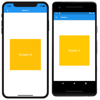
Your screen should now look like:
Where to Go From Here?
You can download the completed project using the Download Materials button at the top or bottom of this tutorial.
Wow, that was a lot of work, but you learned a lot:
- A Flutter project starts with Material Widgets.
- There are Material Widgets and Cupertino Widgets.
- You can use the flutter_platform_widgets library to use both types for your app.
- Most of the widgets have a Platform version.
- You may have to create your own widgets if some are missing.
You can learn more about Platform widgets by visiting Platform Widgets .
Stay tuned for more Flutter tutorials and screencasts!
Feel free to share your feedback and findings or to ask any questions in the comments below or in the forums. I hope you enjoyed learning about Flutter Platform Widgets!
Recommend
About Joyk
Aggregate valuable and interesting links.
Joyk means Joy of geeK