

Nested Gradients with background-clip | CSS-Tricks
source link: https://www.tuicool.com/articles/BjaUjue
Go to the source link to view the article. You can view the picture content, updated content and better typesetting reading experience. If the link is broken, please click the button below to view the snapshot at that time.
background-clip
all that often. I’d wager it’s hardly ever used in day-to-day CSS work. But I was reminded of it in a post by Stefan Judis, which coincidentally was itself a learning-response post to a post over here by Ana Tudor.
Here’s a quick explanation.
You’ve probably seen this thing a million times:
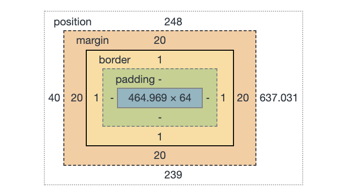 The box model visualizer in DevTools.
That’s showing you the size and position of an element, as well as how that size is made up: content size, padding, margin, and border.
Those things aren’t just theoretical to help with understanding and debugging. Elements actually have a content-box, padding-box, and border-box. Perhaps we encounter that most often when we literally set the box-sizing
property. (It’s tremendously useful to universally set it to border-box
).
Those values are the same values as background-clip
uses! Meaning that you can set a background to only cover those specific areas. And because multiple backgrounds is a thing, that means we can have multiple backgrounds with different clipping on each.
Like this:
See the Pen
Multiple background-clip by Chris Coyier (@chriscoyier)
on CodePen.
But that’s boring and there are many ways to pull off that effect, like using borders, outline
, and box-shadow
or any combination of them.
What is more interesting is the fact that those backgrounds could be gradients, and that’s a lot harder to pull off any other way!
See the Pen
Nested Gradients by Chris Coyier (@chriscoyier)
on CodePen.
Recommend
About Joyk
Aggregate valuable and interesting links.
Joyk means Joy of geeK