

Multi-Line Truncation with Pure CSS
source link: https://www.tuicool.com/articles/IbMbyi6
Go to the source link to view the article. You can view the picture content, updated content and better typesetting reading experience. If the link is broken, please click the button below to view the snapshot at that time.
Truncating a single line
of text if is
fairly
straightforward
. Truncating multiple lines is a bit harder. Using just CSS (no JavaScript or server-side dancing) is nice for the simplicity. It's gotten a little easier lately since Firefox (since version 68) has started supporting
the ultra-bizarre -webkit-line-clamp
soup method
, which makes browser support for that pretty OK.
There is another way though, which is very clever and something I'd call a bonafide CSS trick. We somehow failed to cover it properly in our canonical post on line clamping , so I'll cover it here then add it to that post. I first saw this trick on the now-dead Mobify blog, and more recently covered by Natalia Onischuk on Hacking UI .
The trick uses line height for measuring
Here's a big part of the trick. Imagine an element has a line-height
of 1.4rem
and you want to make sure it only shows a maximum of three lines of text. If you set the max-height
to 1.4rem * 3
, you've done it!
I'm not the worlds biggest fan of united line-height
, but alas, it's necessary here to do the math. I'm also not the biggest fan of setting it over and over on elements, so let's set a variable we can use later, and then use it to set a global line-height
.
html {
  --lh: 1.4rem;
  line-height: var(--lh);
}
Set that max height
The truncation happens just like this:
.truncate-overflow {
  --max-lines: 3;
  max-height: calc(var(--lh) * var(--max-lines));
  overflow: hidden;
}
You actually could leave it like this. That might be good enough if you don't care about the ellipsis.
The rest of the trick comes in when you want to display that ellipsis stuff
An ellipsis ("...") signifies that text has been truncated and continues longer than what it displayed. Using it is probably a pretty good practice when truncating text so the content doesn't come to an abrupt, awkward end. (Well, the content itself might be awkward anyway, but hey, you tried.)
If you set position: relative
on the element, you can absolutely position the ellipsis in the bottom-right corner.
.truncate-overflow::before {
  content: "...";
  position: absolute;
  bottom: 0;
  right: 0;
}
I was very tempted to, instead of setting the bottom, to set the top and use top: calc(var(--lh) * (var(--max-lines) - 1))
. My thinking there was that you might as well place the ellipsis at the exact point you need it. If the text is too short, the hidden overflow will cut it off. The problem with that is that it doesn't deal with the "exactly max lines lines" problem.
The ellipsis will show when the text matches the max lines — not only when it exceeds that space.
We'll have to get trickier!
Note that this "setting stuff in the bottom-right" thing is pretty specific to left-to-right languages. I'm going to make the demo with CSS logical properties
like inset-inline-end
instead of right
in hopes to make it more friendly to different languages and flow scenarios.
Another limitation is that the ellipsis doesn't attach itself to the final word since it's absolutely placed. We're not going to fix that as well.
Let's cover up the ellipsis when the text is too short
This is the second part of the trick. If we position the absolute at the bottom/end of the text all the time, that's fine. But if the text is exactly equal to the --max-lines
value or less, we want to hide it.
The trick there is to make a little box that is the same background as what is behind it and set it on top of the ellipsis to cover it. We can do that with the other pseudo-element:
.truncate-overflow::after {
  content: "";
  position: absolute;
  right: 0; /* note: not using bottom */
  width: 1rem;
  height: 1rem;
  background: white;
}
Another trick we're using here is not setting a bottom ( inset-block-end
) property. This places the box at the bottom of the content rather than the bottom of the relative parent, which is very useful.
Let me make the boxes red so you can see them in these three different examples:
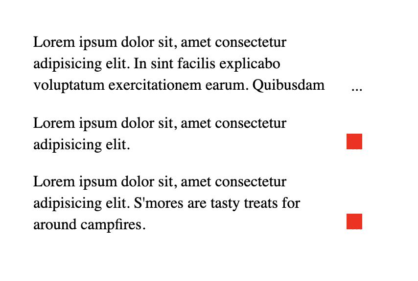 The top example has more than three lines, so we see the ellipsis. The second example only has two lines, so the red box shows that the ellipsis will be covered up (but imagine a white box instead). The last example shows that this system works even when the content is exactly the same as the value of
 --max-lines
. Demo
See the Pen
by Chris Coyier ( @chriscoyier
)
on CodePen .
I used CSS logical properties here, as the browser support has gotten pretty good. If you're supporting any version of IE
, you'll have to switch back to using the bottom
and right
stuff instead.
This browser support data is from Caniuse , which has more detail. A number indicates that browser supports the feature at that version and up.
Desktop
Chrome Opera Firefox IE Edge Safari 69 62* 41 No 76 12.1Mobile / Tablet
iOS Safari Opera Mobile Opera Mini Android Android Chrome Android Firefox 12.2-12.3 46* No 67 75 67Recommend
About Joyk
Aggregate valuable and interesting links.
Joyk means Joy of geeK