

GitHub - jaames/iro.js: ? HSV color picker widget for JavaScript with a modern,...
source link: https://github.com/jaames/iro.js
Go to the source link to view the article. You can view the picture content, updated content and better typesetting reading experience. If the link is broken, please click the button below to view the snapshot at that time.
README.md
⚠️ This readme is for iro.js v4, which is a major rewrite of the library. If you are still using v3 (version 3.5.1 and below) please read the migration guide. The v3 version of the library and documentation is preserved in the v3 branch if you need it!
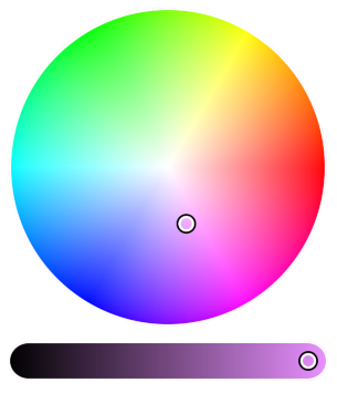
iro.js
An HSV color picker widget for JavaScript, with a modern SVG-based user interface | iro.js.org
Features | Demo | Installation | Usage | Plugins | Documentation
Features
- Simple: Low friction API, with robust support for hex, rgb, hsl and hsv color formats.
- Extendable: Tweak the library to your requirements with Plugins and custom UI elements
- Consistent behaviour: Works across all modern browsers and devices, including touchscreens.
- Small footprint: 7kb minified and gzipped, with absolutely no jQuery or extra css/images in sight.
- Great design: The controls are designed to be intuitive and responsive, plus they're built with SVG so they look super crisp at any resolution.
- Transparency support: Optional transparency slider with the transparency plugin.
- Licenced under MPL 2.0: 100% free for personal and commercial use.

Demo
An interactive demo is available on Codepen.
Installation
Install with NPM
$ npm install @jaames/iro --save
If you are using a module bundler like Webpack or Rollup, import iro.js into your project:
// Using ES6 module syntax
import iro from '@jaames/iro';

// Using CommonJS modules
const iro = require('@jaames/iro');
Download and host yourself
Development version
Uncompressed at around 52kB, with source comments included
Production version
Minified to 20kB
Then add it to the <head> of your page with a <script> tag:
<html>
  <head>
    <!-- ... -->
    <script src="./path/to/iro.min.js"></script>
  </head>
  <!-- ... -->
</html>
When manually including the library like this, it will be globally available as window.iro.
Using the jsDelivr CDN
<script src="https://cdn.jsdelivr.net/npm/@jaames/iro/dist/iro.min.js"></script>
Usage
Getting Started
Create a HTML element with a unique identifier (such as an id attribute) to act as a container for the color picker:
<div id="color-picker-container"></div>
Then use JavaScript to create a new iro.ColorPicker with a CSS selector that matches your chosen container element:
var colorPicker = new iro.ColorPicker('#color-picker-container');
You can also use a DOM object instead of a CSS selector here -- this might be more suitable if you're integrating iro.js into an application built with Vue, React, Angular, etc.
Color Picker Options
The color picker can be configured by passing a set of options to the second iro.ColorPicker parameter:
var colorPicker = new iro.ColorPicker("#color-picker-container", {
  // Set the size of the color picker
  width: 320,
  // Set the initial color to pure red
  color: "#f00"
});
Available Options
Option Purpose Defaultwidth
Total width of the control UI.
300
color
The initial color value. This can be any supported color format.
"#ffffff"
borderWidth
Width of the border around the controls. Set to 0 for no border.
0
borderColor
Color of the border. Any valid CSS color is supported.
"#ffffff"
padding
Padding around the control handles.
6
handleRadius
Radius of the control handles.
8
handleSvg
Custom handle SVG, used for Custom Handles
null
handleOrigin
Custom handle origin point, used for Custom Handles.
{x:0,y:0}
wheelLightness
If set to false, the color wheel will not fade to black when the lightness decreases.
true
sliderHeight
Slider control height. By default this will be calculated automatically
undefined
sliderMargin
Distance between the wheel and the slider controls.
12
display
CSS display value for the color picker root element.
"block"
layout
Used for Custom Layouts
null
More details about color picker options, properties, and methods can be found on the Color Picker API documentation.
Selected Color API
Each color picker instance has a color object which stores the currently selected color. This color object is tied to the color picker, so any changes to its values will be reflected by the picker and vice versa.
Color Properties
The color object has a few "magic" properties which can be used to both get and set the selected color in different formats. Whenever one of these properties is set, the color picker controls will update and the color:change event will fire.
For example, to get the current color as a hex string:
var hex = colorPicker.color.hexString;
console.log(hex); // hex = "#ff0000"
Or to set the selected color from a hsl object:
colorPicker.color.hsl = { h: 180, s: 100, l: 50 };
// Color picker updates to match hsl(180, 100, 50)
The color object has properties which cover all of the most common web color formats (hex, rgb, and hsl) in the same manner, in addition to hsv:
Property Example FormathexString
"#ff0000"
rgb
{ r: 255, g: 0, b: 0 }
rgbString
"rgb(255, 0, 0)"
hsl
{ h: 360, s: 100, l: 50 }
hslString
"hsl(360, 100%, 50%)"
hsv
{ h: 360, s: 100, v: 100 }
For more details about the color object, check out the Color API documentation.
Color Picker Events
Events let you listen for specific color picker events such as changes to the selected color, the start of user input, or when the color picker has mounted.
The color picker's on method can be used to add callback functions which get called whenever the given event is fired. These callbacks can also be removed at any time by passing the same function to the color picker's off method. In this example we add and remove a callback for the color:change event:
// color:change event callback
// color:change callbacks receive the current color and a changes object
function onColorChange(color, changes) {
  // print the color's new hex value to the developer console
  console.log(color.hexString);
}

// listen to a color picker's color:change event
colorPicker.on('color:change', onColorChange);

// later, if we want to stop listening to color:change...
// remove the color:change callback
colorPicker.off('color:change', onColorChange);
Available Events
color:change
Fired whenever the selected color changes -- either when the user interacts with the color picker, or when the color is set via code. This event's callback function gets passed two values:
color: the currently selected colorchanges: an object showing which HSV channels have changed since the last time the event was fired
input:start
Fired whenever the users starts interacting with the color picker controls. The currently selected color is passed to this event's callback function.
input:end
Fired whenever the user stops interacting with the color picker controls. The currently selected color is passed to this event's callback function.
mount
Fired when the colorPicker's UI has been mounted to the DOM and is ready for user interaction. The colorPicker object is passed to this event's callback function.
Plugins
- iro-dynamic-css: Allows you to dynamically update CSS rules whenever the selected color changes.
- iro-transparency-plugin: Adds optional transparency slider to the color picker and support for color-with-alpha color formats.
Documentation
Website | Codepen Demo | Contribution Guide | Donate | Changelog | License
Recommend
About Joyk
Aggregate valuable and interesting links.
Joyk means Joy of geeK