

GitHub - gauravk95/bubble-navigation: ? [Android Library] A light-weight library...
source link: https://github.com/gauravk95/bubble-navigation
Go to the source link to view the article. You can view the picture content, updated content and better typesetting reading experience. If the link is broken, please click the button below to view the snapshot at that time.
README.md
Bubble Navigation
? A light-weight library to make beautiful Navigation Bar easily with ton of ? customization option.
Demos
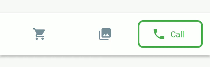
BubbleNavigationConstraintView in spread mode

BubbleNavigationLinearView when used normally or BubbleNavigationConstraintView in packed mode
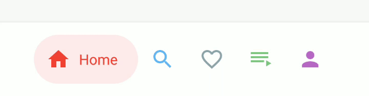
BubbleNavigationLinearView when distibuted equally
Features:
- Support for API Level 16+
- Higly customizable
- Light weight and easy-to-use
- Supports TransitionDrawable for cool state changes
- 2 types of NavigationView for different use cases
- BubbleNavigationConstraintView: supports
spread,insideandpackedmode - BubbleNavigationLinearView: allows equal distribution using weight or packed mode
- BubbleNavigationConstraintView: supports
- Bonus BubbleToggleView to create new UI components, other than navigation
Usage
Check out the Sample app, to see how its implemented.
Gradle
- This library is available on JCenter. To use it, add the following to
build.gradle
dependencies {
    implementation 'com.gauravk.bubblenavigation:bubblenavigation:1.0.2'
}
XML
<com.gauravk.bubblenavigation.BubbleNavigationConstraintView
        android:id="@+id/top_navigation_constraint"
        android:layout_width="match_parent"
        android:layout_height="wrap_content"
        android:layout_marginBottom="380dp"
        android:background="@color/white"
        android:elevation="4dp"
        android:padding="12dp"
        app:bnc_mode="spread">

        <com.gauravk.bubblenavigation.BubbleToggleView
            android:id="@+id/c_item_rest"
            android:layout_width="wrap_content"
            android:layout_height="wrap_content"
            app:bt_colorActive="@color/search_active"
            app:bt_colorInactive="@color/search_inactive"
            app:bt_icon="@drawable/ic_restaurant"
            app:bt_shape="@drawable/transition_background_drawable_restaurant"
            app:bt_title="@string/restaurant" />

         <!-- Add more child items here - max upto 5 -->

    </com.gauravk.bubblenavigation.BubbleNavigationConstraintView>
attr Description bnc_mode Changes the display mode the child elements
- spread : equally distributes the child elements
- packed : elements are packed with center gravity
- inside : inside elements are equally distributed
OR
<com.gauravk.bubblenavigation.BubbleNavigationLinearView
        android:id="@+id/bottom_navigation_view_linear"
        android:layout_width="match_parent"
        android:layout_height="wrap_content"
        android:background="@color/white"
        android:elevation="8dp"
        android:orientation="horizontal"
        android:padding="12dp">

        <com.gauravk.bubblenavigation.BubbleToggleView
            android:id="@+id/l_item_home"
            android:layout_width="wrap_content"
            android:layout_height="wrap_content"
            app:bt_active="true"
            app:bt_colorActive="@color/home_active"
            app:bt_colorInactive="@color/home_inactive"
            app:bt_icon="@drawable/ic_home"
            app:bt_shape="@drawable/transition_background_drawable_home"
            app:bt_title="@string/home" />

    <!-- Add more child items here - max upto 5 -->

    </com.gauravk.bubblenavigation.BubbleNavigationLinearView>
Using BubbleToggleView
BuggleToogleView is designed to work as a child component for the BubbleNavigationLinearView and BubbleNavigationConstraintView.
This view can be used independently
- you may use it for your own implementation of NavigationBar
- create new UI components
- or simply use it as toggle view
Activity/Fragment
In Java
  bubbleNavigation.setNavigationChangeListener(new BubbleNavigationChangeListener() {
            @Override
            public void onNavigationChanged(View view, int position) {
                //navigation changed, do something
            }
        });
Or in Kotlin
  navigation_view.setNavigationChangeListener { view , position ->
            //navigation changed, do something here
        }
Contribute
Found a bug or have an idea/feature request or any other help needed. Please suggest or report them here
I am always open to new suggestions and good contributions.
Contact
Have a cool project in mind? Want to collaborate? Shoot me a mail at [email protected]
License:
    Copyright 2019 Gaurav Kumar

    Licensed under the Apache License, Version 2.0 (the "License");
    you may not use this file except in compliance with the License.
    You may obtain a copy of the License at

    http://www.apache.org/licenses/LICENSE-2.0

    Unless required by applicable law or agreed to in writing, software
    distributed under the License is distributed on an "AS IS" BASIS,
    WITHOUT WARRANTIES OR CONDITIONS OF ANY KIND, either express or implied.
    See the License for the specific language governing permissions and
    limitations under the License.
Recommend
About Joyk
Aggregate valuable and interesting links.
Joyk means Joy of geeK