

Tableau in 10 Minutes: Step-by-Step Guide
source link: https://www.tuicool.com/articles/hit/ie6vimY
Go to the source link to view the article. You can view the picture content, updated content and better typesetting reading experience. If the link is broken, please click the button below to view the snapshot at that time.


Tableau is an innovative system of business intelligence enterprise-class, which can be used in both conventional and complex investigations: from visualization of questions and answers to complex data analysis (trends, correlations, and statistics). The convenience of the system is that it recognizes the data in any format, significantly reduces the time of data analysis by a visual presentation of information and is very easy to understand and use.
In this tutorial we will work with Tableau Public and Summer_Olympic_medallists_1896–2008 dataset. Tableau Public is free, so you can download it using just your email.
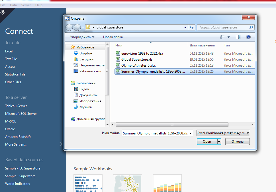
Let’s open Tableau Public. On the left side of the screen select the type of the data file and then open the Olympic medalists dataset.

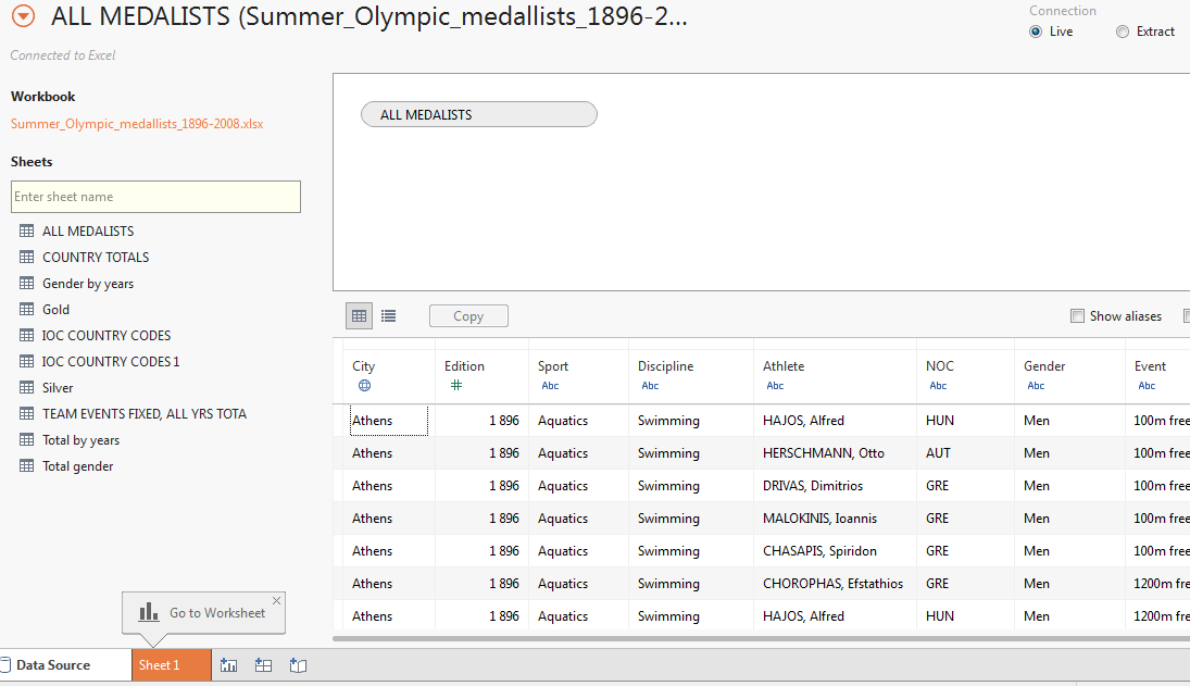
You can preview all your data and choose only the needed data; simply drag and drop it to the field. Here you can change your data, split it or even join several fields by the columns with the same data. We will choose the first list of all the medalists.

After selecting the data, go to the first Worksheet. You can see all your data fields on the left side of the screen. Let’s drag the Discipline field and drop it to the Columns , then take Medal and drop it to the Rows . Click on the arrow near Medal (drop-down menu) and select Measure (Сount) -> Count to see bars that show the number of medals earned by each country. Another way to do it is to choose Number of records in the Measure tab and drop it to the Columns field.

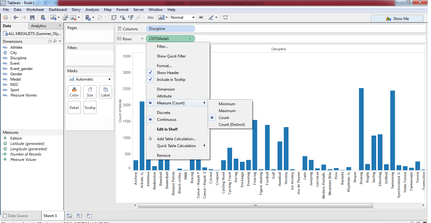
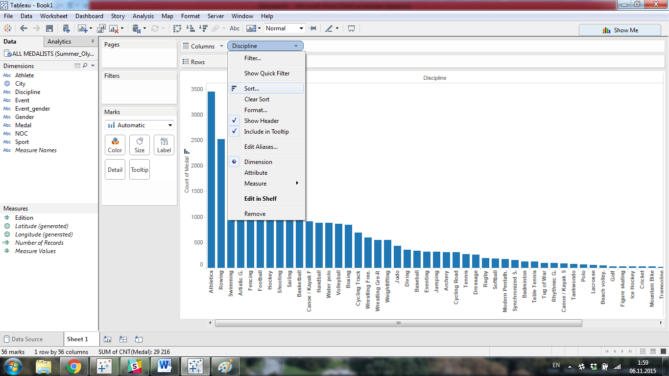
The countries are sorted in the alphabetical order by default. You can sort them by the number of medals using the Sort icon near the vertical axis label or in the drop-down menu of Discipline :

Now we have a list of all sports disciplines, but there are such sports that had too little data (medals). It is not very interesting for us, so we can group them to one new field. Let’s choose these disciplines using SHIFT or CTRL and clicking “Group” after right-clicking the mouse.

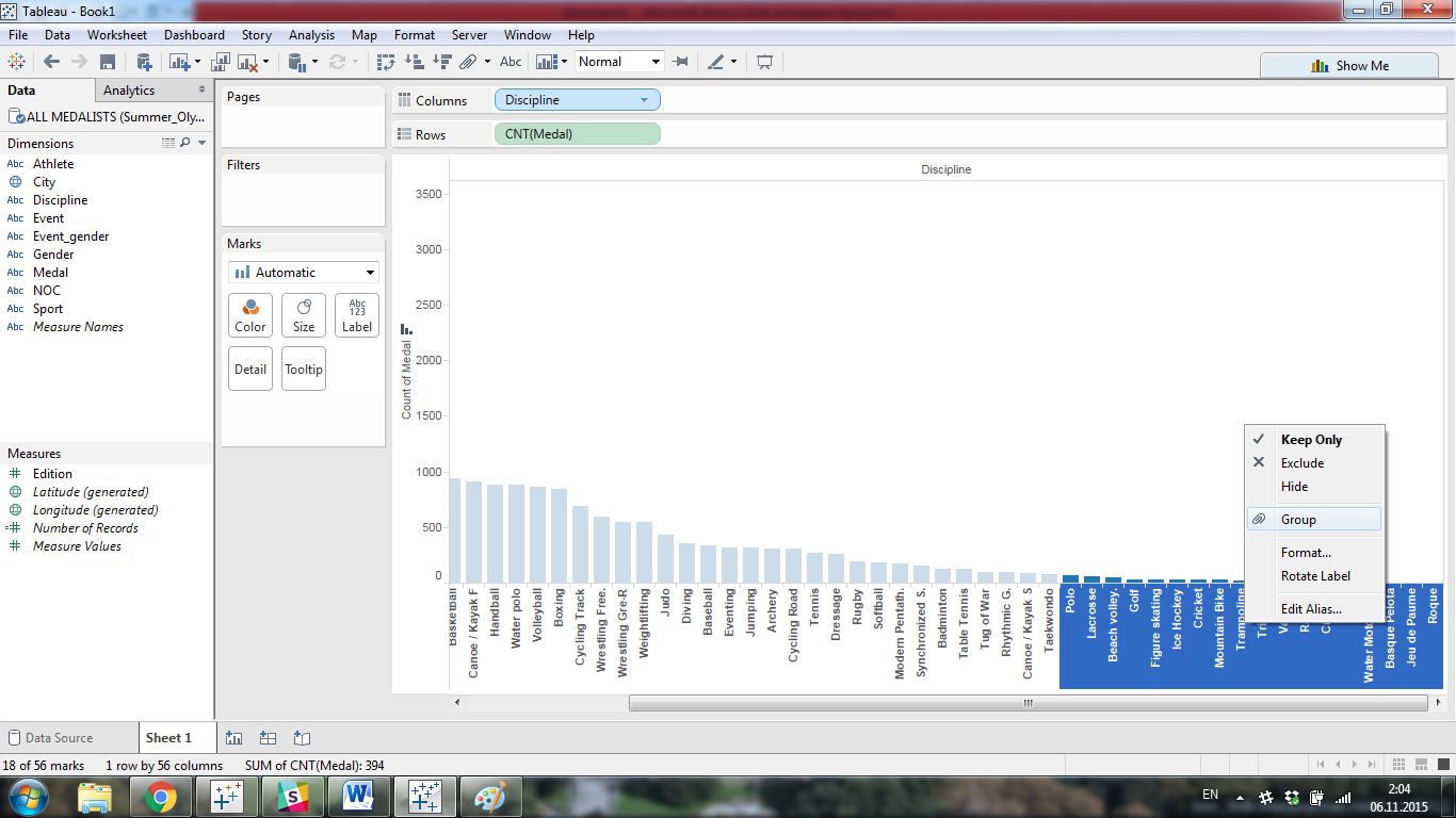
Rename the new category to “Different” or “Other” or just exclude this data by mouse right click -> Exclude . Now, we have enough data for visualization and we can add some features. Let’s see the division of medals (gold, silver, bronze) in each sport. Drag Medal and drop it to the Color field on the left of the graph.
Now you can see that every column is divided into three parts. Use legend field Medal on the left of the chart to change colors of the columns’ parts and the sequence of the medals to personalize chart.

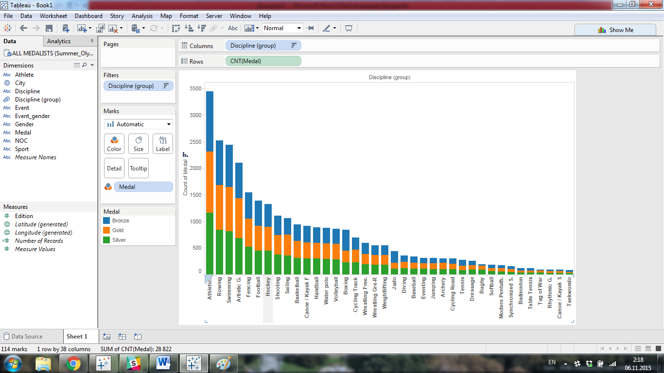
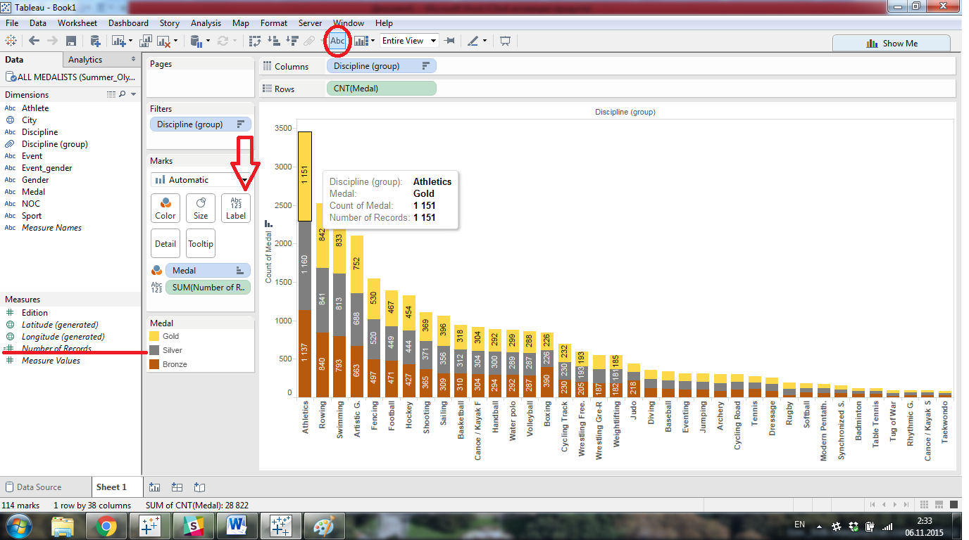
Also, you can add labels on your bars by clicking on Abc icon on the top (Show mark labels) or by dragging Number of records to the Label field on the left of the graph.
Note that all graphs are interactive. By clicking the mouse on the chart more information appears there. This allows us not to overload the original image. In this case, there is no need to add labels on such a diagram. You can see all the information just selecting the needed bar.

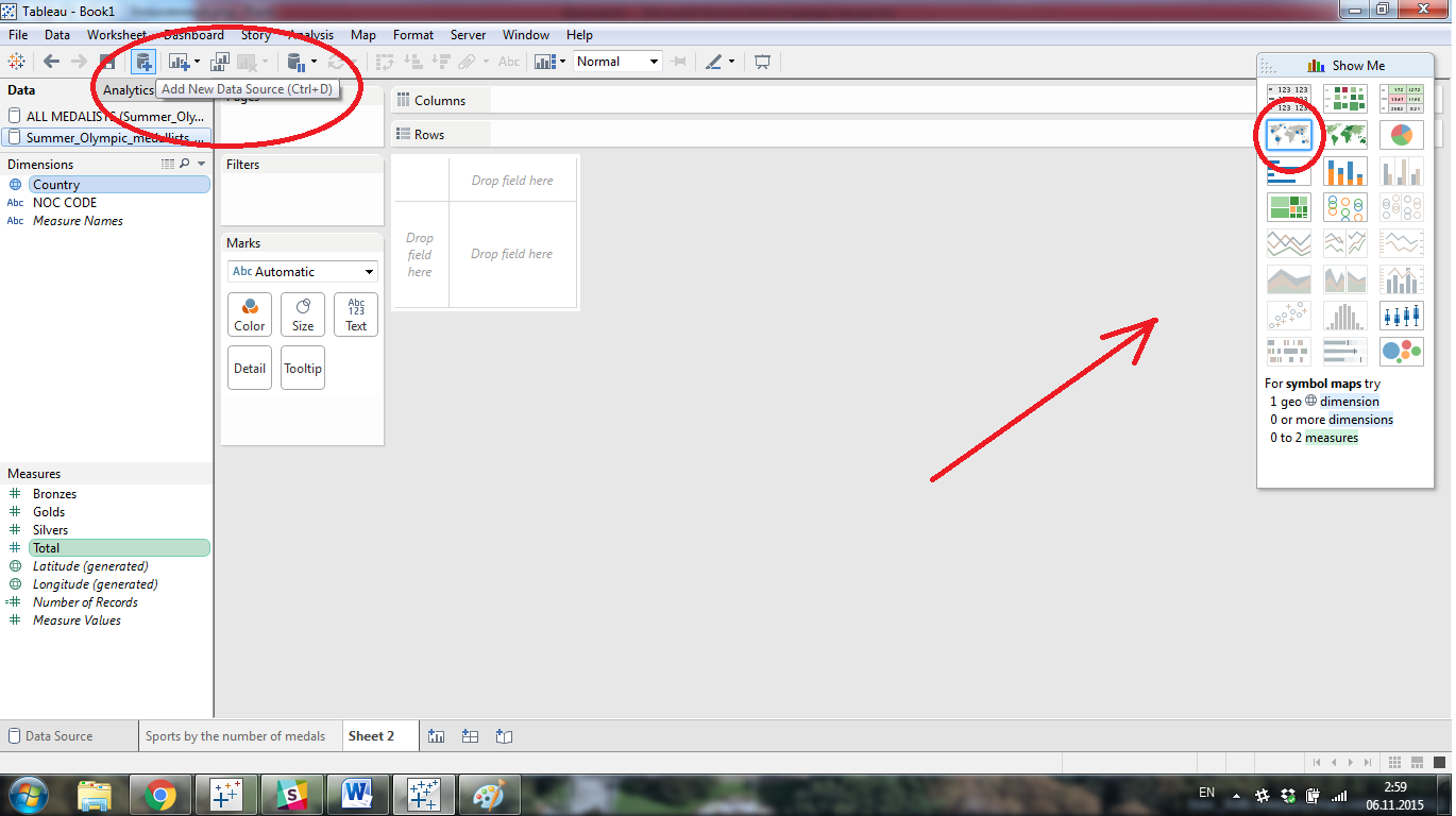
Now you can rename the Sheet by clicking 2 times on the name of the sheet. You can also add a new sheet by clicking plus (+) icon near the first Worksheet. Now we will show all the Countries in our dataset and create a beautiful interactive graph of the Most Successful Countries of All-Time. For that, we will need more information. Click “Add New Data Source” on the Toolbar and add our database ones more. Now drag the list TEAM EVENTS FIXED, ALL YRS TOTAL and go to the new Worksheet.
Let’s choose Show Me pallet in the top right corner of the window and select Country in the Dimensions field and Total in Measure (using CTRL). Show Me pallet highlights all kinds of graphs you can build using selected data. We will choose a Symbol map .

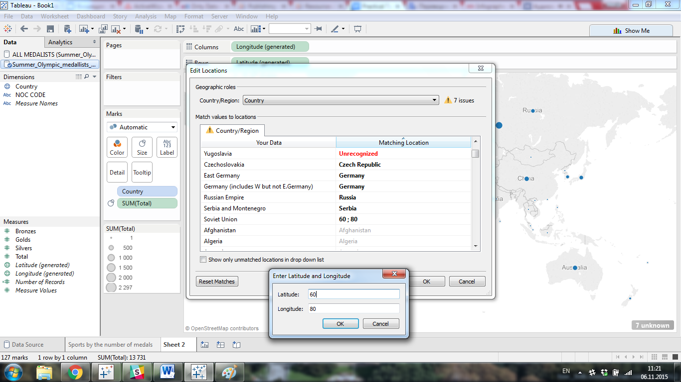
You can see in the bottom right corner of the scheme that there are 13 values with unknown geographical location. This is due to the fact that our base covers the period since 1896. We need to add all unknown locations to the already existing ones. Choose Map-Edit locations on the Toolbar . Now you have all 13 unknown countries on the top of the list. Change Unrecognized field to one of the existing countries. We will do so for every country except the Soviet Union. For this country we will enter new Location (it is optional, we chose 60 and 80).

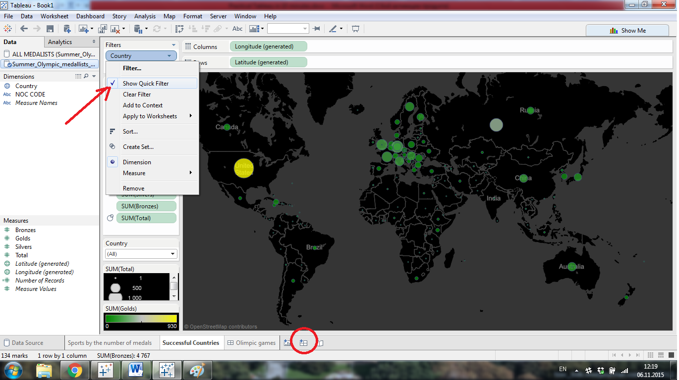
You can change the size of the circles, their color, border and thickness using Size and Colortab . Also, we can add more information to this map and personalize it. Use Map –> Map Options on the Toolbar to change the map; add the Gold field (from Measures ) to the Color tab field. Now we can change the color grade for the quantity of the gold medals in all countries and add to Detail field all information you want to see when the country is selected.
Add a filter to a Filter field by dropping the Countries in it. Now you can choose only one country or a number of countries from the entire list to be shown.

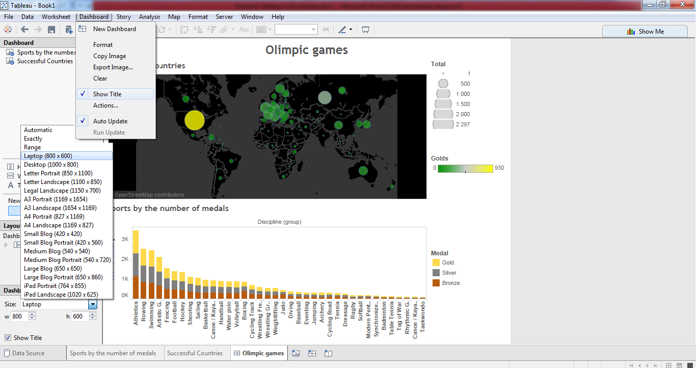
Rename your sheet and add a new Dashboard, like it is shown on the image.
Drag and drop your Sheets to the central field. You can change Legend on the left side of your Dashboard. It is easy to change the size of this Dashboard, choosing its size from the drop-down menu. The laptop size is very useful to see the whole information without scrolling the page. Also, you can add Title or change the format of the Dashboard in the Dashboard menu on the Toolbar .

Finally, you can save the project to the cloud by clicking Toolbar –> File –> Save To Tableau Public . Now, you should set the name of the Book, log in to your account, and your Workbook will be available online. You can download the file on your computer, only after saving it in Tableau Public online.

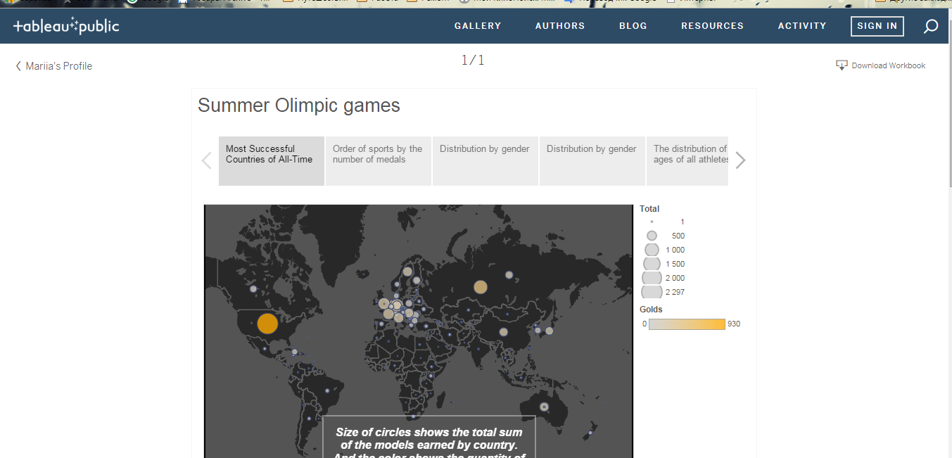
Please note that all the Dashboards and Workbooks continue to be interactive online. You can share these graphs by copying the link under them.
Conclusion
In this tutorial we have shown only a small part of the Tableau functionality. This platform is a very convenient tool for creating various interactive graphs, maps, and charts, as well as their publication on the Internet. You can see all the possible types of data analysis of Olympic Games database here .
We hope this information was helpful and Tableau will be a useful tool in your work.
Originally published in datascience-school.com
Recommend
-
127
[原]解密Airbnb 自助BI神器:Superset 颠覆 Tableau Original...
-
57
-
78
从来没有一个时代像我们现在这样对「数据」如此重视,一夜之间,对「数据」的态度、解读、分析和利用已经成为划分传统经济和新经济的重要标准。...
-
82
Tableau 是基于斯坦福大学突破性技术的软件应用程序。它帮助您生动地分析实际存在的任何结构化数据,以在几分钟内生成美观的图表、坐标图、仪表盘与报告。利用 Tableau 简便的拖放式界面,可以自定义视图、布局、形状、颜色等等,帮助您展现自己的数...
-
72
This post builds on my previous blog post, where I introduced the Fusion SQL service: https://lucidworks.com/2017/02/01/sql-in-fusion-3/ . Since that post,...
-
94
Forecasting with Python and Tableau I’m Greg Rafferty, a data scientist in the Bay Area....
-
41
导读 Tableau公司近日推出Tableau 2018. 2 版本更新,该更新的扩展API能够让用户直接拖放第三方应用功能到仪表板。此外,在新推出的Tableau服务管理器下,用户可直接在浏览器中管理Tableau Server。 此外,Tableau 2018. 2 还具备...
-
6
This article was published as a part of the Data Science Blogathon. Introduction on Tableau Hi and welcome to this article. Visua...
-
4
-
14
About Joyk
Aggregate valuable and interesting links.
Joyk means Joy of geeK