

Element 2.0 is here – ELEME Frontend Engineering – Medium
source link: https://medium.com/elemefe/element-2-0-is-here-71bfa217e269
Go to the source link to view the article. You can view the picture content, updated content and better typesetting reading experience. If the link is broken, please click the button below to view the snapshot at that time.
Element 2.0 is here
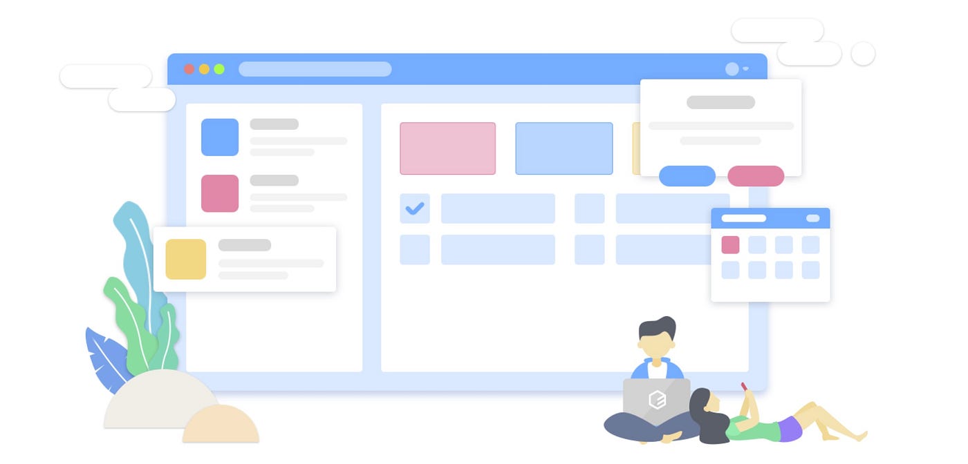
Element 2.0 was released last Friday, and together the website has been updated to show the 2.0 documentations by default (and, of course, you can still select the 1.x docs from the dropdown menu).
Element 2.0 has 210 commits, including more than 90 new functions and optimizations. They can be roughly categorized as follows:
Component functions
- First of all, we improved usability. Here’s some examples: in 1.x, if you need to change the default size of components, you’ll have to add the
sizeattribute on each component. Now you can configure the default size for all components with just one line of code. Another example is that the new theme is written in SCSS, so SCSS users can easily modify style variables to get a custom theme. At the same time, we also added some methods for components, so that you can programmatically trigger some behavior of the components. For example we addedopenandclosemethods for Menu to open and close SubMenus, and now Table has atoggleRowExpansionmethod that is used to expand or collapse expandable rows - Second, we now support some of the popular demands our users have been asking. To name a few, now Dialog can be nested in template, Table supports rowspan and colspan, and MessageBox can render HTML strings
- Third, we enriched component APIs, so they can be used in a wider business scenario. For example, now you can configure which corner of the screen Notification pops up, and use custom icon in Loading
- Last but not least, we corrected some bad design in 1.x, and improved API consistency. One big change is that the
changeevent of form components now only triggers on user interaction, keeping it consistent with nativechangeevent
Please refer to the changelog for details.
New theme
Element 2.0 has a new theme: theme-chalk. What is the design principle of this theme? Let's hear what our designer
In line with current design trends, the redesigned Element 2.0 adapts to the current aesthetic. To abandon redundant design modification, we adhere to the “less is more” design principle. For example, with more and more high-res screens, we make Element “bigger” than 1.x, so the reading experience will be more friendly. At the same time, besides the default component size, we also provide a variety of sizes to accommodate different needs.
In addition, keeping the consistency of components is also a principle when we design 2.0. For example, we first defined the four heights of Button (
40 px,36 px,32 px,28 px); after that, Input, Select and other components are then maintained with the exact same heights. This enables the design output based on Element 2.0 to ensure a high degree of unity.In general, 2.0 is more modern and friendly than 1.x.
Accessibility
We also improved accessibility of components in version 2.0. The following is from @maranran, who is responsible for this work:
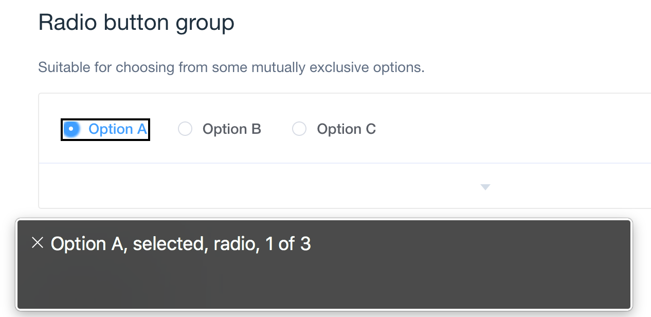
Accessibility means that the components, behaviors, and DOM structures on the page are semantically correct, so that AT devices can convey page information to people with disabilities, including the blind, physical disability, and cognitive disability.
As a UI library of basic components, Element encapsulates the underlying DOM structure. In the 2.0 version, we have done some basic work in accessibility to help people with disabilities to understand the page and interact with it. At the same time, we have made it easier for developers to keep improving accessibility in their projects.
What we have done includes two parts: increasing operability of keyboard, and improving semantics of the components. Keyboard operability allows people with disabilities to navigate to each component using keyboard and interact with them using left, right, up, down, enter, esc, etc. When it comes to semantics, we used the WAI-ARIA technology to add roles, states, properties for different components, so that UA and AT can correctly convey the semantics of components.
Documentation
The 2.0 website and documentations have also been upgraded, and hopefully you will find them easier to use.
The main contributors of Element 2.0 are (in alphabetical order) : @baiyaaaaa @Dreamacro @Leopoldthecoder @liril-net @maranran @wacky6 @waynecz. In addition, there are many community users who have made suggestions for 2.0, and we are grateful to them.
The release of version 2.0 marks a new era for Element, and it also means that the 1.x version goes into maintenance mode. We will continue to support it until December 01, 2017.
We hope you enjoy Element 2.0.
Recommend
About Joyk
Aggregate valuable and interesting links.
Joyk means Joy of geeK