

Announcing Ant Design 3.0 – Ant Design – Medium
source link: https://medium.com/ant-design/announcing-ant-design-3-0-70e3e65eca0c
Go to the source link to view the article. You can view the picture content, updated content and better typesetting reading experience. If the link is broken, please click the button below to view the snapshot at that time.
Announcing Ant Design 3.0
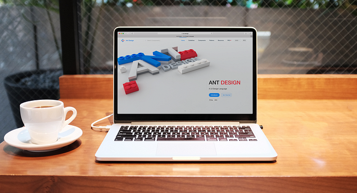
Ant Design which is specially created for enterprise internal desktop applications, is committed to improving the experience of users, designers and developers.
We released Ant Design 2.0 14 months ago. In those 14 months we received PRs from more than 200 contributors.Underwent about 4,000 commit and over 60 releases.
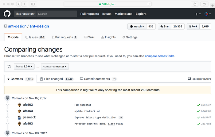
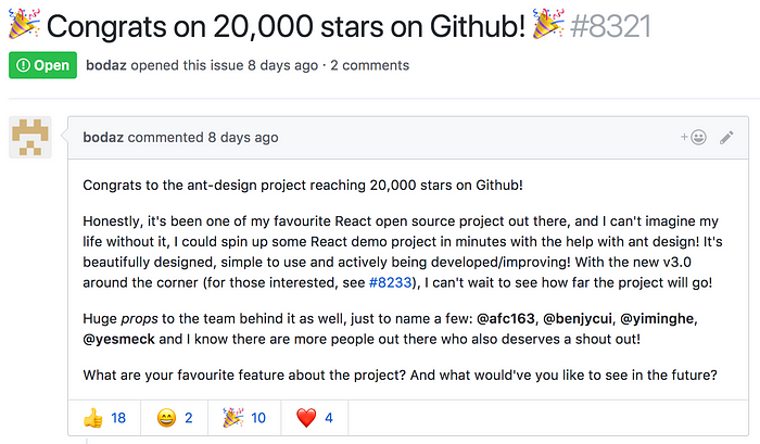
The number of GitHub star also rose all the way from 6k to 20k.
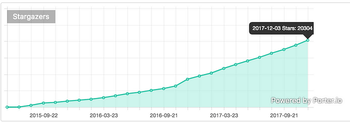
GitHub trending since 2015
Today, we are happy to announce that Ant Design 3.0 has finally been released 🎉. In this release we made a completely new design for components and websites, introduced a new color system, refactored code for multiple underlying components, introduced new features and improvements while minimizing incompatible changes. See full change logs here.
Here is our home page http://ant.design/ and GitHub repository.
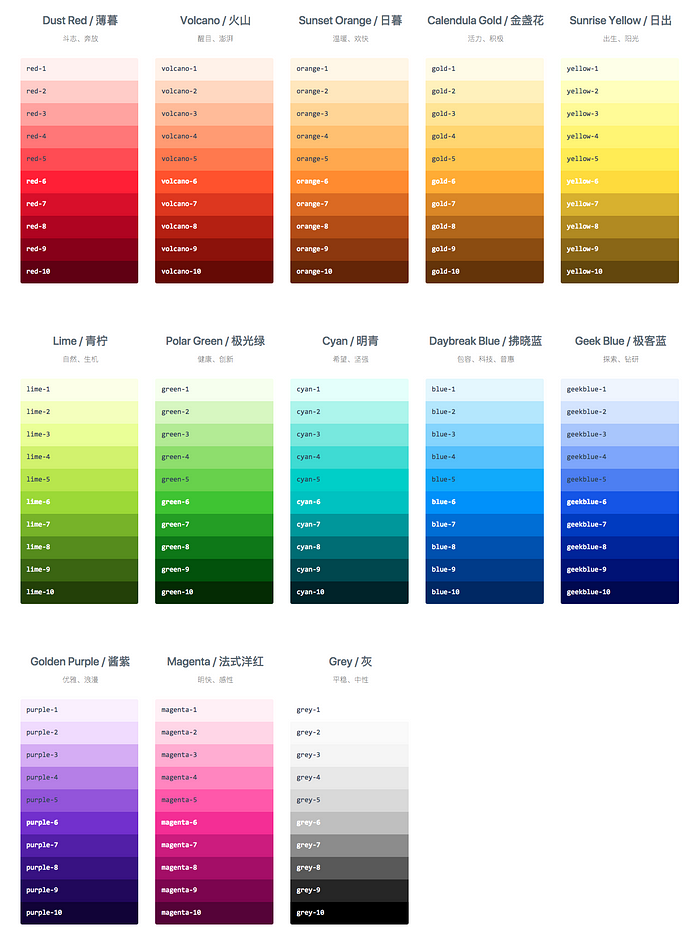
New Color System
Our new color system is inspired by the sky, because its inclusiveness coincide with the tone of our brand. Based on the natural sky color change with time and the research on the light and shade rules, we rewrote our color algorithm to generate a brand new palettes, and the corresponding gradation levels are optimized too. The senses of new color palette is younger, brighter, and grayscale transitions more natural, a perfect blend of sensual and rational beauty. In addition, all dominant color values take into account accessibility standards.
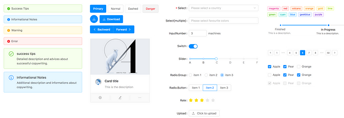
New Design of Components
In previous version, the basic font size of the component was 12px, and we received many feedbacks from community to request us increasing the font size. Our designers are also aware that today the big screen is very common, 14px is a more appropriate font size. So we increased the base font size for to 14px and resized the dimensions of all the components to accommodate this change.
Rewrote components
We rewrote the Table component to resolve some long living issues. A new prop components was introduced, with this props you can highly customize Table component now, here is a example to add drag & drop feature to table.
Form component also has been rewrote to provide a better support for nested fields.
Another rewrote component is Steps, with this rewrote Steps has a simpler DOM structure and IE9 compatibility.
New Components
This version we added two new components, List and Divider.
List components can be very convenient for text, lists, pictures, paragraphs and other data display. And easy integration with third-party libraries, for example, you can use react-virtualized to achieve infinite loading list. More detailed examples can refer to the List document.
The Divider component can be used to split paragraphs of text in different chapters or to split in-line text / links, such as the action column of a table. Detailed examples can refer to the Divider document.
Full support for React 16 and ES Module
In this version we added support for React 16 and ES module. If you are using webpack 3 then you can now enjoy the optimization of antd’s components by Tree Shaking and Module Concatenation. If you’re using babel-plugin-import, just set libraryDirectory to the es directory.
More friendly TypeScript support
We’ve removed all the implicit any types in our code, and we no longer requires "allowSyntheticDefaultImports": true in your project. If you happen to have projects that you plan to write using TypeScript, please refer to our new documentation “Using in TypeScript” .
😍 One More Thing…
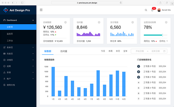
Some people may already know it, we are working on another project named Ant Design Pro, it’s a out-of box UI solution and a React boilerplate for enterprise applications based on Ant Design 3.0. Though it has not reached its 1.0 release yet. But with antd 3.0 releasing, you can use it in production now.
What’s Next
Our designers are working on rewriting our design guideline documentation and designing a new website for Ant Design. We are very excited to provide a better design language to inspire more ideas of building enterprise applications.
And our engineers are working hard on Ant Design Pro to make 1.0 happen, which also need your help to translate our documents.
Conclusion
It’s not possible to reach here without your supports, feedbacks, and participations. Thanks to the awesome Ant Design community. If you encounter any problems when using antd, feel free to file a new issue on GitHub.
Thanks for reading. Go install it, star it, and give it a try! 🎉
Links
Recommend
About Joyk
Aggregate valuable and interesting links.
Joyk means Joy of geeK