

How we built a React design system
source link: https://treatwell.engineering/how-we-built-a-react-design-system-ad03978b9e01
Go to the source link to view the article. You can view the picture content, updated content and better typesetting reading experience. If the link is broken, please click the button below to view the snapshot at that time.
How we built a React design system

At Treatwell we use design tokens together with the atomic design methodology and CSS custom properties to create the design system that is the foundation for our React components.
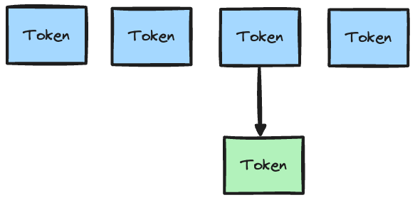
A design system is a collection of reusable components that follows a set of predefined rules, built from a collection of design tokens.
So.. what are design tokens?
Design tokens have meaningful names and store visual design attributes such as colours, sizes, fonts and more. They usually take the form of key/value pairs which makes JSON an ideal format to store them:
{
  "color": {
    "grey": {"value": "#dddddd"},
    "red": {"value": "#dc2222"}
  }
}
{
  "spacing": {
    "small": {
      "value": 4
    },
    "medium": {
      "value": 8
    },
    "large": {
      "value": 12
    }
  }
}
By storing the tokens in this simple, raw format it makes it easy to transform them into the different formats that we require. A tool that we use to achieve this is Style Dictionary. It comes with an extensive list of transform functions that can turn JSON tokens into CSS, JavaScript, and other common source files.
In addition, it makes it easy to write your own transformation functions for more complicated use cases. We make use of custom lodash templates to output TypeScript definitions for the JavaScript tokens. For example, using the spacing tokens above:
// style dictionary template
export interface Spacings {
    <% _.each(spacings, function(spacing) { %>
      <%= spacing.attributes.type %>: number;
    <% }); %>
  }

// output into `d.ts` file
export interface Spacings {
  small: number;
  medium: number;
  large: number;
}
Deciding on the tokens
Treatwell frontend engineers collaborate with the design team when creating the tokens. The token names that we agree to use are chosen carefully because if at a later time the values need to be updated, the names should remain meaningful. An example of this is using small, medium, and large for the spacing token names rather than 4, 8, and 12 which would make changes much more difficult.
You can refer to The Dilemma of Naming Font Size Variables for more examples of this.
Benefits of using design tokens
By using tokens you essentially have one source of truth, which can be converted to many formats for your applications. Token names can also be referenced in design tools such as Figma or Zeplin, which is useful and time saving for engineers, and they also create a common language between the tech and design teams.
If any of the values need to be changed, for example there is a requirement for components to use a different shade of red, then the value only needs to be updated in one place.
They also play a part in enabling theming, as different projects can use their own tokens.
Using the tokens to create a theme
Components in the Treatwell design system make use of CSS custom properties to allow flexible theming. If you are unfamiliar with custom properties, they can be thought of as variables for CSS, but are subject to the cascade and can inherit values from their parent.
This allows us to override tokens for all instances of a component, but even for specific components if needed.
Using Style Dictionary the tokens are transformed into CSS custom properties and added to the :root pseudo-class, essentially making them available globally to the whole application:
:root {
  --color-base-grey: #dddddd;
  --color-base-red: #dc2222;
  --spacing-small: 4px;
  --spacing-medium: 8px;
  --spacing-large: 12px;
}
The following example will use a simple Button component that can be customised. Additionally, CSS modules will be used to apply styles to the component:
/* Button.module.css */

:root {
  --Button-primaryColor: var(--color-base-red);
  --Button-secondaryColor: var(--color-base-grey);
}

.primary {
  background-color: var(--Button-primaryColor);
}

.secondary {
  background-color: var(--Button-secondaryColor);
}
The Button component creates its own set of custom properties on the :root that map the design tokens to its internal styling. We will see how this forms the basis of the theme in the following section.
// Button.js
import React from 'react';
import styles from './Button.module.css';
import classnames from 'classnames';

export const Button = ({type, children}) => {
  const className = classnames({
    [styles.primary]: type === 'primary',
    [styles.secondary]: type === 'secondary'
  });

return <button className={className}>{children}</button>;
};

// Usage
<Button type="primary">Click me</Button>;
The Button component uses the classnames utility package for conditionally joining the class names to be applied based on the type prop. You can use meaningful prop values that do not have colour specific names to choose which styles should be applied to the component.
There are a few ways of theming this button now, depending on your needs.
Overriding all instances of a token
If there is a need to use a different value in one of your projects, that can easily be achieved with an override for that specific value.
For example changing the value of one of the colour values across the whole application. Typically this would be achieved by adding any of your overrides in an additional file and ensuring that it has a higher specificity, then include this file somewhere in your application:
/* theme-override.css */

/* increasing specificity of the :root selector by using it twice */
:root:root {
  --color-base-red: red;
}
With this solution all the components, including our previous Button example component, will respect the new colour value for red and you will not need to update all the CSS properties that use that token.
Overriding a custom property on all instances of a component
Sometimes it can be necessary to change the value of a custom property across all instances of a component. For example, if at some point you need all Button components to use a different primary background colour, it is simpler to just override the actual custom property:
/* theme-override.css */
:root:root {
  --Button-primaryColor: green;
}
Overriding a custom property on a single component instance
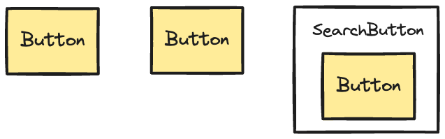
It is more common that a single component needs to use different styles. As mentioned before, custom properties inherit their values from their parent, which can allow a single component to inherit different values.
Let us take an example of having one instance of a Search Button component with a different background colour:
/* SearchButton.module.css */

.searchButton {
  --Button-primaryColor: navy;
}
// SearchButton.js

import styles from './SearchButton.module.css';
import Button from './Button';

export const SearchButton = () => {
  return (
    <div className={styles.searchButton}>
      <Button type="primary">Click me</Button>
    </div>
  );
}
By attaching the searchButton class to the parent div it allows this one use of Button to inherit the new primary colour.
As we have seen with these examples, theming can be very versatile which makes it a powerful tool to have in your arsenal.
Using the tokens in a component library
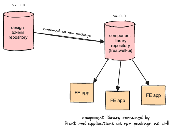
Design tokens used with CSS custom properties have helped us in creating a UI library (called treatwell-ui), which contains pre-made React components that can be customised similar to the Button example above. This helps maintain consistency across our frontend applications and it saves development time by reducing the need to reinvent the wheel for each new change.
The design tokens are consumed by treatwell-ui as a versioned NPM package that exports them to various formats via Style Dictionary. Then treatwell-ui itself is also exported as an NPM package to our various frontend applications, shown below:
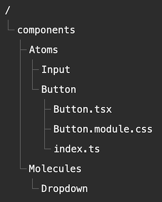
The components in treatwell-ui are organised based on the Atomic design methodology:
“Atomic design is a methodology composed of five distinct stages working together to create interface design systems in a more deliberate and hierarchical manner”
These stages in order are: Atoms, Molecules, Organisms, Templates and Pages.
An Atom is the smallest unit and usually translates to basic HTML elements like a button or input. A molecule is composed of a number of atoms and an organism can contain molecules and/or atoms. Templates take a step further and assemble a page’s layout, and Pages are instances of a template.
If you want to learn more about this methodology I recommend giving the Atomic Design blog post by Brad Frost a read.
An example of how treatwell-ui implements this:
Lastly, we have opted to use Storybook to preview and document the components, hooks, and utilities using the MDX format. This documentation is very useful to share with other engineers and with anyone from the product or design teams. This ensures everyone is on the same page with what components are available and how they are used.
We treat it as an internal open source project which follows semantic versioning and each component is tested via Cypress component tests.
How did treatwell-ui help us?
Not too long ago the design team requested a colour palette change for the whole Treatwell website in order to make it more consistent with our brand. The important part of this request was that the whole site should use the new colours so that there are no inconsistencies on a user’s journey.
We approached this change by creating a theme override CSS file, which was subsequently dropped in all the frontend applications that serve the Treatwell website. To create the override we collaborated with the design team in order to map the existing colour tokens to the new ones.
Let’s have a look at the mapping:
/* design-tokens */

:root {
/* existing colours */
  --color-base-grey: #dddddd;
  --color-base-red: #dc2222;

/* updated colours from design team */
 --color-new-base-grey: #515e7f;
 --color-new-base-red: #d02b0b;
}
/* theme-override.css */
/* used in each application to override the old colours */

:root:root {
  --color-base-grey: var(--color-new-base-grey);
  --color-base-red: var(--color-new-base-red);
}
If you are interested in seeing the whole theme override, that can easily be done by going to our Treatwell website and opening the DevTools!
Importing the CSS override to all our applications helped us save a significant amount of time with releasing the new colour palette to our users. There was no need to go through all of our components one by one and update their custom properties to reference the new tokens. If we look at our previous Button example:
/* Button.module.css */

:root {
  --Button-primaryColor: var(--color-base-red);
  --Button-secondaryColor: var(--color-base-grey);
}

.primary {
  background-color: var(--Button-primaryColor);
}

.secondary {
  background-color: var(--Button-secondaryColor);
}
Even though the Button component looks like it is still using the old design tokens, they will be inheriting the values for the new tokens from the override file.
Another benefit of creating the CSS theme override was that we could leverage the Stylus Chrome extension to easily test the changes ourselves on the live website, and to also allow our stakeholders to easily preview what the end result would look like.
Conclusion
By spending the time defining this system and iterating on it we increased the collaboration between the engineers and the design team. Additionally, we saved time when developing features by having these reusable components and custom properties.
Another benefit is that by having one single source of truth for components, typography, colours and so on, if anything needs to change there is only one place that needs to be updated.
This design system has been incredibly helpful for us, and we are always looking to improve and add new features to it!
Recommend
About Joyk
Aggregate valuable and interesting links.
Joyk means Joy of geeK