

What is Visual Accessibility? WACG views and it’s limitation on it.
source link: https://uxplanet.org/what-is-visual-accessibility-wacg-and-its-limitation-on-it-449c16c94b9f
Go to the source link to view the article. You can view the picture content, updated content and better typesetting reading experience. If the link is broken, please click the button below to view the snapshot at that time.
What is Visual Accessibility? WACG views and it’s limitation on it.
So being a UX designer, I worked on many projects and I often see people struggling with the acessibility concept figuring out what exactly is aceessibility.
Lets start simple, the word accessibility can be called as ‘ability to access’. meaning things/emotions/objects that has the property of being able to access.
Accessibility means making sure that a product or service can be easily used by everyone, regardless of any disabilities they may have. This includes designing things in a way that accommodates all potential users in different situations. Accessibility laws exist to help people with disabilities, but it’s important for designers to consider the needs of all users because it leads to better designs that benefit everyone.
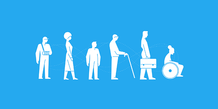
Various Accessibility issues in Designing
- Visual ( color blindness)
- Motor/mobility ( wheelchair-user concerns)
- Auditory (hearing difficulties)
- Seizures (especially photosensitive epilepsy)
- Learning/cognitive ( dyslexia)
Visual
Visual accessibility means making sure that information is presented in a way that can be easily seen and understood by people with visual impairments.
- Color plays an important role in visual accessibility as it can be used to convey information, provide visual cues, and enhance readability.
Does Providing color contrast solves it?
Well not necessarily ! it is crucial to consider that not all individuals perceive colors in the same way.
Simple image examples for better understanding
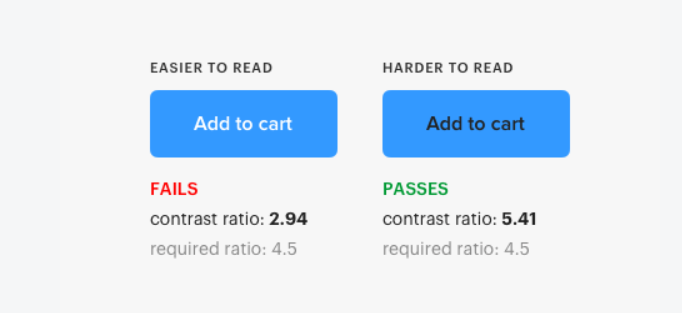
the-myths-of-color-contrast-accessibility
The Web Content Accessibility Guidelines (WCAG) serve as a standard for accessible color contrast, but they may not always be perfect in real-world situations. Rather than blindly following them, use them as a guide to inform your design choices, adapting them to suit the specific needs and context of your users. To know more about it read the-myths-of-color-contrast-accessibility.
The contrast ratios fail for white text on a background with high luminance, it’s because both the text and the background have similar brightness levels. This makes it difficult for the computer to computationally render the text as high contrast because it doesn’t stand out clearly.
- For Figma Users the plugin “Color Blind” will help you to check your design with all the types of color blindness
- “Stark” is a free color-blind simulator and contrast checker plugin for Sketch
- “Colorsinspo” for Adobe XD, Provides you Contrast checker, Color blindness, Color palettes, solid colors, color generator, palette collections, color design systems and more.
- AAA Accessibility
To meet WCAG Level AAA accessibility, the contrast ratio between text and its background should be at least 7:1 for normal text and 4.5:1 for large text. Large text is considered 14pt (or larger and bold) or 18pt (or larger). Use very dark text on a very light background, or vice versa, to ensure sufficient contrast.
Here’s a example for that
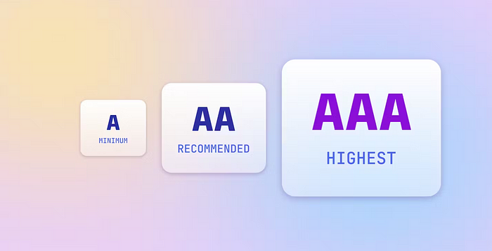
AAA requirement in design accessibility
The Three different criteria plays it’s own important role, to know more about these three accessibility criteria by WACG go through wcag-conformance-levels/
But there is also a Twist !😎
The AAA requirement for a contrast ratio of 7:1 aims to accommodate individuals with low vision, specifically those with a vision loss of 20/80 or more. Many of these users rely on assistive technologies that enhance contrast to help them access digital content across various interfaces.
The AAA requirement primarily applies to those with 20/80 vision loss who do not use assistive technologies, which represents a smaller group compared to those who do use such technologies.
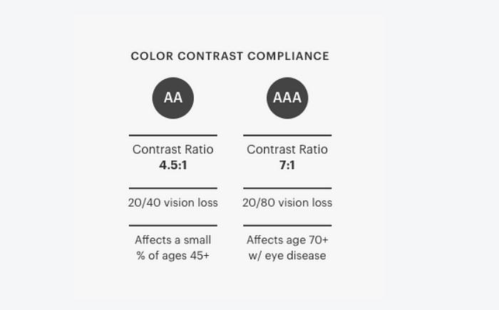
AAA requirement can be a myth
Conclusion
Visual accessiblity plays a super important role in Designing on the fact that the maximum learning by a human is done via eyes as there are 70 millions neurons for vision
An accessible design meets the needs of every user on the planet is a Myth… so Relax 😉
Signing off………
Recommend
-
2
EDI Integration Platforms: Benefits and Limitations Find out h...
-
63
libwxfreq 编译lib: make libwxfreq.a 编译server: 依赖libevent库,所以要修改DIRLIBEVENT变量为libevent.a所在目录,并确定libevent相关头文件在头文件搜索路径中, 运行make 修改makefile文件中的HEADERINSTALLDIR...
-
107
Version vom 1. August 2018, 08:27 Uhr ( Quell...
-
12
今天分享的这篇Writeup关于速率限制问题(请求次数限制,Rate Limitation),这也是面向公众网站的设计中常常会忽略掉的防护措施,利用速率限制漏洞可以实现对网站注册用户名、密码等账户信息的批量枚举。这里的速率限制漏洞存在于Facebook...
-
34
dyOpen A dlopen library that bypasses mobile system limitation byOpen是一个绕过移动端系统限制的增强版dlfunctions库。 Android 支持App中加载和使用Android系统库接口(即使maps中还没有被加载也...
-
2
Don’t miss what’s happeningPeople on Twitter are the first to know.
-
7
Technical Articles
-
6
Recently, we had a customer who wants to test the Event Hub quota in JavaScript. Then I did some tests about add Event Hub events in Batch through JavaScript SDK. This blog will explain my tests send EventHub events in batch through Ja...
-
2
More Secure Passwords in Bcrypt — Beating the 72 Bytes Limitation Rafał Rothenberger December 17, 2021 Storing...
-
3
For founders who want to launch apps, 'being non-technical is not a limitation'S&P 5004,209.61-49.91 (-1.17%)Dow 3032,985.40-188.67...
About Joyk
Aggregate valuable and interesting links.
Joyk means Joy of geeK