

Illuminating Interactions: Visual State in Jetpack Compose
source link: https://medium.com/androiddevelopers/illuminating-interactions-visual-state-in-jetpack-compose-188fa041b791
Go to the source link to view the article. You can view the picture content, updated content and better typesetting reading experience. If the link is broken, please click the button below to view the snapshot at that time.
Illuminating Interactions: Visual State in Jetpack Compose
An important responsibility of any design system is making it clear what components can and cannot be interacted with, and letting users know when an interaction has taken place. This blog post will explain how to listen to user interactions in Jetpack Compose, and create reusable visual indications that can be applied across your application for a consistent and responsive user experience.
(Code for this is shown in Advanced Indication)
Why visual feedback is important
Compare the following two UIs:
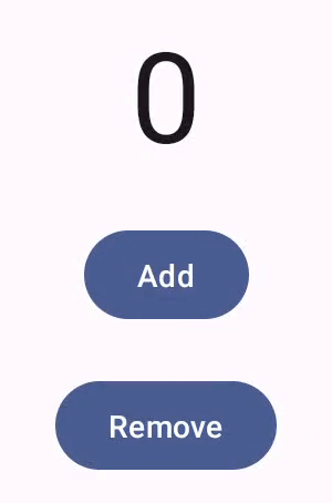
Buttons that always appear enabled, with no press ripple
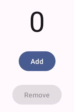
Buttons with press ripples that reflect their enabled state accordingly
A lack of visual feedback can result in an app feeling slow or ‘laggy’, and results in a less aesthetically pleasing user experience. Providing meaningful feedback for different user interactions helps users identify interactive components, as well as confirming that their interaction was successful.
What interactions are available to the user depends on many factors — some depend on what the component is (a button can typically be pressed, but not dragged), some depend on the state of the application (such as if data is being loaded), and some depend on what input devices are being used to interact with the application.
Common interactions include:
- Press
- Hover
- Focus
Showing visual effects for these interactions provides users immediate feedback and helps them know how their actions can affect the state of the application. For example, showing a hover highlight on a button makes it clear that the button can be used, and will do something when clicked. By contrast, a component that does not appear hovered is unlikely to do anything when clicked.
The appearance of a component is affected by more than just interactions — other common visual states include:
- Disabled
- Selected
- Activated
- Loading
Although design systems often treat these states similarly to states that result from interactions, there are some fundamental differences. The most important difference is that these states are externally controlled, and do not belong to the component. Instead of being caused by one event, these states represent the ongoing state of the application. There is no single ‘disable’ or ‘enable’ event — instead a component remains in that state until other state(s) in the application change.
By contrast, interactions are events that result in transient state. A press starts, and a press ends, and the ‘pressed’ visual state exists for the time between these events. Additionally, multiple interactions can occur simultaneously — a component can be focused and hovered at the same time. In this case there is no single answer for what the resulting visual state should be: different design systems handle overlapping states in different ways.
In Material Design, interaction states are represented as an overlay on top of the content. Press ripples are treated specially, and are drawn above other states (if present). For non-press interactions, the most recent one is shown. So if a component is focused, and then later hovered, the component will appear hovered. When un-hovered, it will go back to appearing focused. In design systems with distinct effects for different states, such as an overlay for hovered and a border effect for focused, it may be desirable to represent both at the same time.
To support these varied use cases, Compose provides a set of unopinionated APIs that do not make assumptions about the order or priority of interactions.
Anatomy of Interactions
Each type of user interaction is represented by a unique Interaction for each specific event. For example, press events are split into three distinct types:
PressInteraction.Press— emitted when a component is pressed (also contains the position of the press relative to the component’s bounds)PressInteraction.Release— emitted when a priorPressInteraction.Pressis released (such as when a finger is lifted up)PressInteraction.Cancel— emitted when a priorPressInteraction.Pressis cancelled (such as when a finger moves outside of the component’s bounds without lifting up)
To support having multiple simultaneous Interactions of the same type, such as multiple ongoing presses when a user touches a component with multiple fingers, Interactions that correspond to the ‘end’ of an event, in this case Release and Cancel, contain a reference to the ‘start’ of the event so it is clear what interaction is finished.
The primary entry point for Interactions is an InteractionSource. An Interaction is an event corresponding to a type of user interaction, and an InteractionSource is an observable stream of Interactions. By observing an InteractionSource, you can keep track of when events start and stop, and reduce that information into visual state.
InteractionSource is built using Kotlin Flows — it exposes an interactions property that is a Flow<Interaction> which represents the stream of Interactions for a particular component.
In most cases you won’t need to directly collect from the Flow — in Compose it is much easier and more natural to just work with state, and reactively declare how your component will appear in different states. Because of this it seems intuitive to model InteractionSource internally as state instead of a stream of events, but there are a few shortcomings with this approach:
- The underlying systems that produce
Interactions, such as pointer input and the focus system, work with events and not state. Reducing these events into state is a lossy transformation — the ordering of these events and time between events is lost, as you end up with just a list of current interactions. This makes it challenging to build components that care about the ordering of events, such as ripples, as you cannot recreate the information that was lost in the transformation. - In Compose,
MutableStateis a snapshot of data at some point in time. For efficiency, multiple writes to aMutableStatewill be batched into one write, to limit the amount of work that is done. For true application state, this is ideal, but for trying to represent events this means that multiple events in a short period of time can be merged into one — for example, two quick presses might only appear as one press, which can lead to missed ripples or other press effects. - For most use cases, representing a press and release as just ‘pressed’ state is good enough, but some cases care about the specifics of each event — for example, where the press occurred, and whether it was released or cancelled. Representing multiple presses is also difficult in this way, as there is no easy way to distinguish between ‘pressed’ state, and ‘pressed, but multiple times’ state.
Compose initially used a state-backed implementation for InteractionSource (then called InteractionState), but changed to an event stream model because of these reasons — it is much easier to reduce events to state than it is to try and recreate events from state.
Producers and consumers
InteractionSource represents a read-only stream of Interactions — it is not possible to emit an Interaction to an InteractionSource. To emit Interactions, you need to use a MutableInteractionSource, which extends from InteractionSource. This separation is consistent with SharedFlow and MutableSharedFlow, State and MutableState, List and MutableList, and others — it allows defining the responsibilities of a producer and consumer in the API surface, rather than an implementation detail of the component.
For example, if you wanted to build a modifier that draws a border for focused state, you only need to observe Interactions, so you can accept an InteractionSource.
In this case it is clear from the function signature that this modifier is a consumer — it has no way to emit Interactions, it can only consume them.
If you wanted instead to build a modifier that handles hover events like Modifier.hoverable, you would want to emit Interactions, and accept a MutableInteractionSource as a parameter instead.
This modifier is a producer — it can use the provided MutableInteractionSource to emit HoverInteractions when it is hovered or unhovered.
High level components such as a Material Button act as both producers and consumers: they handle input and focus events, and also change their appearance in response to these events, such as showing a ripple or animating their elevation. As a result they directly expose MutableInteractionSource as a parameter, so that you can provide your own remembered instance.
This allows hoisting the MutableInteractionSource out of the component and observing all the Interactions produced by the component. You can use this to control the appearance of that component, or any other component in your UI.
If you are building your own interactive high level components, we recommend that you expose MutableInteractionSource as a parameter in this way. Besides following state hoistingbest practices, this also makes it easy to read and control the visual state of a component in the same way that any other sort of state (such as enabled state) can be read and controlled.
Compose follows a layered architectural approach, and this same approach is evident here. High level Material components are built on top of foundational building blocks that produce the Interactions they need to control ripples and other visual effects. The foundation library provides high level interaction modifiers such as Modifier.hoverable, Modifier.focusable, and Modifier.draggable, which combine and integrate the lower level systems such as pointer input and focus with higher level abstractions such as Interactions, to provide a simple entry point for common functionality.
This means that if you want to build a component that responds to hover events, all you need to do is use Modifier.hoverable, and pass an MutableInteractionSource as a parameter. Whenever the component is hovered, it will emit HoverInteractions, and you can use this to change how the component appears.
To make this component focusable as well, you can add Modifier.focusable and pass the same MutableInteractionSource as a parameter. Now both HoverInteraction.Enter/Exit and FocusInteraction.Focus/Unfocus will be emitted through the same MutableInteractionSource, and you can customise the appearance for both types of interaction in the same place.
Modifier.clickable is an even higher level abstraction than hoverable and focusable — for a component to be clickable, it is implicitly hoverable, and components that can be clicked should also be focusable. By using Modifier.clickable, you can create a component that handles hover, focus, and press interactions, without needing to combine lower level APIs. So if you want to make your component clickable as well, you can replace hoverable and focusable with just a clickable.
Internally this is how Material components such as Button are built — a Button uses a clickable Surface which is essentially just a Box with Modifier.clickable.
Using Interactions
As mentioned previously, typically you want to interact with a state representation of the current interactions on a component, rather than each individual event. For each type of Interaction, there is a corresponding API that observes an InteractionSource, and returns a State representing whether that type of interaction is present or not.
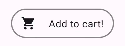
For example, assume the following Button:
If you want to observe whether this Button is pressed or not, you can use InteractionSource#collectIsPressedAsState.
You can also use InteractionSource#collectIsFocusedAsState, InteractionSource#collectIsDraggedAsState, and InteractionSource#collectIsHoveredAsState to observe other Interactions in the same way.
While these APIs are provided for convenience, the implementation is small and useful to know as a general pattern when working with Interactions. For example, assume you care about whether the Button is pressed or dragged. While you could use both collectIsPressedAsState and collectIsDraggedAsState, this will result in duplicate work and this will also lose fine grained information such as the order of interactions — you may want to only care about the most recent interaction, instead of prioritising one over the other.
To do this you need to observe and keep track of Interactions emitted by the InteractionSource. New Interactions corresponding to a start event are added to a SnapshotStateList (created by mutableStateListOf) — reading from this list will cause a recomposition when it is mutated.
Now all you need to do is observe Interactions that correspond to an end event — since these interactions (such as PressInteraction.Release) always carry a reference to the start Interaction, you can just remove that reference from the list.
If the Button is pressed or dragged, there will be at least one Interaction that has not been removed from interactions, so the overall result is just whether interactions is not empty:
val isPressedOrDragged = interactions.isNotEmpty()
If instead of calculating a combined state you want to know what the most recent Interaction was, you can just look at the last Interaction in the list — this is how the Compose ripple implementation shows a state overlay for the most recent type of user interaction.
Because all Interactions follow the same structure, there is not much of a difference in code when working with different types of user interactions — the overall pattern is the same.
Note: The previous examples represent the Flow of interactions using State — this makes it easy to observe updated values, as reading the state value will automatically cause recompositions. However, as mentioned before, composition is batched pre-frame. This means that if the state changes, and then changes back within the same frame, components observing the state won’t see the change.
This is important for interactions, as interactions can regularly start and end within the same frame. For example, using the previous example with Button:
If a press starts and ends within the same frame, the text will never display as “Pressed!”. In most cases this is not an issue — showing a visual effect for such a small amount of time will result in flickering, and won’t be very noticeable to the user. For some cases, such as showing a ripple effect or a similar animation, you may want to show the effect for at least a minimum amount of time, instead of immediately stopping if the button is no longer pressed. To do this you could directly start and stop animations from inside the collect lambda, instead of writing to a state — there is an example of this pattern in the Advanced Indication section.
Building interactive components
You can use the same patterns for observing interactions on an existing component to build higher level, reusable components. For example, building a button that shows an icon when hovered (such as when using a Chrome OS device, or a tablet with a mouse connected).

Which can be used as:
HoverButton wraps a Material Button internally, but also shows an icon when hovered in addition to its normal hovered state. Using InteractionSource in this way is identical to the previous examples, but now you have a higher level button that uses the InteractionSource internally as part of its implementation, in the same way that the internal Button uses the InteractionSource to change its elevation when hovered.
Indicating Indications
The previous examples have covered cases where you want to change part of a component in response to different Interactions — such as showing an icon when hovered. This same approach can be used for changing the value of parameters you provide to a component, or changing the content displayed inside a component, but this is only applicable on a per-component basis. Often an application or design system will have a generic system for stateful visual effects — an effect that should be applied to all components in a consistent manner.
Material uses ripple animations to show a pressed state, and a state layer for other states. This is applied consistently to all components, and is even provided as a default for use in modifiers such as clickable — if you are using a Material library (and within a MaterialTheme), using Modifier.clickable will automatically show a ripple effect on press. This makes it easy to build custom components that show consistent visual effects in response to different Interactions.
For example, assume you are building a design system where components should scale downwards on press — following the previous examples you could write something like the following for a button:
However, this isn’t very reusable — every component in the design system would need the same boilerplate, and it is easy to forget to apply this effect to newly built components and custom clickable components. It is also difficult to combine with other effects — such as if you wanted to add a focus and a hover overlay in addition to the press scale effect.
For these use cases, Compose provides Indication. Indication represents a reusable visual effect that can be applied across components in an application or design system, such as a ripple. Indication is split into three parts:
Indication— a factory for creatingIndicationInstances. For simplerIndicationimplementations that do not change across components, this can be a singleton (object) and reused across the entire application. More advanced implementations such as a ripple may offer additional functionality, such as the ability to make the ripple bounded or unbounded, and manually change the color of the ripple.IndicationInstance— a specific instance of a visual effect, that is applied to a particular component.IndicationInstances can be stateful or stateless, and since they are created per component, they can retrieve values from aCompositionLocalto change how they appear or behave inside a particular component. For example, ripples in Material useLocalRippleThemeto determine what colour and opacity they should use for differentInteractions.Modifier.indication— a modifier that drawsIndicationfor a component.Modifier.clickableand other high level interaction modifiers includeModifier.indicationinternally, so they do not only emitInteractions, but can also draw visual effects for theInteractions they emit, so for simple cases you can just useModifier.clickablewithout needingModifier.indication.
Compose also provides LocalIndication — a CompositionLocal which allows providing Indication throughout a hierarchy. This is used by modifiers such as clickable by default, so if you are building a new clickable component it will automatically use the Indication provided across your application. As mentioned previously, the Material libraries use this to provide a ripple as the default Indication.
To convert this scale effect to an Indication you need to first create the IndicationInstance responsible for applying the scale effect. IndicationInstance exposes one function that needs to be implemented — ContentDrawScope.drawIndication(). As ContentDrawScope is just a DrawScope implementation, you can use the same drawing commands as with any other graphics API in Compose. Calling drawContent() available from the ContentDrawScope receiver will draw the actual component that the Indication should be applied to, so you just need to call this function within a scale transformation. Make sure your Indication implementations always call drawContent() at some point, otherwise the component you are applying the Indication to will not be drawn.
This instance exposes two functions for animating the scale effect to and from pressed state, and also accepts a press position as an Offset in order to draw the scale effect from the exact position of the press.
Then you need to create the Indication. It should create an IndicationInstance, and update its state using the provided InteractionSource. This is the same as the previous examples of observing an InteractionSource — the only difference here is that instead of converting the Interactions to state, you can directly animate the scale effect inside the instance, using the animateToPressed and animateToResting functions.
As mentioned previously, Modifier.clickable uses Modifier.indication internally, so to make a clickable component with ScaleIndication, all you need to do is provide the Indication as a parameter to clickable.
This also makes it easy to build high level, reusable components using a custom Indication — a button could look like:
Which can then be used like:

You could then use LocalIndication to provide this custom Indication throughout your application, so any new custom components would use it by default.
Note: Ripples are drawn on the RenderThread (using the framework RippleDrawable under the hood) which means that they can continue to animate smoothly while the UI thread is busy, such as when pressing a button causes your app to navigate to a new screen. There are no public APIs to allow drawing to the RenderThread manually, so if you are trying to build indication that can still have an animation after a click has finished (such as a ripple, or the example in the next section), be aware that this can cause jank if the click causes a lot of work to happen on the UI thread.
Advanced Indication
Indication is not just limited to transformation effects, such as scaling a component — since IndicationInstance provides a ContentDrawScope, you can draw any kind of effects, above or below the content. For example, drawing an animated border around the component and an overlay on top of the component when it is pressed.
(Be mindful of the performance impact when using non-ripple indication, as detailed above)
The Indication implementation here is very similar to the previous example — it just creates an instance and starts animations. Since the animated border depends on the shape and the border of the component the Indication is used for, the Indication implementation also requires shape and border width to be provided as parameters.
The IndicationInstance is also conceptually the same, even if the drawing code is necessarily a lot more complicated. As before, it exposes functions for animating to pressed and resting states, and implements drawIndication, to draw the effect (some drawing code omitted for brevity).
The main difference here is that there is now a minimum duration for the animation, so even if the press is immediately released, the press animation will continue. There is also handling for multiple quick presses — if a press happens during an existing press or resting animation, the previous animation is cancelled, and the press animation starts from the beginning. To support multiple concurrent effects (such as with ripples, where a new ripple animation will draw on top of other ripples), you could track the animations in a list, instead of cancelling existing animations and starting new ones. The full implementation for the above example can be found here.
Further reading
For more information on the APIs discussed here, see the guidance, API reference documentation and samples:
Handling user interactions guide
Ripple’s source code can be found here.
Thanks for reading!
Code snippets license:
Copyright 2023 Google LLC.
SPDX-License-Identifier: Apache-2.0
Recommend
About Joyk
Aggregate valuable and interesting links.
Joyk means Joy of geeK