

CKC- UX Case Study: Gamified STE(A)M learning for kids
source link: https://uxplanet.org/ckc-ux-case-study-gamified-ste-a-m-learning-for-kids-5aa8952d9322
Go to the source link to view the article. You can view the picture content, updated content and better typesetting reading experience. If the link is broken, please click the button below to view the snapshot at that time.
CKC- UX Case Study: Gamified STE(A)M learning for kids
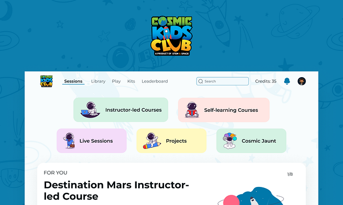
This case study showcases the design process and decisions I made for one my biggest projects so far. An astronomy learning web app for kids- Cosmic Kids Club.
Overview 🖼
The COVID-19 pandemic had a major impact on how people utilized technology on a daily basis. This was especially true for developing countries like India, where technologies like smartphones, internet, and laptops were still considered a luxury rather than an essential. The pandemic changed all those notions resulting in people utilizing technology for their everyday tasks. This was a major turning point for some sectors such as online education, which saw a massive surge in the number of parents accepting to teach their kids online, whether voluntarily or not.
‘STEM & Space’ is a prime example of one of those institutions that went through this change. They offer STEM and Astronomy learning programs for young minds. While the offerings were in-person before the pandemic, things had to change in order to continue with their mission of educating the next generation of Indian Astronomers and were desperately looking to create an online solution in the form of a web application. They wanted to offer live classes, recorded sessions, videos, books, project kits, and loads of different types of content revolving around astronomy and thus needed detailed and exhaustive designs to make their dream a reality.
Role: Freelance Product Designer
Duration: September 2021 — January 2022 (5 months)
Design Challenges 😐
1. The Scale
The biggest challenge has to be the sheer scale of the project. Being a solo freelance designer, the size of the project was pretty intimidating and it only grew further and further as the design process moved forward.
Just an FYI: I created more than 80 high-fidelity screens for the final version of the web application. I will leave the number of wireframe iterations to your imagination lol.
2. Adding Functionalities mid-way through the design process
Being a completely new product the client team was also figuring out new and better functionalities to offer a better overall learning experience. This required me to be agile and detached throughout the journey as the next change could be a small addition or even an architecture modification that affects all the other functionalities of the platform.
3. Meaningful Gamifications
One of the main goals of CKC was to provide a fun and interactive learning experience that keeps kids hooked. This required building of multiple forms of gamifications while being part of a larger cohesive system.
4. Variety in Content offerings
The app wanted to offer astronomy content in forms like live classes, project kits, videos, flip e-books, audiobooks, and even mini-games. This was a big challenge, especially during the initial stages of defining the overall architecture of the app so that users can easily access and navigate through loads of different forms of the content offered to them.
5. Playful Visual Design
The target audience of the app is kids from grades 1–8 and thus required simplified layouts along with a playful visual design that appeals to them. This was a major challenge as none of my previous projects had their primary audience as children and required me to develop a new understanding of UI principles useful for this style of product design.
Design Process
I followed more of a conventional design process starting from research, and defining UX deliverables like Information Architecture, User flows, and personas to wireframing and visual design.
Research 🧐
I began the process by developing a deep understanding of the product from the viewpoints of the business and the target users. The client team, who had been involved in this business for years, obviously had a much better understanding of the users and product as a whole. So, I prepared a set of key questions for them which laid the foundation for my further research. Some of the most important questions included-
- The primary objectives app was trying to deliver along with the long-term and short-term goals as a business.
- Understanding of the target users (students in this context) along with the brand perception clients wanted to build.
- Main competitors in the market while also discussing their positives or shortcomings.
- Understanding every feature/functionality the app is trying to offer in detail.
- Understanding of their expectations from a product/features perspective as well as UI and visual design.
Empathy Mapping
The next step of the research phase was brainstorming on an Empathy map. This allowed us to identify any significant voids in understanding the users’ perspectives. As expected we identified some gaps in our knowledge and went forward with carrying out a few interviews talking to previously enrolled students and their parents.
User Personas
The research phase ended with the creation of a User persona which in our case was identified to be both parents as well as their children. Kids as they would spend the most time using the application itself while their parents were the decision-making authority on whether or not to buy the subscription in the first place.
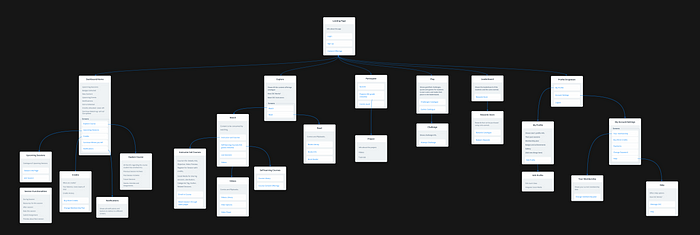
Information Architecture 📊
IA plays a crucial part in my design process as it is a great technique to better arrange and visualize the overall hierarchy of all the potential screens and build the navigational structure of the app. This was especially true for an app like this offering tons of different types of content and features.
The step of defining IA was assisted with the help of affinity mapping. I arranged all the features the app wanted to offer by their traffic as well as use frequency. Features higher in both aspects meant they needed to be easily accessible such as in Navbar while other features can have deeper flows.
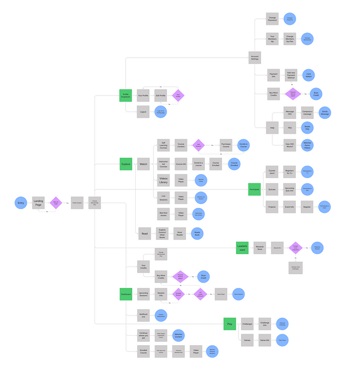
User Flows 📈
The next important step was to define how each feature can be delivered to the users. Keeping how the user moves from one screen to the other intuitive was crucial as our target audience was kids. User flows also helped in identifying the exact screens that would need to be designed in order to deliver every feature.
Wireframing 💀
I started off by creating low-fi wireframes of some of the key screens. After establishing the right direction with those initial screens, the rest of the wireframes were a bit higher fidelity considering proper layout and spacing in mind.
The wireframes created had enough visual fidelity that users were properly able to understand most functionalities. Thus, I created a prototype to get feedback from potential users and the client team before moving on to visual design.
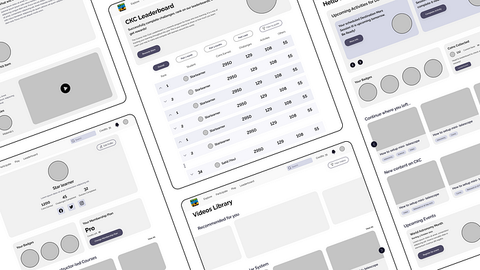
High Fidelity Designs 💻
With more than 80 final screens created, it would require me to write a small book to explain all of them in detail. Sticking to this article for now, here are some of the key needs that were identified initially and how I designed solutions for them.
1. Easy Onboarding and Membership Funnel 🙏
The user journey would start with the landing website I separately designed for CKC. It’s an integral piece of the sales funnel that demonstrates to users all the benefits and functionalities CKC offer along with a clear Call-to-Action that redirects them to the CKC web app onboarding process.
The app required the onboarding process to be simplified yet descriptive so users can make the judgment on which membership option suits them the best.
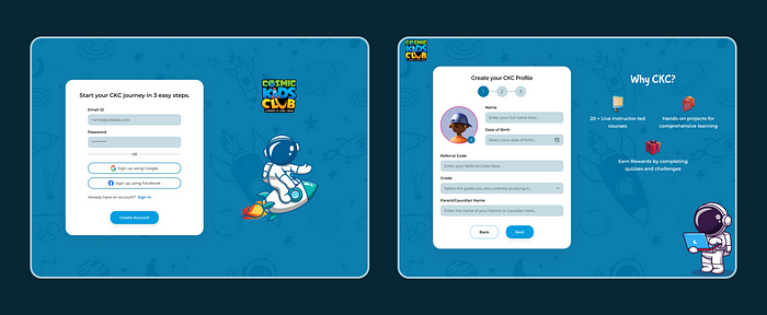
Login/Sign Up
The onboarding process starts with an account creation/sign-in screen. The main focus was to allow users the easily create an account for CKC while communicating strong brand identity and what it stands for.
Creating Profile
The first part of creating a new account begins with basic profile creation. This screen also displays to users some key features of what makes CKC special.
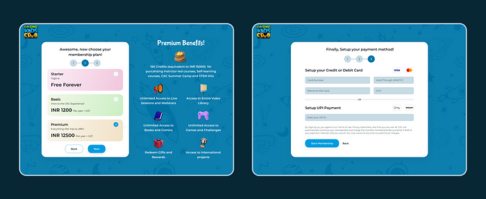
Membership Plans
After creating their profile, users have to choose the type of membership they want to enroll in. It was vital for users to clearly understand what each plan offers. I designed Dynamic Cards as the solution for this screen. Whenever the user clicks on the card, benefits would change and reflect based on which plan was selected.
Setting-up Payment
The final step of the account creation process is to set up the subscription payment user just enrolled. CKC provided users with payment flexibility, allowing them to pay with credit/debit cards as well as UPI.
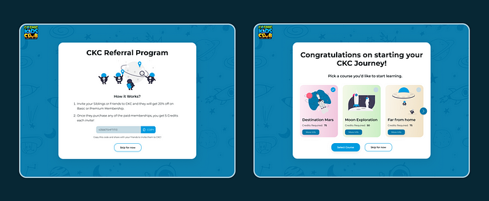
CKC Referral
After account creation, users are provided with a referral code that they can share with others to earn CKC credits. I realized that users might not be interested in sharing the app with others as they just created their account in the first place. As a result, a clear “Skip” CTA was provided.
At the same time, it is necessary to include this screen in the onboarding process to inform users that a feature that benefits both users and business is available.
Picking a course
The final step of this onboarding flow is for the students to enroll in their first live course. Users can check out all the necessary details of the course by clicking on the “More Info” button.
Still, we acknowledge that users might need more time to make this important decision and first spend time on other offerings of the platform. Thus, a “Skip” secondary CTA was provided.
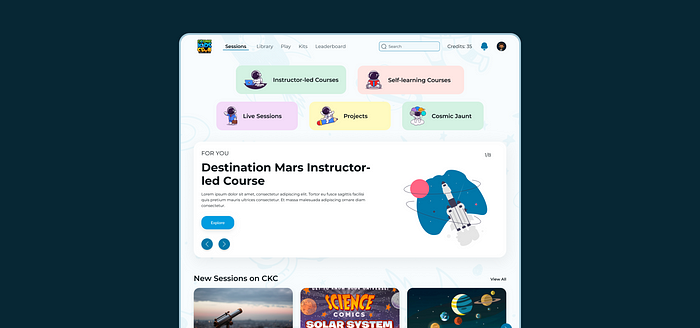
2. Dashboard and Content Personalization 🗂
With so many content choices and features on the CKC platform, users can easily become overwhelmed and may not be able to use any of them efficiently. Dashboard plays a crucial role in summarizing all those functionalities at one glance.
Let’s have a deeper look in order to better understand the dashboard.
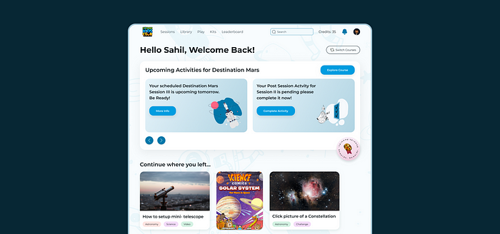
- The flagship offering of CKC is the Instructor-led courses and consequently needed the most attention from the users. The hero section of the dashboard is made up of the instructor-led course in, which the student is currently enrolled. The Hero div is designed to be dynamic, allowing users to move between courses if they are enrolled in more than one.
- Upcoming activities are displayed as cards that can be explored further, ensuring that the user is always aware of the deliverables that must be performed as well as their overall progress in the course.
- The rest of the dashboard provides features to get back to the activity they were doing earlier be it watching videos, reading books, or completing challenges.
- Users can also look up the new content available on the platform as well as the upcoming live sessions they might have booked for, right on their dashboard.
Managing screen real-estate and user’s cognitive load are crucial aspects of UX design, which becomes even more important on flows like Dashboard. This entailed deleting many potential offerings from the dashboard and carefully evaluating, based on user feedback, which feature is most deserving of their attention.
While most of the dashboard main section is covered with Instructor-led courses div, the team wanted Gamification Progress to be easily and frequently accessible as it made the core of gamified STEM learning. I came up with Floating Button as the solution such that it is accessible by users at all times when they are on their dashboard and how their learning and rewards progress is going on.
The rest of the Dashboard flow involved joining instructor-led sessions, and tracking users progress throughout the course.
- The Session Info page provides students with all the necessary information they would be expected to know before the session along with a link to attend the live class.
- Clicking the “Explore Course” button on the dashboard allows users to track their progress on the course as a whole. The page was designed as a mini-dashboard in itself featuring a timeline structure for easy navigation and revision of past course contents.
3. Managing Content Offerings 📹
Tighten your seat belts because we’re going on a ride on this one. 😎
The content hierarchy conundrum
This section delves deeper into one of the Information Architecture problems and how I devised a solution for it. Feel free to continue with the final designs by skipping ahead to the rest of the case study.
From e-books to live classes, CKC desired to offer students educational content in a variety of formats. Figuring out how to classify these offerings under an appropriate umbrella term so that they made the most sense and reduced any unnecessary clicks from the user was the tricky part. This required understanding the offerings from different perspectives and where they made sense for the most number of users.
Let me give an example of one of the earlier solutions to better illustrate the problem.
- The initial architecture divided all the main content formats under two main umbrellas- Explore and Participate.
- Explore was further divided into the content formats by how they would be consumed- Watch and Read.
- While Watch contained, Instructor-led courses, Self-paced courses, Live sessions, and videos. Read had comics and flipbooks in its offerings.
- On the other hand, Participate consisted of offerings that required active user participation like Quizzes, Projects, and Cosmic Jaunt (a yearly CKC event).
While this seemed like good architecture at first, soon enough we realized several problems.
- The first one being very little parallel between Courses and videos. While courses were a type of live class that could only be attended in real-time, videos were created for passive consumption and self-learning. This was a significant difference and didn’t fit right to have both offerings under one umbrella.
- Another issue was on the monetization side of things, all courses, live sessions, and projects were purchasable entities using the CKC credits provided in the user’s subscription. (consider them more like apps available to buy on the app store) while the whole library of passive content like books and videos was fully available to be consumed directly if the user had the appropriate membership.
With these key differences, users can get easily confused about one type of offering for the other and thus reduce overall trust and confidence in the app as a whole.
After going through multiple iterations, the final solution had a much better classification of offerings. or at least that’s what I and a few others think. lol
- This time around the offerings was still divided into two umbrellas as having more items meant cramped and difficult-to-understand navigation for the user. A big NO NO. So the two high-level umbrellas were Sessions and Library.
- Sessions consisted of all the offerings that required to be purchased by the users using CKC credits as well as required more active participationfrom the user like consuming content in real-time. Thus the offerings under this umbrella were Instructor-led sessions, Self-paced sessions, Live-Sessions, Projects, and Cosmic Jaunt.
I still feel that the “Sessions” name was a bit misleading but the client team insisted on it so we went forward with it for now. But it could be changed by now, you never know.
- On the other hand, the Library consisted of offerings that offered full access at any time along with passive consumption. The library consisted of Videos and Books as its offerings.
This still may not be the best possible solution in terms of content type compatibility but one thing I’ve realized all these years is you have to settle for a “good enough” solution if it satisfies both users as well as business needs.
Sessions Content Offerings
Sessions consisted of a lot of content so it was crucial to provide users with proper classification as well as recommendations on what might be best for them.
Let’s have a look.
The Sessions’ main page consisted of cards having different content offerings accompanied by a fitting illustration for better context and visuals. Further, the page offered recommendations based on the user’s class and experience on CKC. Each of these cards lets users further explore individual content offerings and purchase them if found useful using CKC credits.
Instructor-led Courses
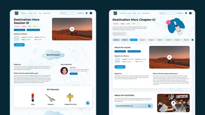
The first and most important Session offering of CKC is Instructor-led courses. These are live real-time classes taught virtually. The main flow included creating a catalog page that showcases courses available based on popularity, membership plans, or difficulty levels.
Since these courses are only carried on for a limited time, I designed a timeline-like view as the solution. This arranges courses in chronological order and provides necessary information such as credits required, or course length right on the cards.
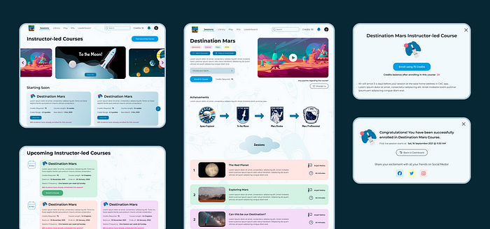
Whenever any course card is clicked, it redirects users to the Course Description page showcasing details about batch, class timings, achievements users can unlock, syllabus, each class details, and prerequisites for the course.
The enrollment process is carried out with the help of pop-ups as shown in the flow image.
This same flow is replicated for Self-paced courses as they are pretty much the same thing just with pre-recorded classes that users can learn from at their own time.
Live Sessions
The other major offering under the Sessions umbrella is the live sessions which are more like live streams carried out by CKC instructors on news-related topics in astronomy.
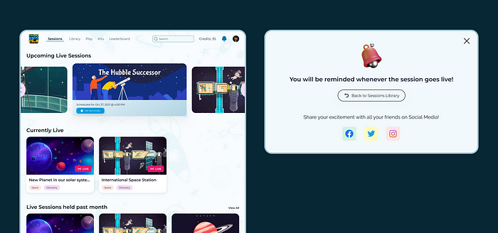
The Catalogue page included-
- Cards for users to set a reminder for upcoming live sessions.
- Live sessions they might not have set a reminder for but are currently live.
- An archive of sessions held in the past month
Setting a reminder is pretty straightforward.
When a user clicks on the “Set Reminder” button on upcoming live sessions, a feedback modal pops up confirming their action. Users are notified on their dashboard as well as by email a few minutes before the session goes live.
Projects
Projects are small time-based activities that allow students to have a more hands-on learning experience.
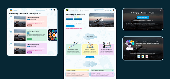
Unlike Instructor-led courses, these only occur for a limited time duration thus having the catalog page in only a timeline layout made much more sense.
The enrollment process is very similar to what we’ve seen for other offerings above designed with a project description page and enrollment pop-ups.
Cosmic Jaunt
This final offering is only visible on the Sessions page for limited times as it is a yearly summer in-person/virtual event.
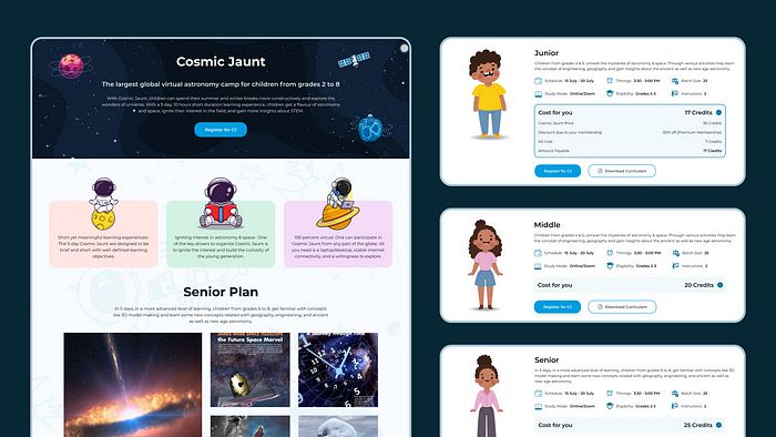
While Cosmic Jaunt (CJ) is a separate entity from CKC boasting its own website. A lot of CKC members usually make up the core of the audience attending the event and thus having some CJ page in the web app made sense for better business monetization as well as ease of booking for CKC members.
The Cosmic Jaunt page was designed more like a landing page explaining details about the event and showcasing different enrollment options.
Library Content Offerings
The library consisted of more passive consumption content like- videos and books. Since both videos and books also had multiple types. Watch and Read seemed like better superset terms.
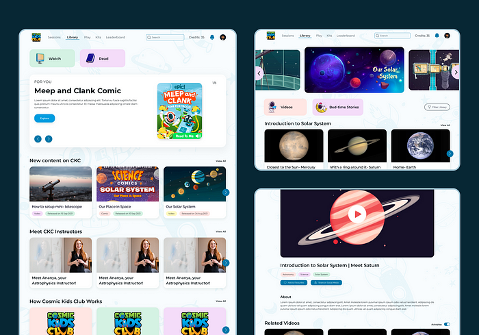
The library page was designed similarly to the Sessions page allowing for better design consistency throughout the platform. When clicked on the watch card, users are shown the watch library where they can further filter on watching videos or bedtime stories. (another CKC offering for younger kids)
The final step of the flow was a video player page allowing users to view videos, share with friends, or add them to favorites.
Read Flow
The other part of the Library section was the Read page showing users all the comics as well as the STEM books available on CKC while also allowing a filter tab to view either one of them.
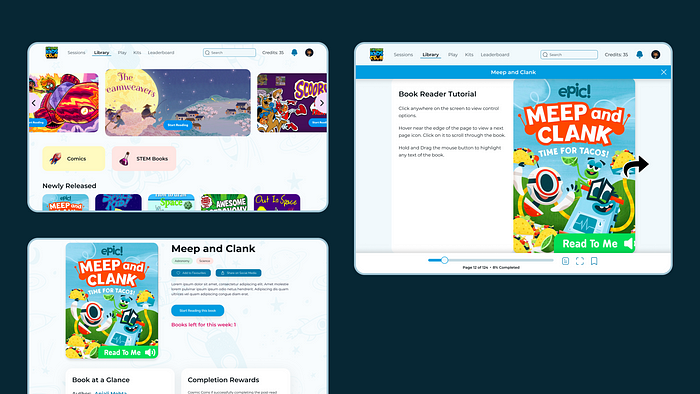
To complete this flow, we also needed to create an in-app book reader. I examined multiple e-book readers and added several interactions that would make the overall reading experience more enjoyable and efficient.
- A large page turn icon appears whenever users hover near either side of the book.
- A scroll bar at the bottom for easier parsing of the book.
- An expand icon that compresses the navbar and takes on the full screen for a more focused reading experience.
Apart from these, all basic interactions for taking notes, highlighting, and bookmarking were added in order to deliver a thorough reading experience.
4. Quizzes, Games and Gamifications 👾
To make learning more fun, CKC had a Play section offering users different challenges, games, and quizzes to earn CKC stars that can boost their ranks on the leaderboard while also earning them rewards.
The image below showcases the flow of users starting on the Play page, exploring challenges, and finally completing the challenge.
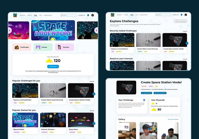
The Play and challenges catalog page had similar designs to what we’ve seen so far. On the other hand, the challenge page had its own requirements and thus needed a new design to suffice them.
Most of the challenges require kids to create an artifact (physical or digital) and then upload it as a photo or video. This submission is then reviewed and liked by other peers. Submissions with the most likes are featured on the gallery leading to earning higher rewards.
Similar flows were designed for other Play offerings- Games, and quizzes.
CKC Gamifications
All these challenges, games, and quizzes lead us to the gamifications which make up the core of how CKC approaches learning. After studying how the best in the business implement it, I tried to design a cohesive gamification system following the fundamentals of the concept.
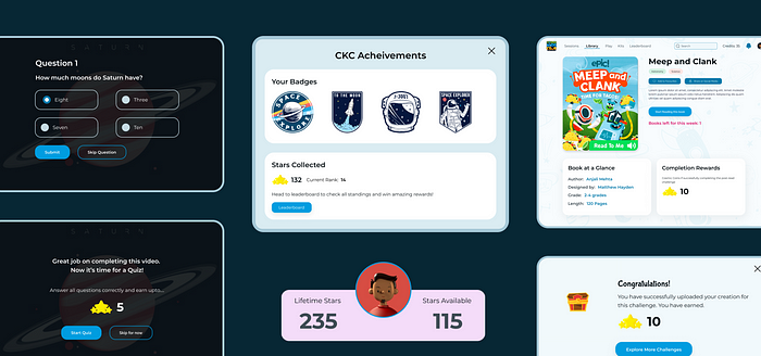
Goal: Learn Astronomy. As simple as it sounds, it is eventually the end goal of the kids and the expectation of their parents when they enroll their kids in CKC.
Achieving top ranks on the leaderboard acts as a medium to quantify this goal. This gives them a sense of purpose to the system and a feeling of accomplishment — an essential component of fun.
Rule: As in games, rules limit the possibilities thus making the experience more fun. In this scenario, kids have a simple rule to keep learning lessons and practice using quizzes and challenges to reach their goal.
Rewards: Rewards in the form of CKC Stars and badges were given to the kids based on how they performed in the activities. This is a crucial incentive for them to keep pushing to their end goal.
More than that, CKC stars lead to actual physical rewards such as merchandise which makes it all the more attractive for the kids.
Progress: Leaderboard and Badges (only for instructor-led courses) act as important progress indicators that kids are moving towards their end goal.
Motivation: Apart from all the rewards, the intrinsic motivation of kids and parents is to see their kids work in a space agency one day.
Here is a look at how the leaderboard and Rewards flow was designed for CKC.
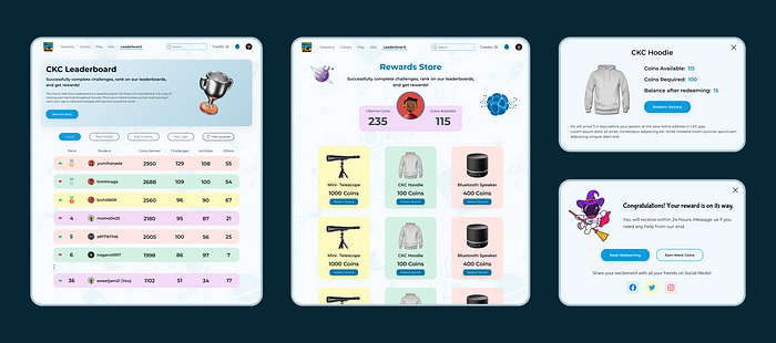
Since gamification was such a crucial part of CKC, the leaderboard was constantly available to users right on the navigation bar. This made checking progress easily accessible.
Users can reach Rewards Store from the leaderboard or after completing any activity that provides them with stars to redeem physical goods implemented with pop-ups as shown above.
5. Design consistency for development and future iterations 📖
This brings us to the end of the project (Almost lol). Please don’t blame me for this case study being so long, the sheer scale of the project demanded me to learn a lot of new things and then share them with you. Creating a design system being one of them.
Since I was only working as a contractor and won’t be there to always provide my design input, it is crucial to provide some sort of system so that the client team or anyone else can make sense of all the design work that was done. This is not an exhaustive design system but more of a library for the purpose of handoff and better design consistency.
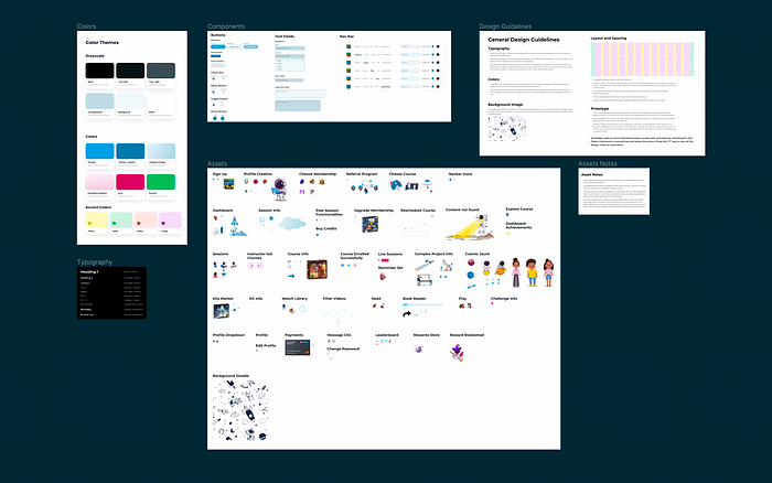
This system included-
- Design Guidelines for better understanding of UX, UI, and layout concepts used throughout the project.
- A compilation of external assets that were used for the visual design.
- The style guide of colors and typography.
- All the components that are used along with their states.
And… That’s a wrap 🎁
From gamifications to a better understanding of information architecture, this project brought along a lot of learnings. Hopefully, I was able to share some of those insights today in this case study and make this case study useful and informative.
Be sure to 👏🏽 below (You can give 50 claps at once, just click and hold on the clap button).
Wanna get in touch for a project or just wanna talk?
Feel free to hit me up at [email protected] or any socials listed below.
My Socials
Recommend
About Joyk
Aggregate valuable and interesting links.
Joyk means Joy of geeK