

Logo Trends 2021: How to Design an Innovative Logo
source link: https://uxstudioteam.com/ux-blog/logo-trends/
Go to the source link to view the article. You can view the picture content, updated content and better typesetting reading experience. If the link is broken, please click the button below to view the snapshot at that time.
Logo Trends 2021: How to Design an Innovative Logo
Our take on the most current trends in logo design and prediction on how faster digital adoption will shape logo design trends for 2021.
The COVID-19 crisis has not only fundamentally changed how people interact with products and services, but also accelerated the drive towards a digital-first approach. This sudden shift towards digital channels means that brands need to address changes and expectations more rapidly.
In the light of the pandemic, many brands were forced to undergo digital transformation, while others used this time to their advantage and repositioned themselves by embracing design trends. Major brands such as Google or Burger King have redesigned their logos to make them more relevant and fresh for this new era, and many others were pushing creative boundaries to set themselves apart from competitors.
In this article, we will be focusing on the following top logo design trends:
1. Minimalistic logos
2. Variable & Responsive logos
3. Symbols only
4. Unique styles
5. Logos with gradients
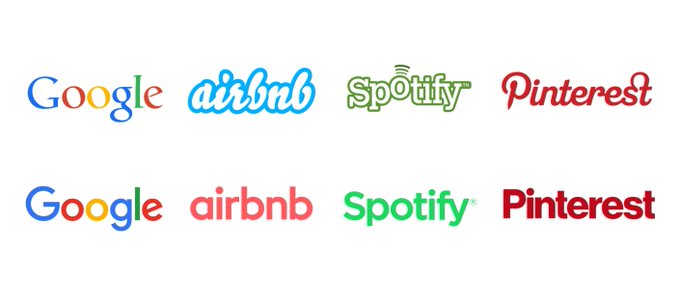
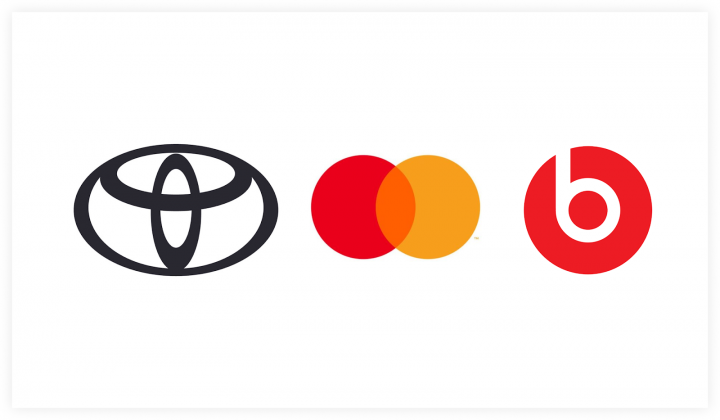
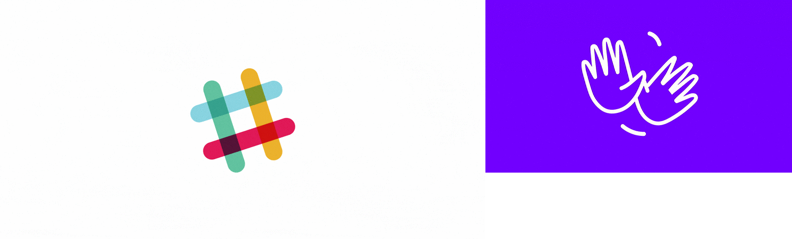
1. Minimalistic logos
 From @OHnoTypeCo
As we are bombarded with information and visuals all day, clarity and extreme simplicity become more and more crucial. Tech giants are moving away from their original logo designs and introduce neutral, predictable, and almost identical logos. This is an organic process resulting from these companies operating across multiple markets, audiences, and platforms.
A simple and flat typeface such as sans-serif ensures that logos can be scaled faster and better. Due to their neutrality, sans-serif logo designs are also much more appealing to broad audiences since they can be easily fitted into a cohesive experience and brand identity. Considering all this, it’s not a surprise that most brands are favoring generic logotypes as they send a very direct message to consumers: “We’re clean, adaptive, and convenient.”
Seeing how brand identity has less to do with logos than experiences, this message is now widely understood. As digital technology plays a more and more important part in our everyday lives, a brand’s identity becomes defined by the experiences we associate with it.
Think about how brand names literally become verbs we use in our daily conversations, like “I’m googling this” or “Just venmo me”.
2. Variable & Responsive logos
Variable logos
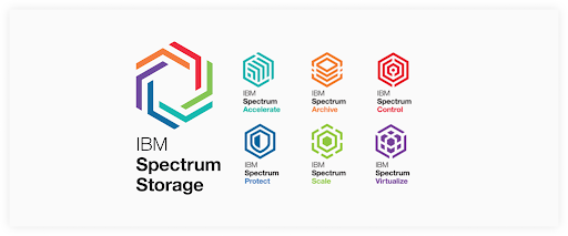
Variable logos will remain amongst the modern logo design trends in 2021. Everyone regards the logo as the single most representative feature of a company, so how come some people use more than one? To this tricky question, I can only say you have to play it smart. IBM Spectrum or Firefox provide good examples.
They gather their — sometimes unrelated — individual products under a unified family. They maintain consistency by keeping the most important part of the logo and change the rest. This way, the memorable part (the idea) stays intact while you have a ton of freedom to play around with.
Although there’s a clever way to it, we have to be careful with these variable logos. For example, many believe that Google was not careful enough when designing the new G suite logos. Yes, the new logos cleverly include Google’s four colors to create a nice visual consistency. If we’re looking at these logos one by one, they do have a contemporary and clean look. But these logos are icons in daily use.
Countless users are clicking and tapping on them many times a day. Since the new logos are so similar looking, you find yourself taking longer to open any Google app because you have to make sure you’re launching the right one. We have to make sure in what context the logos will be used, and with simple UX research, these inconveniences can be easily avoided.
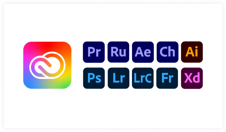
Adobe’s Creative Cloud logo was changed from solid red to a multicolor gradient which suggests more inclusivity. Not only that it represents creativity, but it also brings the colors of their many applications under one umbrella.
To some, it might seem cliché to introduce the colors of the rainbow into a logo, but as we saw through the years, it has been trending amongst other big company logos too.
Adobe also decided to categorize their apps by Motion, Video, and Photography, with a single color per category, which might not be the best strategy. It might not happen that often but for a person who uses only photography-related apps, it might take more time to distinguish one app from another.
In Adobe’s case, being able to differentiate apps quickly would be more important than knowing which package they are included in.
Responsive logos
![]()
With a wide variety of digital screen sizes and printing materials, the need to have a scalable logo has become almost a must. Whether it’s on a billboard on the street, a digital screen, or maybe on a pen, a logo should always be recognizable and, most importantly, maintain the visual consistency of a brand’s identity on every possible medium.
3. Symbols only
The classical logo anatomy consists of a symbol and a logotype which work together as a whole. However, once a brand has become established well enough, it commonly abandons the logotype since everyone already knows the company’s name.
In other cases — especially in the digital era — brands have multiple versions of their logos. Sometimes the symbol suffices, sometimes you need the whole thing. Mailchimp redesigned their logo recently and added their well-known mascot, Freddie. They can use him independently as a symbol in any size (looking cool in the navigation or on a T-shirt as well) or they can write out the company name. The animation with the winking chimp provides an extra layer, which adds to their friendly tone of voice.
By now, many well-known companies have matured to a level where they don’t have to advertise themselves by displaying their whole logo. People have seen it so many times that it has been ingrained in their memories.
2021 might be the year when we’ll start seeing more symbol-only logos. When making such a big decision, brand research is a very important step that no company should ignore.
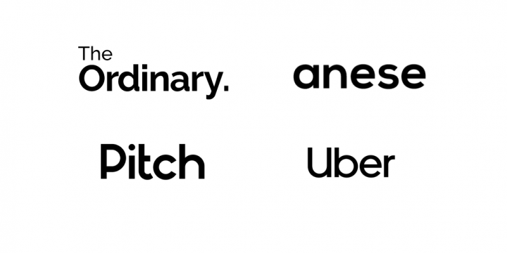
4. Unique Styles
Unique fonts
From handwritten to variable and ink trap, we will continue to see many logos with unique typography.
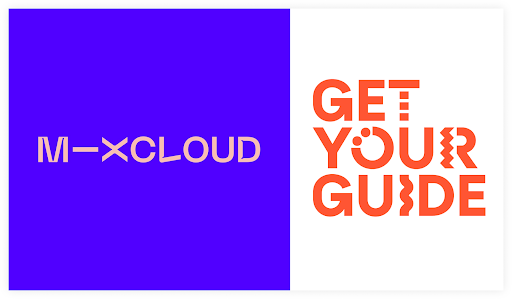
Mixcloud, for example, introduced not only a fresh look but a clever way of using only typography to communicate their brand values: to connect and unify a wide range of user-generated content from their musical genres to their imagery.
Their new logo works well on this eclectic variety of album covers and gig photos. They got rid of the cute cloud icon and instead emphasized the word “MIX” which is what they represent.
“This actually led us to our solution: the shorthand ‘M—X’ logo, [which introduces] the connector device to the logo and plays on the idea of remixing.” – Rob Coke
Retro logos
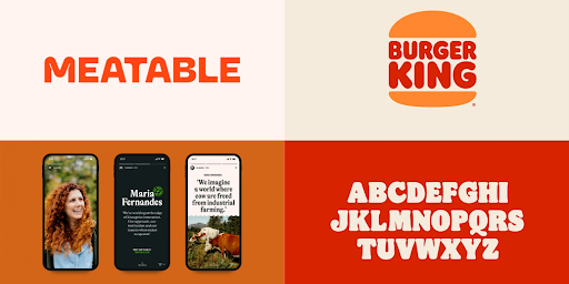
Since the pandemic hit, we’ve been reaching for nostalgia to look back on what seems like easier times right now. Brands are embracing bold red shades matched with muted, natural color palettes and characterful typefaces inspired by the 1960s and 1970s.
Through streamlined and simple visual style, they create the feeling of nostalgia and limit the noise created by overwhelming visual patterns and textures. The most recent example is the Burger King redesign that refers back to the company’s classic 1969 look and communicates a more natural and playful tone.
Another example is the visual language of Meatable, a newly launched cruelty-free food production company. Meatable’s look is simple and flat, yet exciting to look at.
So all things considered, if nostalgia resonates with your target audience’s taste, then tapping into this design trend can be a good strategic decision.
3D logos
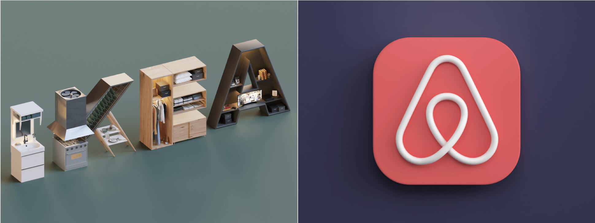 IKEA 3D concept by Eslam Mohamed. AirBnB 3D concept by Webshocker.
One of the hottest UI design trends of last year, 3D is here to stay for 2021 as well. MacOS Big Sur has also introduced icons with 3D-like effects which might inspire designers to start experimenting with 3D concepts. Naturally, this raises the question if 3D logos will become a thing too?
Thanks to more powerful technology and new tools like Spline (a fresh 3D design tool currently in beta), creating 3D graphics is getting less and less time-consuming. Still, integrating 3D graphics into mobile and web interfaces is a challenge that requires a lot of practice and a specialized skill set. In other words, 3D is eye-catching and visually appealing, but it’s more time-consuming as well.
Therefore, creating a trendy 3D logo is only worth the time and effort if it fits your brand identity and adds to the overall user experience.
Animated logos
Thanks to improving technology, static logos aren’t the standard anymore. Adding motion to your logo spices things up and makes you stand out from the competition. We’re seeing more and more brands embracing the animated logo trend in 2021.
Surely, it comes as no surprise since animated logos can be part of cross-platform brand identity from mobile to web or even social media. These brands know that motion not only engages and entertains people but can make your logo much more eye-catching in an era of short attention spans.
5. Logos with gradients

There are two kinds of people: those who love gradient logos and those who absolutely hate them.
If not used right, it can be, indeed, tacky. The good old linear way of a gradual blend of two colors like blue to green won’t do anymore, as it would give an outdated look to a logo.
But there are many creative ways gradients can be applied:
- Including more than three colors
- Unorthodox combination of colors for an edgy look
- Creative ways of washing certain colors together to match the curves of the logo, for example
All in all, the use of gradients in logos will continue to thrive in 2021. Although, there are several things to consider before deciding to use a multicolor blend to your logo. As mentioned earlier, it’s a polarizing subject, so it’s crucial to take into consideration the target audience who will be presented with the logo.
Another crucial factor before deciding whether to use a multicolor blend for your logo is the platform. Will it be used online or offline? After all, we have to be conscious of the number of printing materials and the effort it takes to make them.
Should you follow logo trends?
After reviewing the most popular logo trends for 2021, you might start to wonder… Should I follow trends or just keep it original? Well, there isn’t a simple yes or no answer to this. The world is constantly changing, so you shouldn’t be afraid of embracing change.
Successful brands are simultaneously striving for freshness, timelessness, and originality.
According to Paul Rand, who set the benchmark for corporate branding by creating identities for IBM, ABC, and UPS, among many others: “The principal role of a logo is to identify, and simplicity is its mean. Its effectiveness depends on distinctiveness, visibility, adaptability, memorability, universality, timelessness, and simplicity.”
Dave Schools, the editor of the Entrepreneur’s Handbook, used Rand’s philosophy to create a seven-step checklist. Schools call this the Paul Rand Logo Test and set up seven easy-to-follow guidelines to help determine the value and scope of a logo.
Although Paul Rand wouldn’t argue that incorporating elements from the latest logo trends can be a good strategy, the most important aspect of creating an effective logo design is to visually represent your brand’s identity in a simple and universal way.
At UX Studio, we’re always taking brand personas into consideration and ensure that the logo reflects what a business does and resonates with its target audience. So while logo trends may come and go, following this seven-step recipe will definitely set you on the right path for creating an effective logo:
- Is your logo distinctive?
- Is your logo visible?
- Is your logo adaptable?
- Is your logo memorable?
- Is your logo universal?
- Is your logo timeless?
- And ultimately… Is your logo simple?
+1: If you want to dive deeper into what makes a logo, try playing around with this logo integrity experiment created by Jim Nielsen.
Learn more about current and future trends in UX/UI
Want to know more about the UI trends of 2021 and what are the things that people love? Read our article about 10 UI trends of 2021.
Wondering what could be the UX design trends of 2021? A new design language? UX of self-driving cars? Or chatbots? These are cool things, and many people will list them as the hot UX design trends of 2021, but we think there have to be more out there. Here are our ideas about UX trends for 2021.
Searching for the right UX agency?
UX studio has successfully handled 250+ collaborations with clients worldwide.
Should you want to improve the design and performance of your digital product, message us to book a free consultationwith us.
We will walk you through our design processes and suggest the next steps!
Our experts would be happy to assist with the UX strategy, product and user research, UX/UI design, etc.
Recommend
About Joyk
Aggregate valuable and interesting links.
Joyk means Joy of geeK