

How to Build Loading Screens—KendoReact’s Skeleton Component
source link: https://www.telerik.com/blogs/how-to-build-loading-screens-kendoreact-skeleton-component
Go to the source link to view the article. You can view the picture content, updated content and better typesetting reading experience. If the link is broken, please click the button below to view the snapshot at that time.
How to Build Loading Screens with KendoReact’s Skeleton Component

See how the KendoReact Skeleton component can be used to easily create skeleton loading screens, which improve the perceived performance of your website or app.
Skeleton loading screens, also known as “skeleton screens” or “skeleton UI,” are an important design pattern used to improve the perceived performance of a website or application. They are often used to temporarily display a simplified version of a page or component while the actual content is still being loaded.
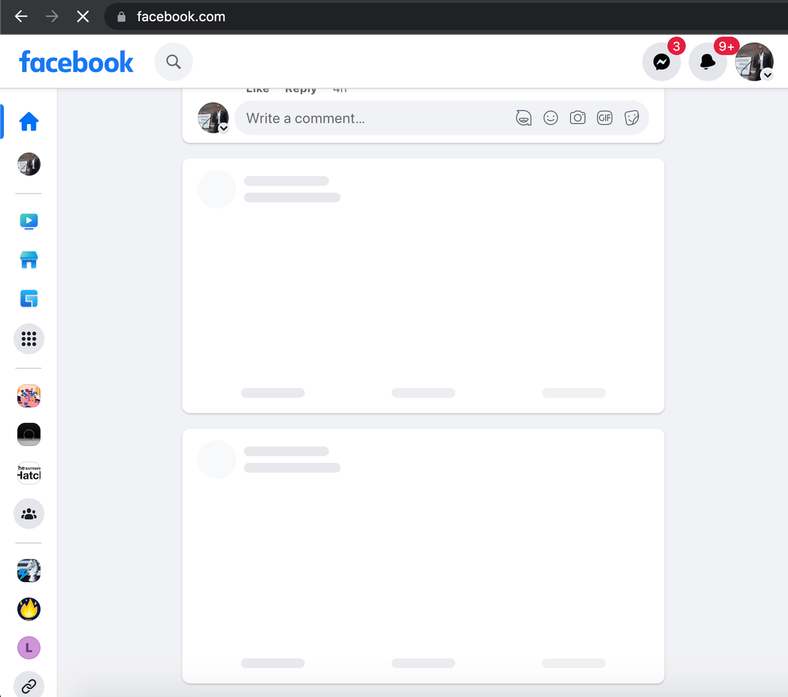
We can see examples of skeleton loading screens in many of the different web applications we use today. When we load our Facebook newsfeed, we’re presented with skeleton loading indicators that tell us content is about to be loaded within card elements.
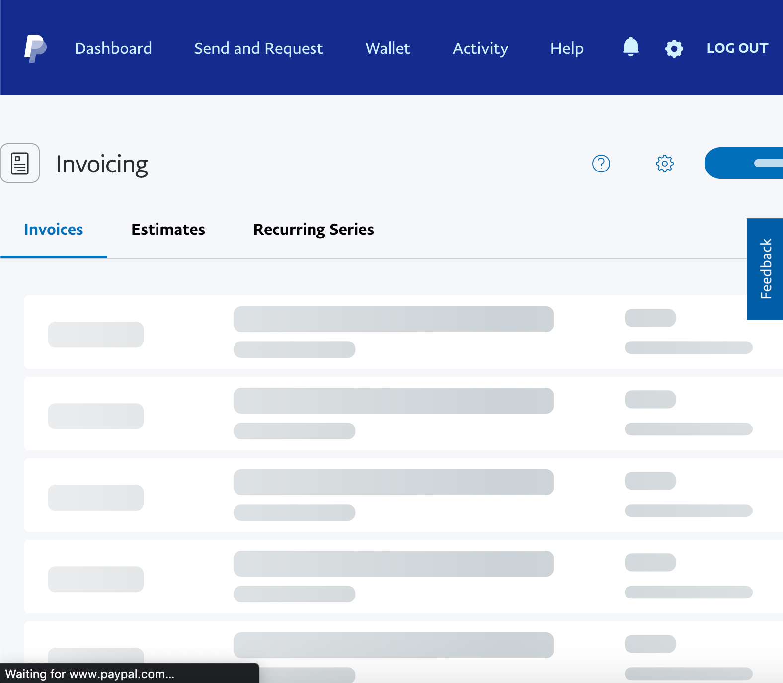
When we intend to see the list of invoices we’ve created on Paypal, we’re presented with skeleton loading indicators that tell us rows of information will soon be loaded.
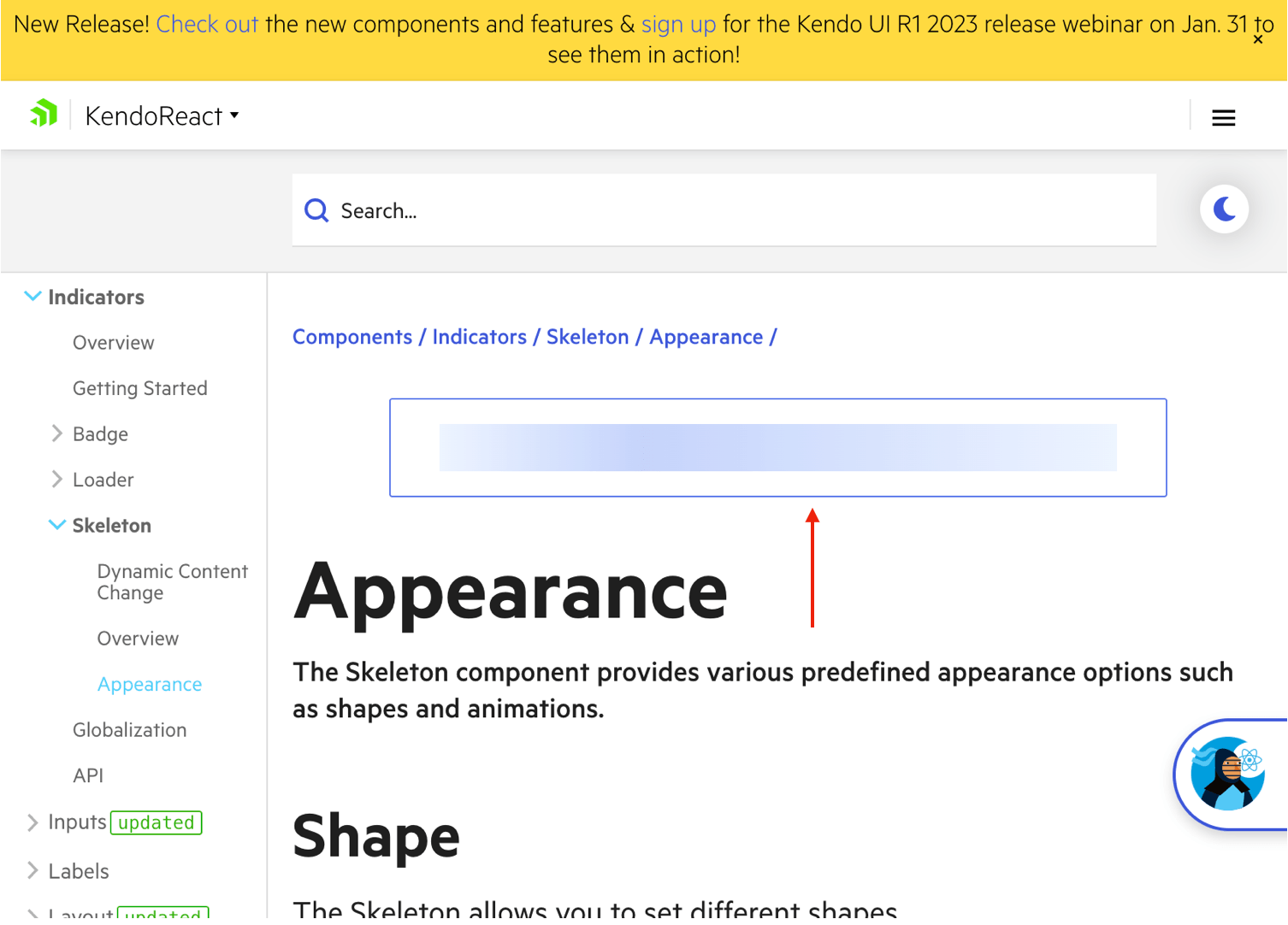
And when we view Progress KendoReact component documentation, skeleton loading indicators exist to tell us that some content on the page has still not been loaded.
The main benefit of using skeleton loading screens is that they provide immediate visual feedback to the user indicating that the page is loading and that the content will be available soon. This can help reduce the perception of latency and improve the overall user experience.
In addition to the above, skeleton loading screens can sometimes also improve the actual performance of the website or application. By displaying a simplified version of the content first, the browser can start rendering the page before all of the data has been loaded. This can help to reduce the time it takes for the page to become fully interactive which improves the overall performance of the website or application.
In the following section, we’ll take a look at how we can use the KendoReact Skeleton component to quickly and effectively create skeleton loading indicators in our React applications.
The KendoReact Skeleton Component
The KendoReact Skeleton component is a UI component built on top of the KendoReact UI library and provides a set of pre-built configurations that can be used to create skeleton loading screens quickly and easily.
The KendoReact Skeleton is distributed through the kendo-react-indicators NPM package and can be imported directly from this package.
import { Skeleton } from "@progress/kendo-react-indicators";
When placed in markup like the following:
import { Skeleton } from "@progress/kendo-react-indicators";

const App = () => {
  return <Skeleton />;
};
The component displays a skeleton loading bar that conveys to the user that some content is still loading.

Shapes
The <Skeleton /> component allows us to configure the shape of the skeleton loading element to be in the shape of text, a circle or a rectangle. It allows us to make this configuration through a prop labeled shape.
When providing a value of text to the shape prop of the component:
import { Skeleton } from "@progress/kendo-react-indicators";

const App = () => {
  return <Skeleton shape="text" />;
};
The component renders a loading element that resembles a single line of text. This is also what’s rendered by default (i.e., when no shape value is provided).
When attempting to render a circular skeleton indicator, we’ll need to specify the width and height of the circle element we want to be rendered. We can do this with the help of the style prop also available
to us.
import { Skeleton } from "@progress/kendo-react-indicators";

const App = () => {
  return (
    <Skeleton
      shape="circle"
      style={{
        width: 100,
        height: 100,
      }}
    />
  );
};
We’ll then be presented with a skeleton loading indicator that has a circular shape.

When attempting to render a skeleton indicator that is a rectangle, we’ll also need to specify the element’s height and width.
import { Skeleton } from "@progress/kendo-react-indicators";

const App = () => {
  return (
    <Skeleton
      shape="rectangle"
      style={{
        width: 100,
        height: 100,
      }}
    />
  );
};
The above example will have us render a similarly sized skeleton loading element but the element will now instead be represented as a rectangle/square.

Animation
The <Skeleton /> component also allows us to specify the animation behavior of the skeleton element through a prop labeled animation.
By default (i.e., when no specific animation value is provided), the <Skeleton /> component shows a pulse animation effect. We can also ensure this by specifying a type: "pulse" value to the animation component property.
import { Skeleton } from "@progress/kendo-react-indicators";

const App = () => {
  return (
    <Skeleton
      shape="rectangle"
      animation={{
        type: "pulse",
      }}
      style={{
        width: 100,
        height: 100,
      }}
    />
  );
};
This will give us the same pulse animation behavior we’ve seen in our examples above.
We can instead declare a wave-like animation by providing a value of type: wave to the animation prop.
import { Skeleton } from "@progress/kendo-react-indicators";

const App = () => {
  return (
    <Skeleton
      shape="rectangle"
      animation={{
        type: "wave",
      }}
      style={{
        width: 100,
        height: 100,
      }}
    />
  );
};
This will give us wave-like loading behavior in our skeleton components.

If we ever wanted to disable the animation completely, we can do so by setting the animation property to false.
import { Skeleton } from "@progress/kendo-react-indicators";

const App = () => {
  return (
    <Skeleton
      shape="rectangle"
      animation={false}
      style={{
        width: 100,
        height: 100,
      }}
    />
  );
};
With the above example, we’ll be presented with the skeleton element but with no animation.

Dynamic Content Change
We now have a good understanding of the different configuration settings the <Skeleton /> component provides us. Let’s now go through an exercise to see how the <Skeleton /> component can help us create an actual skeleton loading experience when we’re waiting for data to be fetched.
Assume we were tasked with the requirement to begin building a newsfeed of sorts. Thankfully, we have the UI components available to us from the KendoReact library to assist us here. First, we’ll begin building a card component we’ll call <CardElement /> that will represent a single post a certain user makes
in the newsfeed.
Note: KendoReact is a commercial UI component library, and as a part of this you will need to provide a license key when you use the components in your React projects. You can snag a license key through a free trial or by owning a commercial license. For more information, you can head over to the KendoReact Licensing page.
We’ll use the building blocks available to us from KendoReact’s Card component as well as the KendoReact Avatar component to help us here.
import {
  Avatar,
  Card,
  CardTitle,
  CardSubtitle,
  CardHeader,
  CardImage,
  CardFooter,
} from "@progress/kendo-react-layout";

const CardElement = ({ avatar, title, subtitle, thumbnail, description }) => {
  return (
    <Card
      style={{
        minWidth: 350,
        width: 350,
        height: "auto",
      }}
    >
      <CardHeader className="k-hbox">
        <Avatar type={"image"} shape={"circle"}>
          <img alt="User Avatar" src={avatar} />
        </Avatar>
        <div
          style={{
            flex: "1 1 50%",
          }}
        >
          <CardTitle>{title}</CardTitle>
          <CardSubtitle
            style={{
              marginTop: 0,
            }}
          >
            {subtitle}
          </CardSubtitle>
        </div>
      </CardHeader>
      <CardImage src={thumbnail} />
      <CardFooter>{description}</CardFooter>
    </Card>
  );
};
Our above <CardElement /> expects a series of props that it uses to populate the information within the card. It then uses the building blocks of the KendoReact <Card /> component to establish the markup for a single card element.
We’ll render the <CardElement /> component in our parent component and provide some mock data:
import {
  Avatar,
  Card,
  CardTitle,
  CardSubtitle,
  CardHeader,
  CardImage,
  CardFooter,
} from "@progress/kendo-react-layout";

const CardElement = ({ avatar, title, subtitle, thumbnail, description }) => {
  return (
    <Card
      style={{
        minWidth: 350,
        width: 350,
        height: "auto",
      }}
    >
      <CardHeader className="k-hbox">
        <Avatar type={"image"} shape={"circle"}>
          <img alt="User Avatar" src={avatar} />
        </Avatar>
        <div
          style={{
            flex: "1 1 50%",
          }}
        >
          <CardTitle>{title}</CardTitle>
          <CardSubtitle
            style={{
              marginTop: 0,
            }}
          >
            {subtitle}
          </CardSubtitle>
        </div>
      </CardHeader>
      <CardImage src={thumbnail} />
      <CardFooter>{description}</CardFooter>
    </Card>
  );
};

const App = () => {
  const cardData = {
    avatar: "./images/hassan_djirdeh_profile_photo.png",
    title: "Hassan Djirdeh",
    subtitle: "2 hours ago",
    thumbnail: "./images/downtown_to.png",
    description: "Check out this view of downtown TO!",
  };

  return <CardElement {...cardData} />;
};
When saving our changes, we’ll be presented with the card element in our app that’s been populated with the mock data we’ve supplied.

When building this feature out in its entirety, we can expect data like the above to be fetched from an API of sorts. We’ll try and replicate the behavior of fetching this data from an API by mimicking an API call with the help of the React useState() and useEffect() hooks, and the native setTimeout() function.
A Breakdown of the React useEffect Hook
React Hooks aim to solve the difficulties of logic reuse by enabling us to write components that have access to features like state, context, lifecycle methods, ref, etc. In this article, we’ll focus on the powerful useEffect hook, which allows us to perform side effects in our function components.
We’ll mimic an API call being made directly from our parent <App /> component.
import {
  Avatar,
  Card,
  CardTitle,
  CardSubtitle,
  CardHeader,
  CardImage,
  CardFooter,
} from "@progress/kendo-react-layout";

const CardElement = ({ avatar, title, subtitle, thumbnail, description }) => {
  // ...
};

const App = () => {
  const [cardData, setCardData] = React.useState(undefined);

  // simulate an API call to get the content
  React.useEffect(() => {
    setTimeout(() => {
      const updatedCardData = {
        avatar: "./images/hassan_djirdeh_profile_photo.png",
        title: "Hassan Djirdeh",
        subtitle: "2 hours ago",
        thumbnail: "./images/downtown_to.png",
        description: "Check out this view of downtown TO!",
      };

      setCardData(updatedCardData);
    }, 2000);
  }, []);

  return <CardElement {...cardData} />;
};
In the example above, when the component is initialized for the first time, cardData is a state property that is given an initial value of undefined. As the component is being mounted
(i.e., rendered for the first time), the useEffect() hook is triggered which runs a setTimeout() function that delays the updating of the cardData state property by two seconds (i.e., 2000 milliseconds).
When we save our changes in the app, we’ll notice that it takes two seconds for data to appear in our card.

Notice that when card data is unavailable, we’re presented with a card that has no information in it which isn’t very appealing from a user perspective. The easiest thing we can do to handle this is to simply display a Loading… message when data is still being fetched.
import {
  Avatar,
  Card,
  CardTitle,
  CardSubtitle,
  CardHeader,
  CardImage,
  CardFooter,
} from "@progress/kendo-react-layout";

const CardElement = ({ avatar, title, subtitle, thumbnail, description }) => {
  // ...
};

const App = () => {
  const [cardData, setCardData] = React.useState(undefined);
  const [cardLoading, setCardLoading] = React.useState(true);

  // simulate an API call to get the content
  React.useEffect(() => {
    setTimeout(() => {
      const updatedCardData = {
        avatar: "./images/hassan_djirdeh_profile_photo.png",
        title: "Hassan Djirdeh",
        subtitle: "2 hours ago",
        thumbnail: "./images/downtown_to.png",
        description: "Check out this view of downtown TO!",
      };

      setCardData(updatedCardData);
      setCardLoading(false);
    }, 2000);
  }, []);

  if (cardLoading) {
    return "Loading...";
  }

  return <CardElement {...cardData} />;
};
In the example above, we initialize a new cardLoading state property with true when the component mounts, and set it to false only after the cardData state property has been updated. When cardLoading is true we render a Loading… message instead of the <CardElement /> component.

This is better than before. The user is better notified that data is still being requested with a Loading… message, which leads to a better user experience. However, we can take this a step further by implementing
a skeleton loading behavior.
We’ll update our <CardElement /> component to expect that it can also receive a loading prop. We’ll use this loading prop value to
conditionally render skeleton elements in every part of our card—the card avatar, title, subtitle, thumbnail and description.
const CardElement = ({
  loading,
  avatar,
  title,
  subtitle,
  thumbnail,
  description,
}) => {
  // card avatar section
  const cardAvatar = loading ? (
    <Skeleton
      shape={"circle"}
      style={{
        width: 45,
        height: 45,
        marginRight: 16,
      }}
    />
  ) : (
    <Avatar type={"image"} shape={"circle"}>
      <img alt="User Avatar" src={avatar} />
    </Avatar>
  );

  // card title section
  const cardTitle = loading ? (
    <Skeleton
      shape={"text"}
      style={{
        width: "100%",
      }}
    />
  ) : (
    <CardTitle>{title}</CardTitle>
  );

  // card subtitle section
  const cardSubtitle = loading ? (
    <Skeleton
      shape={"text"}
      style={{
        width: "40%",
      }}
    />
  ) : (
    <CardSubtitle
      style={{
        marginTop: 0,
      }}
    >
      {subtitle}
    </CardSubtitle>
  );

  // card thumbnail image section
  const cardImage = loading ? (
    <Skeleton
      shape={"rectangle"}
      style={{
        width: "100%",
        height: 230,
      }}
    />
  ) : (
    <CardImage src={thumbnail} />
  );

  // card footer section
  const cardFooter = loading ? (
    <CardFooter>
      <Skeleton
        shape={"text"}
        style={{
          width: "100%",
        }}
      />
    </CardFooter>
  ) : (
    <CardFooter>{description}</CardFooter>
  );

  // card markup that renders the above sections
  return (
    <Card
      style={{
        minWidth: 350,
        width: 350,
        height: "auto",
      }}
    >
      <CardHeader className="k-hbox">
        {cardAvatar}
        <div
          style={{
            flex: "1 1 50%",
          }}
        >
          {cardTitle}
          {cardSubtitle}
        </div>
      </CardHeader>
      {cardImage}
      {cardFooter}
    </Card>
  );
};
For each card section, we render a certain skeleton element when the loading property of the card is true. For the avatar, we render a circular skeleton element. For the title, subtitle
and footer, we render text skeleton elements. Finally, for the card thumbnail, we render a larger rectangular skeleton element.
We’ll now just need to update our parent component to remove the Loading… message from being shown and to pass the cardLoading state property down as the value of the
<CardElement /> loading prop.
const App = () => {
  const [cardData, setCardData] = React.useState(undefined);
  const [cardLoading, setCardLoading] = React.useState(true);

  // simulate an API call to get the content
  React.useEffect(() => {
    setTimeout(() => {
      const updatedCardData = {
        avatar: "./images/hassan_djirdeh_profile_photo.png",
        title: "Hassan Djirdeh",
        subtitle: "2 hours ago",
        thumbnail: "./images/downtown_to.png",
        description: "Check out this view of downtown TO!",
      };

      setCardData(updatedCardData);
      setCardLoading(false);
    }, 2000);
  }, []);

  return <CardElement loading={cardLoading} {...cardData} />;
};
At this moment, when we save our changes and refresh our app—we’ll notice a skeleton pattern being shown immediately when data is still being fetched for our card!

The skeleton loading card is displayed while the data is being loaded and then replaced with the actual content once the data is available. This improves the perceived performance and user experience of our app since the user can now expect what kind of data will be loaded before the data is even made available.
Wrap-up
Skeleton loading screens can greatly improve user experience by providing visual cues of the content to come. This reduces perceived load times and keeps users engaged. The KendoReact Skeleton component is a versatile and easy-to-use tool for implementing skeleton loading screens in a React-based project. It can be customized to match the design of the website and can be used in place of certain UI elements while data is being fetched from an API.
You can find the code we’ve written in this article in the following public Gist. Finally, for more details, be sure to check out the official component documentation!
Recommend
About Joyk
Aggregate valuable and interesting links.
Joyk means Joy of geeK