

This Kind of UI Will Make You Panic
source link: https://uxplanet.org/this-kind-of-ui-will-make-you-panic-c747b6b08d45
Go to the source link to view the article. You can view the picture content, updated content and better typesetting reading experience. If the link is broken, please click the button below to view the snapshot at that time.
This Kind of UI Will Make You Panic
Probably the worst order status tracker I’ve seen so far.
Screenshot by me. Why is this status bad? Read on for an explanation.
A short story of my heart-breaking experience that could’ve been avoided if a certain website had hired a UX writer.
In the beginning was the Word
The wording you use on your website is everything. Not only because of the tone of voice (an insipid old thing, almost a cliché at this point)—friendly, informative, business-like—but because words can provide:
- clarity (a button describing what exactly happens if I click on it)
- sense (product description of a hair styler that makes hair wavy in 40 different ways)
- accessibility (a complicated term or bureaucratic process put simply, gov.uk being one of the best examples)
- desire to stay on the website and use/buy whatever you offer (even if it’s as expensive as a Rolls Royce—I explain how to write convincing texts in this article)
Unfortunately, small and medium-sized businesses often ignore UX writing. They hire copywriters for mottos and banners and other posh wording, but other texts are created by developers or designers without second thoughts.
UX writing becomes filler text.
Lost in translation
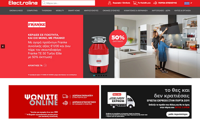
Screenshot by me, Cypriot website Electroline
Cyprus is not known for good service or great web UIs. However, Cyprus is known for an abundance of English-speaking tourists and locals. I happen to be one of them.
Most Cypriot websites open in Greek by default but have English translation options. Sometimes, the translation is lousy.
The case study
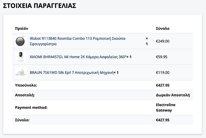
Via the website above, I ordered some things to be delivered to my office address and paid online.
They provided me with a link to my account, and it looked something like that:
Yes, it’s in Greek, and there’s no way to translate it to English from a desktop, as an icon with language options doesn’t work.
I managed to get it to work on mobile, and the first status update right after the payment said:
‘Registered.’
That makes sense, right?
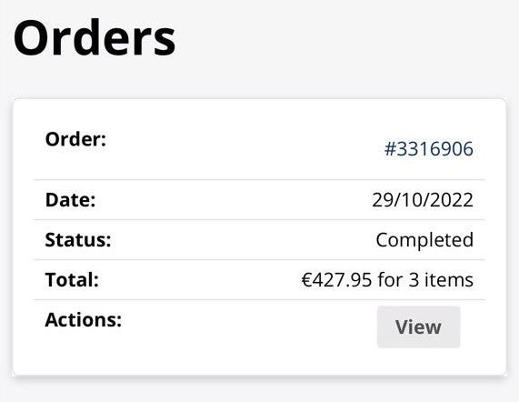
Well, a few days after, I got a new update:
Status: completed. Did I get my order? No. Did I get a call from a delivery company? No. The Greek (original) version of the website had the same status update — completed.
Knowing that Cypriot service is a bit lousy, I started panicking and called the website support.
— “Your order is fine.” reassured the support lady.
— “Status ‘Completed’ means that we have registered your order.”
What went wrong?
Clearly, the UX writing failed to fulfill the 2 essential goals:
- Used unclear and unusual wording designed for usage within the company and not for the average user
- The order update didn’t reflect what was really happening on the client's side
How to write status trackers
Here are examples of clear and descriptive status trackers:
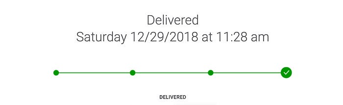
FedEx status tracker screenshot by NN Group
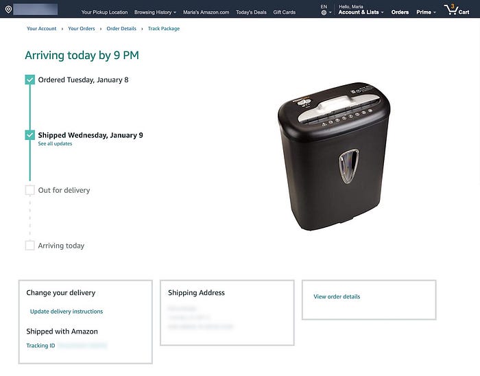
Amazon status tracker screenshot by NN Group
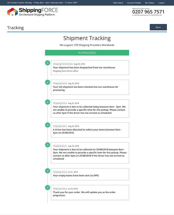
ShippingFORCE status tracker screenshot by NN Group
NNGroup (Nielsen Norman Group, one of the best UX research companies out there) defines a status tracker as a feature for tracking the progress of a product/service delivery.
A good status tracker should:
- Be easy to find.
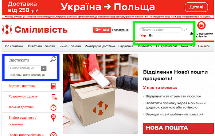
Nova Poshta, a Ukrainian postal service, provides an input field for a tracking number on the main page (see blue rectangular). This field is equivalent in size to the search bar (see green rectangular) and is easy to find.
2. Put the latest update upfront.
3. Be simple and easy to understand. Don’t add technical updates to trackers.
4. Be visually distinct and easily scannable.
5. Be editable. Make users happy by allowing them to edit contact info.
6. Be accessible. Ifusers need to have a personal account to access the tracker, tell them about it.
7. Be detailed and responsive. For expensive deliveries that take a long time to reach the recipient, provide frequent updates so that the tracker preserves its value.
Thank you for reading till the end! Comments and claps are always welcome.
Recommend
About Joyk
Aggregate valuable and interesting links.
Joyk means Joy of geeK