

4 Rules for Airbnb’s Invisible Design
source link: https://blog.prototypr.io/4-rules-for-airbnbs-invisible-design-25a6d5b8e869
Go to the source link to view the article. You can view the picture content, updated content and better typesetting reading experience. If the link is broken, please click the button below to view the snapshot at that time.
4 Rules for Airbnb’s Invisible Design
The symphony of grid design used by Airbnb
When it comes to design, Airbnb is still one of the top-rated places for me to visit and study various components in the hopes of learning a bit more about design grids. Several fabulous designers, I have met in the past vouch for the design grids that Airbnb uses in its web and mobile products.
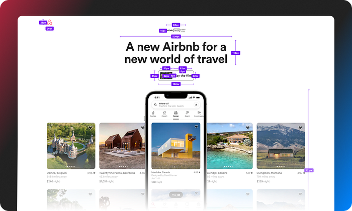
Based on my understanding and observations here are four of the top rules that Airbnb lives by to create killer interfaces that are truly breathable. To keep it simple I have used layout wireframes with container bounds marked to display the power of grids & spacing in selected designs from Airbnb.
Breathable

Host Resources on Airbnb
Breathability is the empty spacing that the container has on the sides and between each of the rows that allows the eyes to move from left to right in the container space.
I have looked at hundreds of screens and components that Airbnb has put together for its web and mobile projects and one thing that stands out the most is the breathability of their designs. The team doesn’t try to crowd up everything with a clogged frame of content. They use a consistent 4pt grid that allows them to place content that allows air to flow into the tiniest of components and promoted breathability. Breathability is nothing but empty spacing that the container has on the sides and between each of the rows that allows the eyes to move from left to right in the container space and doesn’t make the layout feel too tied up.
Content Hierarchy
Places to stay fold on Airbnb
There is something truly beautiful about mindful content hierarchy. When done right, the users know where the content is flowing towards. It supports natural reading patterns and places trust in the user. In the wireframe above, a user would know exactly which parts to skip. The following needs to be taken into consideration when setting-up content hierarchies —
- Placement of hero element
- Typography Scales
- Title
- Subtitles
- Body
- Links - Secondary content with context explained
Responsiveness

Search widget on Airbnb
Not everyone will agree with this bit but grid placements play an important part in achieving effortless responsiveness in web or mobile designs. Airbnb doesn’t fail to impress in this respect. For its website, Airbnb has placed these functional web widgets over the world map to search for your next holiday destination and as soon as the user interacts with the widget, the container expands to show all the different variables that the selection accommodates. This is the most captivating part about responsive grids, they make small components expand effortlessly to display functional properties.
Predictable Layouts

This goes back to the breathability aspect that I mentioned before. When you look at Airbnb’s website, you’ll find that each of its folds has ample spacing, uses a consistent grid structure, and leaves room for the previous and next content after the current one. All of these points when combined create a layout design that we call simple & predictable. This means it doesn’t play with the user's sensibilities and invites them to explore around to make up their mind.
It might be relevant to add that combining simple UX writing with predictable layouting is essential and it is what makes the user feel happy when visiting Airbnb’s website.
That’s all folks 🙌
Thanks for stopping by and reading thru’ this short about grids and spacing principles that are frequently followed in Airbnb’s UI designs. If you want to invest in Airbnb’s layouts further then check out this resource that I have put together on Figma Community that breaks down Airbnb’s latest summer homes offering and redlines each of the folds.
Recommend
About Joyk
Aggregate valuable and interesting links.
Joyk means Joy of geeK