

The World’s Scariest Fonts
source link: https://magenta.as/the-worlds-scariest-fonts-c5d59df12e08
Go to the source link to view the article. You can view the picture content, updated content and better typesetting reading experience. If the link is broken, please click the button below to view the snapshot at that time.
The World’s Scariest Fonts
The definitive guide to horror typography.
Seriousness. Humor. Quirkiness. Friendliness. Godliness. Sophistication. Immaturity. Typefaces are called upon by designers to instill all sorts of characteristics in text. But what about horror? Can a font be scary? And if so, what — and more important, where — are the great horror fonts?
It’s a surprisingly difficult question to answer. When you Google up “scary fonts” or “horror typefaces,” what comes back is a grab bag of obscure novelty fonts with names like Hollyweird and Gargoonies. With ascenders made of bones and descenders of dripping blood, they come across as more tacky than scary, better suited for a flyer for a grade-school Halloween party than the latest horror movie blockbuster or Stephen King cover.
But there are trends in horror typography, especially in cinema. They generally fall into three categories: “normal” typefaces used subversively, original typography used to emphasize the shocking and bizarre, and, well, Trajan.
Subversive Horror Typography
Perhaps the most common type of horror typography, the subversive school of font design employs familiar typefaces to hint at what lurks beneath the surface world of normality.
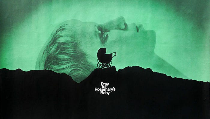
A good example is the poster of Roman Polanski’s 1968 adaptation of Ira Levin’s Rosemary’s Baby. The identity primarily uses Helvetica Neue Medium, modified so that the middle descender in the “m” of “Rosemary” forms the ascender in the second “b” of “baby.” By linking the two letters together, the designers create a glyph that resembles both an umbilical cord and the mobile dangling above a crib, while hinting at the hellish netherworld of Satan worshipping which — spoilers! — will, by the end of the film, swallow up both Rosemary and her baby.
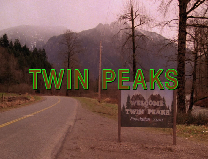
Another example is Rod Serling’s “Twilight Zone” logo. At first, it looks like custom lettering, but upon closer examination, it reveals itself to be a warped version of Bernhard Modern, a serif typeface evocative of old engraving faces designed by Lucian Bernhard in 1937. Just like the breaking window in the opening credits, the show’s use of Bernhard Modern hints at the horrors that can happen when the mundane reality we live in starts to shatter. This is a technique that is similarly used in “Twin Peaks” (with ITC Avant Garde Gothic) and “Stranger Things” (ITC Benguiat) to show how another world or hidden reality can encroach upon our own.
The subversive horror typography trend continues to this day. The poster for the 2007 “found footage” horror movie Paranormal Activity uses a combination of Kautiva Bold and Courier Bold to simulate the LED readings on a home video camera, similar to the one that captures evidence of ghosts in the film itself. Here, the typefaces not only stress the role of technology in the film, but again hint at how the paranormal exists in plain sight on the outskirts of our perception, just like the most mundane and ubiquitous fonts.
Custom Horror Typography
If horror movies focusing on the dark, subliminal worlds beneath our day-to-day reality tend to subvert commonly known typefaces, there’s another school of horror type design that aims to make logos every bit as freakishly monstrous as the movies they represent.
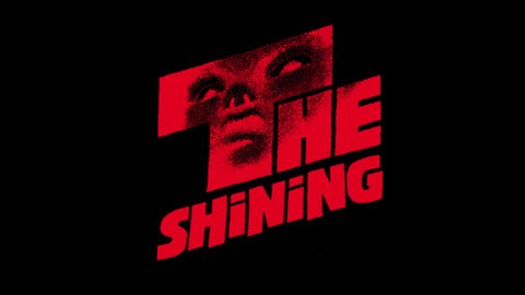
From the original poster for Tod Browning’s 1931 adaptation of Dracula to Saul Bass’s powerful logo for Stanley Kubrick’s The Shining, the history of horror branding is dominated by original typography.
The ’80s was a particularly fertile period for original horror typography. Consider, for example, Dan Perri’s twisted, malevolent on-screen title for A Nightmare on Elm Street, the oddly geometric, Bauhaus-style logo for Sam Raimi’s first Evil Dead movie, or the ‘50s-style, Creature Feature–inspired logo of John Landis’s An American Werewolf in London, each of which is a unique masterwork in horror lettering.
Over on his blog, cinematic type curator Christian Annyas collects some of the better examples of original horror typography. He notes: “If your movie is frightening, disgusting or gory, why not communicate that with moviegoers? That’s what they did during the 1980s. As a result every movie or franchise had it’s [sic] own unique identity…. [but logos like these] are gradually becoming extinct. They’re being replaced by Trajan, which has become the go-to font for horror movie posters.”
Trajan and Other “Trendy” Typefaces
Which brings us to Trajan, perhaps the most overused typeface in cinematic history.
A serif typeface designed by Carol Twombly for Adobe in 1989 to emulate the look of Roman square capitals, Trajan isn’t particularly scary; it’s more evocative of museums than haunted houses. Even so, it’s been widely embraced by Hollywood not just for its readability and adaptability, but because of the way it evokes neoclassical grandeur to elevate any film to a Cinematic Event. This is as true in horror as it is elsewhere, so Trajan is just as prominent in the logos of movies like The Human Centipede and The Conjuring movies as it is on the poster for Gladiator.
But designers throwing up their hands and embracing a trendy type choice for a horror movie poster instead of something more appropriate is hardly a new phenomenon. In fact, before Trajan, there was an arguably even more overused horror font: ITC Serif Gothic.
Released almost half a century ago by Herb Lubalin’s International Typeface Corporation, ITC Serif Gothic was the Trajan of the 1970s, widely used in everything from the original book jacket of Peter Benchley’s Jaws to the posters for Star Wars and Star Trek.
It’s best horror use was probably in John Carpenter’s seminal 1978 slasher Halloween. In that film, an outlined, orange-hued version of the font resembles type hacked out of the face of a Jack O’Lantern with a butcher’s knife. Carpenter has always been a master of using universal typefaces in uniquely iconic ways (consider his lifelong love affair with Albertus), but his use of ITC Serif Gothic for Halloween is perhaps uniquely excellent, especially when compared to other horror logos of the era, like Larry Cohen’s 1974 mutant baby schlockfest, It’s Alive.
The Fonts of Fear
It’s easy to look at a typeface and see it as being whimsical, or serious. But fonts, of course, have no innate personalities, besides what context gives them: A typeface like Futura can be twee in The Royal Tenenbaums one minute, and existentially horrifying in 2001: A Space Odyssey the next. The history of horror branding is filled with incredible original typography, but the predominance of mainstream typefaces in scary movie marketing doesn’t just illustrate the surprisingly versatile emotive power of fonts. It also reminds us that our biggest fear is the perversion of what surrounds us everyday.
Magenta is a publication of Huge.
Recommend
About Joyk
Aggregate valuable and interesting links.
Joyk means Joy of geeK