

THE HAUNTING OF THE DARK PATTERNS
source link: https://uxplanet.org/the-haunting-of-the-dark-patterns-7ca18933266d
Go to the source link to view the article. You can view the picture content, updated content and better typesetting reading experience. If the link is broken, please click the button below to view the snapshot at that time.
THE HAUNTING OF THE DARK PATTERNS
Responses (1)
Also publish to my profile
There are currently no responses for this story.
Be the first to respond.
THE HAUNTING OF THE DARK PATTERNS
A brief expert into the Dark patterns of UX with malice
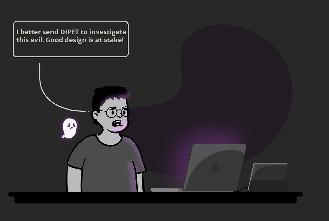
Fig 01: Good Design at stake? ( Source: https://storyset.com/ , https://www.openpeeps.com/ )
Hey! I am an architect by profession and an aspiring UX designer. As a designer at heart, I have always been fascinated with people, the problems they face every day, and why they behave the way they do.
Design is very close to my heart! But anything good in this world will have a dark side, which does the opposite of what it is supposed to do for getting faster results. Sadly it has crept itself into ‘design’ as well!
This article is about the dark side of UX and how it is everything that UX design should not be about. To guide ‘you’ the reader on this spooky journey, I would like to introduce you to your guide and my friend ‘DIPET’.
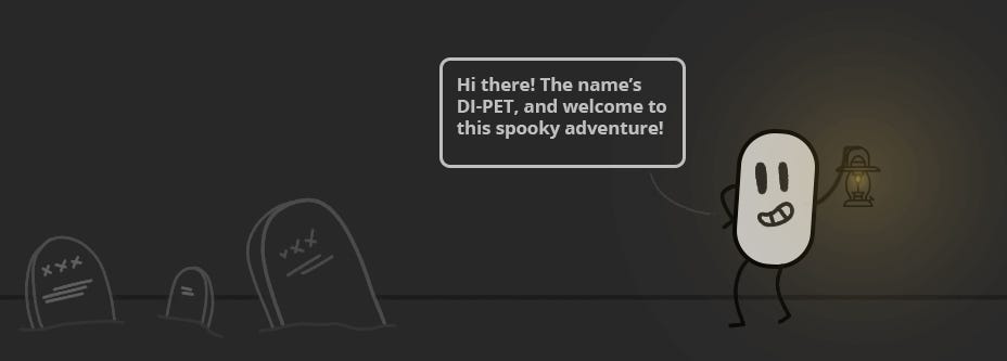
Fig 02: Dipet
The Dark Side of UX
So, what is a Dark pattern in UX? How did this dark side to UX originate?
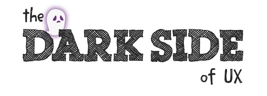
Fig 03: The Dark side ( STAR WARS© )
If you are wondering that this is a reference to the dark mode of UI that we see these days, it’s not! This has nothing to do with it. Dark Patterns are tricks that make the user do things they did not intend on doing.
In the real world, there is a fine line between influencing the user’s decision and outright tricking them. The dark side belongs to the zone beyond this line, aiming to trick users into doing things they did not mean to.
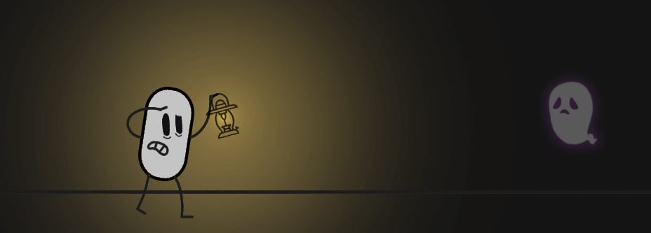
Fig 04: Look in the dark
The Dark patterns have a negative impact in the long run. Users after noticing these patterns will end up never using such products and switching to more ethical products or services. Then, why is this dark nature of UX used?
These patterns are generally used for short-term results. This may be to sell ads for a shady corporation, pushing unreasonable products and services in the hope that some users get baited to buy them, or in the worst-case scenario collecting and stealing data from users. In a nutshell, these patterns don’t have any form of a user-centric approach to them.
Let us now look at some of the common patterns that are out there and learn about them through our journey!
The Patterns of the Dark side
The following are some of the common dark patterns visible:
- Bait and Switch
- Deliberate Misdirection
- Hidden Cost
- Roach Hotel
- Trick Questions
- Disguised Ads
- Privacy Zukkering
- Sneak into Basket
- Roadblock
- Growth hack through Spamming
Let us investigate each one.
*Please note that the example diagrams are exaggerated to make the dark pattern more visible.
Pattern 01 — Bait and Switch
The use of a convention, method, or pattern in a way to make the user falsely assume something. This is the bait and switch pattern where once you are hooked, they reel you in!
“ Its free, we just require you to hand over your soul.”
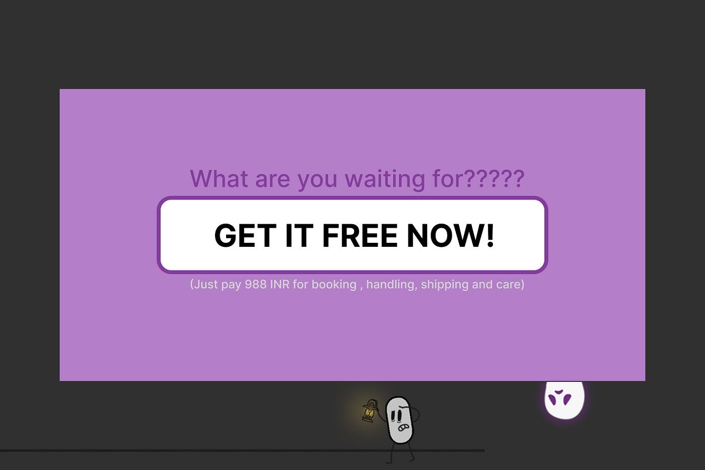
Fig 05: Bait and Switch
Pattern 02 — Deliberate Misdirection
Focussing the user’s attention on the more expensive option. Hiding away the cheaper ones.
“ Hey check out our expensive option, its basically the same as the cheaper one but you will have fun spending money here!”
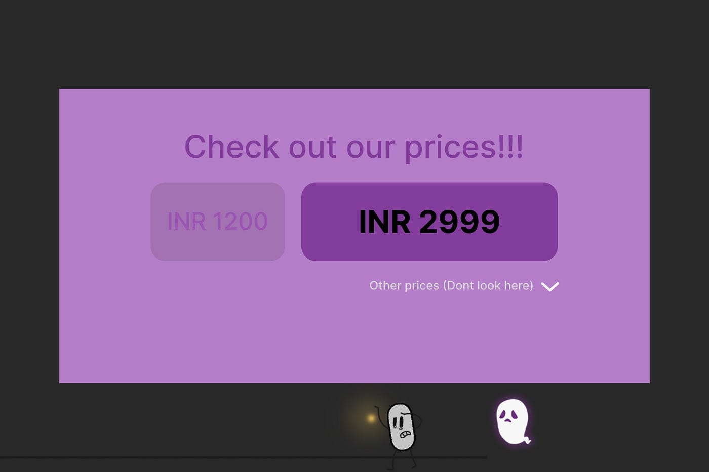
Fig 06: Deliberate Misdirection
Pattern 03 — Hidden Costs
Hidden costs or items are added to your cart without your knowledge and if you are not too careful you end up paying for them as well. There is usually no explanation or information given about these hidden costs and steps are taken to hide them as long as necessary.
“ Hey I dont remember adding 10hrs of Insurance to my cart!…. hey wait, what the heck is a martian snowmobile?”
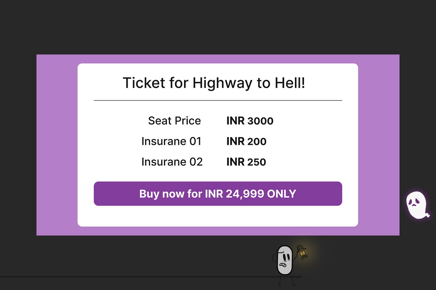
Fig 07: Hidden Costs
Pattern 04 — Roach Hotel
This design pattern makes it very easy for you to enter a place or website but leaving it turns out to be quite impossible. It traps you there intending to keep you for an eternity!
“ You will never leave here… you will become a part of us… come join us..”
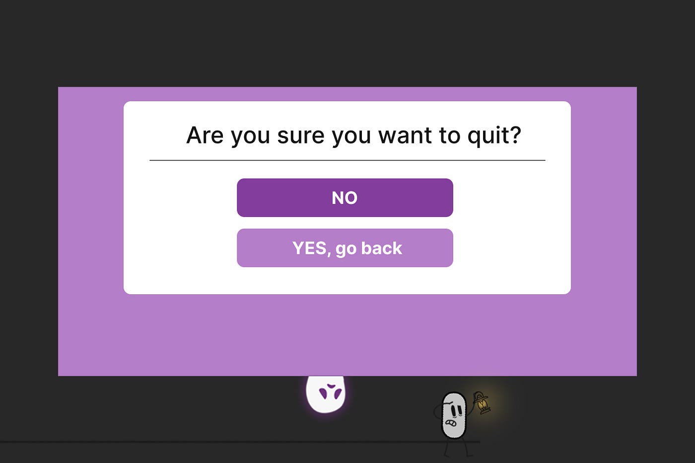
Fig 08: Roach Hotel
Pattern 05 — Trick Question
Trick questions are when the writing does not seem at all deceiving unless you read again and find out the hidden or obscure meaning behind them. This is a strategy to confuse the user and make him choose something he does not want to.
“ If you are not careful, Anabelle might make you sign the marriage papers and haunt you for the rest of your days.”
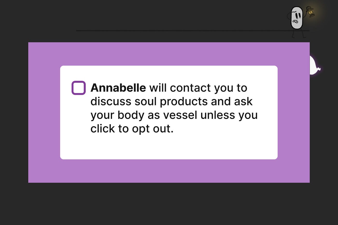
Fig 09: Trick Question
Pattern 06 — Disguised Ads
Ad content that is disguised as other types of content to make users deliberately click on them and send them to their worst nightmare. There are cases where they don’t let you do anything else until you click on any one of them!
“ So Lydia from 2kms away is not waiting for me at the bus station……?”
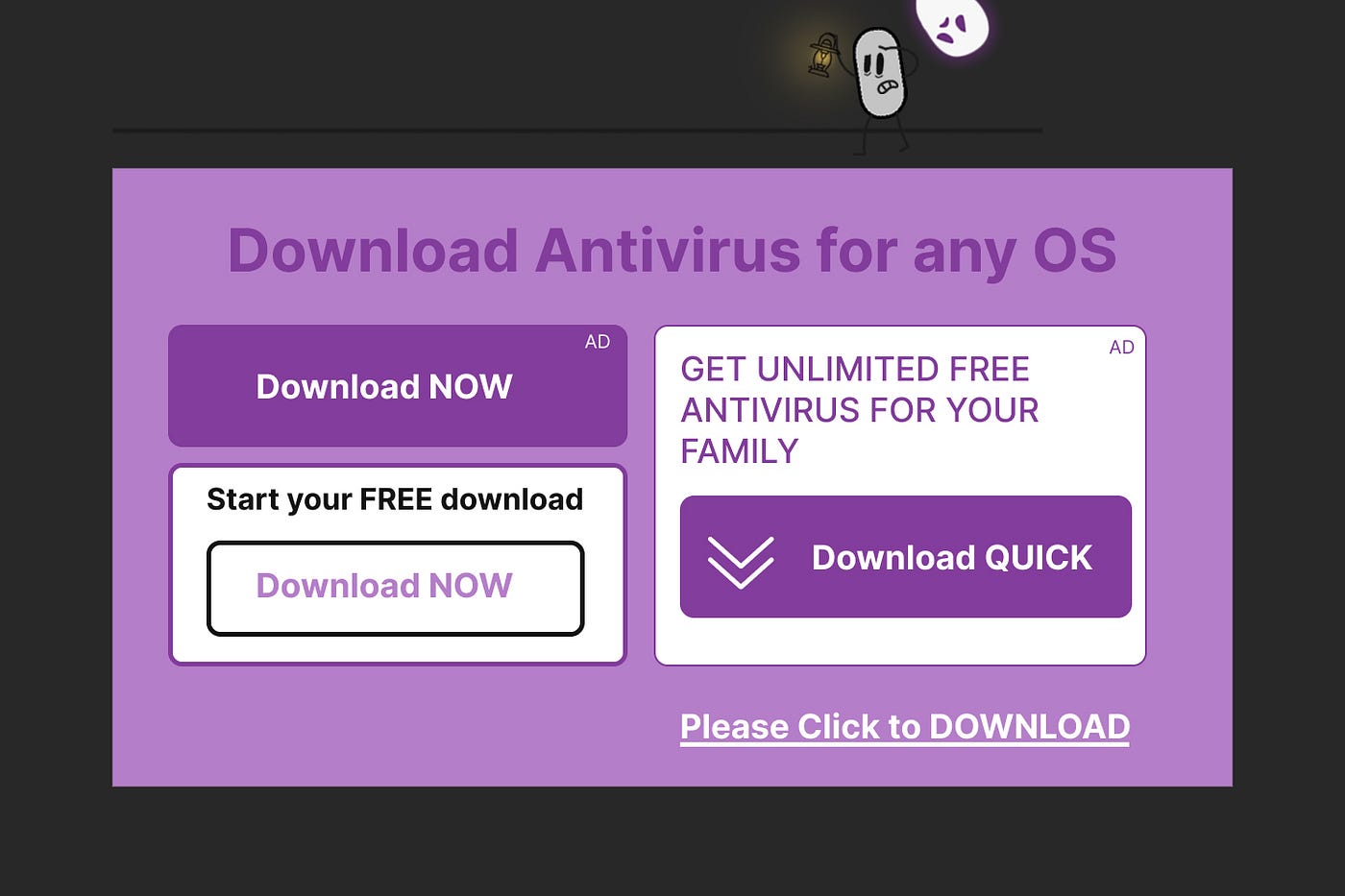
Fig 10: Disguised Ads
Pattern 07 — Privacy Zukering
This is a method of making you unaware of what private information you are agreeing to share. They will use this information for other, not so ethical, procedures in the future.
“ Hey who are you people!!….. the house belongs to you now?…… wait, I belong to you…??”
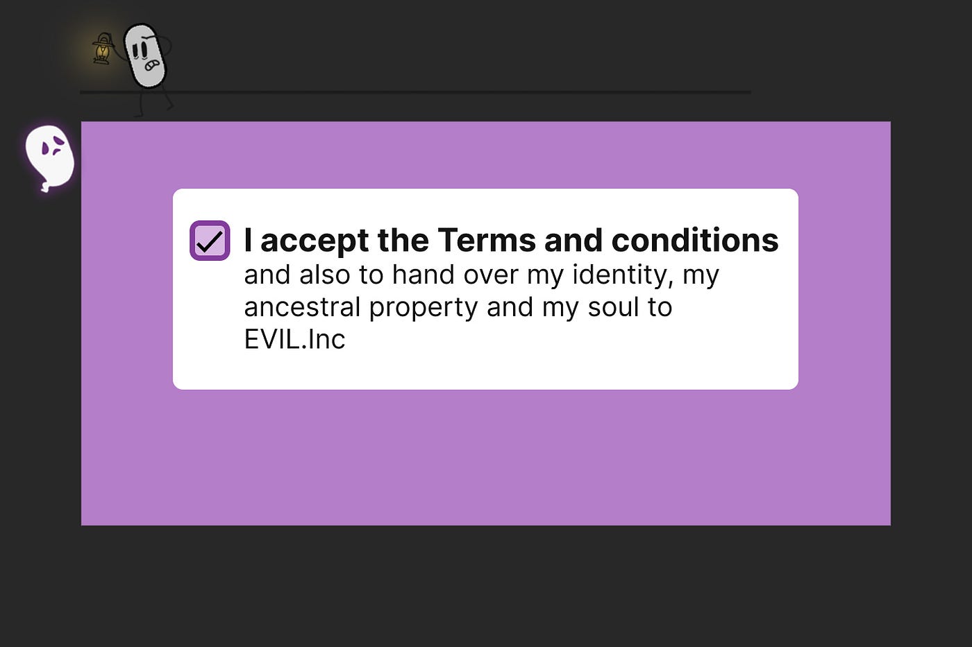
Fig 11: Privacy Zukering
Pattern 08 —Sneak into Basket
You are attempting to purchase something and somewhere along the purchase journey the app or website adds items without your knowledge.
“ Take this as our gift filled with love….. costs only 666 plus GST.”
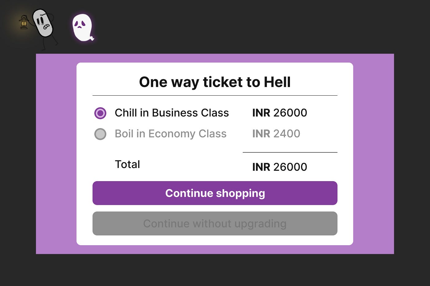
Fig 12: Sneak into Basket
Pattern 09 —Roadblock
A pop-up interrupts your intended action. The app or website makes it its life’s mission to stop you from whatever you were about to do.
“ We can do this all day, everyday… until you hand over both your kidneys.”
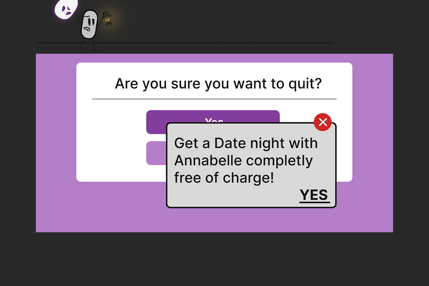
Fig 13: Roadblock
Pattern 10 — Growthhack through Spamming
In this pattern, the product asks for your email or social media permissions under the disguise that it will be used for a desirable social outcome, but then spams all your contacts with a message that claims to be from you and basically puts your life on fire!
“ No wonder people dont want to be anywhere near me… .”
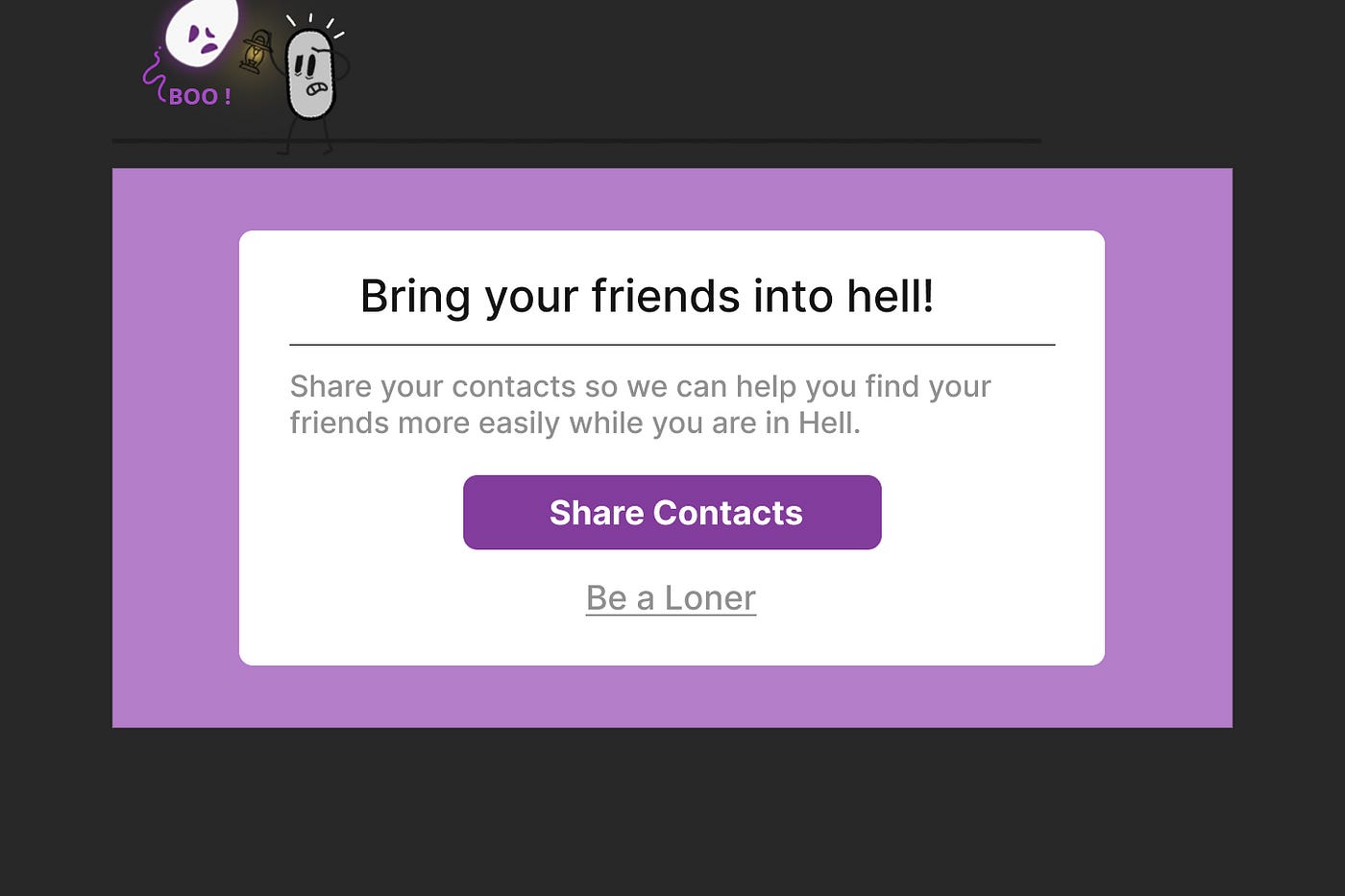
Fig 14: Growthhack through Spamming
These are just some of the dark patterns out there, and there will continue to be more as some people are knee bent on making it a reality.
Conclusion
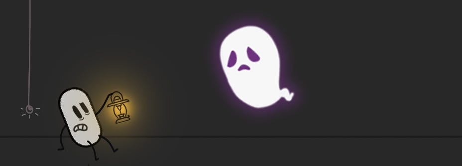
Fid 15: Dark Patterns
These dark patterns are everywhere, lurking in the shadows, hiding in the corners to prance on you when the opportunity comes. What we can do is to observe and stay clear of things from the dark side.
And as Dumbeldore always says -
“Happiness can be found in even the darkest of times, if one only remembers to turn on the light.”
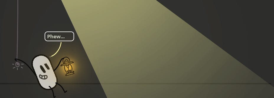
Fig 16: Gone… for now!
The only thing, we as designers, have to keep in mind is to never turn to the dark side. May the force be with you! (STAR WARS©)
Thank you for being a part of this journey. If you liked it, do let me know in the comments. All feedback is welcome. You can reach me at [email protected]. We can also connect on LinkedIn.
If you want to read more content regarding user experience design, don’t forget to follow me on Medium!
Thank you once again!
Recommend
About Joyk
Aggregate valuable and interesting links.
Joyk means Joy of geeK