

How we designed an accessible color palette from scratch
source link: https://medium.com/wttj-tech/how-we-designed-an-accessible-color-palette-from-scratch-f29ec603bd7f
Go to the source link to view the article. You can view the picture content, updated content and better typesetting reading experience. If the link is broken, please click the button below to view the snapshot at that time.
How we designed an accessible color palette from scratch

We knew that, although meticulously crafted, our current 7-color design system (in other words, our secondary branding colors) was very limiting and not suited for all use cases. So when data visualization discussions came up in October 2021, we realized we needed to create a new color palette that was distinct from the existing one — one that was specifically made and thought out for this usage. And as we were going to be building it from scratch, we took advantage of this opportunity to make sure it would fit the accessibility best practices as much as possible. It was indeed important for us that the 4.5% of the worldwide population affected by color blindness, including deuteranomaly (aka green-weak), deuteranopia (aka green-blind), protanomaly (aka red-weak), and protanopia (aka red-blind), could see most of our color palette. Here, we detail the steps we followed to build this accessible color palette designed specifically for data visualization.

Taking the decision to create a new color palette
We quickly decided that this data visualization palette was going to be its own thing, so it was important to stay away from our secondary colors. But that was going to go both ways — this palette wasn’t going to be a free-for-all buffet.
Why did we make this decision? Well, for 2 main reasons:
- We only have 7 colors in the secondary palette, so for a larger sample we would have to invent new ones anyway, so we thought we might as well start with a clean slate. Also, those 7 colors wouldn’t entirely pass a contrast ratio check or a color deficiency evaluation and we can’t exactly replace them at will.
- It’s always better to differentiate branding colors from those used for data visualization or any other functionality. Colors used consistently in products establish intent and expected behavior. For example, we use yellow for all our CTAs, so using the same color for data visualization could mislead our users when interpreting data results.

Identifying the best color palette types
“A good set of colors will highlight the story you want the data to tell, while a poor one will hide or distract from a visualization’s purpose” — Michael Yi, How to Choose Colors for Your Data Visualizations
According to the 2019 article How to Choose Colors for Your Data Visualizations, written by Michael Yi, there are 3 major types of color palette for data visualization:
The qualitative/categorical palette
For variables that are distinct categories in nature and without inherent ordering. Having 5 to 10 colors that work well together will allow for a flexible system.
The sequential palette
For datasets showing a range of values from low to high or to highlight a selection of variation of data.
The diverging palette
When there is a middle amount and 2 groupings (often used when there’s a 0 in the middle and values go positive/negative).

For our usage, we were more interested in qualitative data, so we started with finding a sample of 9 colors: 1 red, 1 orange, 1 yellow, 2 greens, 2 blues, 2 fuchsias. To do so, we simply followed a rainbow curve from red to pink to find as many categories as we needed and to work on the harmony of it. As you can see, it’s not rocket science!
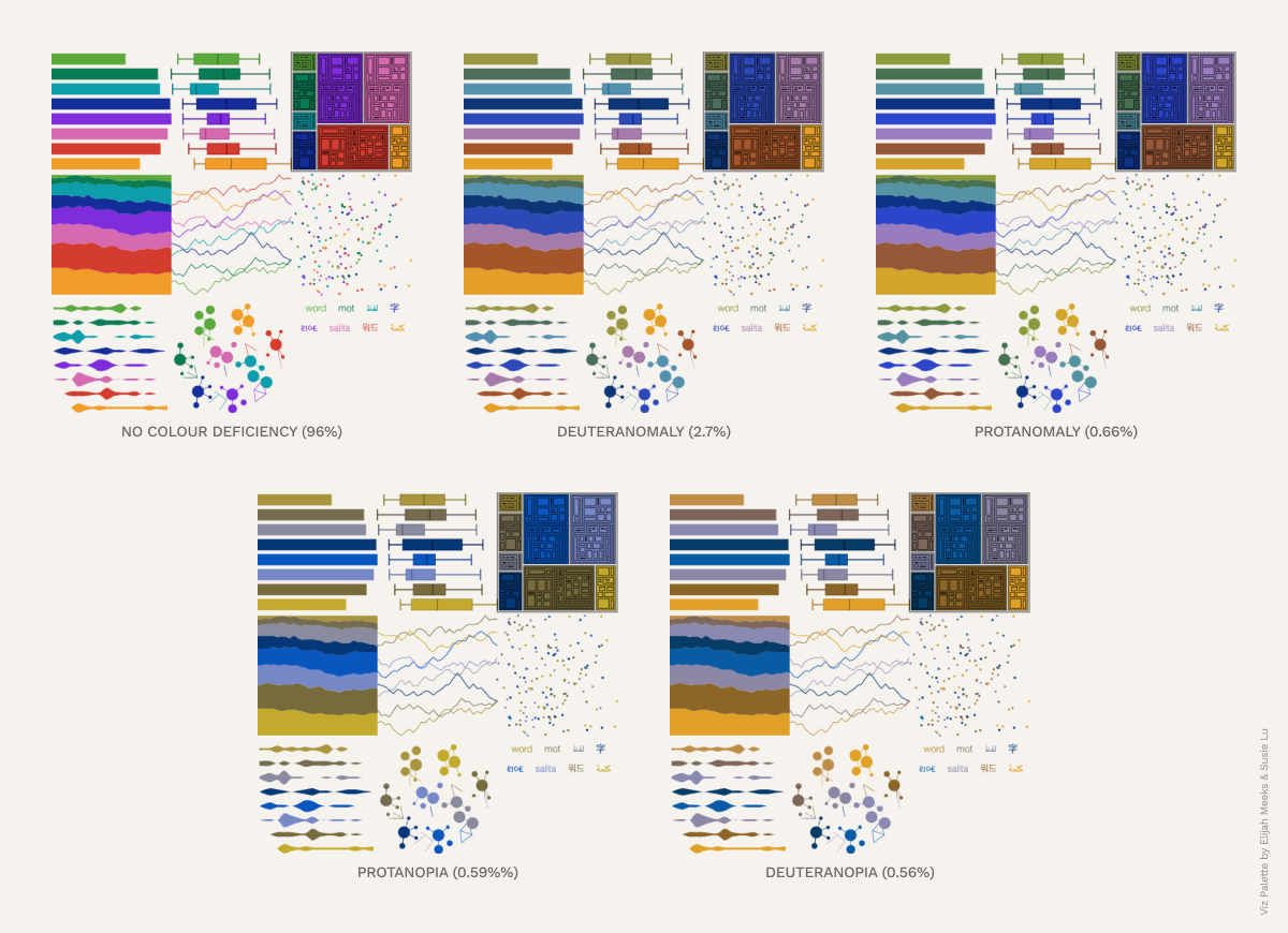
Testing our color sample for color blindness
Once we had a solid base, we tested our colors on Viz Palette, a tool created by Susie Lu and Elijah Meeks, to see how visible they were to those with color blindness.
We then tweaked them a bit until we obtained a full pass and a satisfying result with regard to color blindness and an almost full pass for deuteranomaly and protanomaly. It was a bit more tricky with protanopia and deuteranopia because it was very hard to achieve full accessibility without impacting on the consonance of the colors.
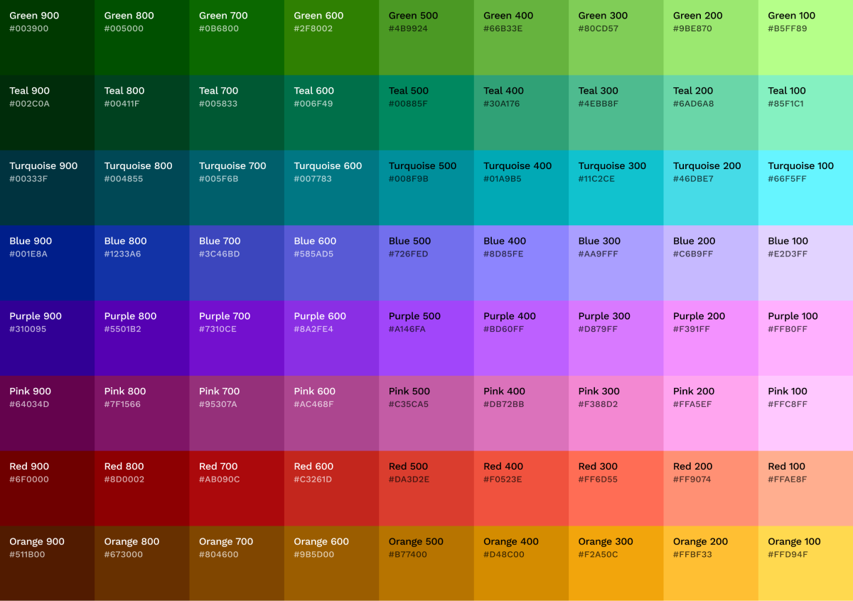
Creating full spectrum and sequential adaptation
To craft more shades and adapt to sequential data, we used the Chroma.js Color Palette Helper. It helped us decline a total of 8 additional hues from our starting point, adding a range below (darker), above (lighter), and in between.
Checking the contrast ratio
In addition to a color deficiency check, our colors were submitted to a contrast ratio check, following the Web Content Accessibility Guidelines (WCAG), which are a series of recommendations for making the web more accessible.
Regarding colors, the standards define two levels of contrast ratio: AA (minimum contrast) and AAA (enhanced contrast). Level AA requires a contrast ratio of at least 4.5:1 for normal text and 3:1 for large text (at least 18pt) or bold text. Level AAA requires a contrast ratio of at least 7:1 for normal text and 4.5:1 for large or bold text.
The rule of thumb was to pass a contrast ratio of 3:1, which can be checked on websites such as Coolors or WebAIM.
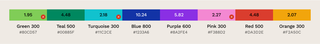
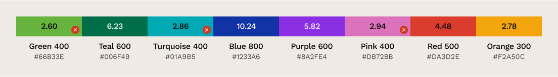
Our light theme
This is the original pick we made, with 4 colors below the 3:1 ratio:
By going down the hues on the spectrum, we were able to attain a 3:1 ratio, but it had such an impact that it was bound to fail color deficiency evaluations as well as the overall scale of harmony. It’s hard work to make sure the red/orange/yellow area avoids becoming a puddle of contrasted browns.
As a personal choice and conviction, we backtracked to maintain balance because the goal was not to entirely disrupt our branding. At most what we could do was aim to retain the harmony and reach as close as we could on the spectrum. So we went down the hues of green, blue, pink and yellow, trying to reach that sweet spot of 3:1 while maintaining the harmony.
Our dark theme
As for dark theming, what we established for our light theme works but can be a bit too bright, so we went a bit further down the spectrum with the aim of maintaining a good contrast ratio.
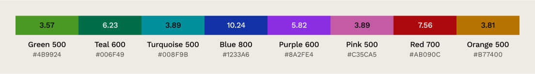
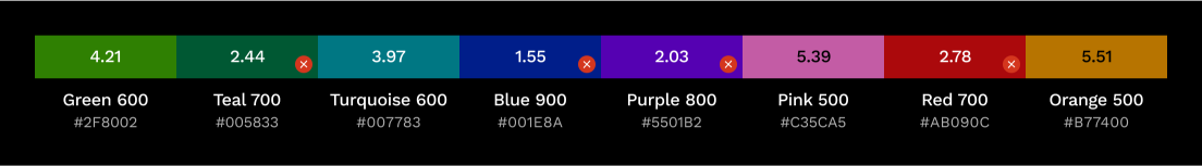
So here is the original light theme palette with the contrast ratios. They all pass except the blue.
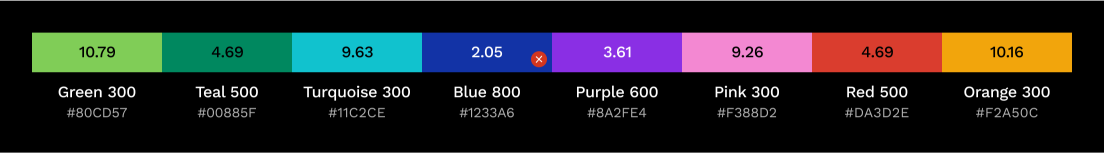
Fixing the blue meant trying to lighten it while still maintaining a correct contrast with the purple… 700 was the only option.
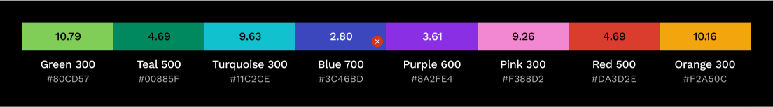
Then we just fixed the colors one hue down to achieve a better match for our dark theme.
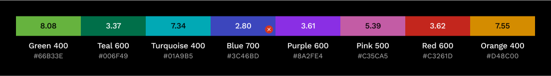
Then as a proof of concept (POC) we went further down with some hues for our dark theme but 4 colors failed the contrast ratio.
We were able to go down even further for a better contrast for our dark theme but ironically we would have failed the contrast ratio checks.

Conclusion
After all those steps, we ended up with a brand new accessible color palette that is currently fully operational for data visualization purposes. But that outcome could not have been achieved without some compromises: Choices had to be made to make sure the branding of the company was respected without the accessibility aspects being neglected. Finding the right balance between those two priorities was certainly the most difficult thing to do. But that is also what makes this color palette efficient for our usage at Welcome to the Jungle.
Written by Jade Mihami, Lead product designer @ WTTJ
Edited by Anne-Laure Civeyrac
Illustration by Gosia Herba
Recommend
About Joyk
Aggregate valuable and interesting links.
Joyk means Joy of geeK