

Building and Sharing React SVG Icon Components
source link: https://blog.bitsrc.io/building-and-sharing-react-svg-icon-components-6e6a8f1dcd6d
Go to the source link to view the article. You can view the picture content, updated content and better typesetting reading experience. If the link is broken, please click the button below to view the snapshot at that time.
Building and Sharing React SVG Icon Components
Create scalable, testable, sharable, and independent SVG React components using Bit

All modern-day applications use image assets.
For example, an application may have a logo that uses one image in various colors and dimensions in several places. In such cases, developers isolate the logo in a separate component and provide customizations to its properties. This situation increases its reusability and customizability.
But, sharing these components across projects is cumbersome. It causes problems such as the following.
- Developers must maintain copies of the component across multiple repositories (projects).
- It is difficult to make changes in numerous places. If one place does not get changed, it causes UI inconsistencies.
However, Independent Components are used to solve the problems discussed above that developers encounter when developing icon components and revolutionize that way of building projects.
Therefore, this article will explore independent components and how developers can leverage Bit to implement and share independent React SVG Icon components.
Independent Components
A component is nothing but a file with varying complexity that serves a single purpose. It can be a React, Angular component, or even a Node.js Module (or anything).
An independent component is a type of component developed, collaborated, and versioned independently. For example, users can develop part of the application without starting up the entire application.
This state introduces a genuinely modularized approach to developing web applications as developers can create components independently and share them across multiple projects without duplicating a single code.
Because of this, independent components add more robustness to applications.
Why use Independent Components to develop SVG Icon Components?
When building SVG icons, one version of the icon is typically used across the application regardless of the platform. For example, you may have a React and a React Native version of the sample application that uses the same SVG assets but with different variations. In cases like this, using plain old components will not help you as you will have to replicate each icon for every project to use it.
For such cases, creating shareable independent components is the best option.
Building an Independent SVG Icon with Bit
Bit is a free, open-source tool that allows you to efficiently build and share independent components across multiple projects.
Let us build an independent and shareable React SVG icon with Bit.
Pre-Requisites
To get started:
- Create a free account on Bit Cloud. We will use this later to export the SVG icon.
- Install Node.js. Make sure to install the latest version.
- Install the Bit CLI using the command
npx @teambit/bvm install
Execute the command bit -v to confirm your installation.

Figure 01: Successfully installing the Bit CLI
Creating a new Bit Workspace
After installing the Bit CLI, a new Bit workspace is needed to create, test, and share independent components.
Run the following command to initialize a Bit workspace with a React template.
bit new react first-workspace
You should see the output as shown below.
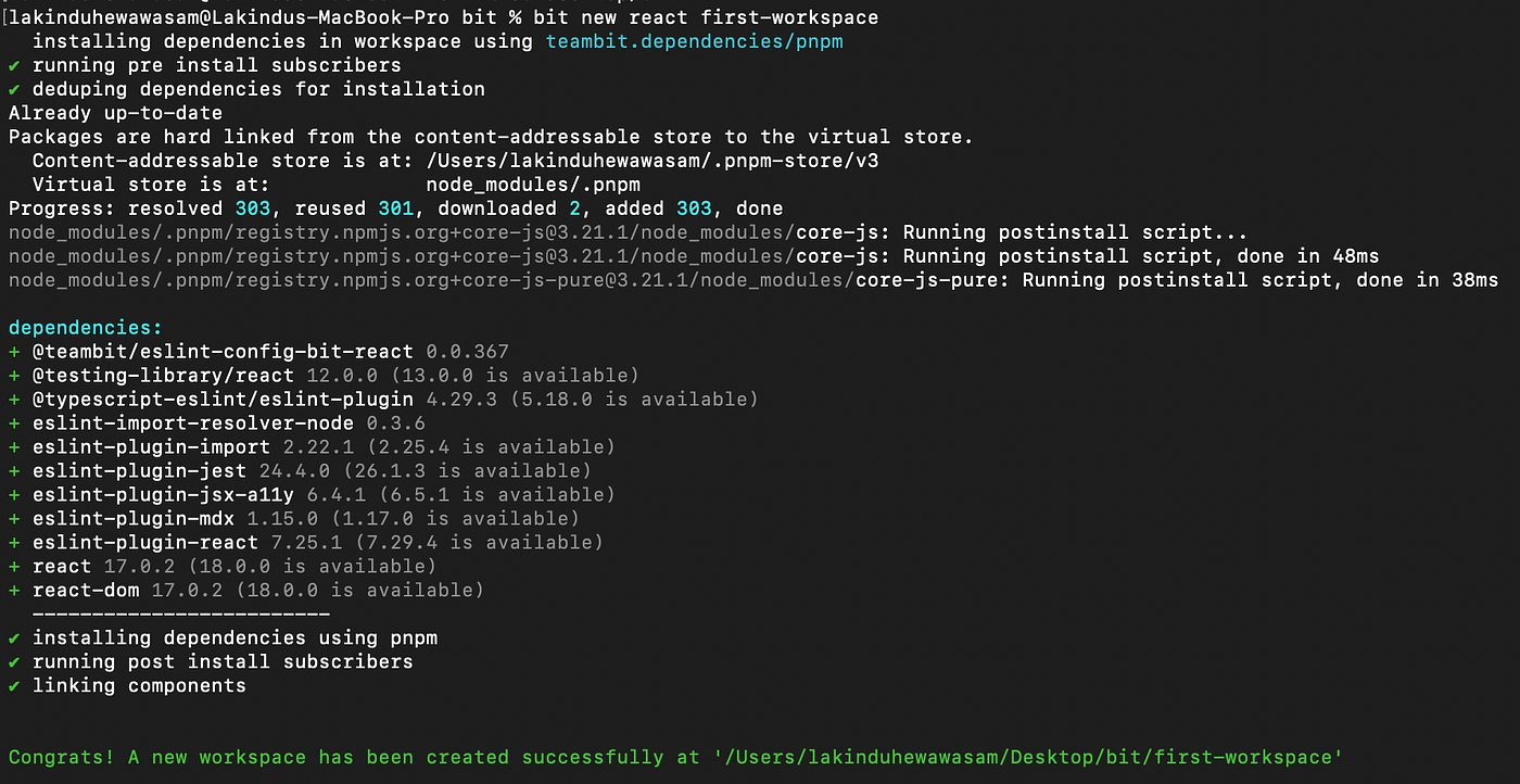
Figure 02 — Creating a new Bit workspace
Afterward, navigate to the newly created workspace and run the command bit start to launch the development (UI) server.
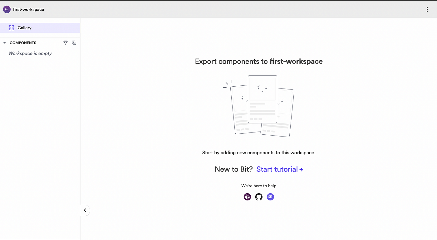
Figure 03 — Expected output after launching the development server
Creating a new Component in Bit
After you’ve successfully configured the Bit Workspace, you can proceed and start developing an SVG icon as an independent component.
Luckily, the Bit CLI has a built-in command that can help us generate a boilerplate React component.
Let’s run the command bit create react ui/app-logo. This command will create a component named "app-logo." Your file directory should look as shown below.
.
├── README.md
├── first-workspace // this can change based on the scope name
│   └── ui
│       └── app-logo // independent component
│           ├── index.ts
│           ├── app-logo.composition.tsx
│           ├── app-logo.docs.mdx
│           ├── app-logo.spec.tsx
│           └── app-logo.tsx
├── pnpm-lock.yaml
├── tsconfig.json
├── types
│   ├── asset.d.ts
│   └── style.d.ts
└── workspace.jsonc
Component Independence with Bit
Before developing, it is crucial to understand component independence in Bit. This can be done by observing the four crucial files the Bit CLI generated.
- Boilerplate Component (
***.tsx**): Helps create the component - Component Documentation (
***.mdx**): Helps document the component - Test File (
***.spec.tsx**): Helps run unit tests for the component - Possible component variations (
***.composition.tsx**): Helps declare possible compositions of the component.
Every component created using Bit generates these files within a specific directory (named after the component). These four files help users create, document, and test the component independently.
Developing the sample SVG Icon Component
To get started, navigate to the app-logo.tsx. Open the file and add the code shown below.
import React, { FC } from 'react';export type AppLogoProps = {
  width?: number;
  height?: number;
  fill?: string;
  characterWidth?: number;
  characterHeight?: number;
};export const AppLogo: FC<AppLogoProps> = (props) => {
  const { width, height, fill, characterWidth, characterHeight } = props;
  return (
    <svg
       width={width}
       height={height}
    >
       <rect
          id='fill-rectangle'
          width={characterWidth}
          fill={fill}
          height={characterHeight}
        />
        <g>
          <path
             fill="rgb(100%, 100%, 100%)"
             d="M 183.070312 86.304688 L 89.394531 74.394531 L 74.585938 72.402344 L 183.070312 58.277344 Z M 31.773438 206.289062 L 159.992188 253.820312 L 159.992188 270.769531 L 31.773438 223.390625 Z M 31.773438 192.753906 L 31.773438 175.777344 L 159.992188 223.390625 L 159.992188 240.367188 Z M 31.773438 162.351562 L 31.773438 145.375 L 159.992188 192.738281 L 159.992188 209.6875 Z M 31.773438 131.769531 L 31.773438 114.695312 L 159.992188 162.339844 L 159.992188 179.285156 Z M 31.773438 236.886719 L 159.992188 284.207031 L 159.992188 301.152344 L 31.773438 253.804688 Z M 159.992188 148.871094 L 31.773438 101.242188 L 31.773438 81.597656 L 159.992188 128.976562 Z M 31.773438 287.546875 L 31.773438 267.242188 L 159.992188 314.902344 L 159.992188 335.207031 Z M 199.898438 308.105469 L 172.859375 304.582031 L 172.859375 124.664062 C 172.828125 124.035156 172.714844 123.417969 172.515625 122.816406 C 172.320312 122.21875 172.042969 121.652344 171.695312 121.128906 C 171.34375 120.601562 170.933594 120.128906 170.453125 119.714844 C 169.976562 119.300781 169.453125 118.957031 168.882812 118.683594 L 79.828125 85.882812 L 84.390625 86.375 L 199.898438 101.339844 Z M 199.898438 308.105469"
           />
         </g>
         <g
            fill="rgb(100%, 100%, 100%)"
            fillOpacity="1"
         >
           <g transform="translate(139.384947, 327.1721)">
           <g>
             <path
               d="M 212.976562 0 L 212.3125 -229.617188 L 184.359375 -229.617188 L 184.359375 -114.808594 C 184.359375 -87.855469 184.691406 -54.910156 185.359375 -27.953125 L 77.203125 -229.617188 L 33.277344 -229.617188 L 33.277344 0 L 61.898438 0 L 61.898438 -114.808594 C 61.898438 -141.765625 61.5625 -174.707031 60.898438 -201.664062 L 169.050781 0 Z M 212.976562 0 "
             />
           </g>
         </g>
      </g>
     </svg>
  );
}AppLogo.defaultProps = {
  width: 512,
  height: 512,
  fill: 'rgb(98.429871%, 81.959534%, 37.649536%)',
  characterWidth: 512,
  characterHeight: 512
}
The snippet above creates an independent, re-usable, and customizable application logo component. This is the basic building block that consumers customize based on their requirements.
Viewing the Sample SVG Icon
We can define compositions in the app-logo.compositions.tsx file to observe the component in use. When declaring compositions, always try to list the possible variations of the component. For example, let us try to add the possible composition for the SVG icon component by adding the code shown below to the composition file.
import React from 'react';
import { AppLogo } from './app-logo';export const BasicAppLogo = () => {
  return (
    <AppLogo />
  );
}export const MiniApplicationLogo = () => {
  return (
    <AppLogo width={380} height={360} characterHeight={400} characterWidth={400}
    />
  )
}export const BlackApplicationLogo = () => {
  return (
    <AppLogo fill='black' width={380} height={360} characterHeight={400} characterWidth={400}
    />
  )
}
After adding the compositions, save all the changes, and visit http://localhost:3000 to view the Bit Workspace. You should see the SVG icon component and the defined compositions added to the local workspace.
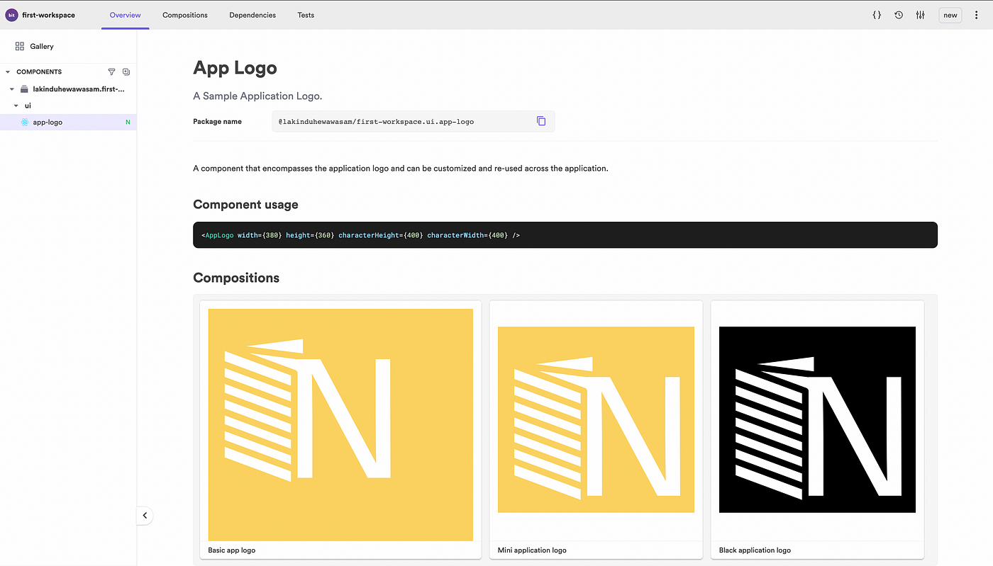
Figure 04 — Observing the compositions of the SVG Icon
Unit Testing the SVG
Usually, a component gets tested when it gets deployed in the application. Therefore, many components only get tested during QA or late stage.
But with Bit, you can write your test tasks for the desired composition to ensure that the component is bug-free when others consume it.
To define a test task, navigate to the app-logo.spec.ts and add the code shown below.
import React from 'react';
import { render } from '@testing-library/react';
import { BasicAppLogo } from './app-logo.composition';it('should render BasicAppLogo with the default fill color', () => {
  const { container } = render(<BasicAppLogo />);
  const el = container.querySelector('#fill-rectangle');
  const fillColor = el.attributes.getNamedItem('fill').value;
  expect(fillColor).toBe('rgb(98.429871%, 81.959534%, 37.649536%)');
});
The test task defined above renders the BasicAppLogo composition and checks if the fill color on the element with the ID — ‘fill-rectangle’ is “rgb(98.429871%, 81.959534%, 37.649536%)”. The element with the ID “fill-rectangle” was previously defined in the SVG Icon Component.
To execute the test in Bit, run bit test.
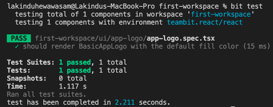
Figure 05 — Testing the Independent Component
Exporting the Component
After developing and testing the component, it can be exported to a remote scope for other developers to collaborate and consume.
However, before exporting, we would have to tag the component version. Bit allows you to tag individual versions per component and ensure complete independence is present per component.
- Run
bit tag --allto tag the SVG Icon component.
Afterward, you can export the component to a remote scope by running the command bit export. Before you export:
- Make sure to log in to Bit Cloud using the command
bit login. - Make sure to create a remote scope with the same name as the local scope.
After exporting, you can access Bit Cloud and view the exported SVG icon.
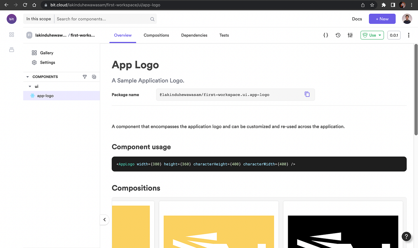
Figure 06: Exporting the components on Bit Cloud
Using the SVG Icon Component in a Project
After successfully developing and sharing the SVG component to a remote scope, other developers can start collaborating and consuming your SVG icon.
Let us create a sample React application using npx create-react-app test-react-app --template typescript to demonstrate the independent SVG Icon component's usage.
After creating the sample application, execute the command shown below to add the Bit component to the application.
npm i @lakinduhewawasam/first-workspace.ui.app-logo
Then, navigate to App.js and add the code shown below.
import './App.css';
import { AppLogo } from '@lakinduhewawasam/first-workspace.ui.app-logo';function App() {
  return (
    <div className="App">
      <header className="App-header">
        <AppLogo
            width={375}
            height={800}characterHeight={400}
        />
       <header>
    </div>
  );
}export default App;
The snippet shown above consumes the independent SVG component that we developed earlier. As a result, it generates the output shown below.
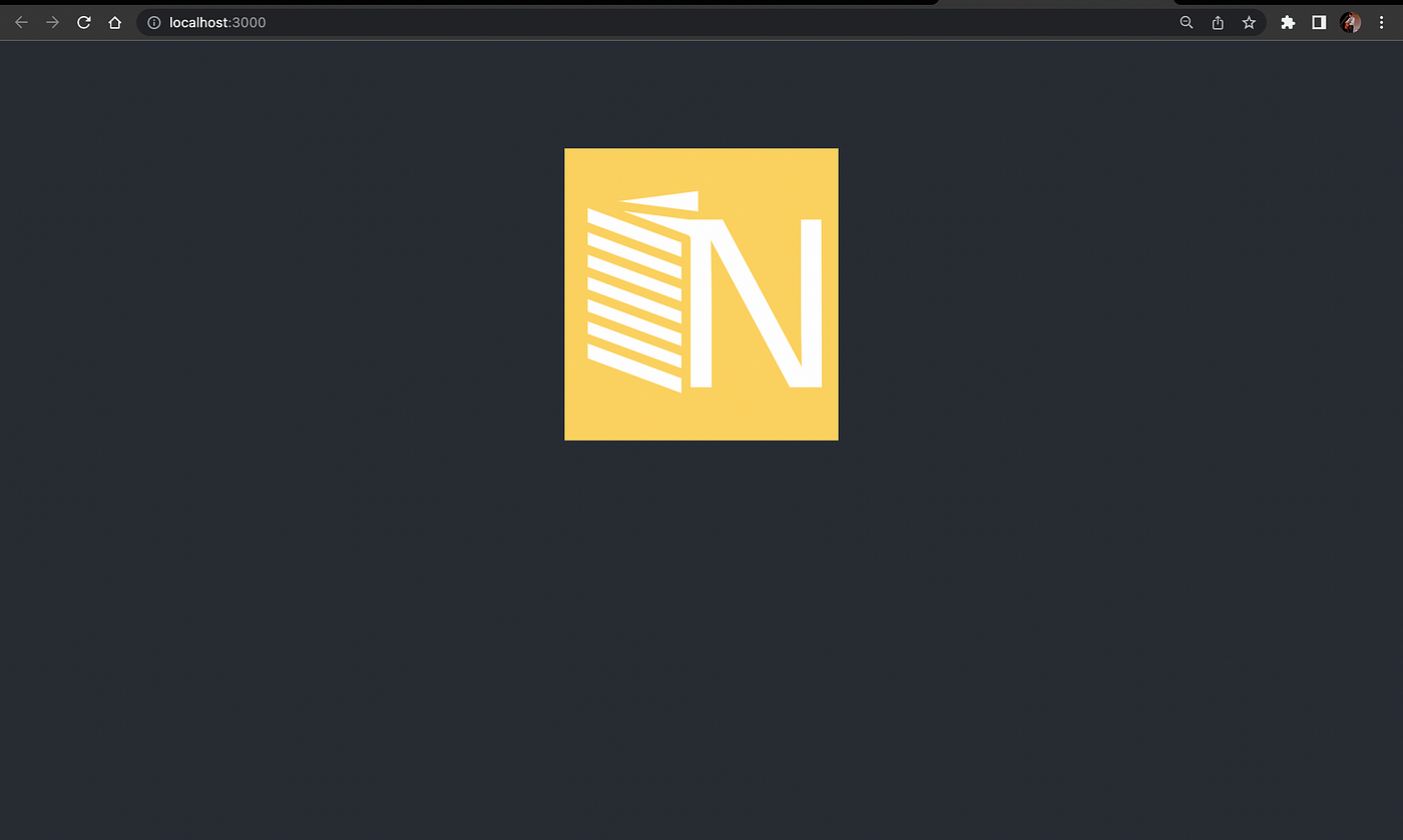
Figure 07: Observing the SVG in a Real-World Application
And that is how you can create an independent component and share it using Bit.
Recommend
About Joyk
Aggregate valuable and interesting links.
Joyk means Joy of geeK