

Structuring information: Learnings from creating slides and presentations
source link: https://uxdesign.cc/structuring-information-learnings-from-creating-slides-and-presentations-7653a93bded6
Go to the source link to view the article. You can view the picture content, updated content and better typesetting reading experience. If the link is broken, please click the button below to view the snapshot at that time.
Structuring information: Learnings from creating slides and presentations
How to structure information for understanding and impact
A big part of any professional job is effective communication. Being able to successfully convey information the way we intend it to not only minimizes any potential confusion or misunderstanding, but also lets us build rapport with the people that we are trying to engage.
As a design researcher and strategist, a big part of my work involves facilitating workshops, communicating with stakeholders and executive management, and sharing back information through the form of meetings and presentations. Oftentimes, these meetings are intended to get buy-in on an idea or a concept and, as such, it is essential that my audience is able to grasp information with as little effort as possible.
A key tool in these stakeholder engagements and meetings are presentations. Yes — I am talking about those slides that we spend days and weeks preparing to ensure understanding of all essential information. Some consider these presentations as just that — a document that supports the oral presentation and narration. However, these slides hold a certain level of impact in them too, especially when this presentation is taken as a deliverable to document work progress or as an artifact that will be kept by members of the team who are both within and outside that specific meeting. Ensuring understanding is key and the way we structure information in these slides go a long way.
Below are some guidelines that I’ve developed and still follow when structuring information in these presentations.
Segregating information
When thinking about the information that I want to share in a presentation, I would ask myself about the goal of the meeting or engagement, as well as the decisions that have to be made within it and after. This will then guide the goal and purpose of the presentation.
However, another important criteria that I use is identifying whether a type of information is something that needs to be shared right in that specific engagement: “Is this a today information or a next [week/month/phase] information?”
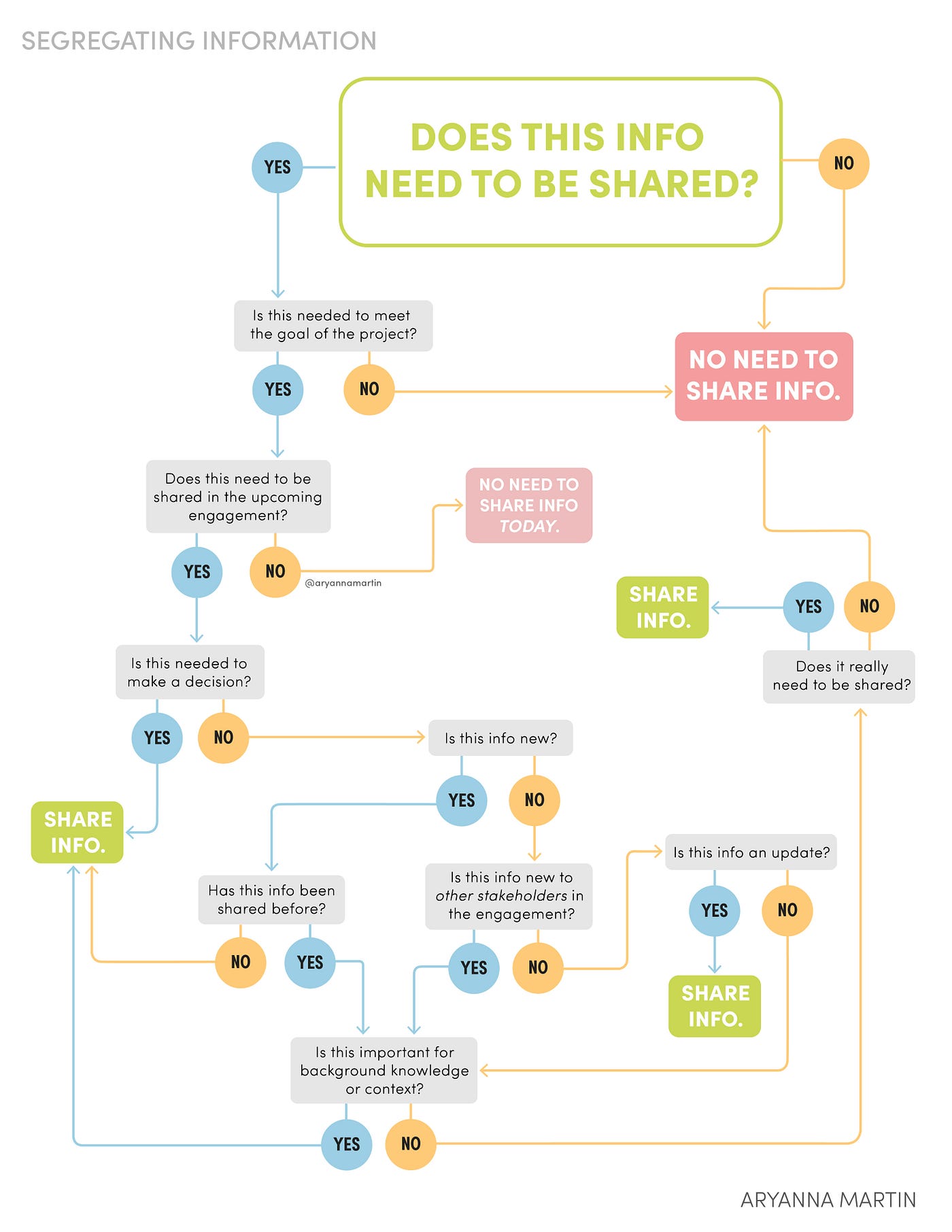
A Yes-No Diagram that can guide decision-making on whether a piece of information needs to be shared
To take it even a step further, I would also determine whether the information is also something that needs to be shared, whether it’s new information, an update, or just something that is necessary for context or background knowledge.
Segregating information will help the stakeholders in the call to not be distracted by information that is not relevant at the moment so that they can focus on information that matters.
Organizing information based on flow of thought and impact
It’s considered not a good practice for slides to have long paragraphs of text. Hence, information often comes in smaller amounts through phrases, short sentences, or bullets to allow the audience to easily grasp the information. However, even the way we organize these bullets or phrases can have an impact on comprehension.
Clustering similar or related information together
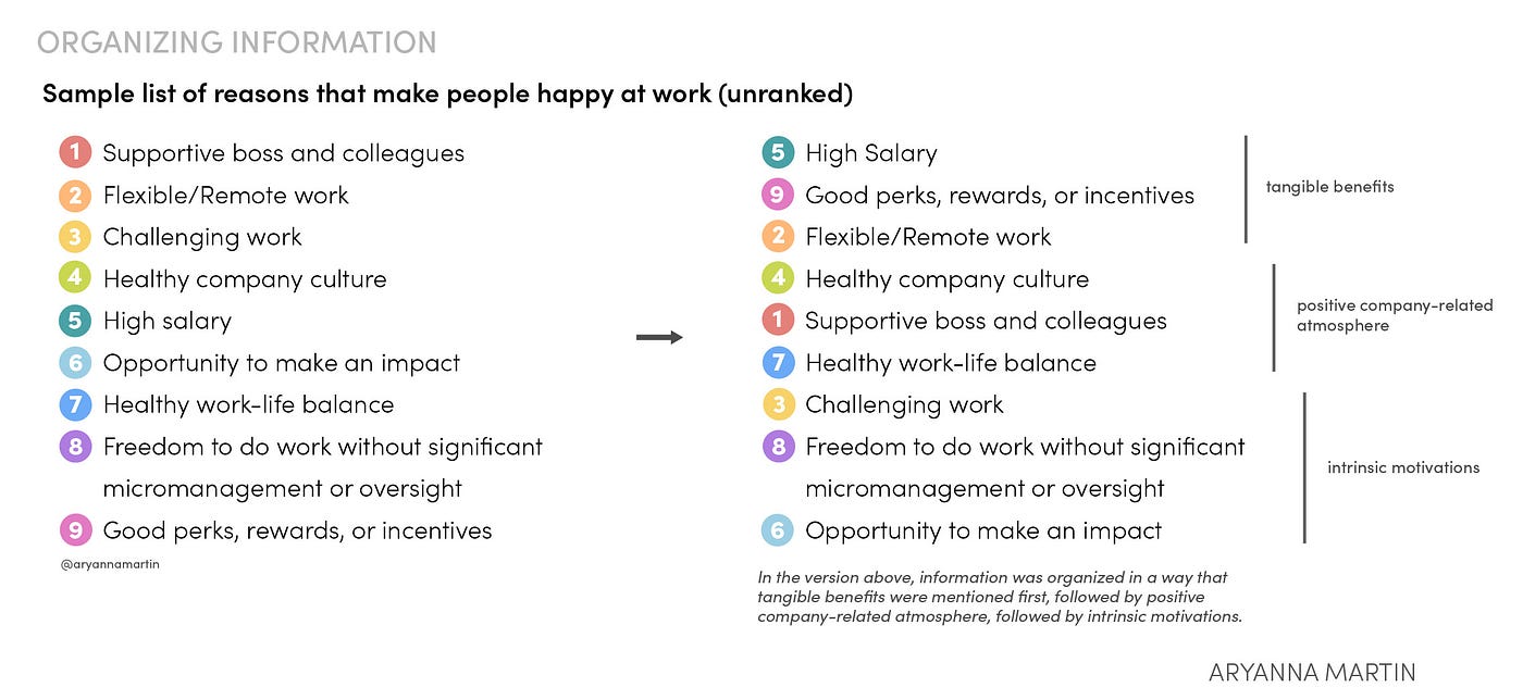
Clustering similar or related information together feeds into the Category principle from Richard Saul Wurman’s LATCH Principles in his book Information Anxiety. Pieces of information that are similar or related to each other should be positioned closely together. Having them in disarray causes disruption of flow of thought and bars comprehension.
I also like to organize information based on its uniqueness and impact. I tend to put information that is somewhat expected or considered almost common knowledge at the beginning while information that is quite unique is placed towards the end. This helps to slowly ease the audience into the information, leaving those that may elicit questions and clarifications towards the end.
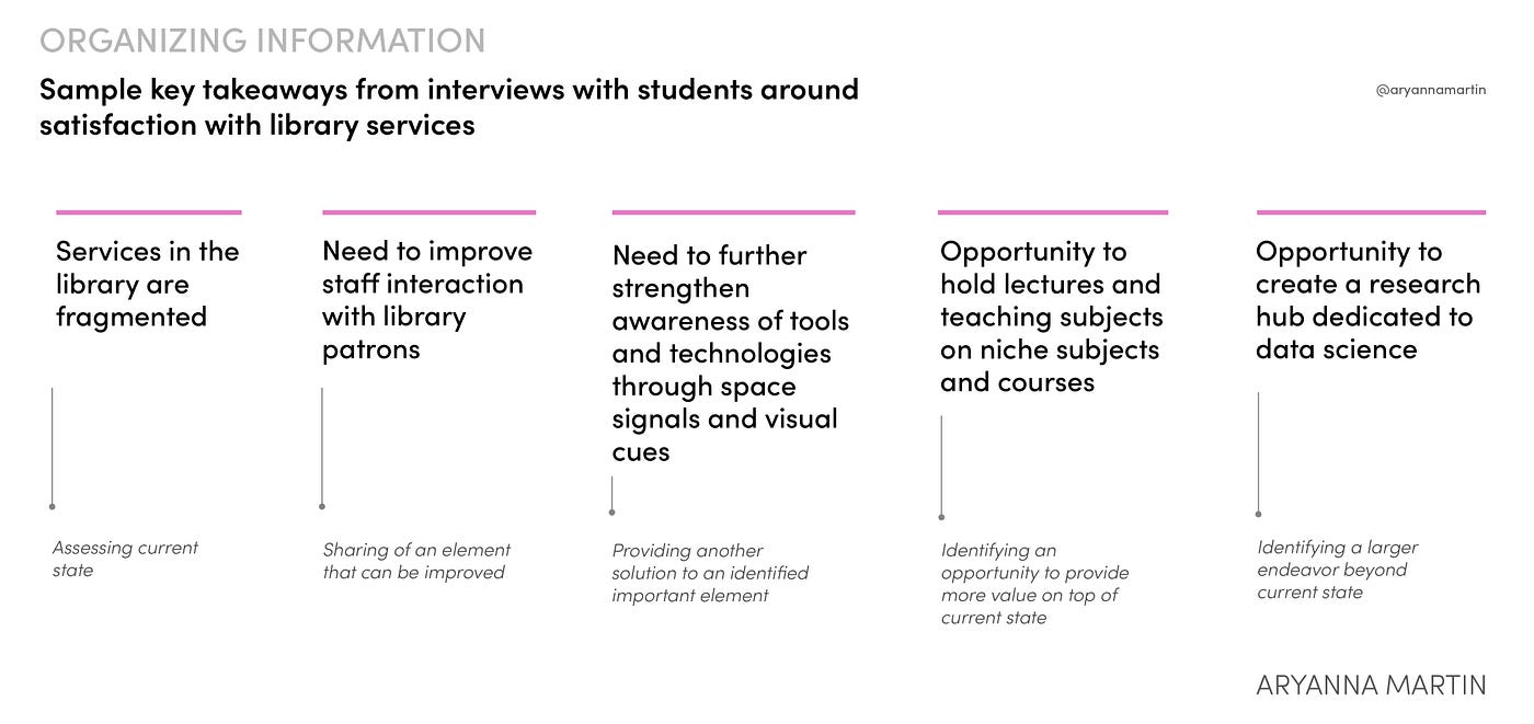
Putting information with stronger impact towards the end
Thinking and distilling information in multiple levels
One of the things that can cause confusion is when pieces of information that actually are from multiple levels are presented as if they belong to a specific level. There were several times in the past when my colleagues and I would spend a long time discussing a specific topic, with each person striving to prove a point, only to realize that we have been talking about the same approach, only that we’re tackling the topic from multiple levels. This refers to Richard Saul Wurman’s Hierarchy principle in his book Information Anxiety.
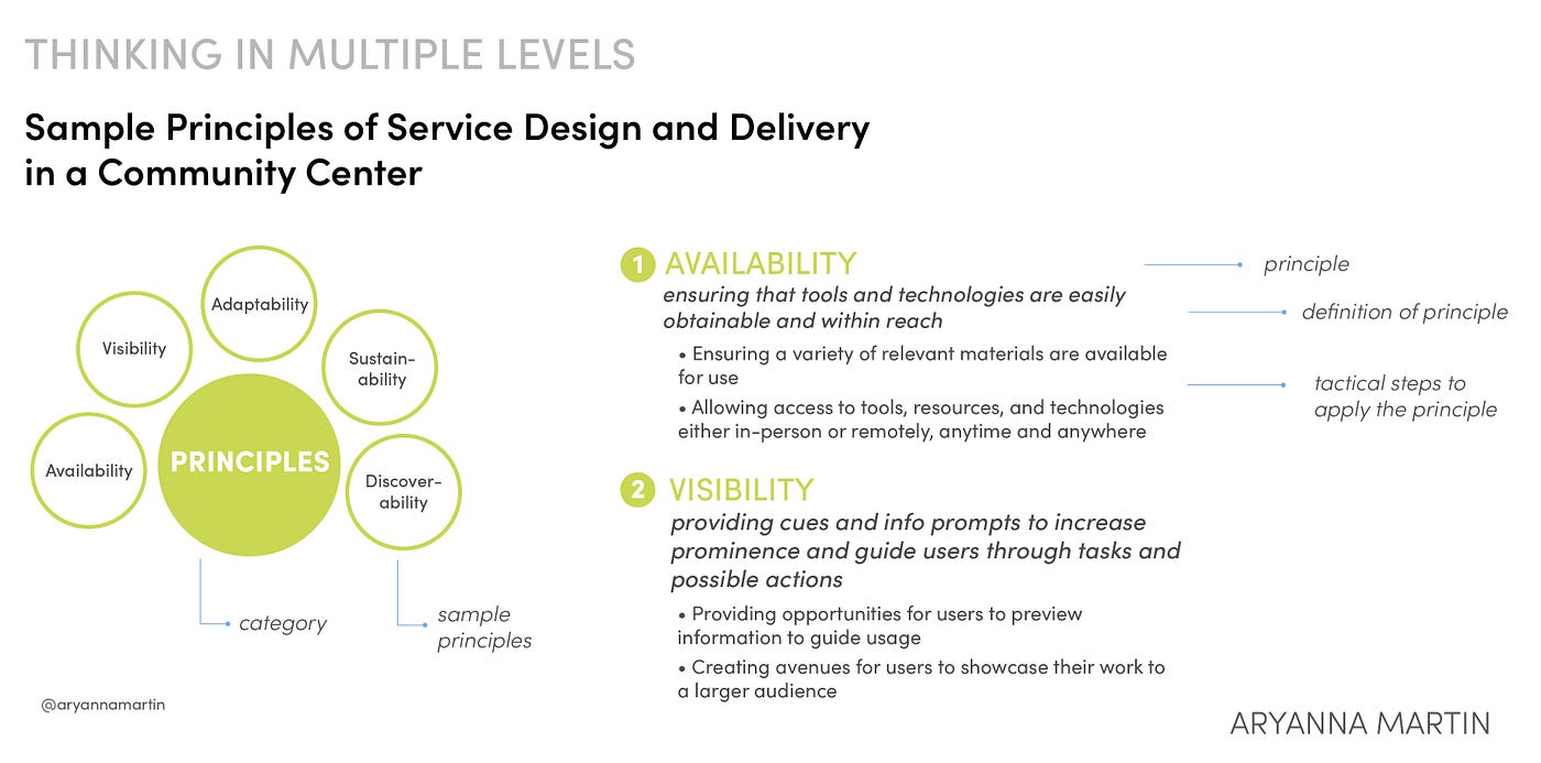
Example of how information varies in hierarchy
Another way to distill information in multiple levels is thinking about them theoretically, conceptually, and operationally. Oftentimes, terminologies from different levels get mixed up. Ayad Jabbar showcases this in a table showing conceptual and operational definitions of critical thinking skills.
Being able to identify at which level a type of information belongs is critical as it shows expansive thinking and also reduces confusion. It sheds light on the taxonomical structure of thought and can pave way for targeted recommendations and feedback.
Ensuring parallelism and consistency of words
Parallelism and consistency have always been key principles in terms of design but these two provides the same benefits when it comes to choosing words and phrasing information. Trent University details the importance of this principle in writing. There is nothing more helpful for the audience than structuring words and phrases the same way for easier processing and better understanding.
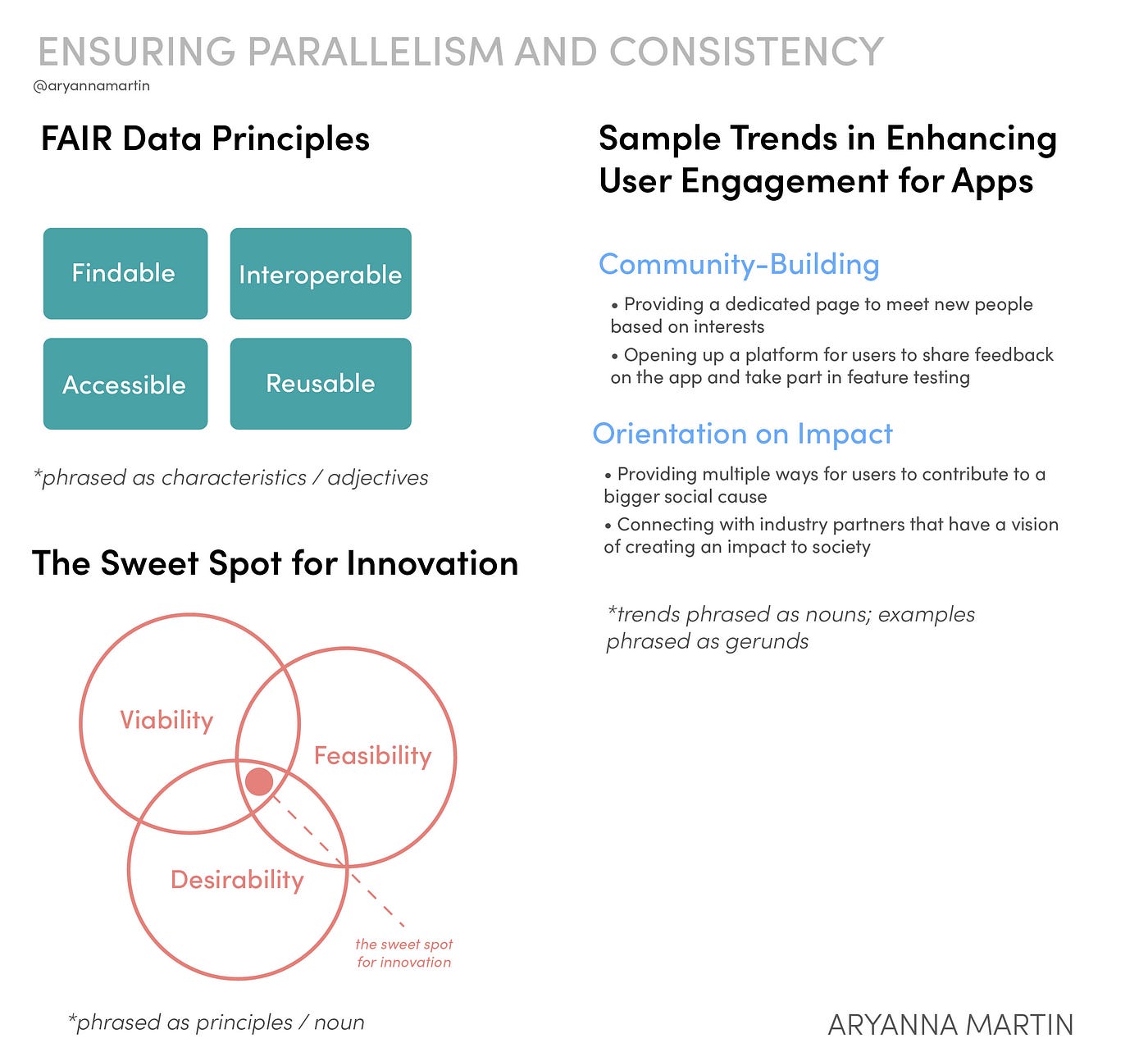
Parallelism and Consistency, as observed in examples including the FAIR Data Principles and the Three Lenses of Innovation by IDEO
Finding the right word amongst a sea of words with almost similar meanings
A colleague once told me that when structuring content in presentations, thesaurus is our best friend. At the time, I did not completely understand what she meant. In my head, I was thinking: “Surely, I wouldn’t need to check the thesaurus — I can just use the first word that comes into my mind.” Soon enough, I realized that even if words may seem somewhat similar, they can evoke different meanings.
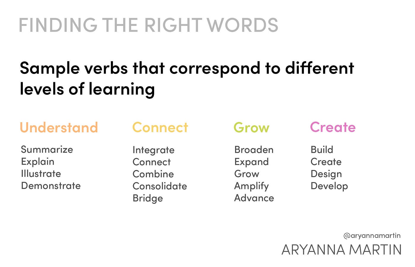
Adapted from Bloom’s Taxonomy Verb Chart made by the University of Arkansas
Even psychology suggests the importance of finding the right words for emotions to help people grapple with them.
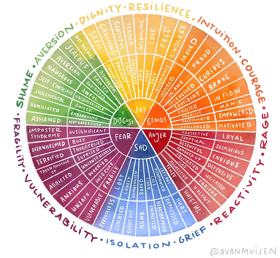
Adaptation of the Emotion Wheel created by Dr. Robert Plutchik. Art by Abby Vanmuijen.
When framing information and content, we should be intentional with the words that we use and understand that being sloppy in language can often hinder us from communicating the point we want to make.
Using softer or stronger words
As a subconcept of the principle above, some words tend to hold a certain weight and impact in them.
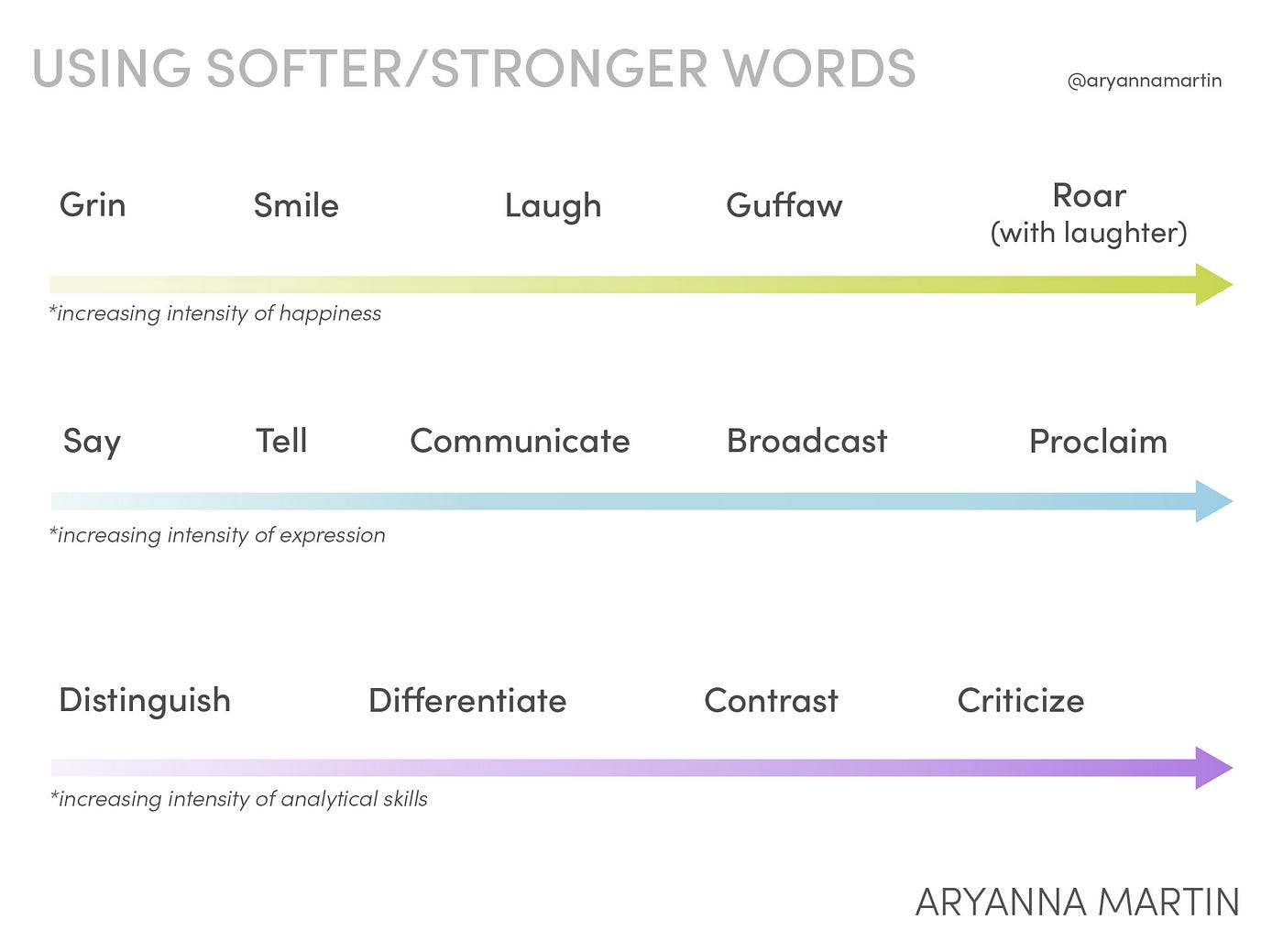
Example words increasing in intensity
Choosing the word that best reflects the context of the idea is essential in evoking the feeling that we need to elicit with the information that we are presenting.
Determining the valence of words and phrases
Another iteration of finding the right word is determining the valence of words and phrases.
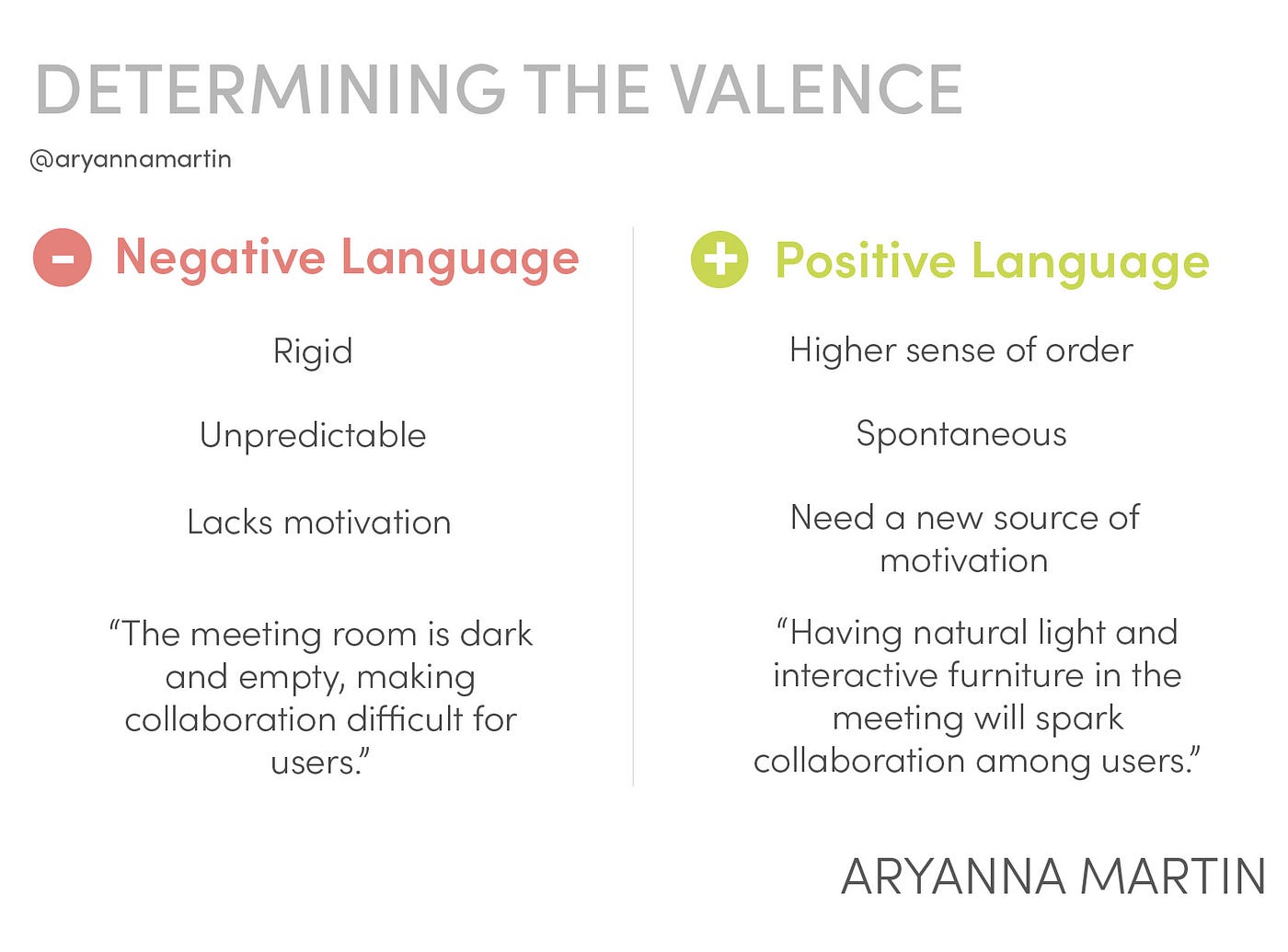
Difference between negative and positive language
When framing information and content, we need to understand whether it should be framed positively or negatively, which again depends on the overall intention of a presentation. Then, we can carefully choose words to fit the framing that we are aiming for. NYU also details some strategies on how to turn negative language into positive communication.
Recommend
About Joyk
Aggregate valuable and interesting links.
Joyk means Joy of geeK