

How can your UI designs stand out through typography?
source link: https://uxdesign.cc/how-can-your-ui-designs-stand-out-through-typography-f5a8c62fe444
Go to the source link to view the article. You can view the picture content, updated content and better typesetting reading experience. If the link is broken, please click the button below to view the snapshot at that time.
How can your UI designs stand out through typography?
Would you be able to design a successful user interface using only typography?
The purpose of this blog post is to share 10 important principles concerning typography usage in interface design.
Not only can typography be a great asset to make your UI designs appealing and attractive, but it can also make them stand out in terms of consistency, clarity, efficiency, and usability.
Some user interfaces can dramatically fail to deliver their content due to the poor use of typography. Hence, it is of the utmost importance for designers to know how to manage type, and to cope with it exquisitely. The lack of this skill will inevitably trigger bad digital products no matter what. So, let’s dive in:
1. Define a typographic hierarchy (and stick to it!)
This is crucial to the way one perceives content. Therefore:
- Make the hierarchy broad enough to cover headings (from h1 to h6), paragraphs (regular and bold), small text and button text. It should be as comprehensive as you’d like it to be, but I dare say that text styles other than those are scarcely necessary in most cases.
- Do not mix more than 2 different fonts because it can give a sense of inconsistency. Indeed, just one font can be quite enough.
- Ensure that a single style does not have too much text decoration. I mean, why have a text style that is simultaneously bold, italic, underlined and upper case?
- Stick to this hierarchy when designing your layouts. Avoid as much as possible creating new text styles every time you design a new page, since the sole purpose of creating a hierarchy is to reuse the styles you’ve previously created in order to maintain consistency throughout all pages.
Hint: you can use type scale to test sizes and fonts before creating your final text styles.
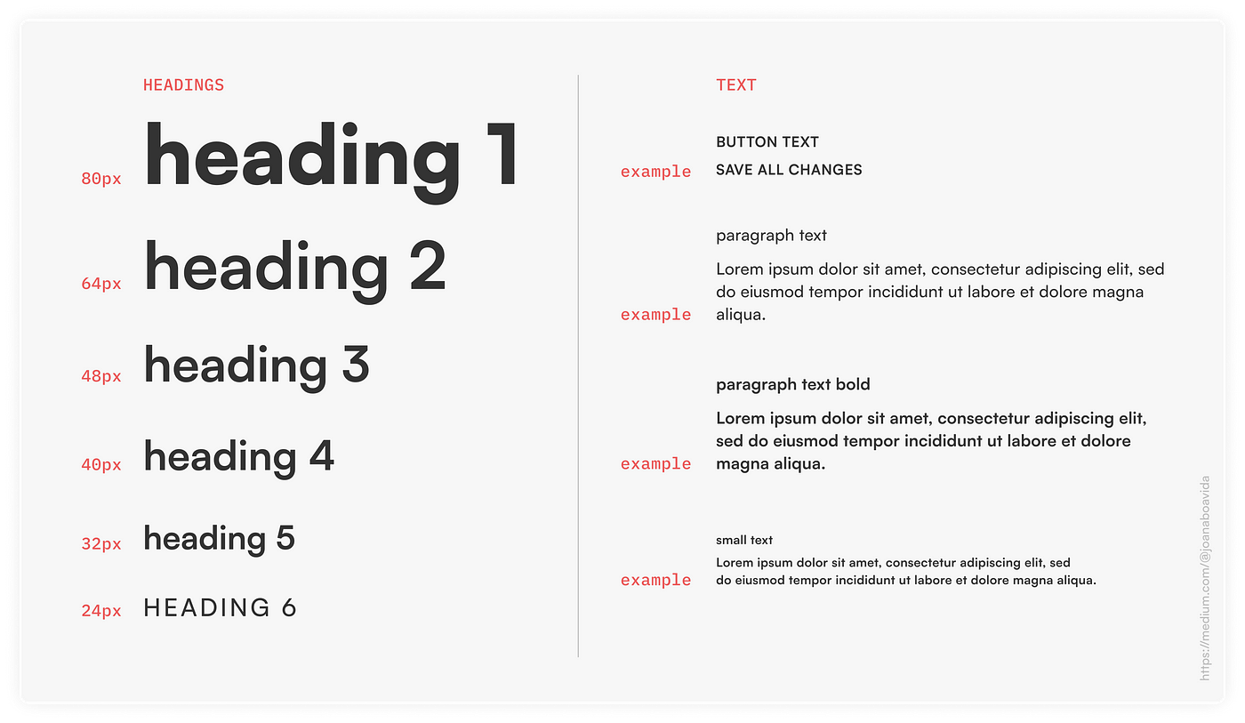
An example of a solid hierarchy
2. Attention to detail
Summon your inner perfectionist and be aware that:
- Before starting the UI itself, some optimal adjustments may be necessary regarding kerning and tracking. Typically, there is the need to increase the tracking a bit in small text styles for better readability. Contrarily, in headings you may want to decrease the tracking to reduce white space between letters.
- When you’re designing the pages, it’s important to look at letters both individually and as a whole. Letters together form shapes, and this somewhat influences the final composition.
- The interface you design may very well stand out if you do have attention to detail. Users with little typographic know-how probably won’t notice your decisions but they will intuitively know that the interface was designed for them.
3. Size and boldness matter
When endeavouring to design an eye-catching interface, size and boldness play an essential role to accomplish this.
- Sans-serif fonts can be far more useful than the serif ones when striving for boldness because of their number of weights, which can vary from thin to extra-black.
- You can use variable fonts and exploit their weights, thickness, and widths. By the way, Figma now supports variable fonts! See more in the Bonus section at the end of this article. 😎
“By making itself evident, typography can illuminate the construction and identity of a page, screen, place or product.” — Ellen Lupton (designer, writer and curator)
An example I designed just to show you that size and boldness truly matter
4. Grids, grids & grids
You can’t manage type unless you use grids, so text should always be placed in a column grid. Note that:
- Grids are not intended to be inflexible. The whole point of sticking to grids is to give you freedom when dealing with content and text.

4 different layouts using the same 12-column-grid
5. Alignment
In western countries, the most natural way to align text is by using left alignment because we read from left to right. As such, try to:
- Always avoid right alignment.
- Be careful with centred and justified text.
6. Text column width
The quality of the user experience may substantially decrease if the column width is either too small or too big. This can cause fatigue or frustration, so note that:
- In paragraphs, the ideal number of words per line is somewhere between 8 and 12.
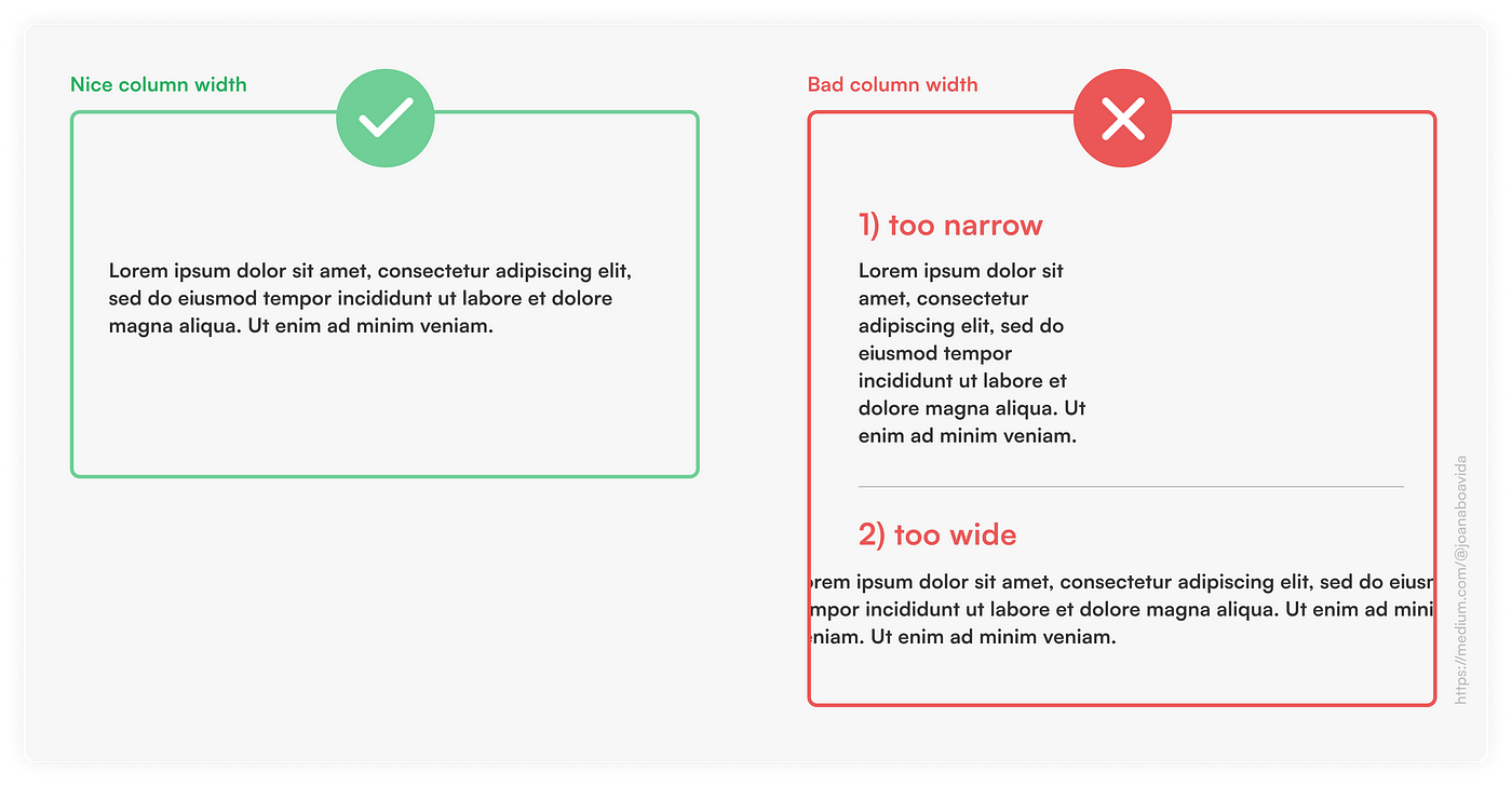
Good vs. bad column widths
7. Line-height (also known as leading)
A set of related sentences should be seen as a single block of text. This does not happen when there is a huge line-height. On the other hand, if the line-height is too small, the block of text is difficult to read. So:
- Find a suitable line-height considering the properties of the chosen font. This value is normally between 110% and 130%.
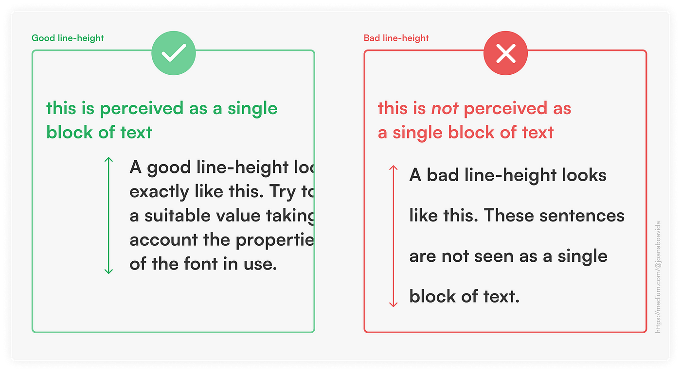
Good vs. bad line-heights
8. Enough contrast
Accessibility must not be left aside. Thus, it’s imperative to:
- Bear in mind that not all users have perfect eyesight.
- Avoid light colours on white backgrounds. Likewise, darker colours are not readable in dark backgrounds.
Hint: you can use a Figma plugin called Contrast as shown below.
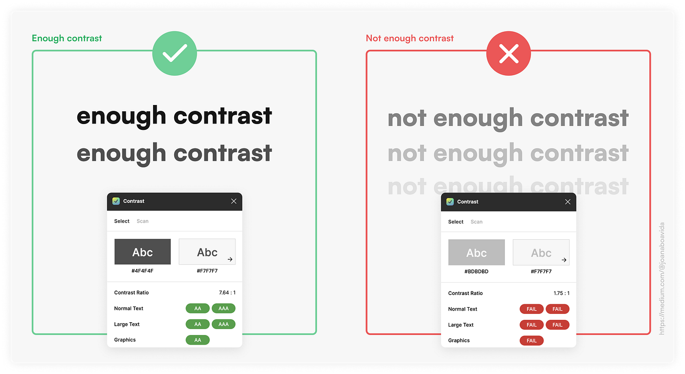
Contrasts between text colour and background colour
9. Outlined letters
Thisis a fine way to make the interface more appealing, but:
- Do not use outlined letters on small text styles. This should only be applied to headings, otherwise it can have huge implications on readability.
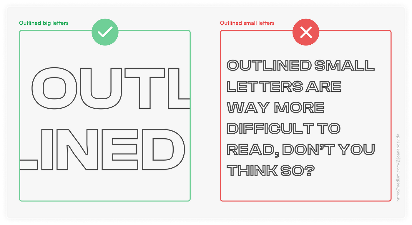
Outlined big letters vs. outlined small letters
10. Interactions with type
The main advantage of using typography in user interfaces is that it does not always have to be static. You can create some interactions and animations to add novelty value to the digital product you’re designing.
- Animations can be used to draw attention to some relevant sections of the website (or app), such as call-to-actions.
- Despite this, keep interactions simple. They must not be a hurdle, nor interfere with the ease of navigation and user experience.
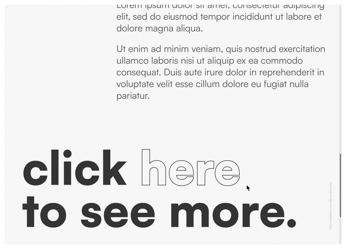
A simple typographic interaction to draw attention to a call-to-action
Conclusion
To sum up, I’d just like to reiterate that to achieve successful user interfaces, typography should be considered a powerful element to work with, and its importance must be acknowledged. Yet, it should be noted that this does not necessarily mean that typography must be extravagant in every single situation. Knowing how to use it well and in a simple way is the crux of it all, and your UIs would still stand out.
Since I utterly believe that type is the be-all and end-all of design, I can only end this article by quoting Robert Bringhurst:
“Typography exists to honor content.”
Recommend
About Joyk
Aggregate valuable and interesting links.
Joyk means Joy of geeK