

How to influence the product roadmap as a product designer
source link: https://uxdesign.cc/how-to-influence-the-product-roadmap-as-a-product-designer-53482e5a701b
Go to the source link to view the article. You can view the picture content, updated content and better typesetting reading experience. If the link is broken, please click the button below to view the snapshot at that time.
How to influence the product roadmap as a product designer
Shift the focus to user outcomes, connect qualitative insights to quantitative data, and get familiar with prioritisation frameworks
As a product designer, I love discussing product strategy and contributing to the product roadmap. That’s because by doing so, I’m keeping users at the centre of the product development process. I’ll also have a greater say about what I do throughout the year, which gives me a sense of autonomy. And lastly, it sharpens my product thinking skills, which I find to be crucial as one matures as a designer.
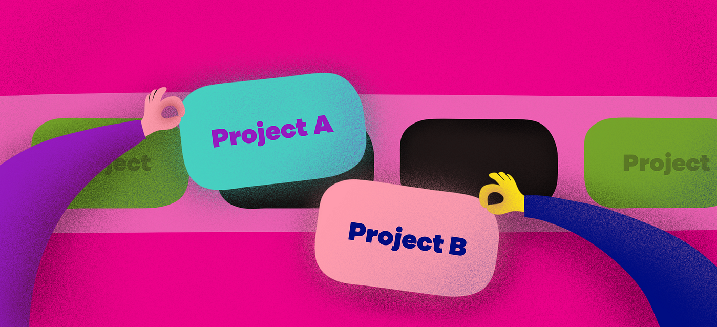
While the roadmap is the domain of product managers, there are many opportunities for designers to complement the product planning process. Based on my experience, I’ve found 3 handy ways to be effective at influencing a product roadmap as a designer:
- Shift the focus to user-centric outcomes.
- Connect quantitative data with qualitative insights.
- Get familiar and involved with prioritisation frameworks.
Let me go through each of them in more detail to illustrate how product designers can make an impact on product strategy.

Shift the focus away from features and towards user-centric outcomes
Why outcomes are better than features
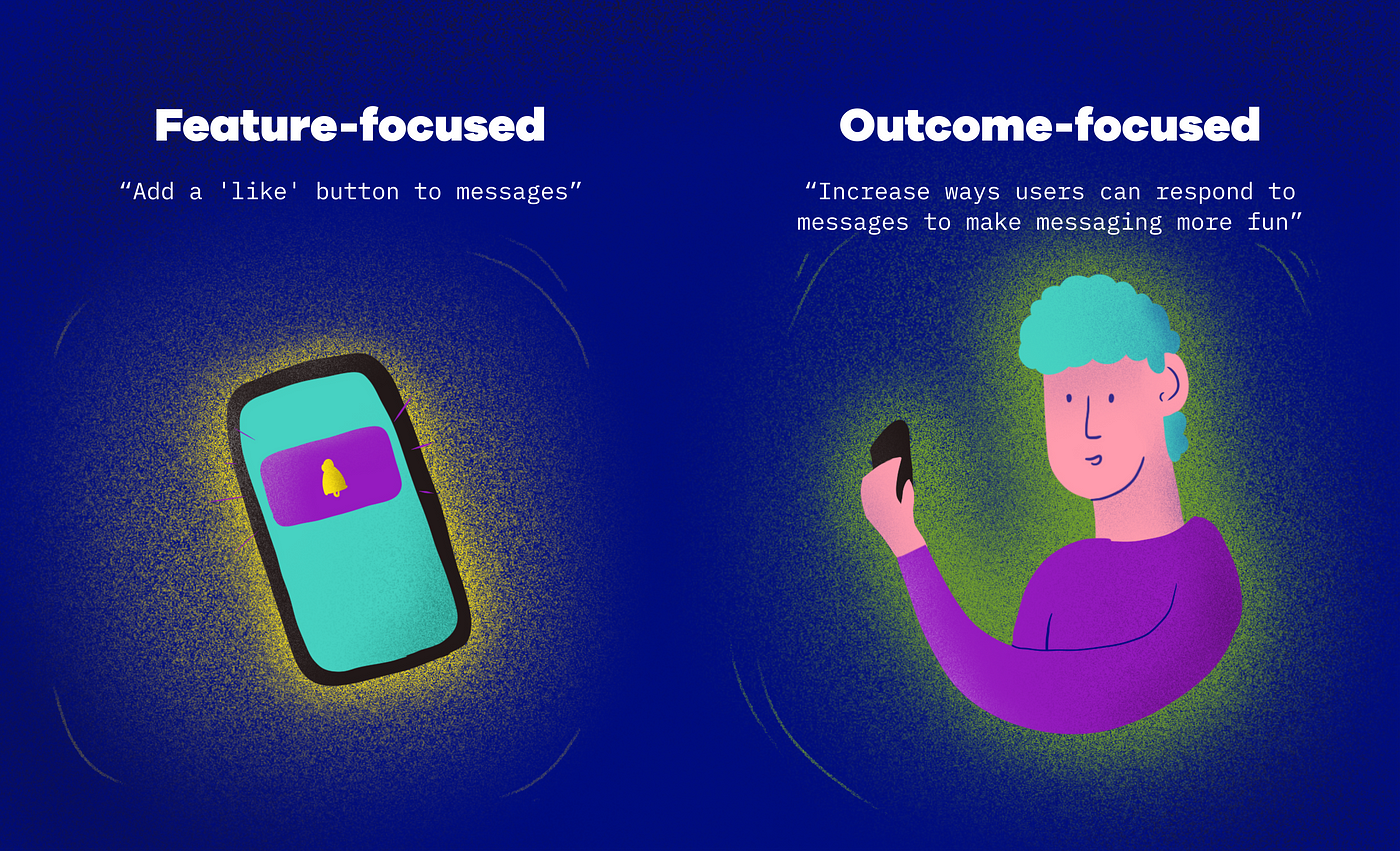
Many product roadmaps focus on features to build, because it’s used to communicate each quarter’s expected engineering effort. Items in such a roadmap might be phrased like “Add a ‘like’ button to messages”.
However, there are some problems with a feature-focused product roadmap:
- It focuses on what to build, rather than why we want to build them and how it impacts users’ lives.
- It leaves users out of the picture, and risks rolling out features that don’t provide value to users, or celebrating feature releases over impact.
- It’s useful to PMs and engineers but less so to others, such as designers and business stakeholders.
Many of these problems can be solved with a roadmap that focuses on user-centric outcomes instead of features. An outcome-focused roadmap emphasises the impact we want to drive (i.e., a user or business problem). So instead of saying “Add a ‘like’ button to messages”, we might say “Increase ways users can respond to messages to make messaging more fun”.
A focus on user-centric outcomes gives us many benefits:
- It makes it clear why we want to work on projects. This gives everyone a higher purpose behind their work.
- It puts users at the centre of the roadmap, and ensures that we’re working towards creating value for them.
- It’s well-suited for future iterations. If the first iteration doesn’t deliver great impact, we can come up with other ideas to drive the same outcome.
Bring the focus back to users
Here’s where product designers come in. As designers, it’s second nature for us to advocate for user goals and pain points. We can apply this into the product planning process, too.
To make a roadmap outcome-focused, we reframe product features into statements around users’ problems or goals. To do this, we need to link each feature idea to an outcome, or impact we want to make on our users’ lives. These outcomes are also called UX outcomes, and they stem from our understanding of user goals, motivations, and problems.
Here are some examples of features reframed into outcomes:
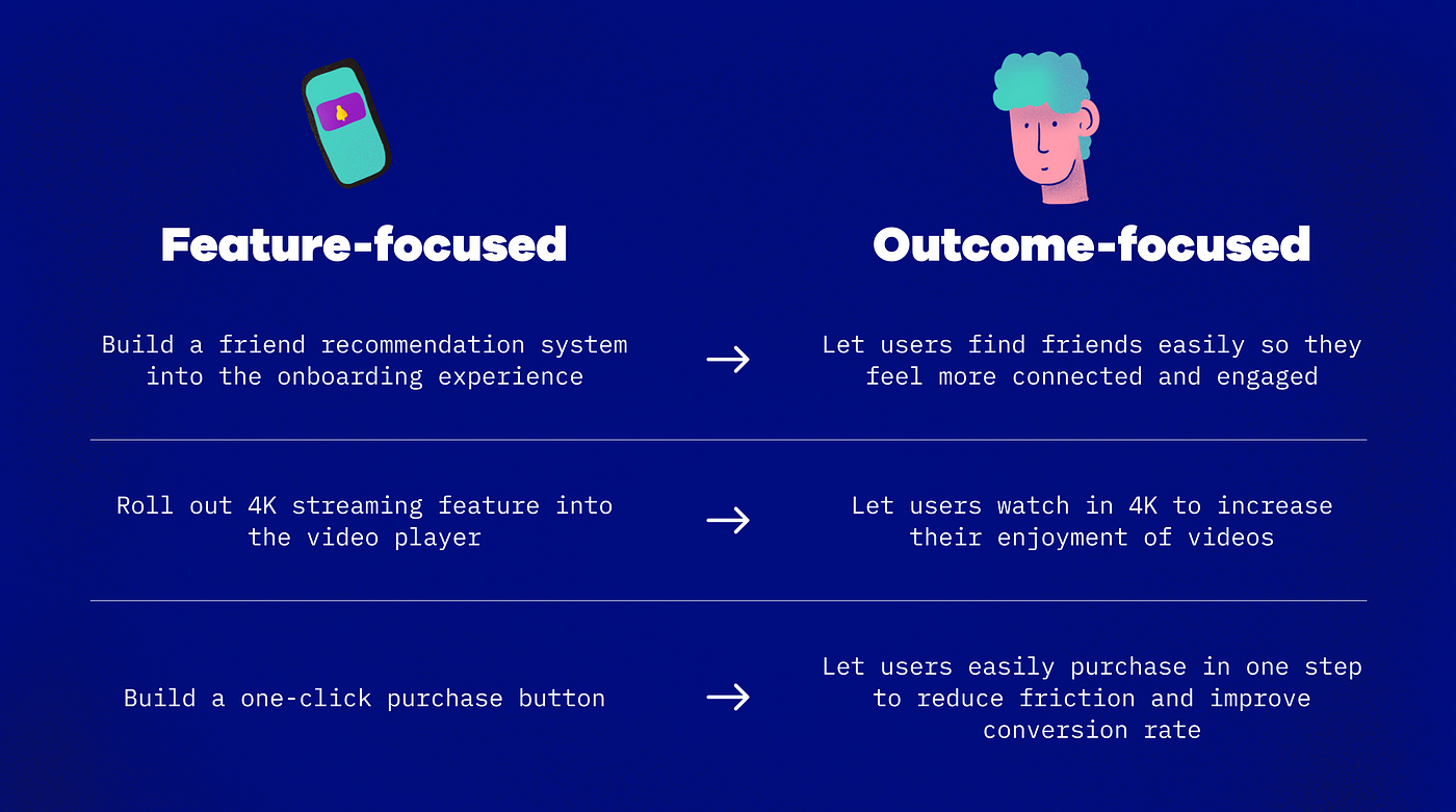
You’ll realise that when features are reframed as outcomes, they tend to get more broadly defined. That’s part of the point—by phrasing things more broadly, we’re creating space for alternative ideas, rather than being prescriptive about what needs to be built.
💡 Tip: You might not need to replace your existing feature-focused roadmap with an outcome-focused one. Instead, you can consider creating a separate, complementary outcome-focused roadmap.

Connect quantitative data with qualitative user insights
Use qualitative data to get a fuller picture
When product teams think of data, they might focus on quantitative numbersand overlook qualitative insights. It’s easy to understand why: figures like conversion rate and user retention can seem a lot more concrete than user insights like “most users lead a busy work life”.
But when teams focus on quantitative data and forget qualitative data, they might solve the wrong problems for users. That’s because we need both perspectives to build a full picture of user and business problems. You see, while quantitative data describe the “what” and “how much” of a problem, qualitative insights describe the “why” and “how”.
Let’s use an example to illustrate this.
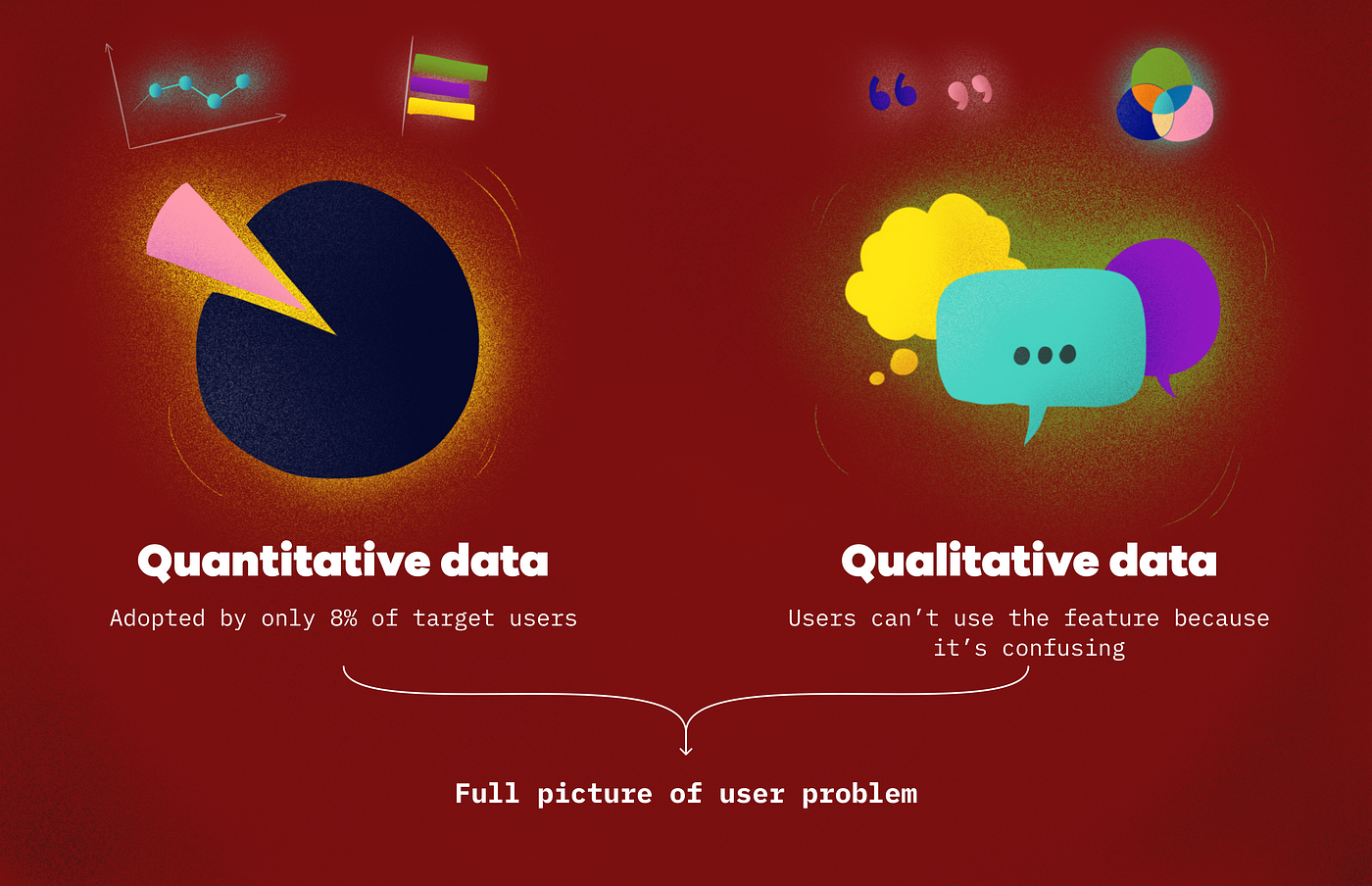
Imagine your team is deciding whether to make enhancements to an existing feature. Looking at the quantitative data, your team sees that the feature was adopted by only 8% of your target users. Clearly, this feature isn’t useful and should be de-prioritised!
However, when you look at qualitative user feedback, you see many people saying that they can’t use the feature because it’s confusing. This fuller picture changes things—instead of de-prioritising the feature, your team should actually prioritise an update so that it can achieve its intended effect.
This is a simplistic example, but it highlights the power of connecting quantitative data with qualitative data.
Link qualitative insights to quantitative figures
As product designers, we can use our familiarity with user research findings and user insights to add more layers to our roadmap discussions.
Tap into these common sources of qualitative data:
- User research (e.g., interviews and surveys), which can give us themes and insights about users.
- User personas, which describe different groups of people and their motivations as well as problems.
- User journey maps, which illustrate commonly-faced pain points by different personas.
- Customer satisfaction surveys, feedback forms, and customer experience tickets, which can reveal areas for improvement.
The key to weaving qualitative findings into quantitative figures is to understand how they complement one another to give us a fuller picture of what’s happening.
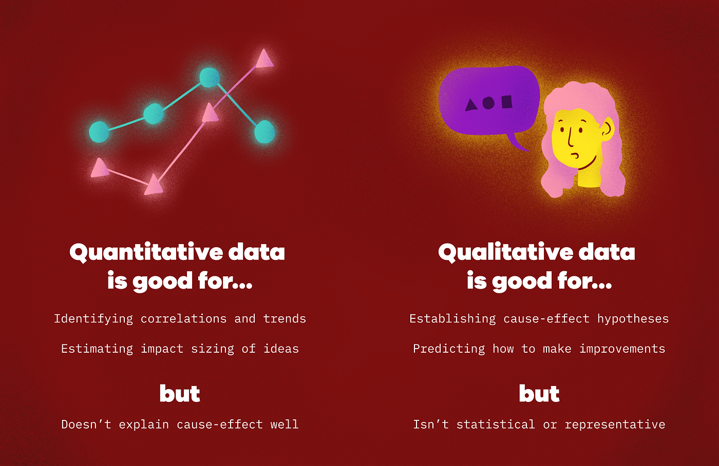
Quantitative data is good at identifying correlations and trends, as well as estimating the number of users who will be impacted by features or decisions. But it doesn’t dive very deep, nor does it explain cause-effect relationships well.
On the other hand, qualitative data is good at establishing cause-effect hypotheses that let us predict how we can make improvements. However, it’s not statistically significant or representative of all users.
What we should do is to find ways to marry quantitative and qualitative data. This is often a tedious and iterative process. One way is to start with qualitative insights, then add quantitative rigour to it. For example, start by gathering problems that users are facing. Then, find ways to quantify how many users are impacted by these problems, or how these problems affect the team’s key results or goals. This way, we can better prioritise which problem(s) to solve first.
When we connect qualitative insights to quantitative data, it can lead us to uncover new questions to answer, or new topics to explore. This is great because we’re ensuring our team is addressing a holistic opportunity space, rather than a narrower way of solving our users’ problems.
💡 Tip: Work closely with your UX research and data analyst counterparts to connect the dots between quantitative and qualitative data.

Get familiar and involved with prioritisation frameworks
How to prioritise between projects (and outcomes)
A roadmap is not only about what outcomes we want to achieve, but also about the order in which we’d like to achieve them. Without prioritisation, a roadmap will be a messy list of projects without a clear focus. This is where prioritisation frameworks come in—they help product teams rank what to do first. There are many frameworks out there, but let’s use the RICE framework as an example of how prioritisation works.
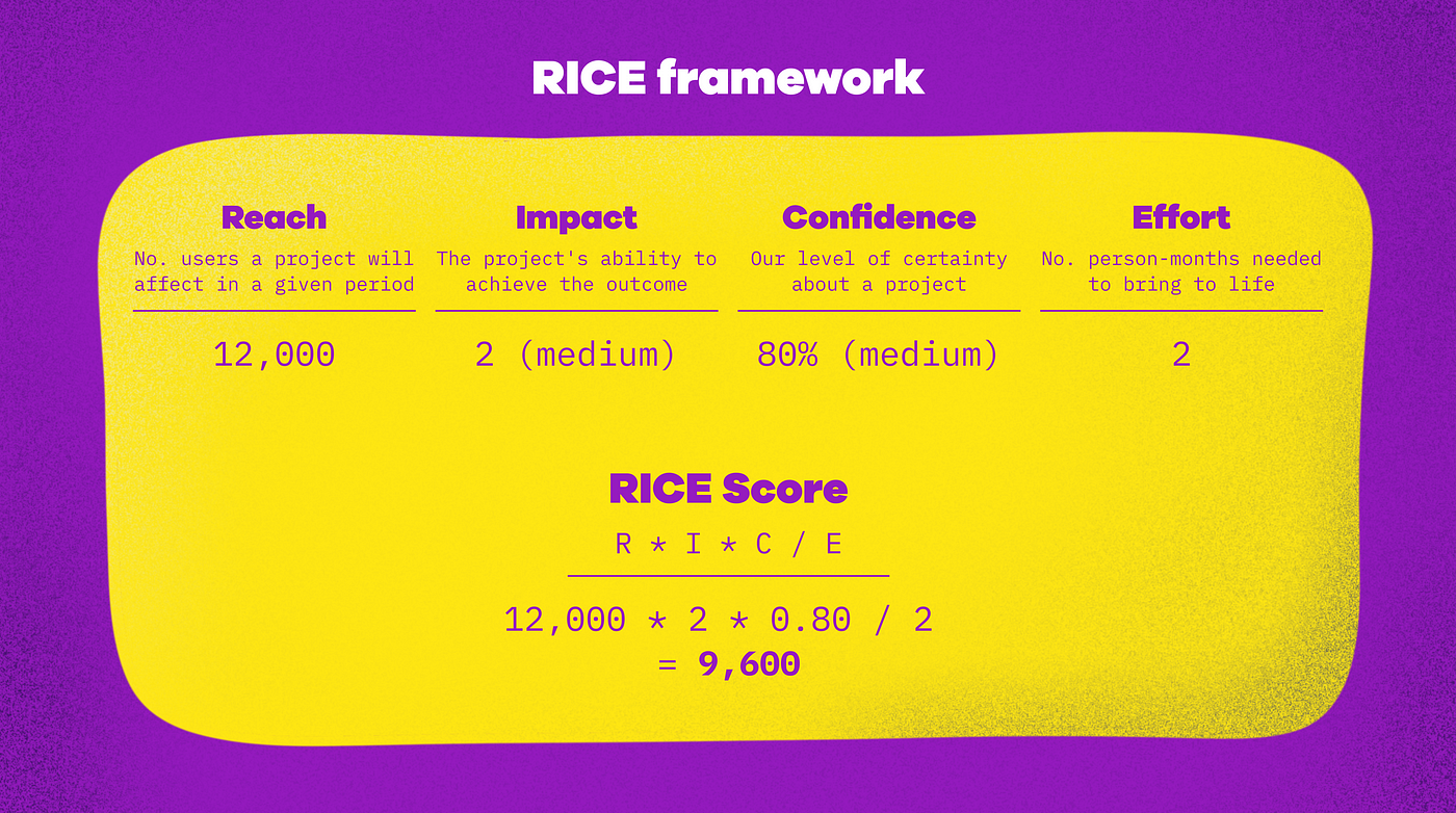
RICE is a popular framework by Intercom to score various projects and rank them. It stands for Reach, Impact, Confidence, and Effort. Essentially, we score each project on these 4 metrics to derive a total score, and rank the projects according to their scores.
On top of using RICE to rank different project ideas, we can also use it to rank different outcomes we want to drive, so we know which outcomes are the most important. For example, is it more important to increase users’ signup rate, or to improve their engagementafter they’ve signed up?
Weigh in on discussions around prioritisation
How do product designers fit into prioritisation discussions? The point here is not to replace product managers—rather, it’s to complement what they do and provide alternative perspectives.
In many ways, this is a culmination of what we’ve discussed so far about how product designers can contribute to roadmaps:
- Reframe feature-centric projects into outcome-focused projects. Explain why it’s better to focus on user-centric outcomes rather than features.
- Tap into quantitative and qualitative data to inform how you prioritise different projects (e.g., using the RICE framework). You’ll typically rely on quantitative data to score the Reach of your projects and rely on qualitative insights to inform your Impact and Confidence scores.
- Discuss with your product manager and other stakeholders about how your rankings are similar or different. Share your quantitative and qualitative data sources to back up your ranking.
- You can repeat the same process to rank different outcomes against one another.
The best product roadmaps cater to business, technical, and user needs. As product designers, there is space—and, indeed, a responsibility—to ensure that users’ voices are part of what goes into our roadmaps. By shifting our focus to user-centric outcomes, we’re putting users at the centre of our roadmaps. When we connect quantitative and qualitative data, we can take a more holistic view of user problems. And when we get involved in prioritisation discussions, we can play an active role in shaping how our product impacts our users’ lives.
At the end of the day, the points above can be done by anyone in a product team, including product managers. However, as product designers we come with a unique advantage of being closer to users and advocates for their problems and goals. Let’s use that advantage to create greater value in our product teams.
Resources to learn more
This piece covers just the tip of the iceberg when it comes to product strategy and roadmaps. If you’re interested to learn more, you might find these resources helpful!
On outcome-focused product roadmaps
- In “Outcome-Driven Roadmapping: The Secret to a Focused Product Strategy”, Product Plan explains the shortfalls of feature-focused roadmaps and benefits of outcome-focused roadmaps.
- Jared Spool’s article in UIE, “Shifting Our Team Goals to be UX Outcomes”, provides a great introduction to UX outcomes and how they drive great design.
- “Why Make the Switch From Feature Roadmapping to Outcome-Driven OKR Roadmaps?” by Dragonboat explains the benefits of an outcome-centric roadmap. Here, they refer to business outcomes rather than UX outcomes but the same benefits apply. This illustrates the many interpretations of the concept of outcome-driven roadmaps.
- In “What do you think about project-based roadmaps versus outcome-based (metric-based) roadmaps?”, Gibson Biddle provides a concise take on how project-based and outcome-based roadmaps can both work. Here, we see even more nuance around the topic, since Gibson’s outcome-based roadmaps also represent a team’s timeline differently (using “Now / Next / Consider” instead of “Q1 / Q2 / Q3 / Q4”).
On qualitative and quantitative data
- Fullstory’s article “Qualitative vs. quantitative data: what’s the difference?” provides a deep-dive explainer into qualitative and quantitative data.
- “Data-Driven Design: An Integral Part of UX Design” by UX Matter explains the importance of using quantitative and qualitative data as a part of the design process.
- In “Data-Driven vs Data-Informed Decision Making in UX Design” on Adobe XD’s blog, we dive into more nuances. Here, Nick explains the differences between being data-driven and data-informed.
P.S. When reading these articles, remember that intention is much more important than exact terms used. In Adobe’s article, “data-informed” is synonymous with “qualitative data”, and “data-driven” with “quantitative data”. Whereas in UX Matter’s article, “data-driven” is used to describe what sounds like a “data-informed” process. The key point is that a mix of both qualitative and quantitative data gives teams a fuller picture. Whether we call that “data-driven”, “data-informed”, or something else is secondary.
On prioritisation frameworks
- Intercom’s article “RICE: Simple prioritization for product managers” explains the RICE framework in a way that’s really easy to absorb. Highly recommended read.
- In “Product Prioritization Frameworks”, Productboard goes through 7 popular frameworks to prioritise between different projects. It’s a good way to understand the different ways product managers might approach prioritisation.
Recommend
About Joyk
Aggregate valuable and interesting links.
Joyk means Joy of geeK