

11 Ways to Improve Website UX/UI (Using IP Geolocation & Other Tactics)
source link: https://designmodo.com/improve-website-ux-ip/
Go to the source link to view the article. You can view the picture content, updated content and better typesetting reading experience. If the link is broken, please click the button below to view the snapshot at that time.
- Share
- Tweet
- Share
- Pin It
11 Ways to Improve Website UX/UI (Using IP Geolocation & Other Tactics)
UX DesignEditorial • October 22, 2021 • 11 minutes READ
The terms UX (user experience) and UI (user interface) are often used interchangeably. They’re so closely related that it can be difficult to appreciate that there’s a difference, especially if this is a side of technology that you don’t eat and sleep. So before proceeding, let’s define them.
- UX is the overall experience of using a website or service
- UI is what the user clicks or taps on to do something
It’s the UX that will keep users on your website, so it’s the foundational principle. It’s in the driving seat with UI being an important factor in how you achieve it. When you’re thinking of how to make your website or service better, the probability is that everything you’d consider doing could be said to fall into either UX or UI.
Remember: you have competition and the safest way of proceeding is to assume that your competitors are doing everything that you could be doing, but aren’t.
So let’s work through some of the key elements of UX and UI to help you understand the principles behind improving your website.
How to improve website UX
As mentioned, UX is the overall experience that users form of a site. In all forms of interaction, humans make use of the ‘orienting reflex’. Explored most famously by the neuropsychologists Eugene Sokolov and Olga Vinogradova, it’s what enables us to make snap judgements about what we don’t understand. Therefore, this capability is ‘hard wired’ into our psychology and manifests as we encounter new things.
It’s this that underpins our immediate reactions as we encounter new people and new situations. Websites, for example. So understand that people really will bounce off your website, not just in seconds but potentially milliseconds if the usability is poor.
With Postcards you can create and edit email templates online without any coding skills! Includes more than 100 components to help you create custom emails templates faster than ever before.
Try FreeOther ProductsLet’s take a look at some potential issues and how you should approach resolving them.
1. IP geolocation
IP geolocation services can enable mission-critical capabilities, especially for online stores and banking services. They’re used to detect a user’s location by using IP lookup. Detecting such attempts to spoof geographical location is critical for many businesses.
It might be tempting to leave geolocation in auto mode so that it picks up a user’s geographic location automatically in real-time. At face value, that seems to be the best solution because it requires no interaction from the user (no pop-ups are generally a plus). But there are problems.
A big one is that a user may have real needs that they have to address. Perhaps they need to buy a present for a friend who lives in your market. So take a look at the example below to see what happens when you use auto geolocation:
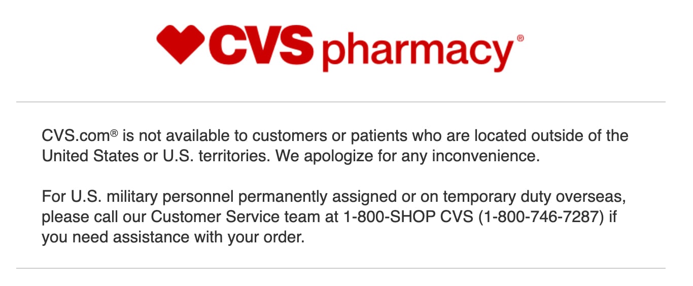
If there’s anything worse than providing a bad experience, it’s providing no experience at all. If someone needs to assess a job offer, then they’ll start researching schools, pharmacies and the like. If someone needs to buy a present for a friend, then your auto-detection shuts them out and forces them to go to one of your competitors. Don’t forget as well that any site wanting to meet W3C’s WCAG 2.0 standards can’t use auto-geolocation.
Instead, let a user manually select their country. People have enough entertainment opportunities, so they’re probably not staying on your website for fun. Then, they can find that gift for a friend. A happy customer is a happy customer, no matter their physical location.
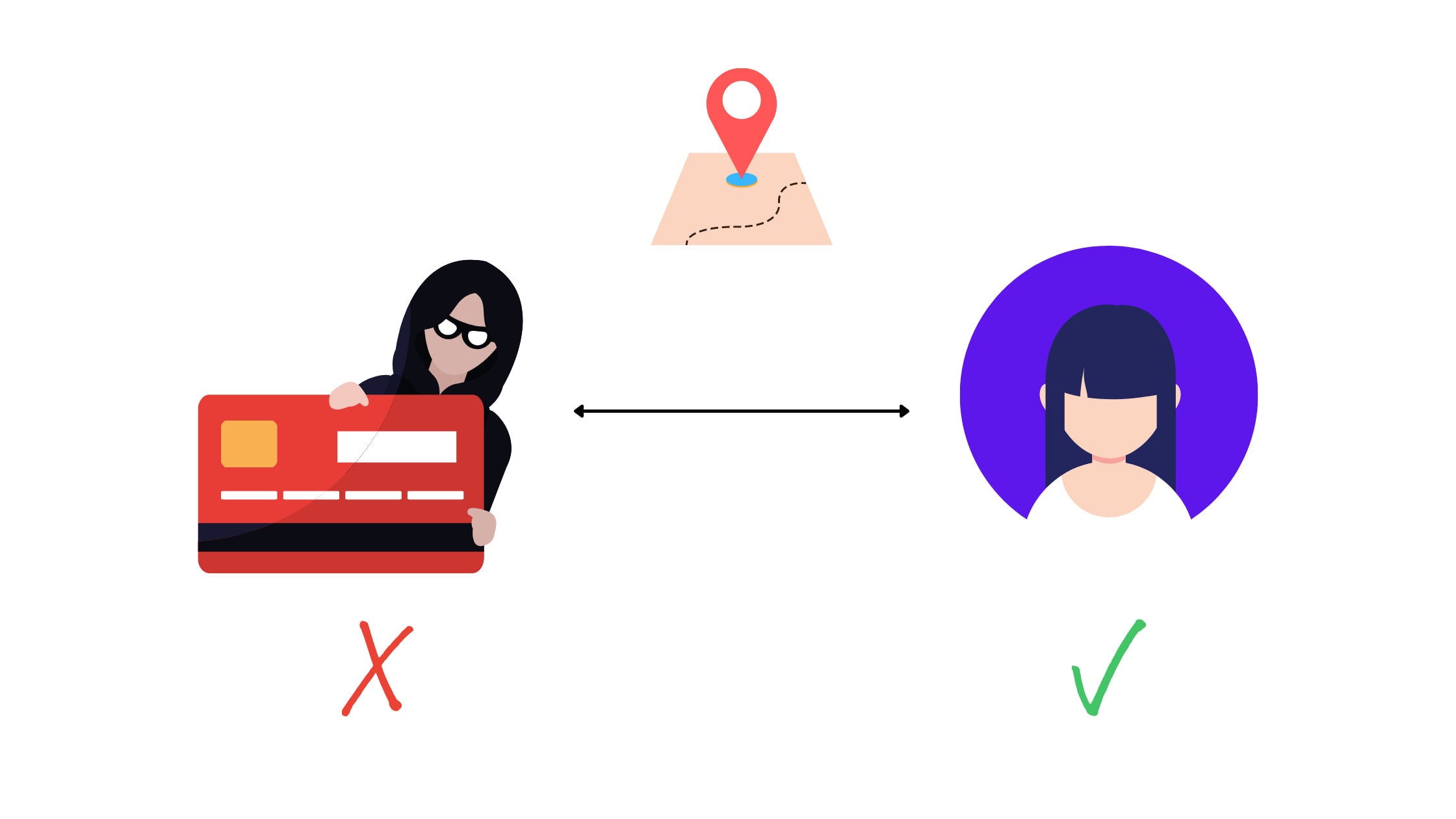
Preventing fraud
Fraud is a potential problem for any business, especially online stores where the financial responsibility in terms of chargebacks are likely to fall upon the store, not the card issuer. It’s therefore important to take reasonable measures to prevent fraud.
Someone whose stated address is on one continent is unlikely to have an IP address on another continent. An IP geolocation API can help by sourcing location data to ensure that the two match. If they don’t, then that could indicate fraud.
With Startup App and Slides App you can build unlimited websites using the online website editor which includes ready-made designed and coded elements, templates and themes.
But while IP geolocation data can help prevent fraud, it’s important to source a product or service that’s capable of detecting attempts to circumvent geolocation. This can be done through the use of VPNs, proxies or anonymizers. So by implementing geolocation, you can increase the likelihood of preventing fraud, a win for you and your customers.
2. UX audit and analysis
Anyone who’s serious about improving things measures what they’re trying to improve first. If you don’t know how you’re doing now, then you can’t assess whether you’re improving or not. Whenever you visit a service provider’s website, you’ll find a case study saying some variant of ‘After doing X sales rose by Y%’. They’re able to determine that by understanding their current performance before making a change.
So take the time to quantify key metrics. It could be page speed. Bounce rate. Time on page. Conversion rate. The number of sales. Total sales. Build up a suite of metrics so that you have something to test against, real use cases that you can strive to improve. Without these, your approach can only be scattergun and you won’t be able to demonstrate value.
3. Page speed
Page speed is the loading time for a webpage. It might be tempting to think that everyone’s on 5G and fiber internet, but even in capital cities, that isn’t necessarily the case. Cities can have areas that aren’t properly served by fiber internet. During the course of visiting your website, customers on mobile devices (the majority of all internet activity is mobile and has been for years) could pass into a 5G zone and out again. Or they may not even have a 5G phone.
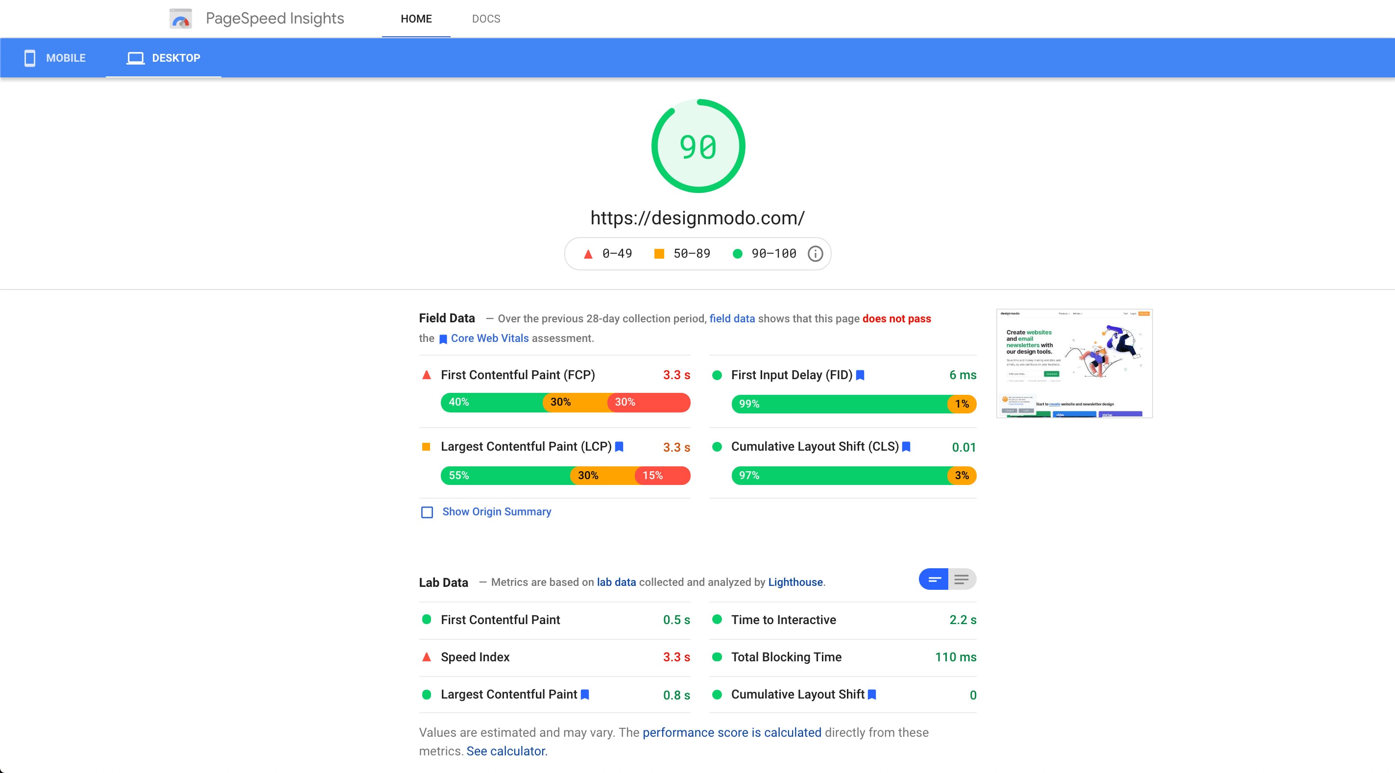
Set a standard: will your page load in under 4 seconds on Wi-Fi at least. If not, assume that some of your website visitors are going to bounce off and not return. There are free tools available from a range of sources, including Google’s PageSpeed Insights, to help. Google’s tool analyzes not just speed, but causes of slowdowns and suggests possible solutions.
4. Targeted headings
Assuming that you have set keywords, are you including these in the headings of your pages? Search engines tend to give more weight to the text in headings. This means that, if headings match terms that users are entering into search engines, websites with those terms are more likely to be returned by search engine algorithms. Yes, there’s far more to SEO (Search Engine Optimization) than this, but this is a useful step down that road. Headings in the content are also good for reading. They break pages up into chunks for users while simultaneously guiding them as to what the next section is about.
But the content still needs to be good, it still needs to be informative or compelling in some respect. Without custom content, how do customers know who you are?
5. White space
White space in website design is whether you put white space around page elements such as text and titles. This spacing can also be applied to images because while full page imagery can be powerful, it can also be overwhelming. White space gives a sense of space, of breathing room, that helps draw user attention.
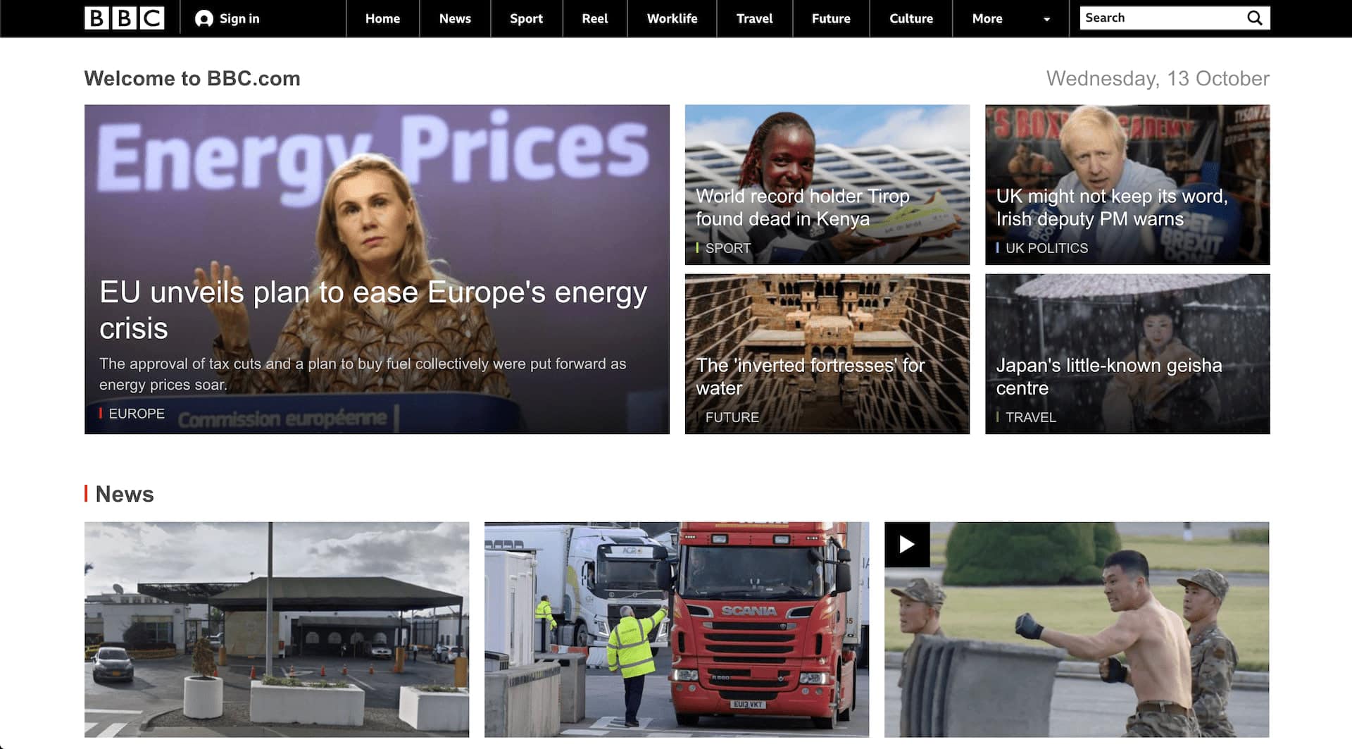
Here, we can see that the BBC has used space to effectively separate the ‘Top stories’ from each other and from the ‘More top stories’. This is particularly effective for a homepage because it doesn’t overload users by creating clutter, but also makes it clear with the interface at the top precisely how users can delve in further.
6. Accessibility
Accessibility issues can arise for a surprising spectrum of people. 8% of men and 0.5% of women are color blind. 3.5% of people are visually impaired. If you don’t address their needs, then again, why wouldn’t they just go to one of your competitors?
The W3C has a suite of guidelines on how to improve accessibility for your website. Following this guidance helps maximize the number of customers that can buy from you. So keep on top of the W3C’s WCAG 2.0 standards.
7. Bullet points
When you’re laying out key content, bullet points can be very useful. They’re clear for users because they create a certain space around each point. Also, there’s an implicit understanding that bullet points are providing summaries, not detailed information, so it forces the condensation of information. This also aids readability.
Bullet points don’t have to be dull either. Is there something that you can use from your branding that will highlight each point more effectively? Can you create iconic pictorial icons as visual cues that will extend your brand to how you present these bullet points?
8. Consistency and hierarchy
If you’ve succeeded in developing all of the above, a final key element you need to bear in mind is consistency. Are your fonts the same on each page? The font sizes? The colors? Page layouts? If each page is different, then not only is that a brand problem, the inconsistency can be jarring. Once users settle into how a website ‘works’, then introducing pages that put the menu in a different place or have different colors will really throw them.
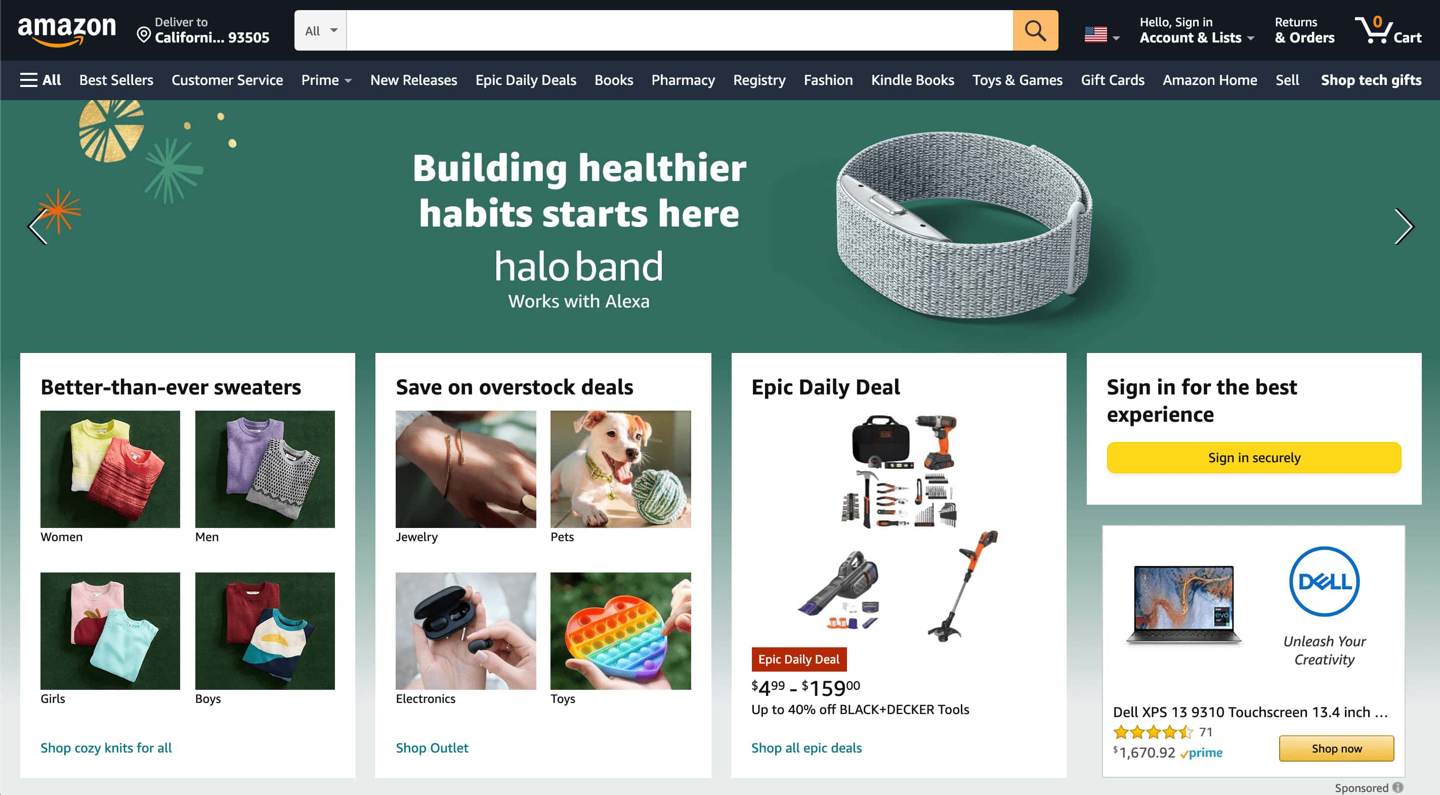
For example, we all know the Amazon page. Imagine if that header image ‘Shop Toys & Games’ was suddenly below the four images beneath on one page. That would create a jarring inconsistency in terms of its look. By being at the top, a hierarchy is being created. From the top down we see:
- Search bar
- Menu or categories once you’ve logged in
- Banner image for key promotions
- Secondary promotions, categories and login reminder
That hierarchy isn’t something that’s just happened. Amazon didn’t get where they are by accident. Also, note that the page is asking me whether I want to shop in the local currency. It’s asking, not auto-detecting and forcing.
So try creating page templates. You can start with pen and paper, as our hero image shows, and continue using illustration software like Sketch. Only then will you be able to create a website that brings the look together.
UX improvements summary
All of the above, UX design and the following UI guidance, are part of a package aimed at creating a good user experience for your target audience. With your metrics, you’ll be able to make decisions about what UX elements are the most compelling. But assuming your website is a business, then two key metrics are likely to be total sales and conversions (the proportion of people who visit your site who then complete a purchase). Seemingly small changes can increase conversions. If we just consider page speed or load times, VBO found that if a page loaded in 4 – 5 seconds, the conversion rate was about half that for pages that loaded in 1 – 2 seconds.
So yes, such seemingly small changes aren’t just relevant, they’re important. But remember: they’re part of a package of improvements you need to make as you craft a better user experience.
How to improve website UI
The UI is what users touch on your website. It’s what they click or tap to find what they need. If the UI is confusing or doesn’t help them find what they need, then that will contribute towards bad UX that’ll see users go elsewhere.
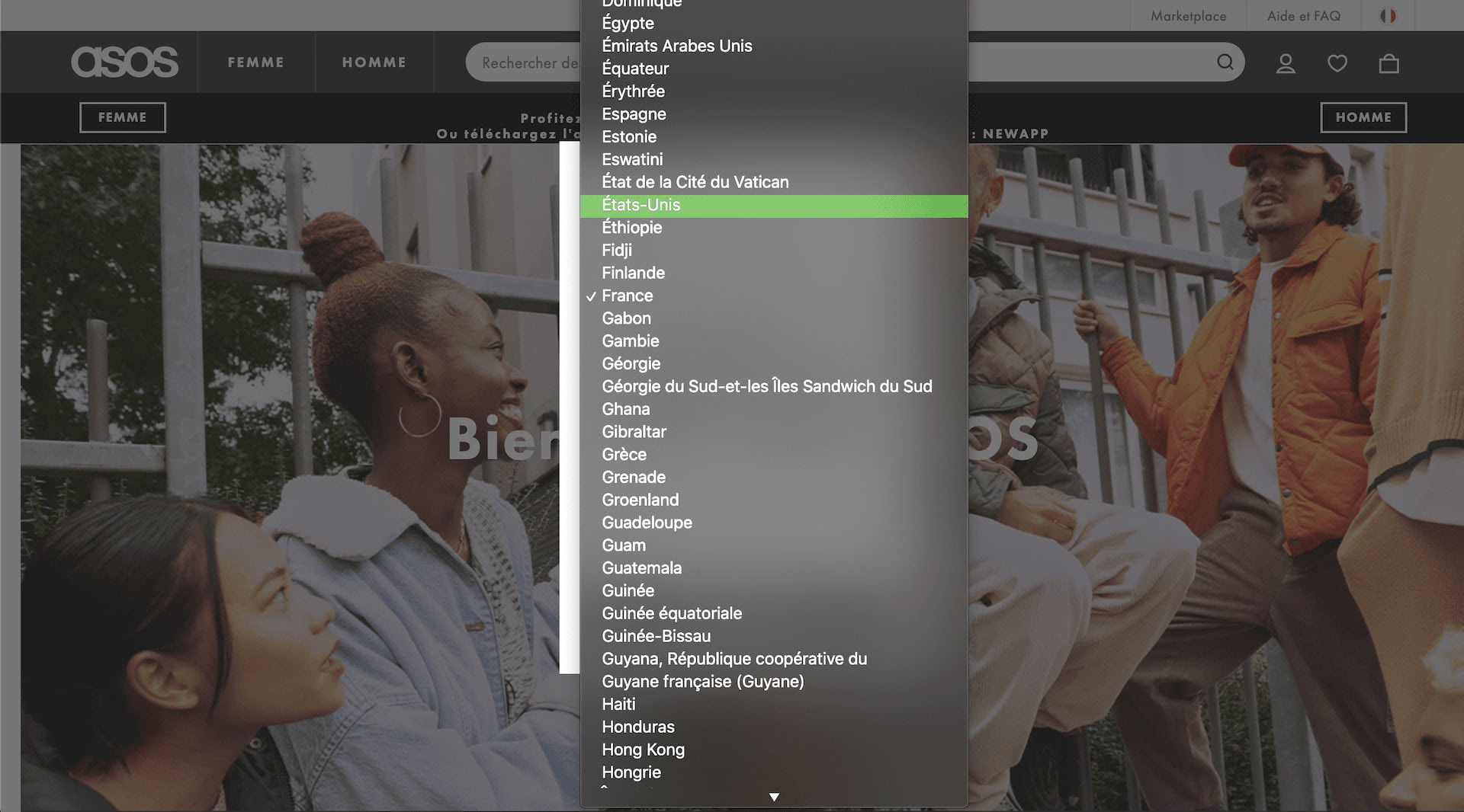
1. IP geolocation: UI
Geolocation is important in tackling fraud, but it still needs to be implemented effectively. If you list countries in the country selection box, then are you accounting for language differences? For example, if you shop on a French website, you might have problems finding ‘United States of America’. That’s because, in French, it’s ‘États-Unis’. If you’re in the United Kingdom, you might need to look for ‘Royaume-Uni’.
If your implementation requires users to type their country, then consider an implementation that can work with spelling mistakes. Typos are possible on any keyboard. They’re especially possible on a virtual keyboard, like that of a phone.
2. Consistency
Consistency is as important in UI design as it is in UX design. Imagine if you clicked on a link on the Amazon homepage and you discovered that the search box was suddenly at the bottom of the page. That kind of inconsistency would jar. Also, make sure that you’re using the same kinds of interface elements. Do your menus use dropdown? Checkboxes? Toggles? If you’re constantly switching these up, users will never be able to settle on your site.
So consider what interface elements you need to help website users navigate and shop on your site. What you need to achieve is a website that users can navigate without thinking about it. The more they have to think, the worse the UI is. So think about how you need to layout your interface. Again, you can use illustration tools to lay these out first. You can also create quick and dirty mockups of web pages, testing different interface elements and using an ipsum lorum generator for page text. Also ensure you address how to apply it to all pages consistently.
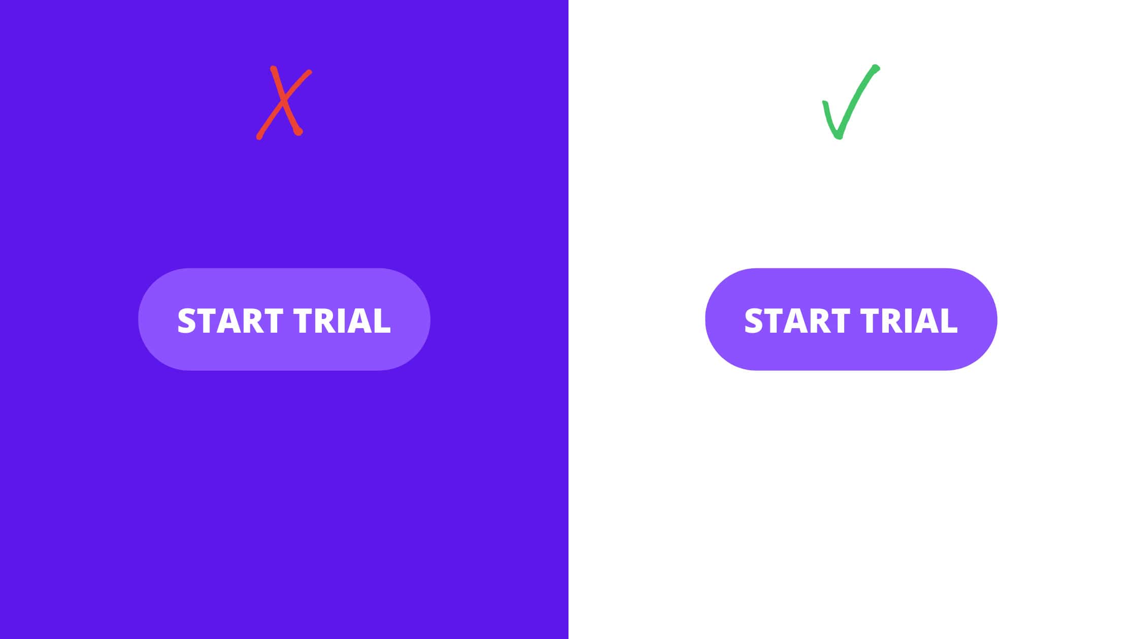
3. Call to action
Put simply, a ‘call to action’ (CTA) is an inducement to a user to take a specific action. It’s appropriate that we tackle this last because everything is leading up to this point. If the above elements are missing creating a bad experience, then a call to action button isn’t going to transform everything by itself.
However, if you’ve nailed the above, then it’s time to nail your call to action button as well. Think first about the text displayed in the button. It needs to be active, not passive, and summarize the benefits of clicking the button even quicker than bullet points. You don’t have space to waste so get punchy.
Understanding where to place a call to action button and the look of the actual button is also critical. One study found that CTA buttons were clicked 84% more often if no scrolling was required to find them.
UI improvements summary
UI isn’t purely about making it easier for potential customers to use your site. Laura Ashley found that just changing the color of key buttons resulted in sales increasing by 11%. So UI in service to UX isn’t just an abstract attempt to provide a better experience. The UI and UX are improved to increase conversion rates.
With metrics in hand and ongoing iteration, then you’ll be able to make targeted changes that have real potential to increase sales.
Conclusion
One of the principles of agile development is understanding that things can and should be open to ongoing iteration in search of improvement rather than expecting to get everything perfect straight away.
It’s the same with your website design process. Even once you’ve implemented all of the above and landed on a good design with a positive user experience, this doesn’t have to be the end. In fact, it shouldn’t be.
Make use of A/B testing capabilities so that you can test whether users place more orders if you change the color of key buttons in the checkout area, for example. You can test different page templates. Different UI options. But be measured about it. Don’t take a scattergun approach. Instead, take your metrics and quantify where your performance is weakest. Then, you’ll be able to prioritize the development of your website in the most effective way possible.
A good website should be in an ongoing cycle of measuring performance -> assessing whether/how you could improve performance -> building an alternative -> A/B testing to see which does better. This has the benefit of spanning both UX and UI, experience and interface, so make use of it.
A great user experience with attractive design elements that’s an ecommerce powerhouse doesn’t just happen. The likes of Amazon are powerhouses now because they’ve been through, and continue to use, these principles in their website design.
Like what you're reading? Subscribe to our top stories.
Recommend
About Joyk
Aggregate valuable and interesting links.
Joyk means Joy of geeK