

Let's Talk about Native HTML Tabs
source link: https://daverupert.com/2021/10/native-html-tabs/
Go to the source link to view the article. You can view the picture content, updated content and better typesetting reading experience. If the link is broken, please click the button below to view the snapshot at that time.
Let's Talk about Native HTML Tabs
An update from one year of Open UI's Tabvengers
October 20, 2021
For the past year I’ve been on a team of folks inside Open UI dedicated to figuring out how get a native, accessible <tabs> element into HTML. We’re a team of people with varying backgrounds; spec authors, browser vendors, implementors, and normie practitioners like myself. Open UI is a community group so we can’t technically make HTML (for legal reasons), but we can present research to the W3C working groups. I see Open UI as an ad hoc research arm for the W3C with specific experience in design systems and common web componentry.
The “Tabvengers” as we’re known, have produced a couple research documents and experiments so far:
- Research documenting a lot of the common parts and features of tabs; an interface inventory across a matrix of design systems and implementations
- Research documenting common markup patterns for tabs; varying greatly from 5 elements, 4 elements, 3 elements, 2 elements, and 1 element solutions
- A custom element wrapped up in a web component; a proof-of-concept prototype and discussion starter
Our research showed there are a lot of variations for what makes up a tab control. There’s a lot of variations in markup patterns as well. There’s variations written in operating systems, video games, jQuery, React components, and web components. But we think we’ve boiled some of this ocean and have come to a decent consensus on what might make for a good <tabs> element… and it isn’t <tabs>!!!
I’ll try to summarize this brief history, but I made a galaxy brain meme version for you if this is too long and reading is boring.
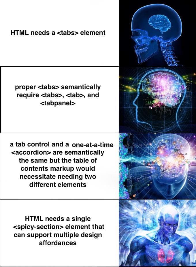
As we analyzed the problem and considered accessibility and responsive design viewpoints we started to collectively feel that HTML may need a solution that is more than a 1:1 mapping of what’s on the ARIA authoring practices guide. This would lead you down a path where you have one element per ARIA role. Which isn’t bad until you consider some real world applications.
From an accessibility standpoint, a one-at-a-time <accordion> is semantically no different than a <tabs> control. They both present one section of content at a time (even the accessible keyboard bindings are the same). In fact, from a responsive design perspective, swapping between Tabs and Accordion at different viewports is a common pattern. Often you want a non-collapsing, naturally flowing tube of content and then opt-in to tabs when the space is available. So… what if one element could solve all these problems at once?
There aren’t a lot of existing HTML elements that can morph into a different element. We needed language to describe the concept and converged on an idea Brian Kardell called “design affordances”. An “affordance” is a unique aural and visual representation of a chunk of content. And the same content can present itself in different affordances. I liken it to <input type=""> to some degree, changing the type of an input will sometimes change the visual and aural experience of the input, but functionally it’s doing the same job: collecting input. Another example might be the humble scrollbar, there’s no <scroller> element in HTML, we use CSS to offer that control or affordance.
To playtest this idea of affordances further, we moved into the prototyping stage and created a Web Component that we’re calling <spicy-sections>.
Meet <spicy-sections>
Spicy Sections is our attempt at experimenting with this idea of design affordances. The core of the idea is that there’s a wrapper element around sections of content. We start with a normal tube of content with a <heading> + <content> structured markup. The content within progressively enhances to something interactive. The root level headings convert into tabs and the content between headings gets slotted into tab panels.
<spicy-sections>
  <h2>My cool section</h2>
  <div>Tab content goes here</div>
  <h2>My other collapsible section</h2>
  <div>More content goes here</div>
</spicy-sections>
Then in your CSS, you define what affordances to use and where:
spicy-sections {
  --const-mq-affordances:
    [screen and (max-width: 40em) ] collapse |
    [screen and (min-width: 60em) ] tab-bar
  ;
}
This syntax is not final, but hopefully you see how a media query (or container query?) could determine the affordance. At less than 40em, the content collapses into an accordion of content. At greater than 60em the content presents as tabs. Between 40em and 60em you should expect to see normal structured content.
You can style parts like the tabbar using Shadow Parts. This can be confusing if its your first time with reaching in to style a web component, but I’ve found it’s pretty versatile.
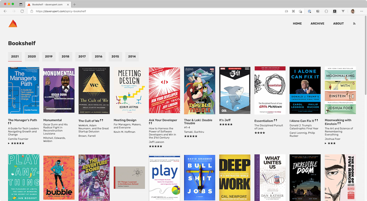
For experimentation purposes I cut a “spicy” version of my bookshelf that folds each year into its own tab panel. On mobile, the years get collapsed into an accordion. You can view source and get a feel for how the markup and styling works.
A note on the table of contents structure
A lot of tabs solutions embrace a “table of contents” style markup:
<tablist>
  <tab>Tab 1</tab>
  <tab>Tab 2</tab>
  <tab>Tab 3</tab>
  <tabpanel>this is a panel</tabpanel>
  <tabpanel>this is a panel</tabpanel>
  <tabpanel>this is a panel</tabpanel>
</tablist>
This is a valid approach and in fact it’s what the ARIA Authoring Practices Guide recommends and it’s the same approach historically popular libraries like jQuery UI took. In practice, there are a couple problems. From a progressive enhancement standpoint, if the JavaScript failed to mount or an older browser tried to render this, the three tab elements would revert to spans that do nothing. They would have no context and the panel of content would lose its labelling. It’s also difficult to extract the other affordances from this markup. Essentially you’d have to reverse engineer the intent and the heading levels to offer a tube of content or a collapse with heading levels. This markup pattern works if you’re doing only Tabs.
Some advantages of the 1 element approach
With one HTML, we can solve two birds with one stone. We get an accordion and a tabs control from the same single element. We can actually use one element and have infinite affordances. We also get a killer progressive enhancement story. And spec’ing one element is easier than five elements? I don’t actually know if that’s true.
Ironically, this approach isn’t too different than Ian Hickson’s tabbox idea from 2004. I can’t believe we spent the last 17 years without native HTML tabs, cursing the sky, failing our users, and reinventing the wheel. But alas, now is the time to fix it.
Dave, Dave, this doesn’t solve my one weird need where you click on the second to last tab and it phones my grandmother.
Congratulations, you’ve graduated to needing to build your own custom tab control!
For real though, I don’t mean to be dismissive, but there are situations bespoke enough that a generic or universal tab solution won’t meet your needs. We’re hopeful that we can make a building block that gets you, or Google Docs, or whoever most of the way there. But if there’s a significant feature missing, please let us know.
What’s next for the Tabvengers?
Next steps is to formally make a proposal to Open UI who will hopefully sign off on the idea and then onto the HTML, CSS, and ARIA working groups. But before we do that, we need to…
- Test with real users - That means you! But I’ve also reached out to friends at Texas School for the Blind and Visually Impaired (TSBVI) to help do some ad hoc QA. Hopefully we can move forward with confidence that this meets people’s needs, and in TSBVI’s case, it’s often people with compound disabilities.
- Get developer feedback - We’ve had some positive signals from browsers and it’s encouraging when someone who works on a browser has little-to-no objections… but we would love more developer feedback. Feel free to play around with Spicy Sections and let us know how it can be better. If you do use it somewhere, let us know, we’d love to keep track of that.
- Naming - The name is not final. They rejected my
MigthyMorphinElementproposal.<spicy-sections>allowed us to avoid endless bikeshedding and it does a decent job conveying what we’re trying to do. The final name might be something like<panelset>or something, but candidly I don’t know and I don’t care even though I’m attached to the project. I think we’re all 100% focused on designing a good, robust solution before getting attached to a name. - Carousels? - In what I take as a positive signal, the ARIA group was discussing a new
role="carousel"and employees at Apple recommended deferring the issue to Open UI, which the Tabvengers have picked up. Carousels… ughck, but maybe there’s a chance to make a good one so we don’t have to keep having bad ones littering the internet. 🤷♂️
If you got this far, thanks for reading! If this makes it to a browser that would be wonderful. Who knows. But what I do know is that NOW is the time for feedback. Is <spicy-sections> useful? If we renamed it <tabbyboi> and put in the browser tomorrow would it meet your needs? Could you see using it in your projects? Are you currently using it? Are there styling gaps? Please let us know either on GitHub or my DMs are open.
Thanks Brian Kardell for reviewing a draft of this post.
Recommend
About Joyk
Aggregate valuable and interesting links.
Joyk means Joy of geeK