

4 Cool CSS Image Effects
source link: https://www.danylkoweb.com/Blog/4-cool-css-image-effects-RV
Go to the source link to view the article. You can view the picture content, updated content and better typesetting reading experience. If the link is broken, please click the button below to view the snapshot at that time.
4 Cool CSS Image Effects
In today's post, our guest blogger Gilad David Maayan shows four ways to spice up your images using CSS effects

[image source: Pixabay]
CSS is a language used to lay out and style web pages. While CSS is often used to style text and define layout, it can also be used to manipulate images and rich media. In this post, I’ll cover a few tricks you can use to achieve great looking image effects, in pure CSS and without requiring any JavaScript code.
Cool CSS Image Effects
There are many techniques you can use to create cool CSS image effects for your website. Here are four image effects that can make your website look cool and professional.
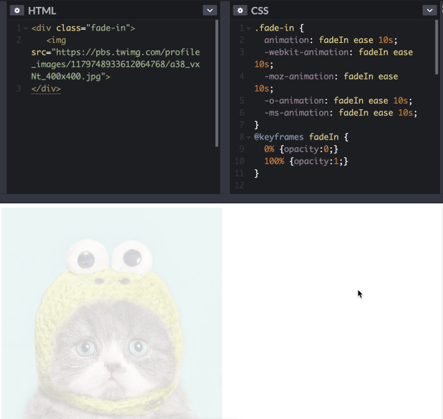
1. Fade-in Image Transition
Fade-in animation can turn your static image into an interactive web element. This works by making the image change from transparent to full opacity.
The below image showcases code by Erika. This code lets you adjust several variables, including the animation property, until you achieve the desired effect. Do not remove the vendor properties—"-webkit", "-moz", "-o", and "-ms". These properties ensure that your animation code can work across several rendering engines and browsers.
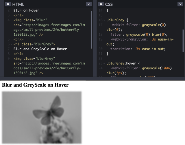
2. Implement a Blur or Filter Effect on an Image
You can create a wide variety of hover effects on HTML elements. This works especially well for images. To create this effect, you can use the filter property, which accepts either a custom or a built-in function. The function itself accepts values in decimal values or percentages.
To apply a blur filter, you need to pass a blur function with values. The example below applies the blur CSS class on HTML image elements and H1 elements.
To apply a blur effect on hover, you need to use the :hover selector. Then, in the selector, pass a percentage or decimal value to the blur function. A big number achieves a higher level of blur and a smaller number keeps the image closer to the original.
To change property values, you can also use the CSS3 transition property. To pass multiple filter functions, you need to separate them by a space.
You can find the full code tutorial here.
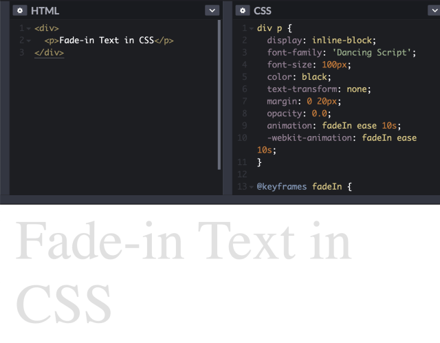
3. Fade-in Text Transition
You can create fade-in animation not only for images, but also for text. Do this by using the above CSS properties, with slight modification. The main difference between the code for images and the code for text is that the latter includes text properties, such as font-family, text-transform, and text properties.
You can find the CodePen by Erica here.
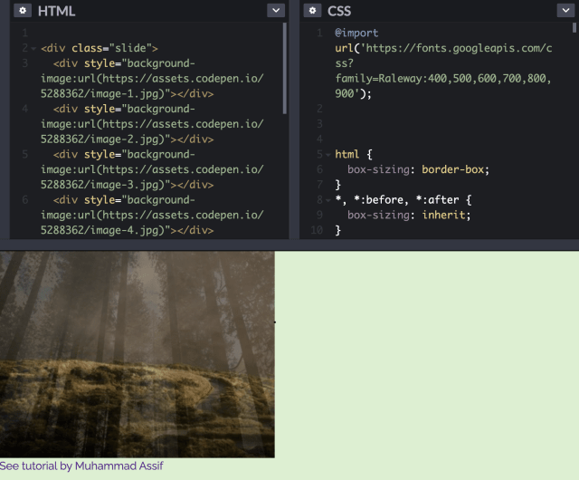
4. Fading Slideshow with Scaling Image
Here is a quick tutorial based on a demo by Muhammad Assif, explaining how to create a fading slideshow. The result should be a slider that automatically presents images in a sequence, using custom delay and duration values.
Here is how to create the HTML structure:
- Create a div element—to serve as a container for the slideshow.
- Add images to the container—to serve as the slideshow background.
- Use CSS animations to slide each div element—this creates the sliding images effect.
Here is how to create the CSS style:
- Define the height and width of the main container of your slideshow.
- Define a background color and border to display before your images are loaded.
- Set the position of the overflow relative and keep it hidden.
- Specify a style for any child div element that belongs to the slideshow.
- Keep the height and width of child div elements at 100% as an absolute value.
- Set the default option to switch or fade into other images by setting child div elements to be hidden by default. Do this by defining the opacity as 0.
- Use the CSS nth-child selector to define an animation delay for each div element.
- Use the below keyframes to define the slide animation. To manage the scaling effect, change the value of the transform property.
I created this CodePen as a tribute to Muhammad’s cool example—you can use it to play around with the code.
Conclusion
There are a wealth of image effects you can create in pure CSS—with no need for plugins or JavaScript code. I covered four of them:
- Image fade in using the animation: fadeIn attribute
- Blurring an image using blur(), or blurring with grayscale using blurGrey
- Fading in text by applying fadeIn to a paragraph element
- Creating a fading slideshow using a series of DIVs with background images
I hope this will help you get started with CSS effects—looking forward to seeing what you create on your own website.
How do you give your images more life? Was there an effect they didn't mention? Post your comments below and let's discuss.
Recommend
About Joyk
Aggregate valuable and interesting links.
Joyk means Joy of geeK