

Angular Calendar: CSS Themes | DayPilot Code
source link: https://code.daypilot.org/59293/angular-calendar-css-themes
Go to the source link to view the article. You can view the picture content, updated content and better typesetting reading experience. If the link is broken, please click the button below to view the snapshot at that time.
Features
Uses Angular Calendar component from DayPilot Pro package
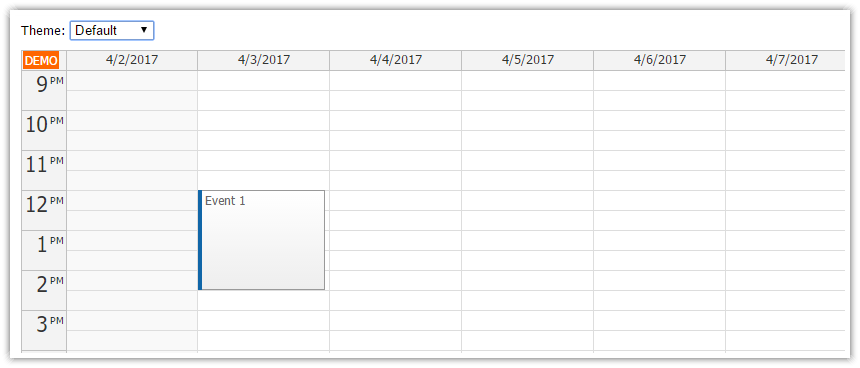
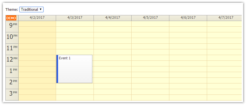
Four sample CSS demos included: Default, Blue, Traditional, White
Live switching of the CSS theme using a drop-down list
Trial version of DayPilot Pro for JavaScript is included (see license below)
License
Licensed for testing and evaluation purposes. Please see the license agreement included in the sample project. You can use the source code of the tutorial if you are a licensed user of DayPilot Pro for JavaScript. Buy a license.
Live Demo
You can test this project in a live demo:
Default CSS Theme
Blue CSS Theme

Traditional CSS Theme
White CSS Theme

Using a Custom CSS Theme
The following steps are required:
Include the theme CSS file
Specify the theme name using "theme" property of the calendar config.
Include the Theme CSS File
The default CSS theme ("calendar_default") is built in - it doesn't require any external CSS file.
In our Angular application, we are going to use multiple themes (which can be switch on the fly) so we will include all of them in styles.css.
src/styles.css
@import 'themes/calendar_blue.css';
@import 'themes/calendar_traditional.css';
@import 'themes/calendar_transparent.css';
@import 'themes/calendar_white.css';
It's necessary to include the theme files your project (themes directory) and import them in styles.css. These global css files will get included in the compiled CSS when you build the Angular application.
It's necessary to include the themes in the global CSS file. If you include it in the component-specific CSS files (using styleUrls property of the @Component annotation) the class names will get prefixed with a local identifier. However, the internal DayPilot Calendar DOM elements are not marked with the identifier and the CSS theme wouldn't be applied.
Changing the Calendar CSS Theme
The CSS theme can be activated using the theme property of the Angular calendar component config:
import {Component, ViewChild, AfterViewInit} from "@angular/core";
import {DayPilot, DayPilotCalendarComponent} from "daypilot-pro-angular";
import {DataService} from "./data.service";

@Component({
  selector: 'calendar-component',
  template: `
  <daypilot-calendar [config]="config"></daypilot-calendar>
  `,
  styles: [``]
})
export class CalendarComponent implements AfterViewInit {

  config: DayPilot.CalendarConfig = {
    // ...
    theme: "calendar_blue"
  };

  // ...

}
The attached Angular application lets you change the theme on the fly using a drop-down list (<select> element):
import {Component, ViewChild, AfterViewInit} from "@angular/core";
import {DayPilot, DayPilotCalendarComponent} from "daypilot-pro-angular";
import {DataService} from "./data.service";

@Component({
  selector: 'calendar-component',
  template: `
  <div class="space">
      Theme:
      <select [(ngModel)]="config.theme">
        <option *ngFor="let item of themes" [value]="item.value">{{item.name}}</option>
      </select>
  </div>
  <div class="{{config.theme === 'calendar_blue' ? 'calendar_blue_wrap': ''}}"><div class="{{config.theme === 'calendar_blue' ? 'calendar_blue_wrap_inner': ''}}">
  <daypilot-calendar [config]="config" [events]="events" #calendar></daypilot-calendar>
  </div></div>
  `,
  styles: [``]
})
export class CalendarComponent implements AfterViewInit {

  @ViewChild("calendar") calendar: DayPilotCalendarComponent;

  events: any[] = [];

  config: DayPilot.CalendarConfig = {
    viewType: "Week",
    startDate: "2021-07-02",
    theme: "calendar_blue"
  };

  themes: any[] = [
    {name: "Default", value: "calendar_default"},
    {name: "Blue", value: "calendar_blue"},
    {name: "Traditional", value: "calendar_traditional"},
    {name: "White", value: "calendar_white"},
  ];

  constructor(private ds: DataService) {
  }

  ngAfterViewInit(): void {
    var from = this.calendar.control.visibleStart();
    var to = this.calendar.control.visibleEnd();
    this.ds.getEvents(from, to).subscribe( result => {
      this.events = result;
    } );
  }

}
Angular Component Template Changes
The themes don't require any changes to the HTML template. You can simply insert the <daypilot-calendar> tag:
<daypilot-calendar [config]="config" [events]="events" #calendar></daypilot-calendar>
The only exception is the "blue" theme which includes a border around the calendar. The border requires two wrapper divs to be added:
<div class="calendar_blue_wrap"><div class="calendar_blue_wrap_inner">
  <daypilot-calendar [config]="config" [events]="events" #calendar></daypilot-calendar>
</div></div>
Creating a Custom Calendar CSS Theme
You can create your own CSS theme using the online theme designer. It lets you design a theme in a WYSIWYG mode and download a generated CSS file.
You can customize the generated CSS file manually if needed.
Recommend
About Joyk
Aggregate valuable and interesting links.
Joyk means Joy of geeK