

Peter Saville & New Order’s Colour Code | Joe Blogs
source link: https://wharferj.wordpress.com/2011/04/19/peter-saville-new-order-colour-code/
Go to the source link to view the article. You can view the picture content, updated content and better typesetting reading experience. If the link is broken, please click the button below to view the snapshot at that time.
Peter Saville & New Order’s Colour Code

This record has become such an intrinsic part of our culture, that it really needs no further comment from me, but this cover and a couple of other connected sleeves are possibly worthy of another look. As well as the now famously expensive die cut shapes making them look like an old fashioned floppy disc, they contain an obscure code that many people didn’t notice at first or if they did, how it worked.
The in-house graphic designer for Factory records was the great Peter Saville, and his distinctive and iconic work had already set Factory Records apart as a company that believed strongly in design, seeing it as a key aspect in cultivating the labels overall image (much like Vaughan Oliver at 23 Envelope who was a direct contemporary of Saville)
Saville was primarily interested in juxtapositions: historical and modern, technological and natural and in a wider sense, how history is perceived when seen through contemporary eyes. His colour code was a way of juxtaposing as he said “the hieroglyphics of technology with historical classicism”. Although the code first appeared on Blue Monday, it was with the release a few months later of the Power Corruption and Lies (PC&L) album, that any sense of what it might all mean began to surface.

The two diagrams below set it all out.
The first clue is that the circle is made up of 26 segments around its outer rim. The wheel is decoded using only the outer two rings, which are either a single colour or a doubled up colour (with either green or yellow). The inner segments as far I can tell are to complete the device and for decoration only.
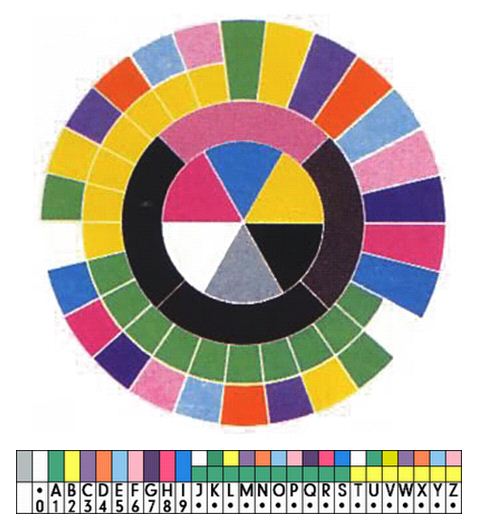
So the coloured squares on PC&L are its catalogue number FACT75 (I have no idea why numbers always seem to read upwards) and the colours down the front of Blue Monday read “FAC73 Blue Monday an” with “d The Beach New Order” on the back.
The last new Order sleeve to feature the code was Confusion released in August 1983 and which again had the catalogue number in the top right (FAC93)

And that was it. All that thought and effort for four record sleeves… In many ways this epitomises the genius of Peter Saville. He had so many brilliant ideas, that it seems he couldn’t and didn’t want to stick with any one thing for too long.
Recommend
About Joyk
Aggregate valuable and interesting links.
Joyk means Joy of geeK