

Responsive Bar Charts with Bokeh, Flask and Python 3
source link: https://www.fullstackpython.com/blog/responsive-bar-charts-bokeh-flask-python-3.html
Go to the source link to view the article. You can view the picture content, updated content and better typesetting reading experience. If the link is broken, please click the button below to view the snapshot at that time.
Bokeh is a powerful open source Python library that allows developers to generate JavaScript data visualizations for their web applications without writing any JavaScript. While learning a JavaScript-based data visualization library like d3.js can be useful, it's often far easier to knock out a few lines of Python code to get the job done.
With Bokeh, we can create incredibly detailed interactive visualizations, or just traditional ones like the following bar chart.
Let's use the Flask web framework with Bokeh to create custom bar charts in a Python web app.
Our Tools
This tutorial works with either Python 2 or 3, but Python 3 is strongly recommended for new applications. I used Python 3.6.1 while writing this post. In addition to Python throughout this tutorial we will also use the following application dependencies:
- Flask web framework, version 0.12.2
- Bokeh data visualization library, version 0.12.5
- pandas data structures and analysis library, version 0.20.1
- pip and virtualenv, which come packaged with Python 3, to install and isolate the Flask, Bokeh, and pandas libraries from any other Python projects you might be working on
If you need help getting your development environment configured before running this code, take a look at this guide for setting up Python 3 and Flask on Ubuntu 16.04 LTS
All code in this blog post is available open source under the MIT license on GitHub under the bar-charts-bokeh-flask-python-3 directory of the blog-code-examples repository. Use and abuse the source code as you like for your own applications.
Installing Bokeh and Flask
Create a fresh virtual environment for this project to isolate our
dependencies using the following command in the terminal. I typically run
this command within a separate venvs directory where all my virtualenvs
are store.
python3 -m venv barchart
Activate the virtualenv.
source barchart/bin/activate
The command prompt will change after activating the virtualenv:
Keep in mind that you need to activate the virtualenv in every new terminal window where you want to use the virtualenv to run the project.
Bokeh and Flask are installable into the now-activated virtualenv using pip. Run this command to get the appropriate Bokeh and Flask versions.
pip install bokeh==0.12.5 flask==0.12.2 pandas==0.20.1
After a brief download and installation period our required dependencies should be installed within our virtualenv. Look for output to confirm everything worked.
Installing collected packages: six, requests, PyYAML, python-dateutil, MarkupSafe, Jinja2, numpy, tornado, bokeh, Werkzeug, itsdangerous, click, flask, pytz, pandas
  Running setup.py install for PyYAML ... done
  Running setup.py install for MarkupSafe ... done
  Running setup.py install for tornado ... done
  Running setup.py install for bokeh ... done
  Running setup.py install for itsdangerous ... done
Successfully installed Jinja2-2.9.6 MarkupSafe-1.0 PyYAML-3.12 Werkzeug-0.12.2 bokeh-0.12.5 click-6.7 flask-0.12.2 itsdangerous-0.24 numpy-1.12.1 pandas-0.20.1 python-dateutil-2.6.0 pytz-2017.2 requests-2.14.2 six-1.10.0 tornado-4.5.1
Now we can start building our web application.
Starting Our Flask App
We are going to first code a basic Flask application then add our bar chart to the rendered page.
Create a folder for your project then within it create a file named
app.py with these initial contents:
from flask import Flask, render_template


app = Flask(__name__)


@app.route("/<int:bars_count>/")
def chart(bars_count):
    if bars_count <= 0:
        bars_count = 1
    return render_template("chart.html", bars_count=bars_count)


if __name__ == "__main__":
    app.run(debug=True)
The above code is a short one-route Flask application
that defines the chart function. chart takes in an arbitrary integer
as input which will later be used to define how much data we want in our
bar chart. The render_template function within chart will use a template
from Flask's default template engine named
Jinja2 to output HTML.
The last two lines in the allow us to run the Flask application from the command line on port 5000 in debug mode. Never use debug mode for production, that's what WSGI servers like Gunicorn are built for.
Create a subdirectory within your project folder named templates. Within
templates create a file name chart.html. chart.html was referenced in
the chart function of our app.py file so we need to create it before our
app will run properly. Populate chart.html with the following
Jinja2 markup.
<!DOCTYPE html>
<html>
<head>
<title>Bar charts with Bokeh!</title>
</head>
<body>
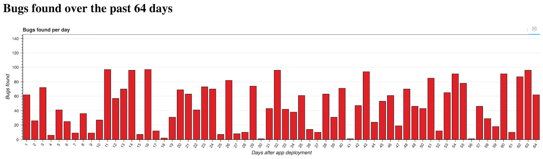
<h1>Bugs found over the past {{ bars_count }} days</h1>
</body>
</html>
chart.html's boilerplate displays the number of bars passed into the
chart function via the URL.
The <h1> tag's message on the number of bugs found goes along with our
sample app's theme. We will pretend to be charting the number of bugs
found by automated tests run each day.
We can test our application out now.
Make sure your virtualenv is still activated and that you are in the
base directory of your project where app.py is located. Run app.py
using the python command.
$(barchart) python app.py
Go to localhost:5000/16/ in your web browser. You should see a large message that changes when you modify the URL.

Our simple Flask route is in place but that's not very exciting. Time to add our bar chart.
Generating the Bar Chart
We can build on the basic Flask app foundation that we just wrote with some new Python code that uses Bokeh.
Open app.py back up and change the top of the file to include the
following imports.
import random
from bokeh.models import (HoverTool, FactorRange, Plot, LinearAxis, Grid,
                          Range1d)
from bokeh.models.glyphs import VBar
from bokeh.plotting import figure
from bokeh.charts import Bar
from bokeh.embed import components
from bokeh.models.sources import ColumnDataSource
from flask import Flask, render_template
Throughout the rest of the file we will need these Bokeh imports along
with the random module to generate data and our bar chart.
Our bar chart will use "software bugs found" as a theme. The data will be randomly generated each time the page is refreshed. In a real application you'd have a more stable and useful data source!
Continue modifying app.py so the section after the imports looks like
the following code.
app = Flask(__name__)


@app.route("/<int:bars_count>/")
def chart(bars_count):
    if bars_count <= 0:
        bars_count = 1

    data = {"days": [], "bugs": [], "costs": []}
    for i in range(1, bars_count + 1):
        data['days'].append(i)
        data['bugs'].append(random.randint(1,100))
        data['costs'].append(random.uniform(1.00, 1000.00))

    hover = create_hover_tool()
    plot = create_bar_chart(data, "Bugs found per day", "days",
                            "bugs", hover)
    script, div = components(plot)

    return render_template("chart.html", bars_count=bars_count,
                           the_div=div, the_script=script)
The chart function gains three new lists that are randomly generated
by
Python 3's super-handy random module.
chart calls two functions, create_hover_tool and create_bar_chart.
We haven't written those functions yet so continue adding code below chart:
def create_hover_tool():
    # we'll code this function in a moment
    return None


def create_bar_chart(data, title, x_name, y_name, hover_tool=None,
                     width=1200, height=300):
    """Creates a bar chart plot with the exact styling for the centcom
       dashboard. Pass in data as a dictionary, desired plot title,
       name of x axis, y axis and the hover tool HTML.
    """
    source = ColumnDataSource(data)
    xdr = FactorRange(factors=data[x_name])
    ydr = Range1d(start=0,end=max(data[y_name])*1.5)

    tools = []
    if hover_tool:
        tools = [hover_tool,]

    plot = figure(title=title, x_range=xdr, y_range=ydr, plot_width=width,
                  plot_height=height, h_symmetry=False, v_symmetry=False,
                  min_border=0, toolbar_location="above", tools=tools,
                  responsive=True, outline_line_color="#666666")

    glyph = VBar(x=x_name, top=y_name, bottom=0, width=.8,
                 fill_color="#e12127")
    plot.add_glyph(source, glyph)

    xaxis = LinearAxis()
    yaxis = LinearAxis()

    plot.add_layout(Grid(dimension=0, ticker=xaxis.ticker))
    plot.add_layout(Grid(dimension=1, ticker=yaxis.ticker))
    plot.toolbar.logo = None
    plot.min_border_top = 0
    plot.xgrid.grid_line_color = None
    plot.ygrid.grid_line_color = "#999999"
    plot.yaxis.axis_label = "Bugs found"
    plot.ygrid.grid_line_alpha = 0.1
    plot.xaxis.axis_label = "Days after app deployment"
    plot.xaxis.major_label_orientation = 1
    return plot
There is a whole lot of new code above so let's break it down. The
create_hover_tool function does not do anything yet, it simply
returns None, which we can use if we do not want a hover tool. The hover
tool is an overlay that appears when we move our mouse cursor over one of
the bars or touch a bar on a touchscreen so we can see more data about the
bar.
Within the create_bar_chart function we take in our generated data source
and convert it into a ColumnDataSource object that is one type of input
object we can pass to Bokeh functions. We specify two ranges for the chart's
x and y axes.
Since we do not yet have a hover tool the tools list will remain empty.
The line where we create plot using the figure function is where a lot of
the magic happens. We specify all the parameters we want our graph to have
such as the size, toolbar, borders and whether or not the graph should be
responsive upon changing the web browser size.
We create vertical bars with the VBar object and add them to the plot using
the add_glyph function that combines our source data with the VBar
specification.
The last lines of the function modify the look and feel of the graph. For
example I took away the Bokeh logo by specifying plot.toolbar.logo = None
and added labels to both axes. I recommend keeping the
bokeh.plottin
documentation open to know what your options are for customizing your
visualizations.
We just need a few updates to our templates/chart.html file to display
the visualization. Open the file and add these 6 lines to the file.
Two of these lines are for the required CSS, two are JavaScript Bokeh
files and the remaining two are the generated chart.
<!DOCTYPE html>
<html>
  <head>
    <title>Bar charts with Bokeh!</title>
    <link href="http://cdn.pydata.org/bokeh/release/bokeh-0.12.5.min.css" rel="stylesheet">
    <link href="http://cdn.pydata.org/bokeh/release/bokeh-widgets-0.12.0.min.css" rel="stylesheet">
  </head>
  <body>
    <h1>Bugs found over the past {{ bars_count }} days</h1>
    {{ the_div|safe }}
    <script src="http://cdn.pydata.org/bokeh/release/bokeh-0.12.5.min.js"></script>
    <script src="http://cdn.pydata.org/bokeh/release/bokeh-widgets-0.12.5.min.js"></script>
    {{ the_script|safe }}
  </body>
</html>
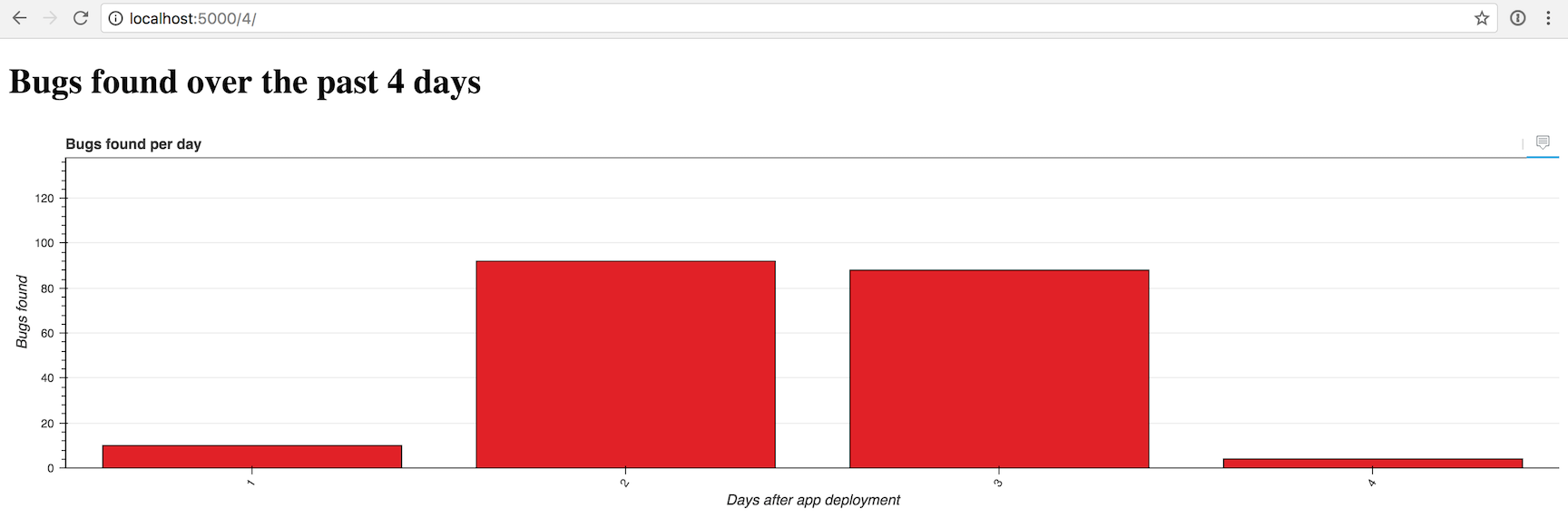
Alright, let's give our app a try with a simple chart of 4 bars. The
Flask app should automatically reload when you save app.py with the new
code but if you shut down the development server fire it back up with the
python app.py command.
Open your browser to localhost:5000/4/.
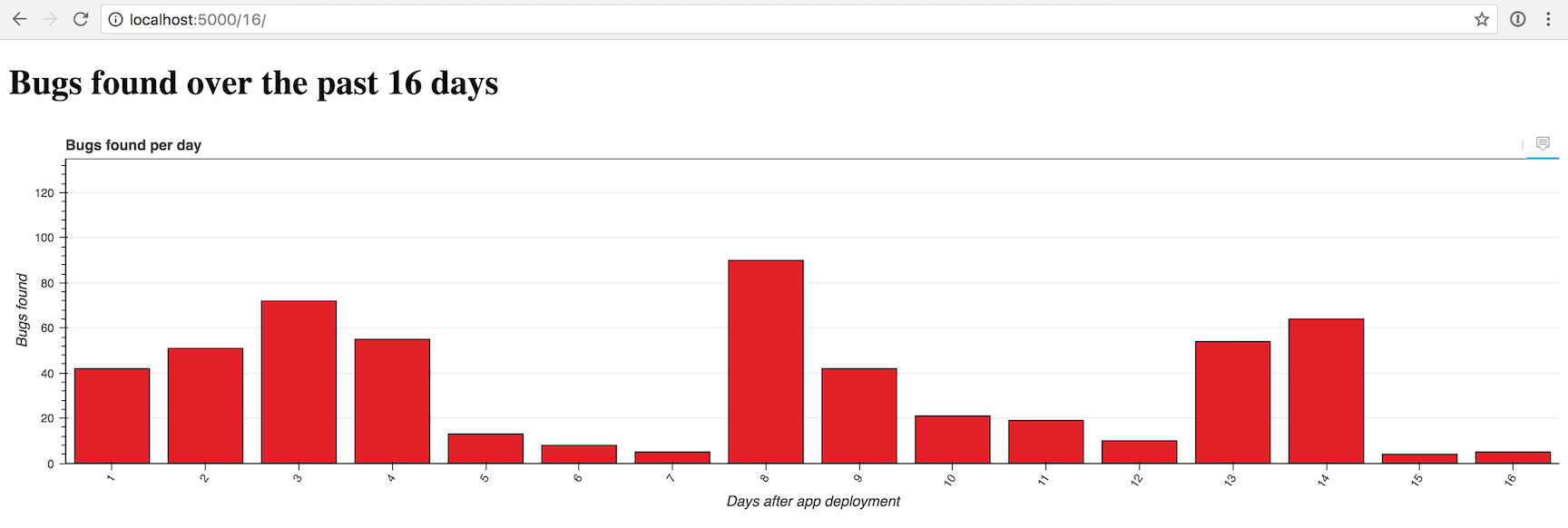
That one looks a bit sparse, so we can crank it up by 4x to 16 bars by going to localhost:5000/16/.
Now another 4x to 128 bars with localhost:5000/128/...
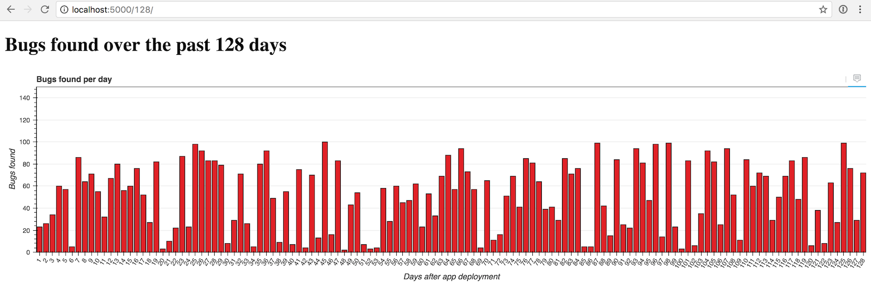
Looking good so far. But what about that hover tool to drill down into each
bar for more data? We can add the hover with just a few lines of code
in the create_hover_tool function.
Adding a Hover Tool
Within app.py modify the create_hover_tool to match the following
code.
def create_hover_tool():
    """Generates the HTML for the Bokeh's hover data tool on our graph."""
    hover_html = """
      <div>
        <span class="hover-tooltip">$x</span>
      </div>
      <div>
        <span class="hover-tooltip">@bugs bugs</span>
      </div>
      <div>
        <span class="hover-tooltip">$@costs{0.00}</span>
      </div>
    """
    return HoverTool(tooltips=hover_html)
It may look really odd to have HTML embedded within your Python application,
but that's how we specify what the hover tool should display. We use
$x to show the bar's x axis, @bugs to show the "bugs" field from our
data source, and $@costs{0.00} to show the "costs" field formatted as
a dollar amount with exactly 2 decimal places.
Make sure you changed return None to return HoverTool(tooltips=hover_html)
so we can see the results of our new function in the graph.
Head back to the browser and reload the localhost:5000/128/ page.
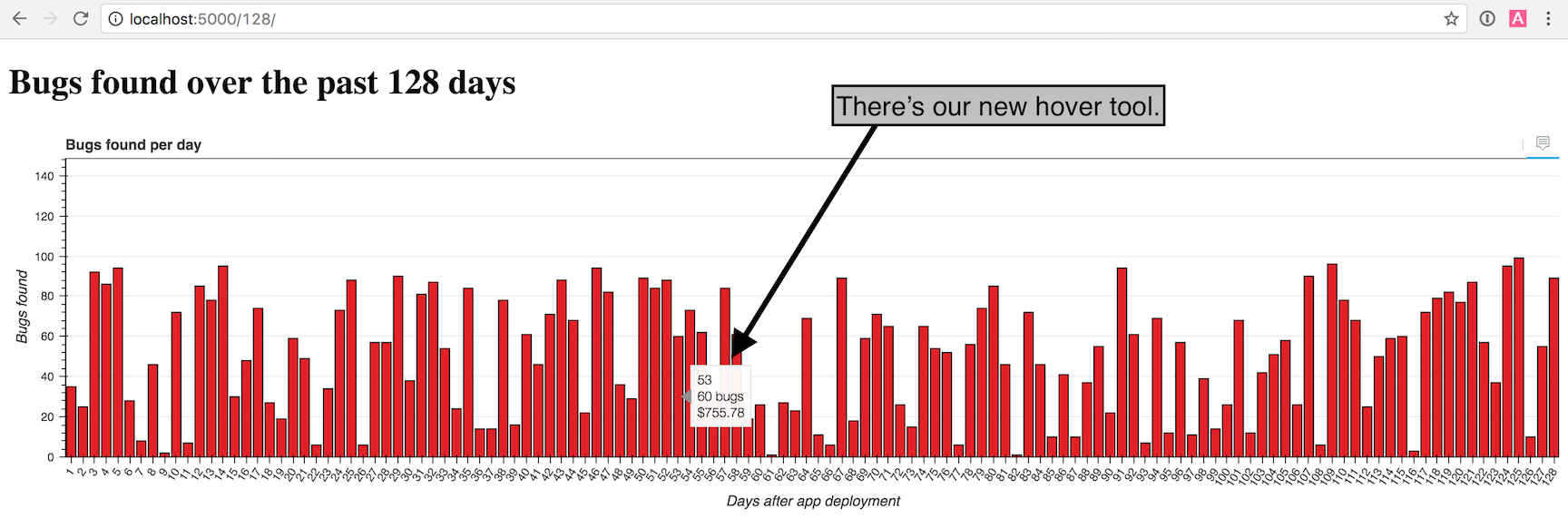
Nice work! Try playing around with the number of bars in the URL and the window size to see what the graph looks like under different conditions.
The chart gets crowded with more than 100 or so bars, but you can give it a try with whatever number of bars you want. Here is what an impractical amount of 50,000 bars looks like just for the heck of it:
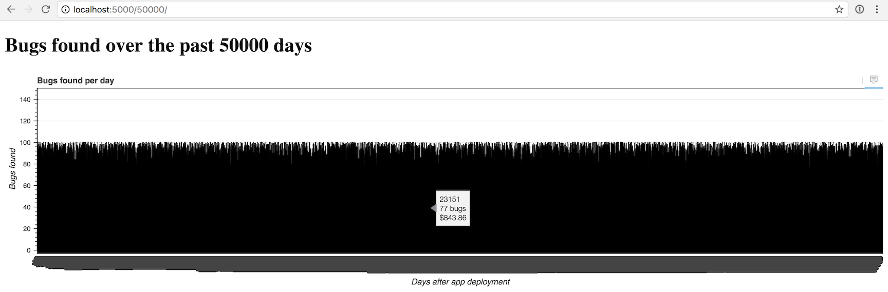
Yea, we may need to do some additional work to display more than a few hundred bars at a time.
What's next?
You just created a nifty configurable bar chart in Bokeh. Next you can modify the color scheme, change the input data source, try to create other types of charts or solve how to display very large numbers of bars.
There is a lot more than Bokeh can do, so be sure to check out the official project documentation , GitHub repository, the Full Stack Python Bokeh page or take a look at other topics on Full Stack Python.
Questions? Let me know via a GitHub issue ticket on the Full Stack Python repository, on Twitter @fullstackpython or @mattmakai.
See something wrong in this blog post? Fork this page's source on GitHub and submit a pull request.
Recommend
About Joyk
Aggregate valuable and interesting links.
Joyk means Joy of geeK