

How TikTok Design Hooks You Up
source link: https://uxplanet.org/how-tiktok-design-hooks-you-up-6c889522c7ed
Go to the source link to view the article. You can view the picture content, updated content and better typesetting reading experience. If the link is broken, please click the button below to view the snapshot at that time.

How TikTok Design Hooks You Up
Being a huge fan of behavioral psychology, I like to analyze popular apps design to see what techniques they use to attract and engage users. Today you will learn how TikTok onboards new customers, creates habit loops, drives our behavior, and hooks us up to keep using the app. Get on board! 👇
Sign up

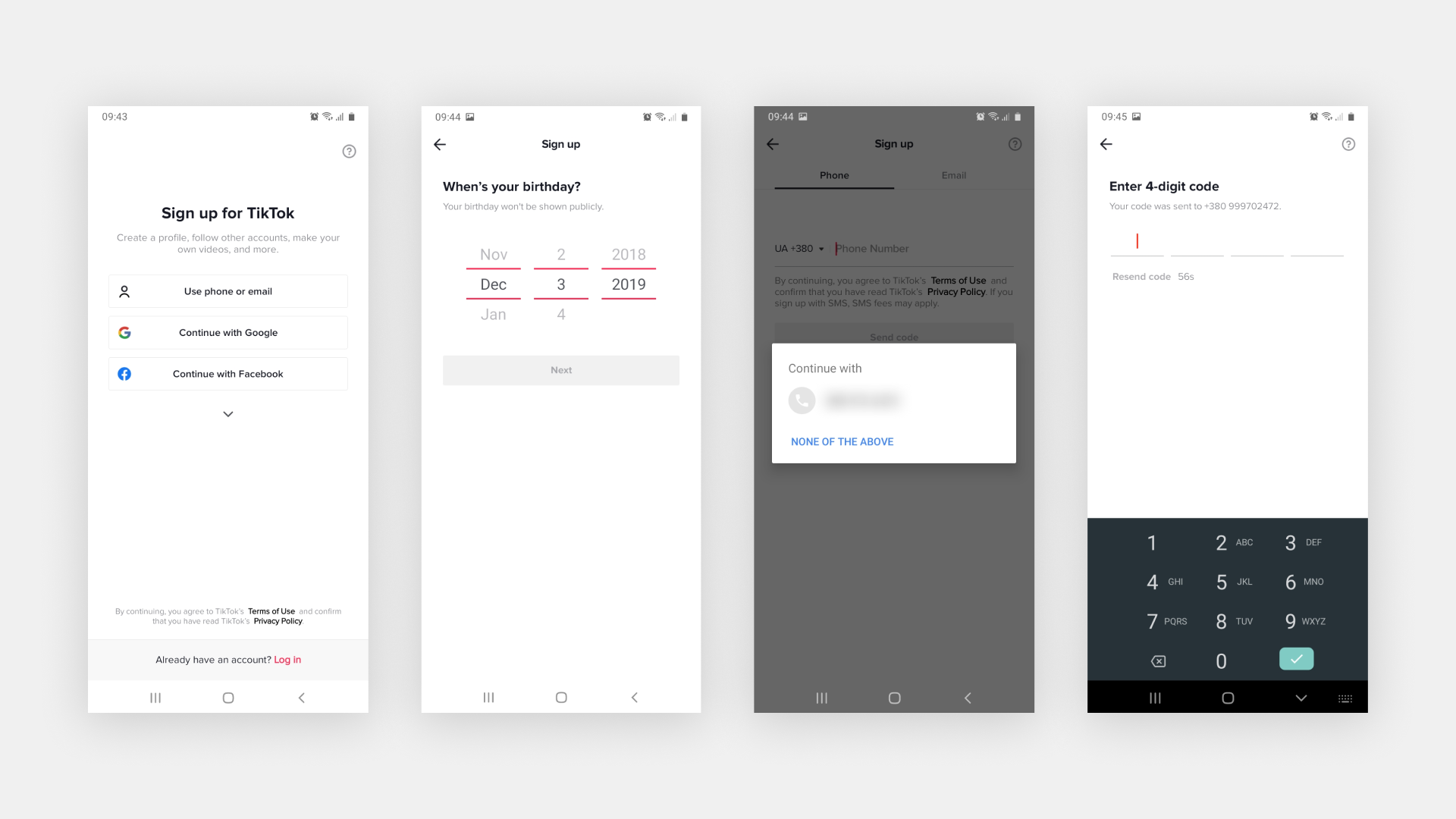
Everything starts with the sign-up screen. It’s pretty dope — all clean and aimed for user action with no distractions like onboarding. Of course, TikTok can afford it because lots of people know what it is and why to sign up for it. So designers have focused all their efforts on making the sign-up screen clear and easy to understand.
Also, please note how they organized the choice architecture for sign-up options. They display only three of them at once, hiding the rest of them.
TikTok's designers know the Hick’s law:
The more choices users have, the harder it’s for them to make one.
So it’s not necessary to put all available options at once when you can first show the desired ones, making it easier for the user to choose.
The registration process is quick and easy. You have to provide your birthday, phone or email and confirm it. One task per step is a common solution because users perceive a complicated task easier to complete if it’s split into smaller ones. Also, as Tinder does it, TikTok automatically provides you your current mobile number and the confirmation code as well.
What’s so smart in it? TikTok’s designers know the core of people’s motivation:
If you want people to do something, make it as easy as possible.
That’s the core of the behavioral theory by BJ Fogg. You need three things to nudge a person to do something — Motivation, Ability, and Trigger. Together they create an easy formula of human behavior. To do something, people need the desire, ability to do this, and a trigger that will nudge you to act. It’s hard to manage people’s motivation, but you can make the ability to do something as easy as possible.

TikTok uses any possibility to reduce the number of interactions required from the user. You don’t even have to recall and then type my phone number with my fingers — you need to make one tap. The country code is already prefilled based on your phone’s location settings, so you don’t have to search for it from the long list. After a short onboarding where TikTok sets up your first feed content and educates how to use the app, you are good to go.

I got you babe
After the user has created the account, a designer’s main goal is to keep him in the app. TikTok does in two ways.
They immediately show you an autoplayed video after a short in-context onboarding. 15M of views? Wow, there’s a great chance that would be an interesting video, and a user would d like to watch it till the end, and maybe like or share it with my friends. That’s very smart to provide the best stuff first to hook your user and create a desire to watch more stuff like this. TikTok creates a positive experience from the first seconds of using the app, and you literally didn’t have to do a thing for it. Only one video per screen is a powerful conception. TikTok puts the main focus on the content, so you’re not distracted by any other videos.

Look at these noticeable notifications at the top and the bottom of the screen. The first one shows me as a user that I have some updated stuff I’m following. However, I haven’t followed anyone; TikTok automatically subscribed me for a popular account (with cats you can’t go wrong). What a nice way to solve the empty state issue for this screen. Instead of showing the user a copy “Follow somebody to see their video,” they already show some content.
The other notification in the navigation menu shows that you already have two Inbox messages. That’s another example of solving the empty state’s issue in a smart way. They show real content on the screen, educating the user how it works, and you have a chance to put a call-to-action to nudge users to start creating videos and broadcasting themselves.
When you go to the Account screen, you’ll see an animated tooltip nudging you to create your first video alongside educating you on how to do it. This animation attracts your attention and leads you to the main action — make a video. Why it’s important? Because content is the fuel of TikTok. The more interesting videos they have, the more chances users will come back to check if there is new stuff to watch.
TikTok Feed

Going back to the simplicity — it’s the core of TikTok app. Simple swipe interactions — and you have everything you need. Tinder also uses a simple swipe gesture as the core interaction model.
TikTok’s designers have made slick and easy navigation. The content takes the whole viewport. The secondary content like creator’s name, description, music, and reactions icons (like, share, comment) are nicely positioned in the thumb access zone.
The number of views, likes, comments, and shares allows the user to form an opinion about the video quickly. The more likes it has, the more chances it is worth viewing. That’s why creators are trying to get as many likes as possible because they know that users will rate their accounts by these numbers.
The TikTok feed is infinite, so you can swipe it looking for interesting stuff almost eternally. The simplicity of interaction and focus on the content combines with the core method of how to hook your users. It’s the same principle that slot machines use — variable rewards. You don’t know what you’ll get next — a cool story or a funny video — so you keep swiping the feed. That’s a really powerful technique to stick your user to your product. Instagram has been doing the same way until they added the “You’re all caught up” message to break this loop and give users a way to stop the interaction.

What’s so cool about TikTok’s feed is its algorithm that works very smart. Considering the time you spent watching a particular video, your interactions with it (like, comment, mark as not interested) and high-rated universal content (it’s all about cats) allows them to fill your feed with videos you’d like to watch more. They require little of your interactions but still generate an interesting feed greatly.
Keep Me In Context

Another cool TikTok interaction principle is using the bottom sheet to comment, share, and so on. Doing this allows the user to stay in the video context and reduces their chances of moving away from the Home screen. Also, this bottom sheet lays in the thumb zone that’s easy to reach.

Creating Video

Creating TikTok video is easy as the rest of the app. Make a video or upload it, add music from the library, add filters or effects, and you're ready to go. After you uploaded the video, the notification at the top of the screen provides you multiple ways to share your new video. That’s another great example of using the MAT model - you keep users motivated, you make it easy to share, and you give this trigger to start sharing right on time when it makes sense.
TikTok limits the video length to 1 min maximum, and that's another technique to explode the creativity. Limitations like 280 characters on Twitter motivate creators to use all their imagination to fit these limits and create cool content.
Right after uploading the video, TikTok had to check if you used the autogenerated nickname and offers to make it more personalized. Another great timing in sending the hot triggers when you’re the most motivated. If they sent this message when the user was swiping the feed, that’d be confusing. You’re watching cat videos, and you don’t want to change your nickname right now. But when you’re doing something related to having a nice nickname, that’s the right time to ask.
Overview
As you can see, TikTok uses lots of behavioral psychology principles to hook their customers. Using the simplicity of interaction and interesting content, they have built the app the users will come back to.
TikTok reminds me of a combination of Instagram, Coub, and Snapchat taking the best of them and spicing it up with smart algorithms and MAT model. And that’s cool because you use the interaction patterns millions of users are familiar with. People don’t need something new; they want the familiar done differently.
By the way, don’t forget to follow me on TikTok 🤙
Recommend
About Joyk
Aggregate valuable and interesting links.
Joyk means Joy of geeK