

网格如此简单
source link: https://yanhaijing.com/css/2013/08/22/dont-overthink-it-grids/
Go to the source link to view the article. You can view the picture content, updated content and better typesetting reading experience. If the link is broken, please click the button below to view the snapshot at that time.
网格如此简单 译 编辑
绝大多数的网站都在使用一个网格。 他们可能没有明确的使用网格系统,但如果他们有一个向左浮动“主要内容区”和一个向右浮动的“侧边栏”,这就是一个简单的网格。
如果需要更复杂的布局,人们往往会借助框架。 他们猜想网格是超高难度的事情最好留给超级CSS书呆子。 这一理念导致这样的事实,很多网格系统是非常复杂的 。
下面是我如何构建网格。 它一点都不难也不复杂。 甚至使他们灵活也不是一个大的任务。
块级元素的宽度和它的父元素一样( width: auto; )。 我们可以把它的宽度看作是100%。 wrapper 对于网格可能语义不太好,但它只是一个普通的包装器,所以div是合适的。
<div class="grid">
  <!-- 100% wide -->
</div>

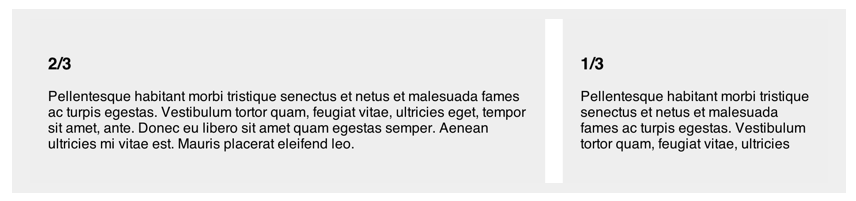
让我们从一个实用的,通用的需要开始:主要内容区宽度为2/3和1/3宽的侧边栏。 我们只用2个div元素代表两列并取的适当的类名。
<div class="grid">
  <div class="col-2-3">
     Main Content
  </div>
  <div class="col-1-3">
     Sidebar
  </div>
</div>
为了让他们水平排列,我们只需要浮动他们并设置合适的宽度。 我们选择他们像下面这样:
[class*='col-'] {
  float: left;
}
各个宽度的设置像下面这样:
.col-2-3 {
  width: 66.66%;
}
.col-1-3 {
  width: 33.33%;
}
这就是全部的前提关于简单网格。
给容器清除浮动
父元素会发生坍塌高度变为0,因为它的子元素全部浮动,浮动的元素将脱离标准流。 下面让我们修补这种情况通过clear属性。 你只需像下面这样:
.grid:after {
  content: "";
  display: table;
  clear: both;
}
网格最难的部分是间隙(列之间的空隙)。 到目前为止,我们已经使用百分比制成了灵活的网格。 我们可以使所有复杂数学计算并且让我们的间隙也使用百分比,但无论如何我个人不喜欢百分比的间隙,我喜欢固定像素尺寸的间隙。 此外,我们正试图解决这个问题。
第一步是使用 box-sizing: border-box;。
*, *:after, *:before {
  -webkit-box-sizing: border-box;
  -moz-box-sizing: border-box;
  box-sizing: border-box;
}
现在,当我们设置元素的宽度,这个宽度=width+padding+border。
第二步是给除了最后一个以外的所有列的右内边距设置一个固定值。
[class*='col-'] {
  padding-right: 20px;
}
[class*='col-']:last-of-type {
  padding-right: 0;
}
这就是基本间隙的所有设置了。
需要设置外部间隙(父元素的内边距)?我喜欢使用一个可选类:
<div class="grid grid-pad">
  Grid with outside gutters also
</div>
第一步是给网格父元素添加左内边距(以及可选的的顶部和底部内边距):
.grid-pad {
  padding: 20px 0 20px 20px;
}
第二步是重新设置最后一列的右内边距
.grid-pad > [class*='col-']:last-of-type {
  padding-right: 20px;
}
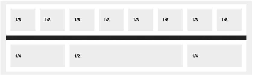
更多列选择
超级简单:
.col-1-2 {
  width: 50%;
}
.col-1-4 {
  width: 25%;
}
.col-1-8 {
  width: 12.5%;
}
做你想做的效果,只要确保列分数加起来为1。 耶,需要一点点思考,但比平常更容易。
在这里我不过分使用它,但使用它让所有事情变得更加简洁(还可用less):
* {
  @include box-sizing(border-box);
}

$pad: 20px;

.grid {
  background: white;
  margin: 0 0 $pad 0;

  &:after {
    /* Or @extend clearfix */
    content: "";
    display: table;
    clear: both;
  }
}

[class*='col-'] {
  float: left;
  padding-right: $pad;
  .grid &:last-of-type {
    padding-right: 0;
  }
}
.col-2-3 {
  width: 66.66%;
}
.col-1-3 {
  width: 33.33%;
}
.col-1-2 {
  width: 50%;
}
.col-1-4 {
  width: 25%;
}
.col-1-8 {
  width: 12.5%;
}

/* Opt-in outside padding */
.grid-pad {
  padding: $pad 0 $pad $pad;
  [class*='col-']:last-of-type {
    padding-right: $pad;
  }
}
我喜欢这些网格内工作的“模块”。
<div class="grid">
  <div class="col-2-3">
     <article class="module">
        stuff
     </article>
     <article class="module">
        stuff
     </article>
  </div>
  <div class="col-1-3">
    <aside class="module">
       Sidebar stuff. Sub modules?
    </aside>
  </div>
</div>
将内容分解成块这种方法看起不错。 额外的副作用是每个模块可以自己的内边距,来是文本内容和网格的边缘保持距离。
这是在CodePen上的一个例子
浏览器不支持
工作仅仅在IE 8+,和所有其他标准的东西看起来是好的。 如果你需要支持IE 7,你将不得不做一些其他的工作)。
此外,Flexbox让这变得更好更容易(有多种方法,包括从新设置盒子模型),但我认为,我们大约需要一年事件,直到我们可以开始考虑使用它。
注:本文为翻译文章,原文章名称《Don’t Overthink It Grids》
原文网址:http://yanhaijing.com/css/2013/08/22/dont-overthink-it-grids/
 关注微信公众号 颜海镜
 赞赏支持 微信扫一扫
Recommend
About Joyk
Aggregate valuable and interesting links.
Joyk means Joy of geeK