

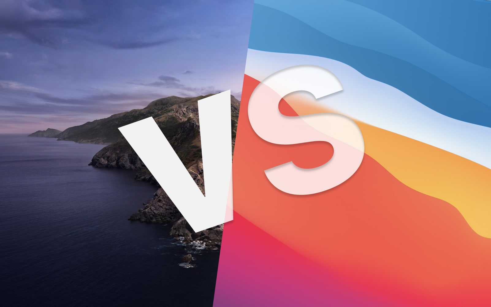
A visual comparison of macOS Catalina and Big Sur
source link: https://www.andrewdenty.com/blog/2020/07/01/a-visual-comparison-of-macos-catalina-and-big-sur.html
Go to the source link to view the article. You can view the picture content, updated content and better typesetting reading experience. If the link is broken, please click the button below to view the snapshot at that time.
A visual comparison of macOS Catalina and Big Sur
Jul 1, 2020
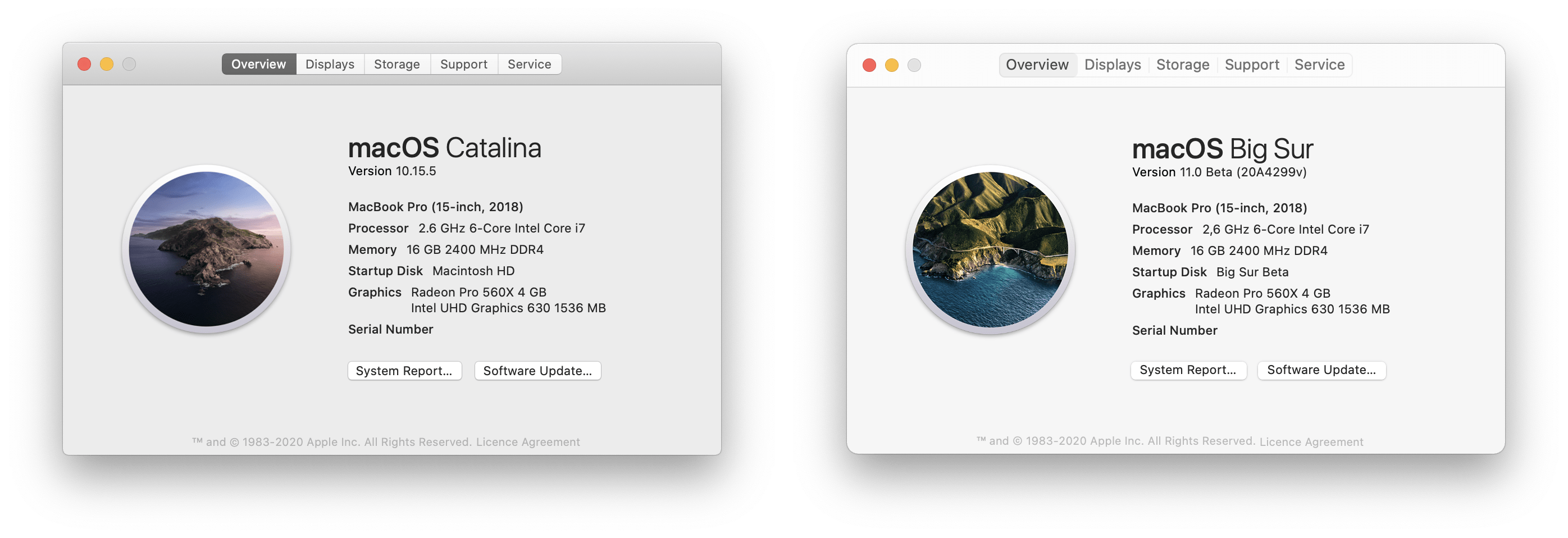
Why did I end up doing this? Well, this week I installed the developer beta of macOS Big Sur as I was curious what impact the new UI would have on the app I currently design. I wanted to make sure my team was ahead of any coming changes as we were burned by changes in last year’s release of Catalina.
I found myself taking lots of screenshots to try and track the changes and thought this might be worth sharing. I decided to carry out a quick catalogue of the UI changes as this may be helpful to other people getting ready for macOS Big Sur.
All of the screenshots below are taken on a default install of macOS and the Catalina version is always on the left. I made a conscious effort not to resize any windows or change any default settings. I haven’t captured everything, but it is a good taste of the changes so far.
First impressions
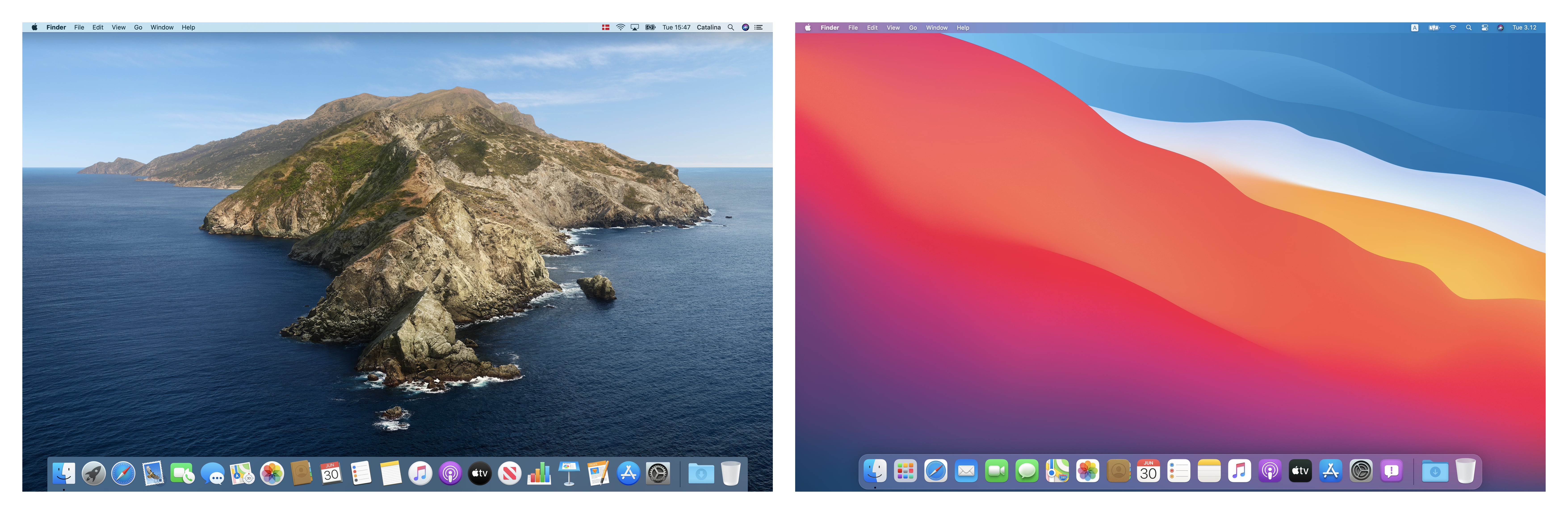
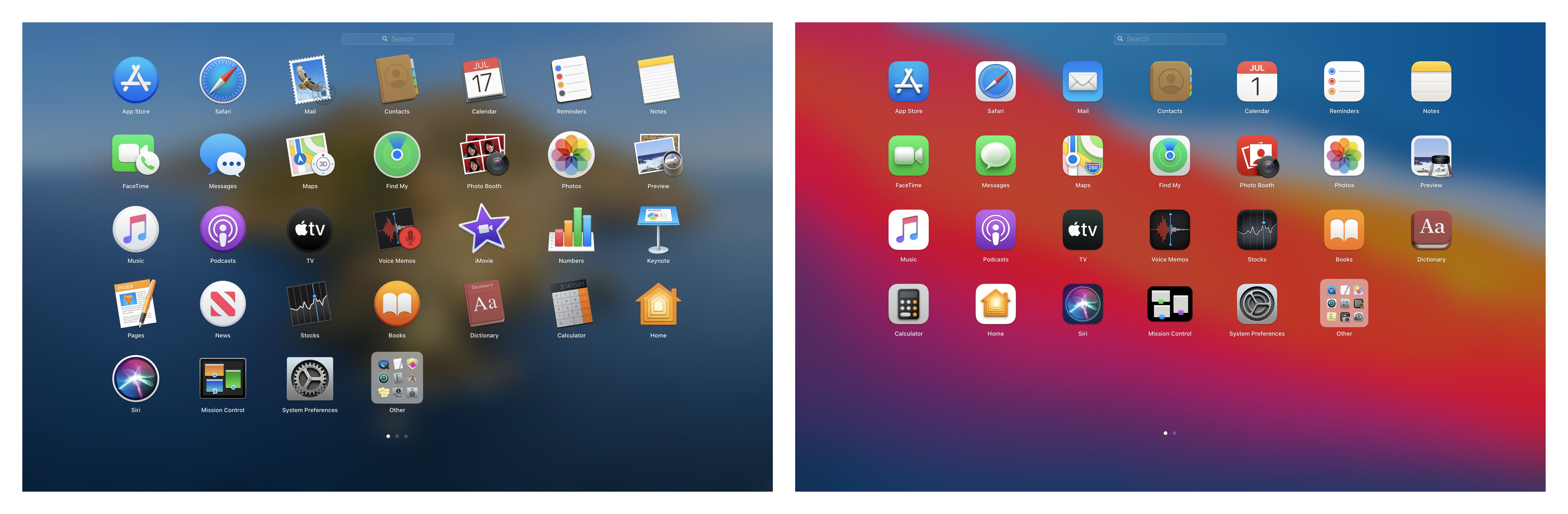
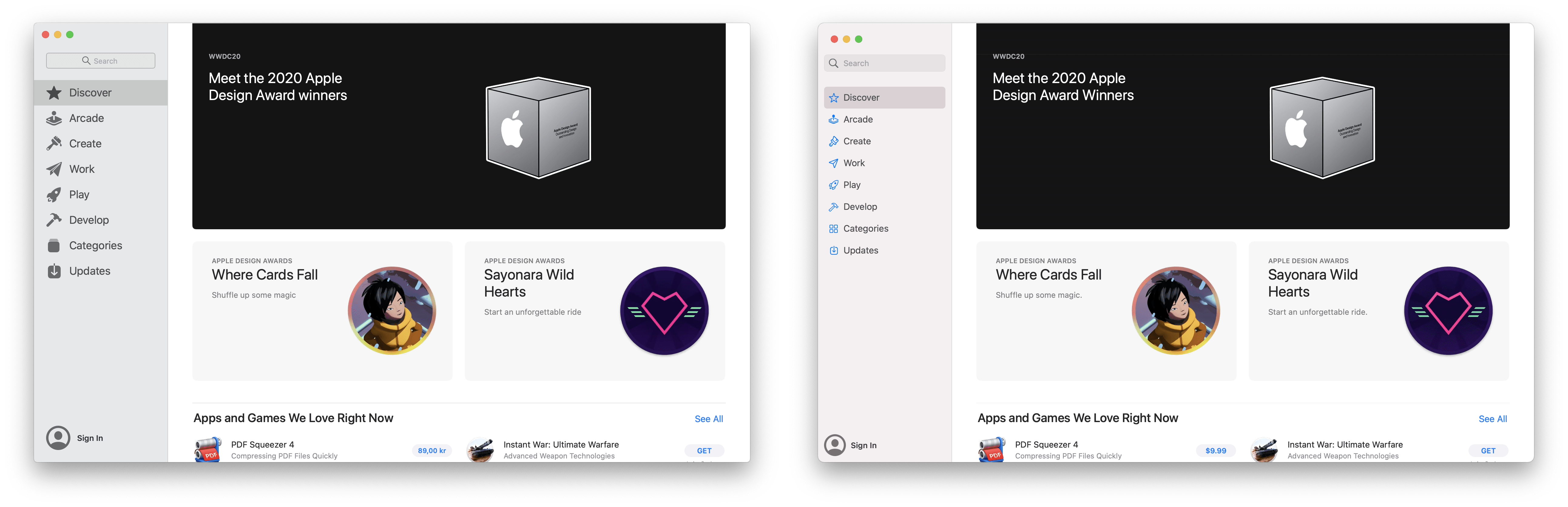
At first glance macOS is a lot more colourful with, and the biggest obvious change is the bright, slightly more cartoonish iOS shaped icons. Everything is more rounded and it feels like everything has gotten a little bigger. Could this be the first hint that macOS is preparing for touch support in the future? One interesting tidbit, is that even though the icons are based around the capsule shape, many of them (like Contacts, or Preview) have elements which protrude from them giving an extra feeling of depth.
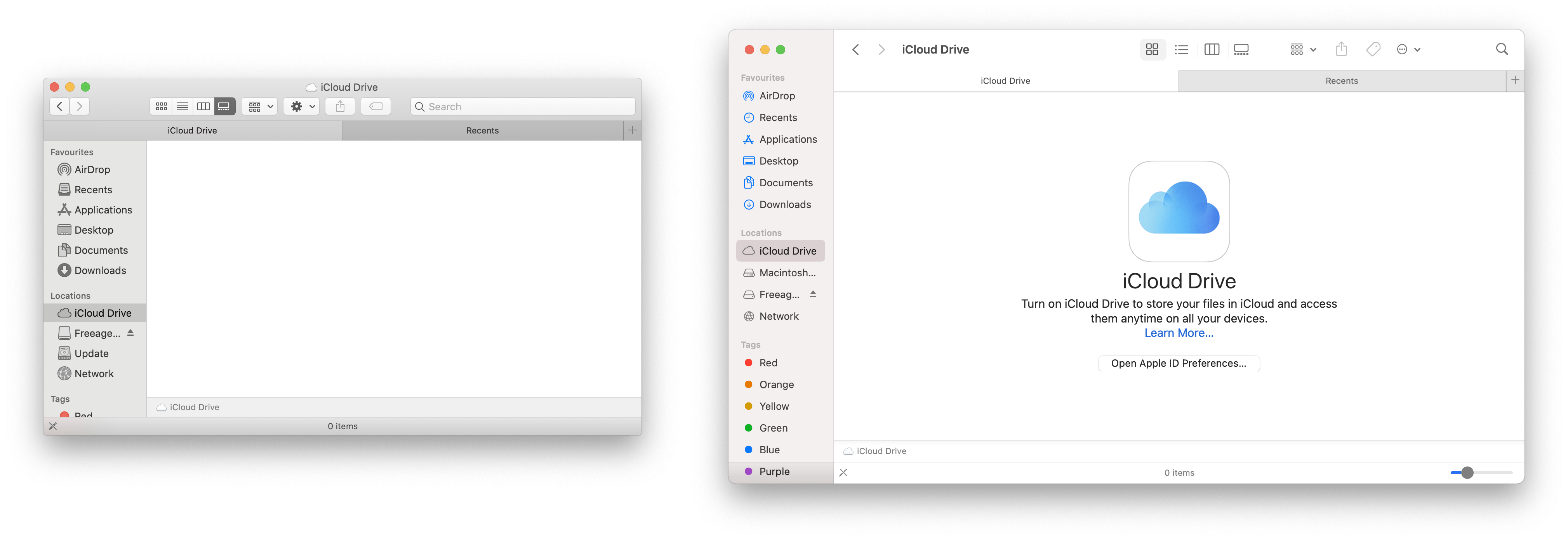
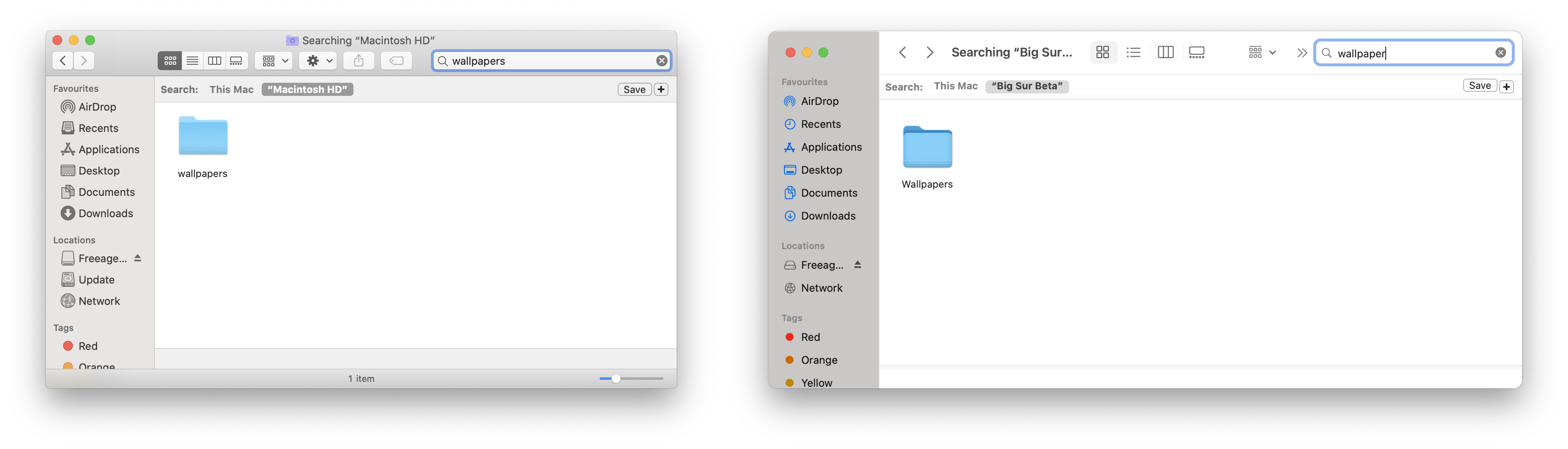
Finder and Preview
Finder sees some significant changes. Of all the places I think Apple needs to get the new UI spot on, is Finder. Overall the default size of Finder seems to be bigger in macOS Big Sur.
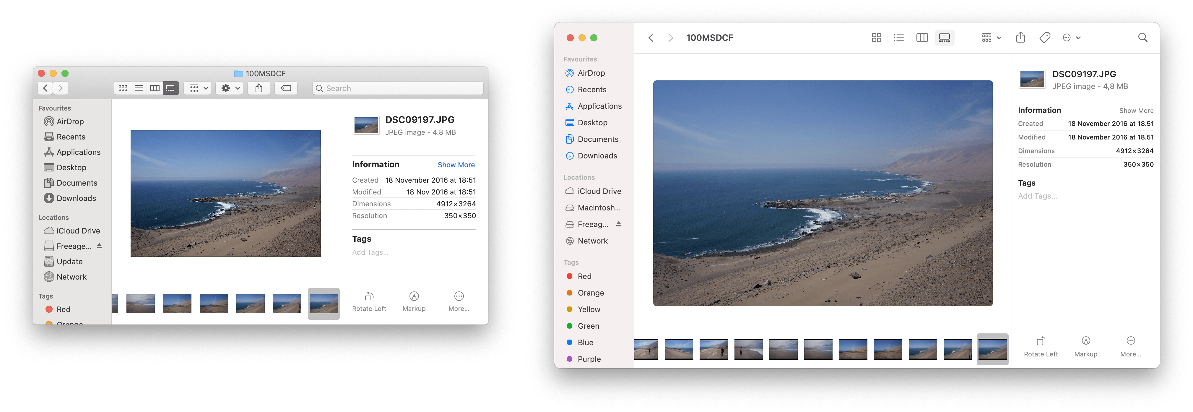
One thing that struck me at this point is that Finder looks a mess with many of the more advanced features enabled. The bottom screenshot shows Finder with a Path Bar, Status Bar and multiple tabs. To me, it seems like the design team have not yet been able to find a way to elegantly integrate these elements into the iOS inspired UI.
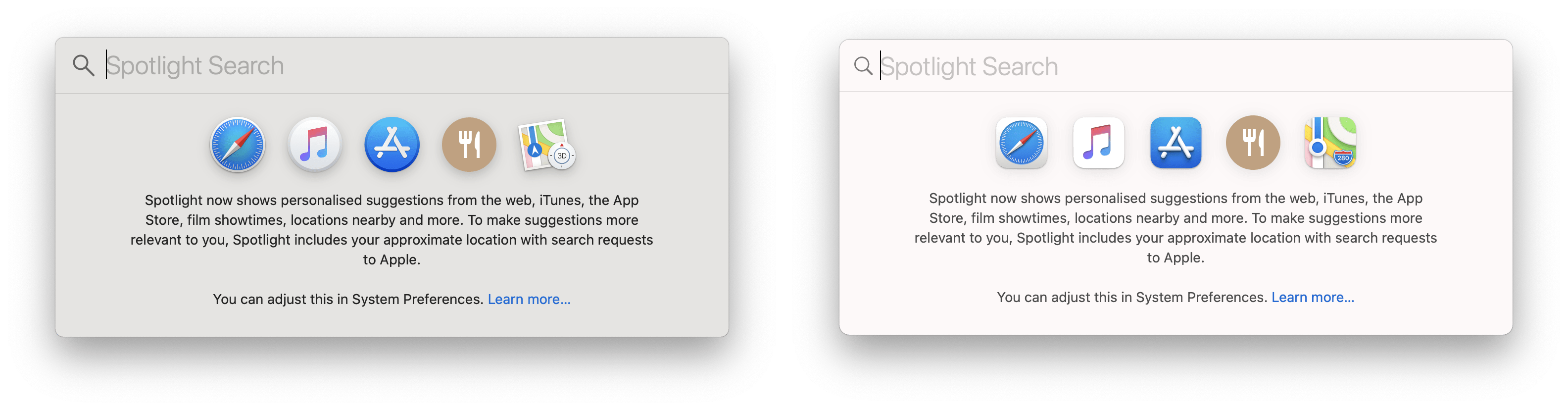
One final thing to note is that in Finder the search bar at the top right has been replaced with a search icon that expands when clicked. This change seems a little inconsistent as it’s not made it to Preview. I can guarantee this will result in fewer people discovering Finder’s Spotlight search goodness.
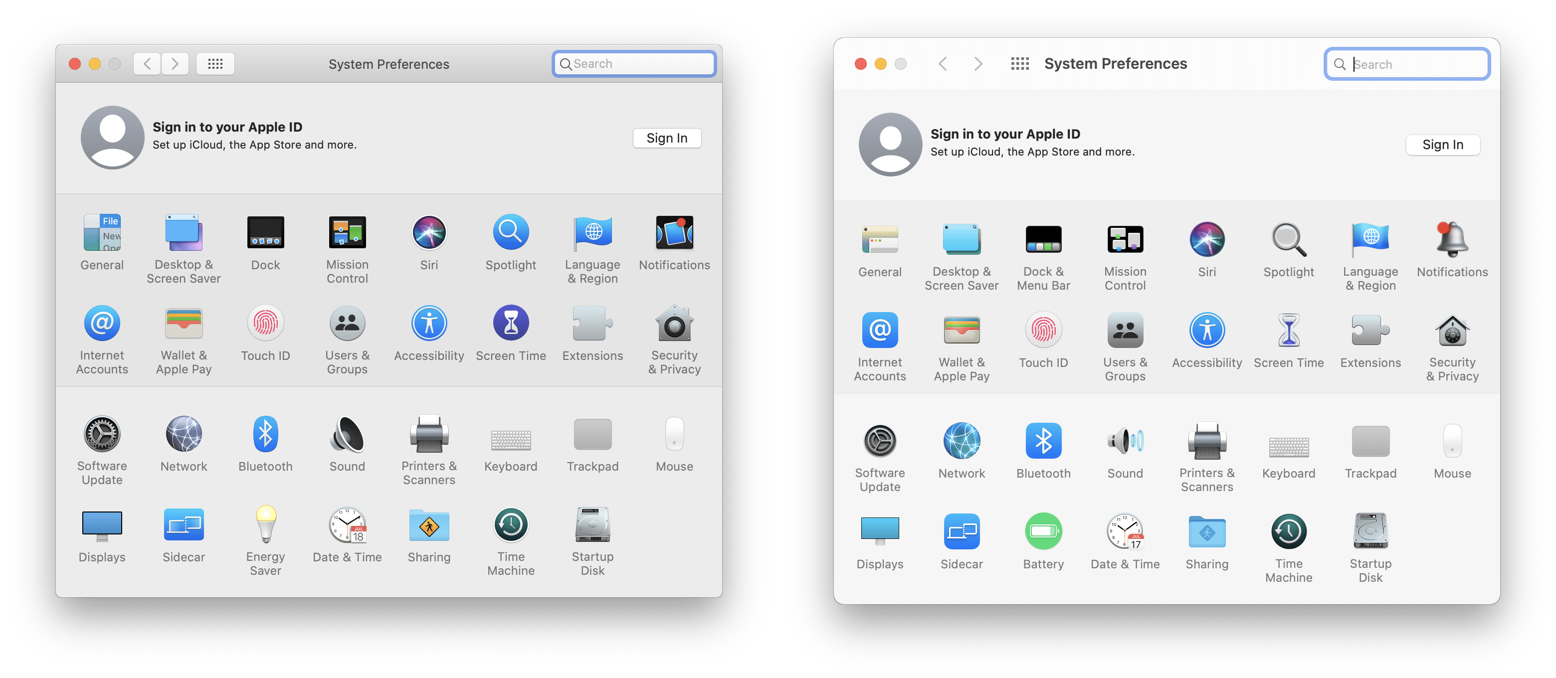
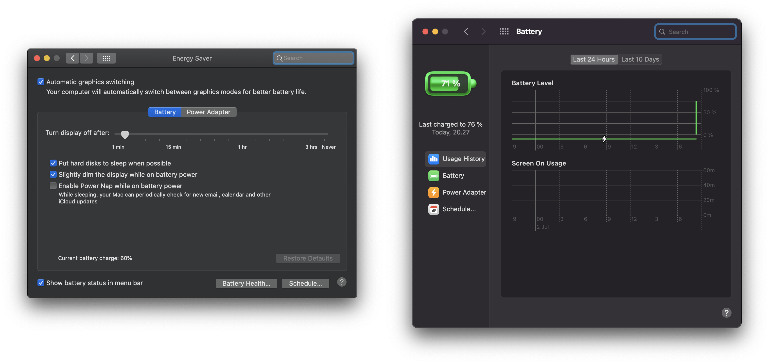
Preferences
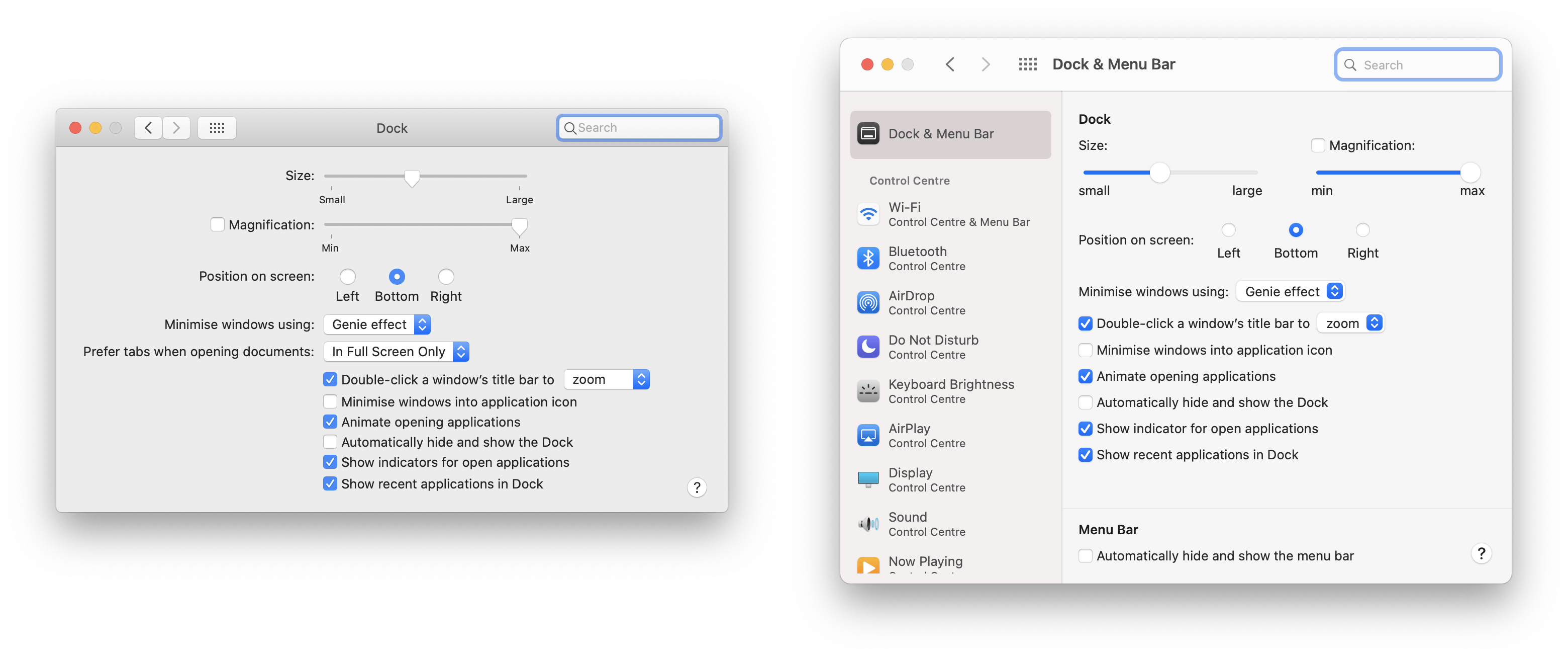
Preferences sees quite a lot of change in some areas. The Dock preferences pane has become “Dock and Menu Bar” and now integrates controls for the new macOS control center. It uses a nicely integrated sidebar to manage different categories.
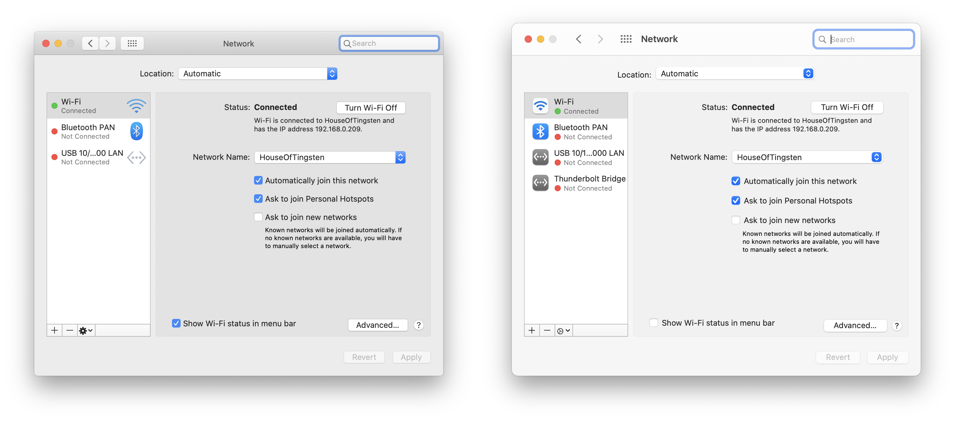
It’s a shame that this sidebar hasn’t yet made it to other parts of the preferences UI with Network and Notifications still using a very old looking sidebar.
One aspect of preferences that has been quite controversial (on Twitter at least) is the new icons. I’m going to hold off judgement for now as they don’t yet look finished. For example, the Notifications icon does not even support retina displays.
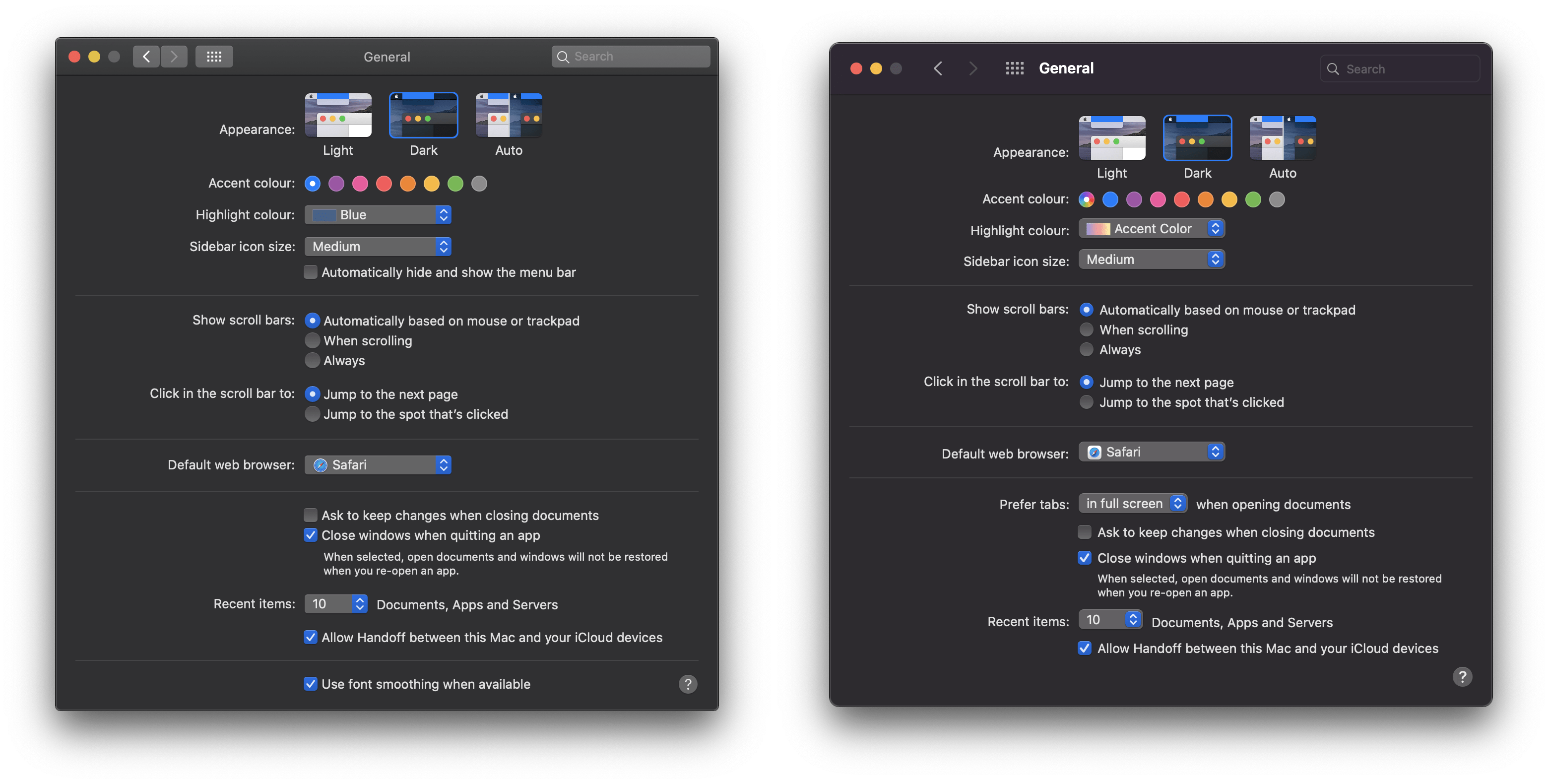
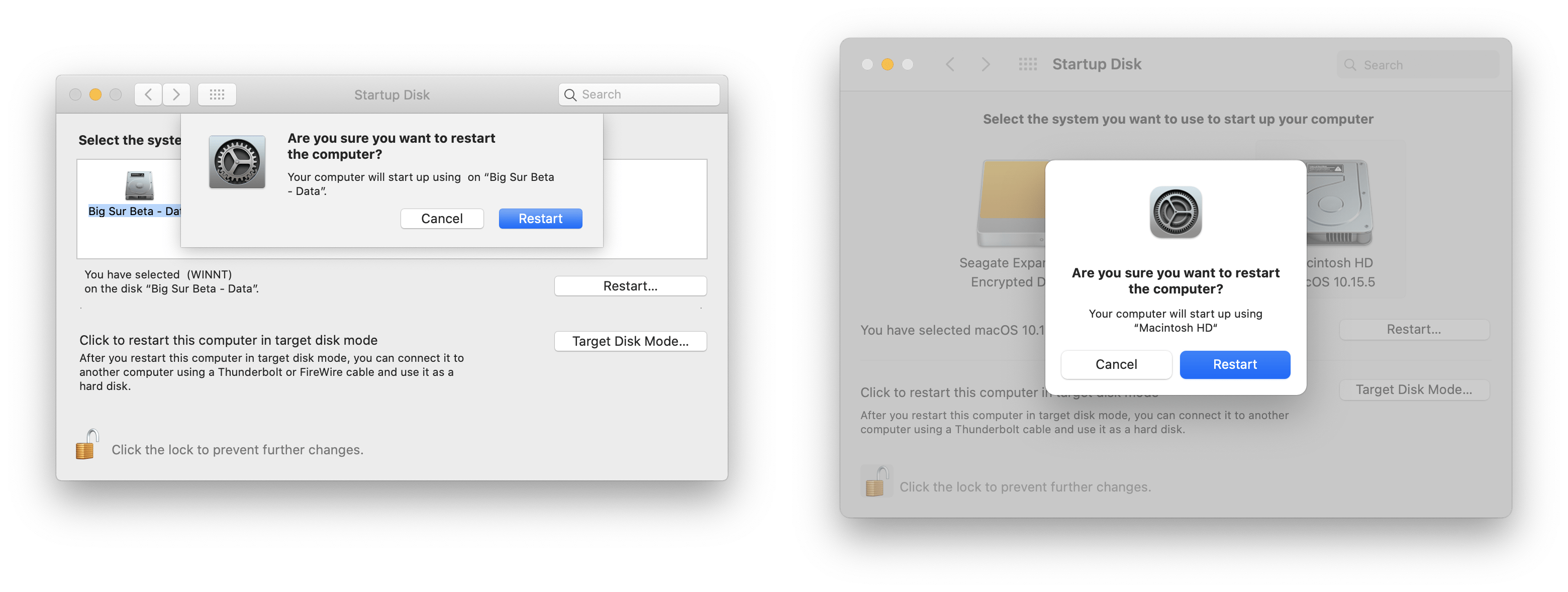
You’ll notice that the Startup Disk pane uses apples new dialog (or sheet) UI. This is quite a departure from the existing sheet drop-down - it feels much more iOS-like.
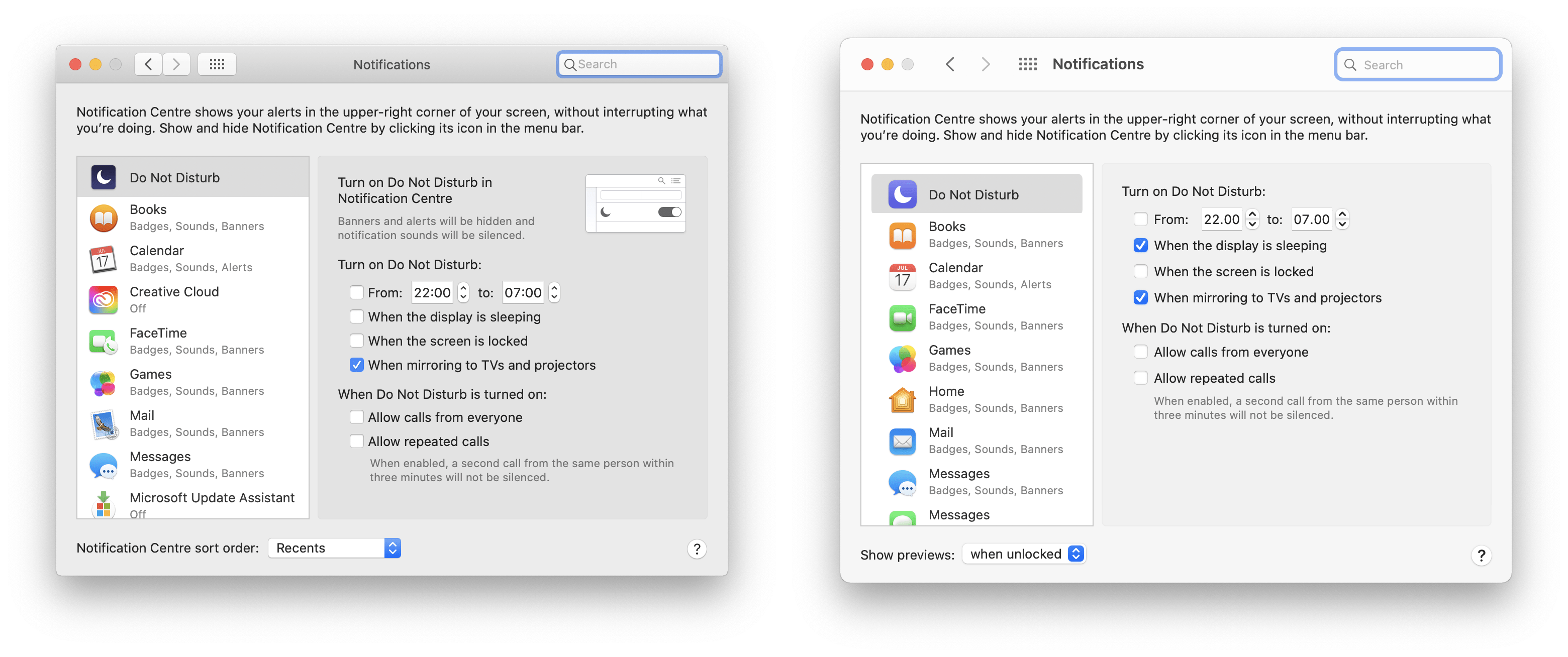
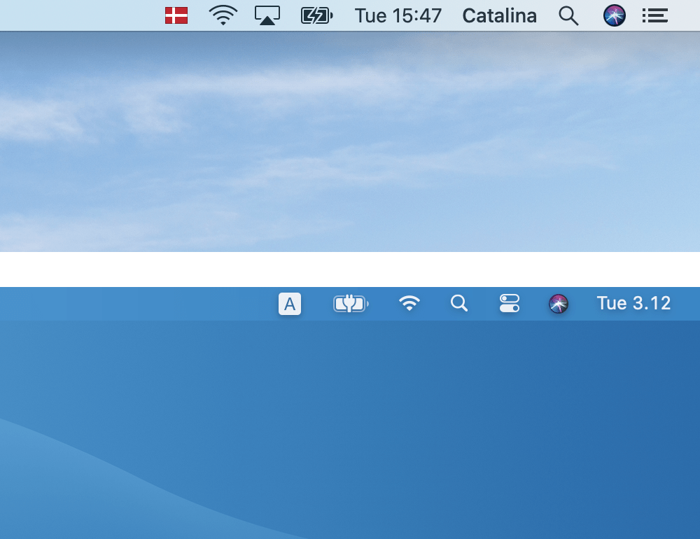
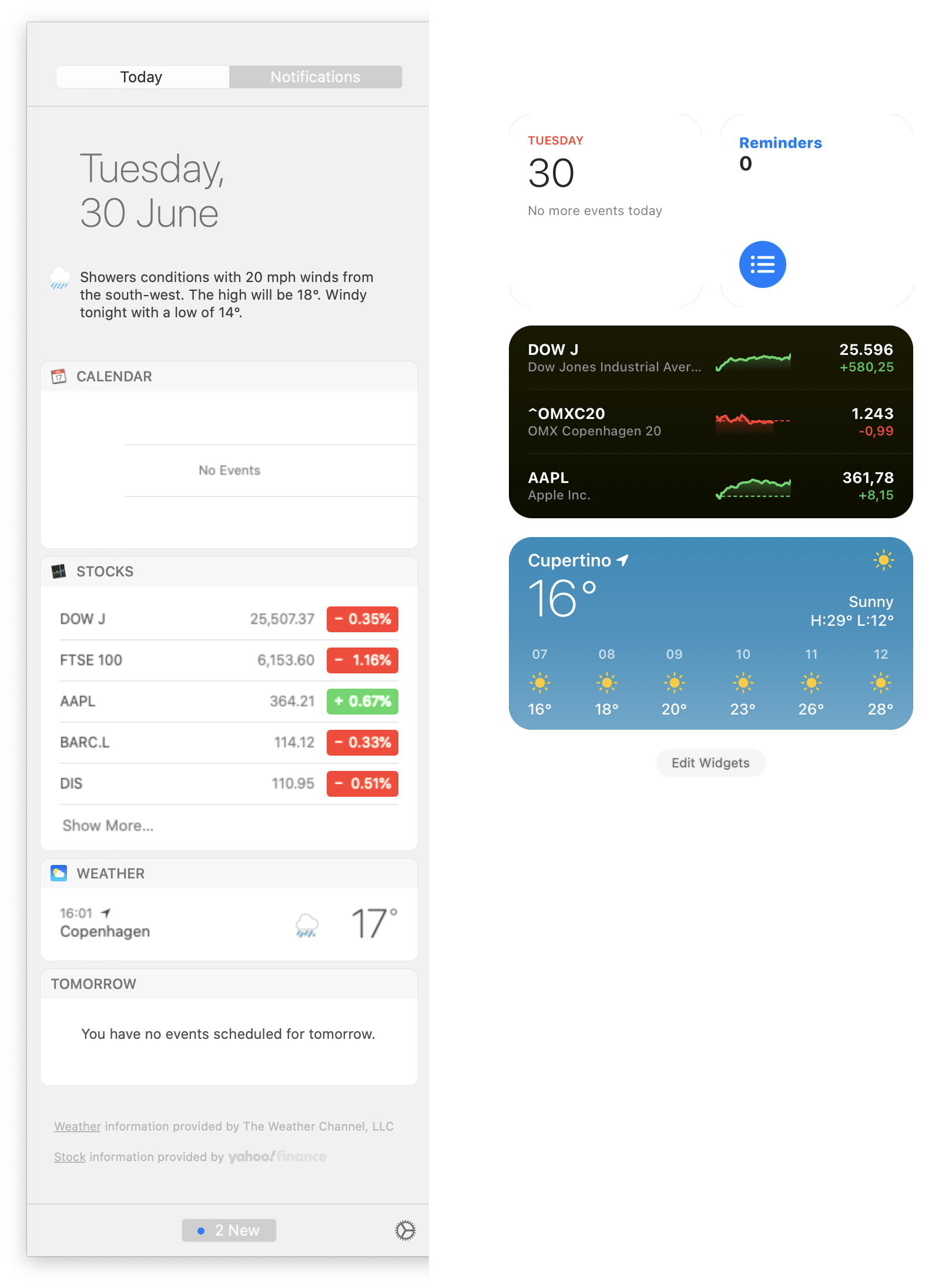
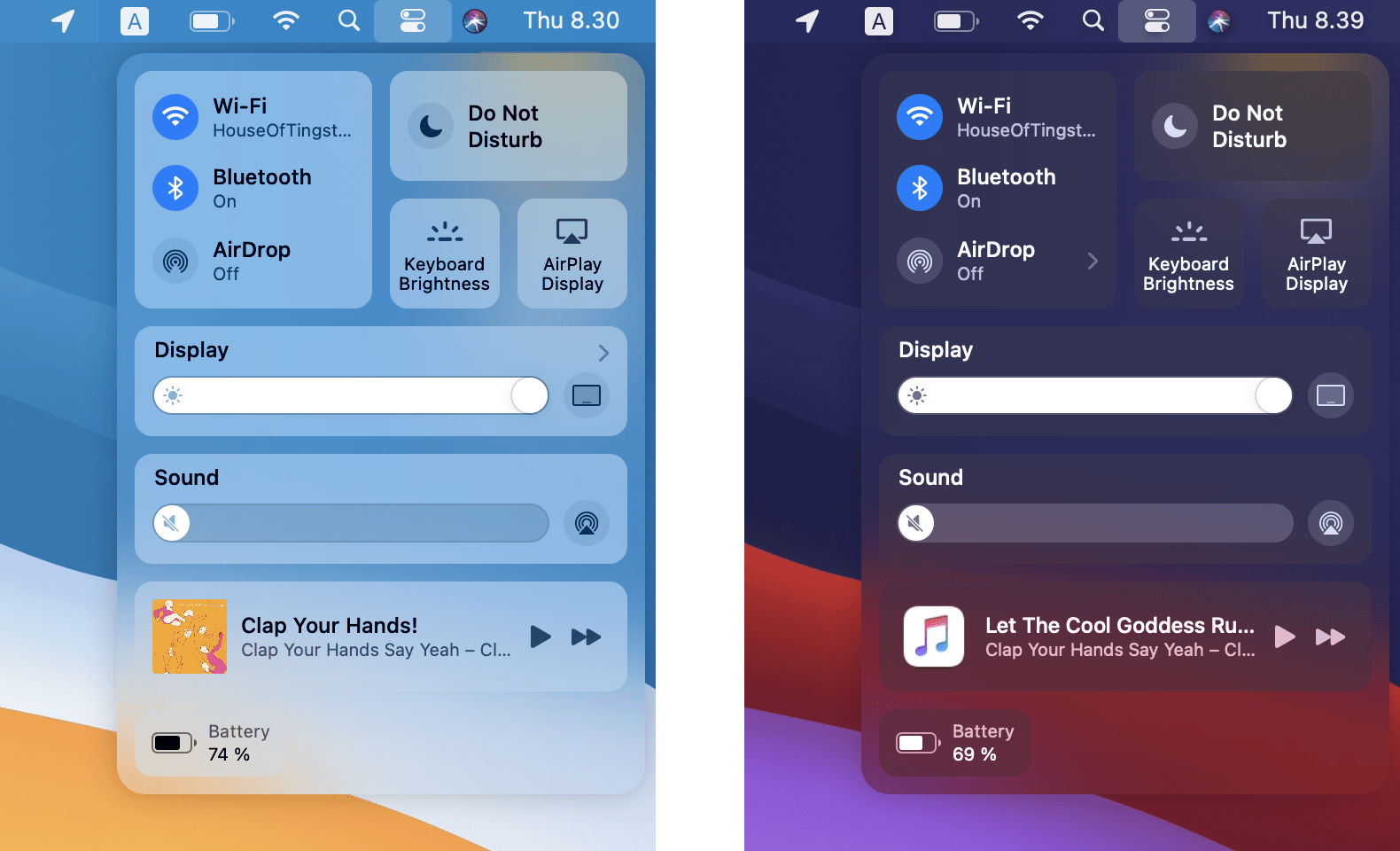
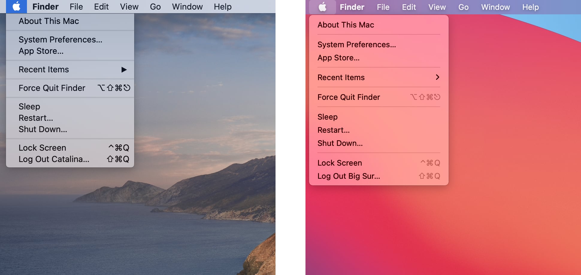
Menu Bar and Notification Center
This is one of the areas where macOS has changed the most. It’s also difficult to take decent screenshots of both of these. Control Center looks like it’s been badly photocopied and the Notification Center in Catalina has a bug whereby it renders at double it’s normal width.
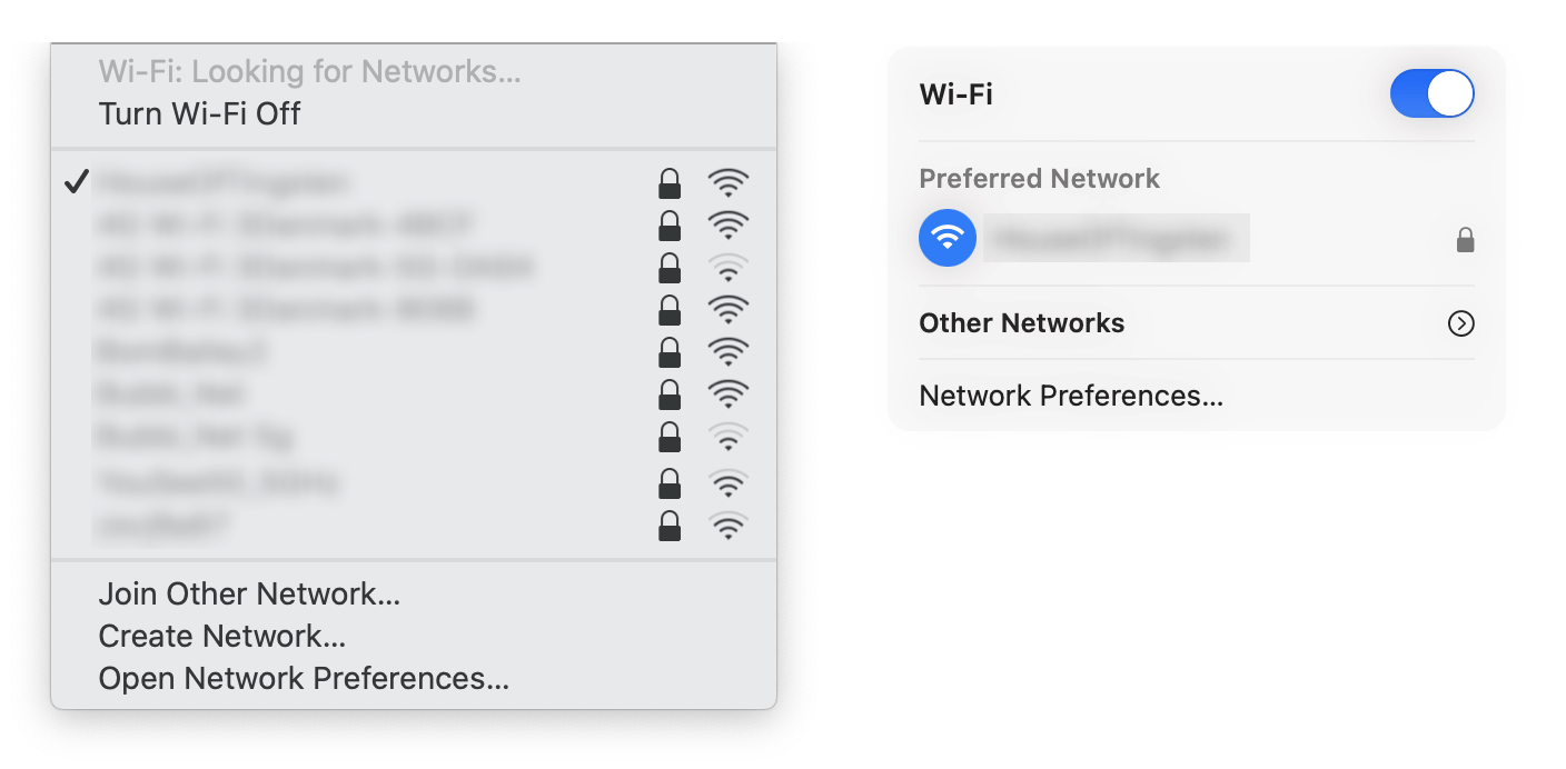
What was obvious within a few minutes of use was that the Control Center is a massive improvement on Catalina’s row of scattered Menu bar icons. The updated WiFi menu is also a massive improvement, as the old list could easily be overwhelming with the number of WiFi networks displayed.
I’m less convinced that the Notification Center is easier to use though. Now it has no background, there is less to separate a list of notifications from my messy desktop!
I will try and get better screenshots for this section and update it in the near future.
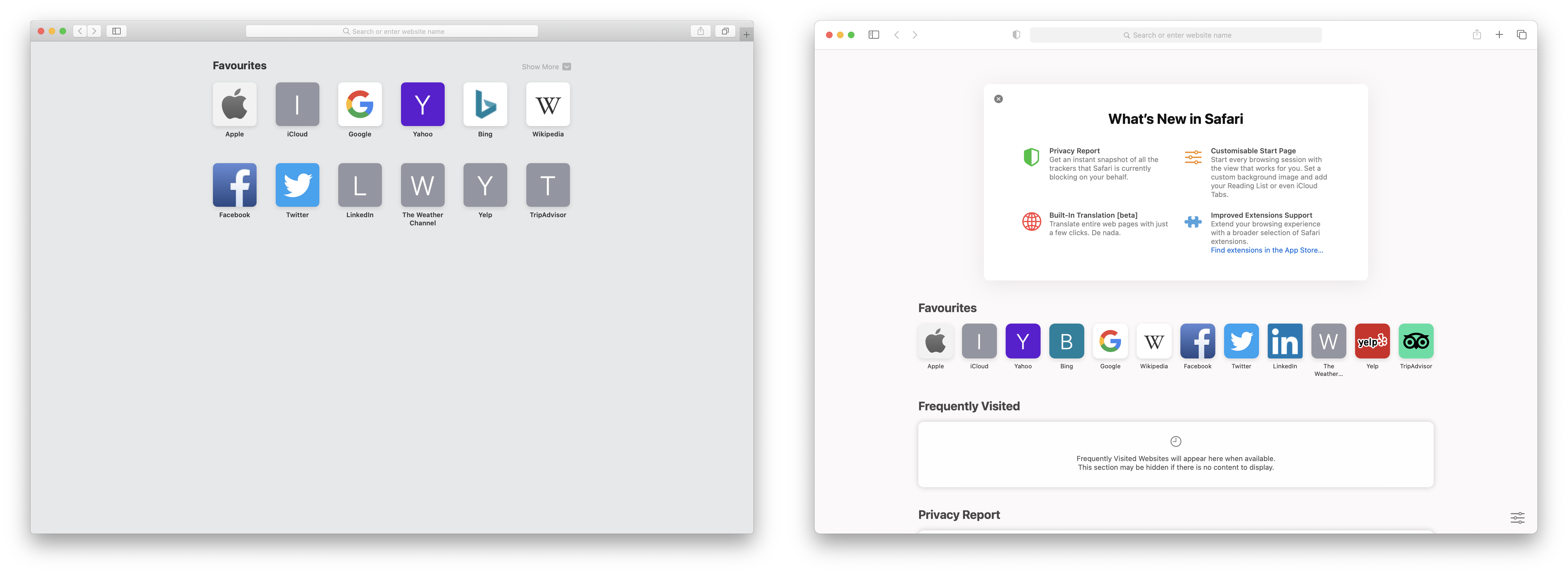
Safari
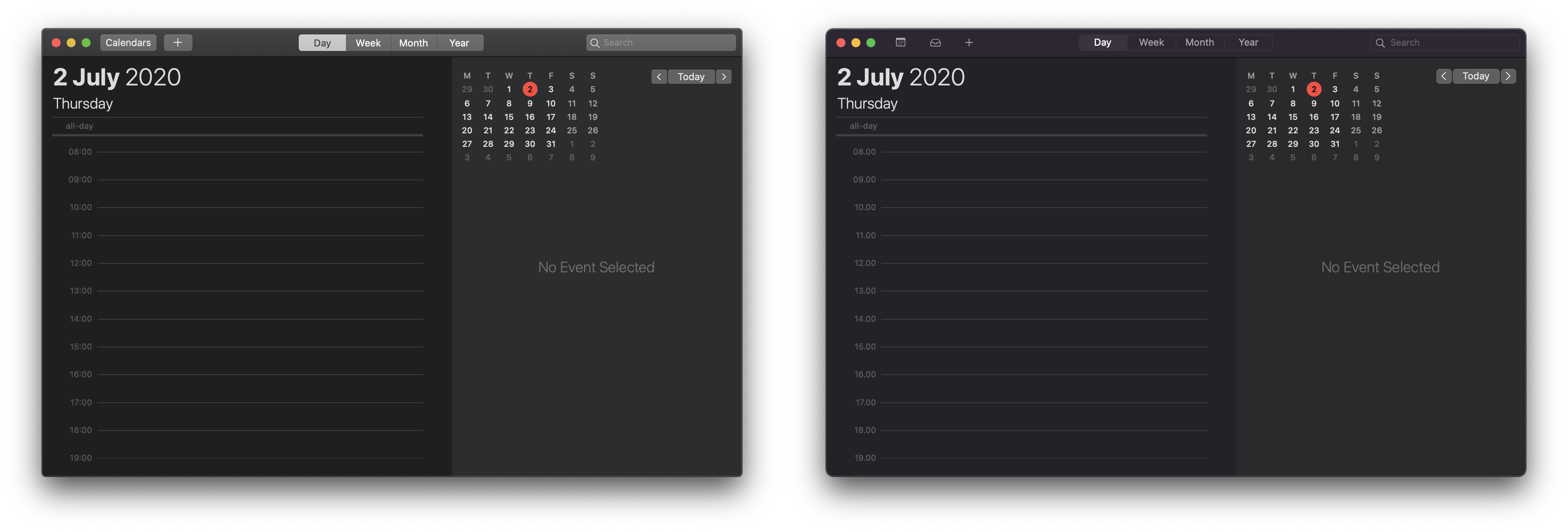
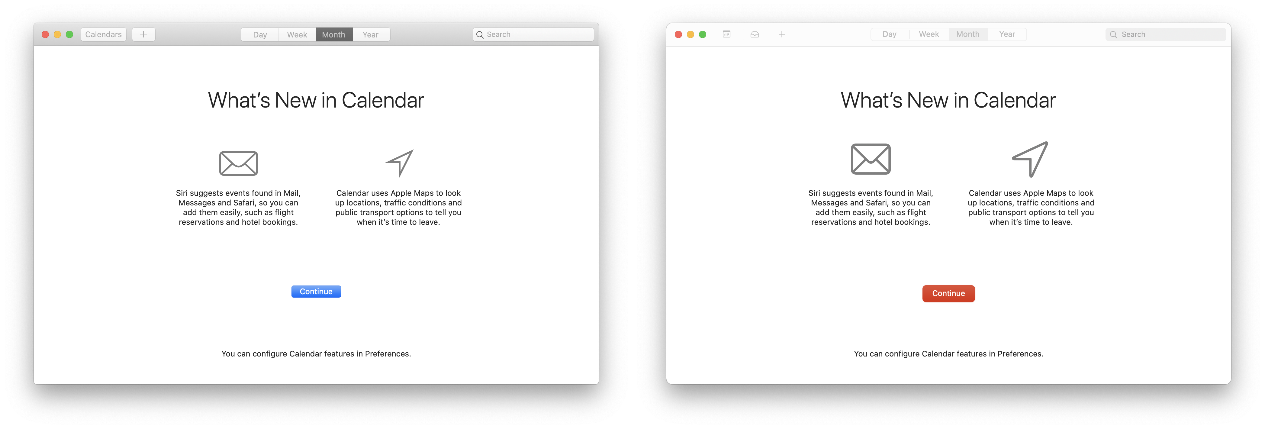
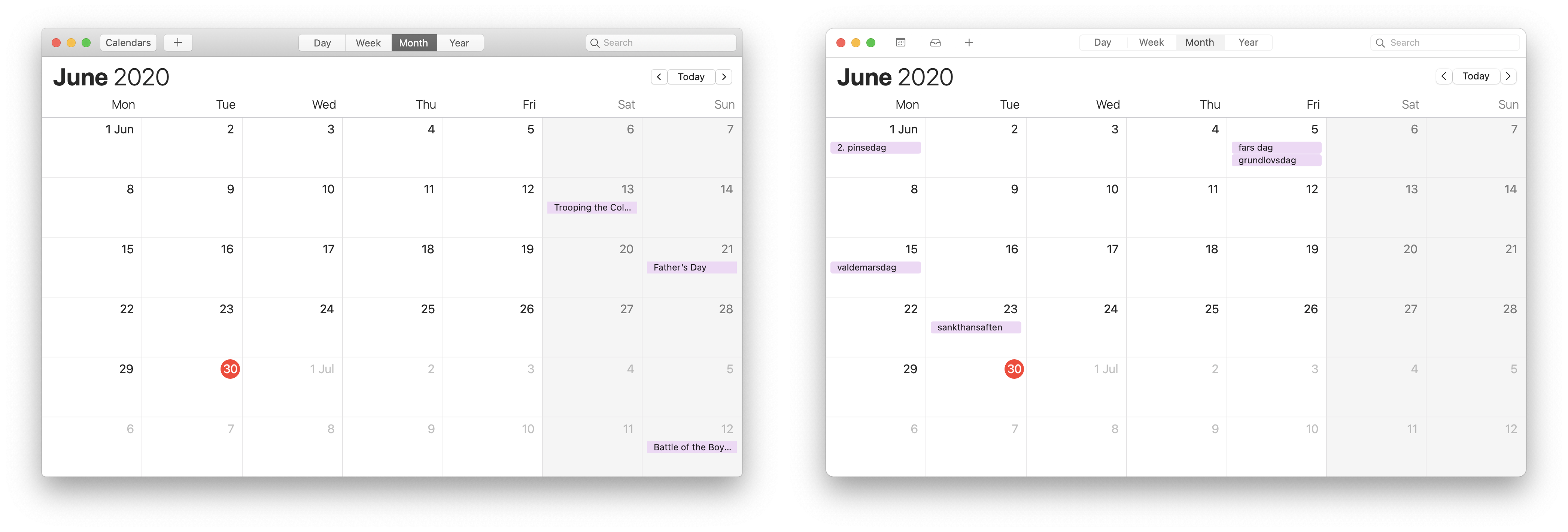
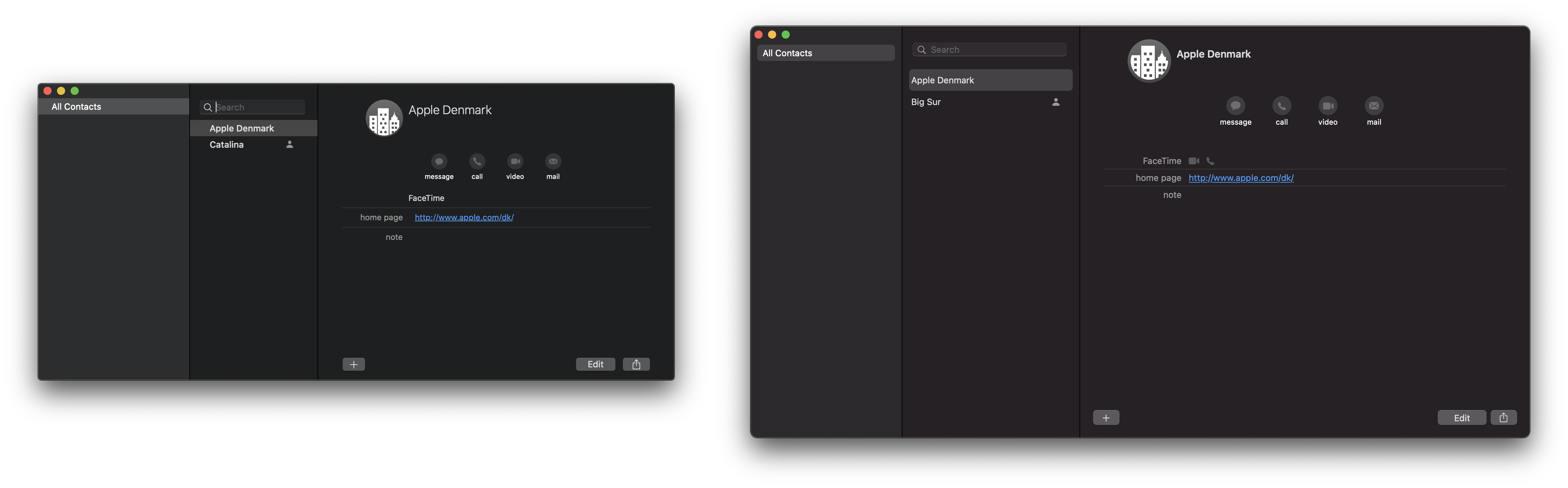
Calendar and Contacts
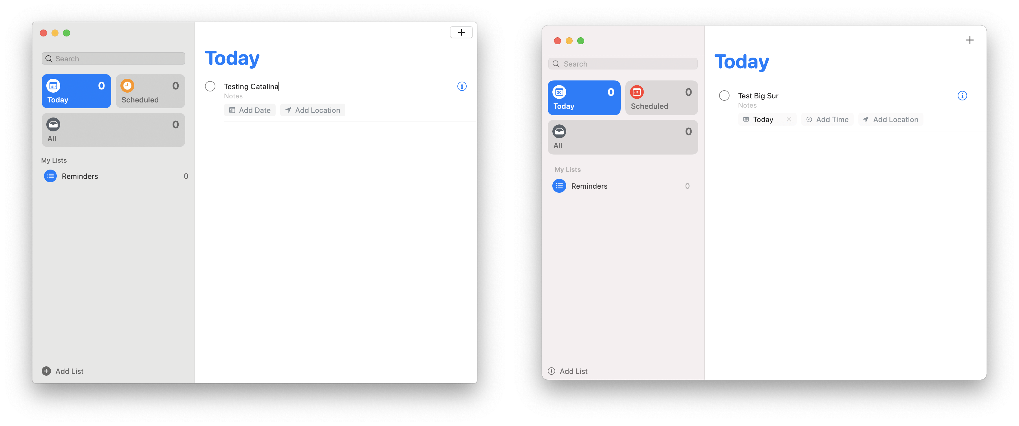
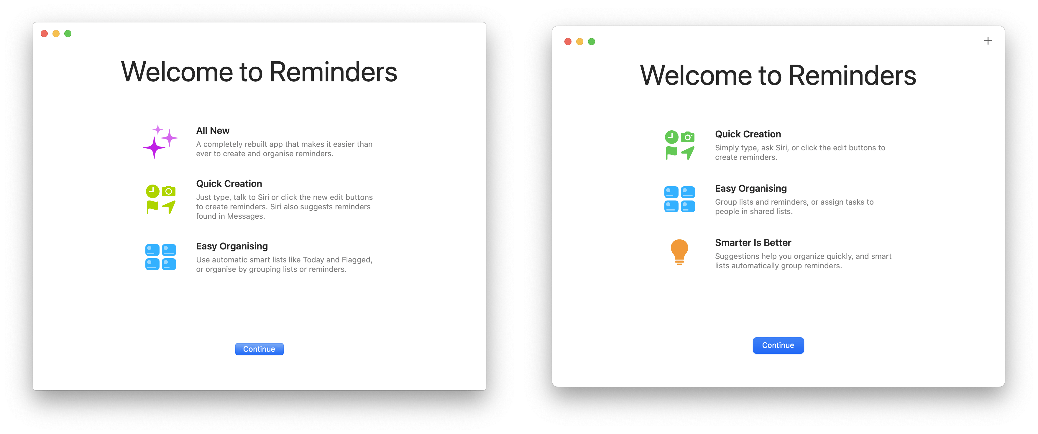
Reminders
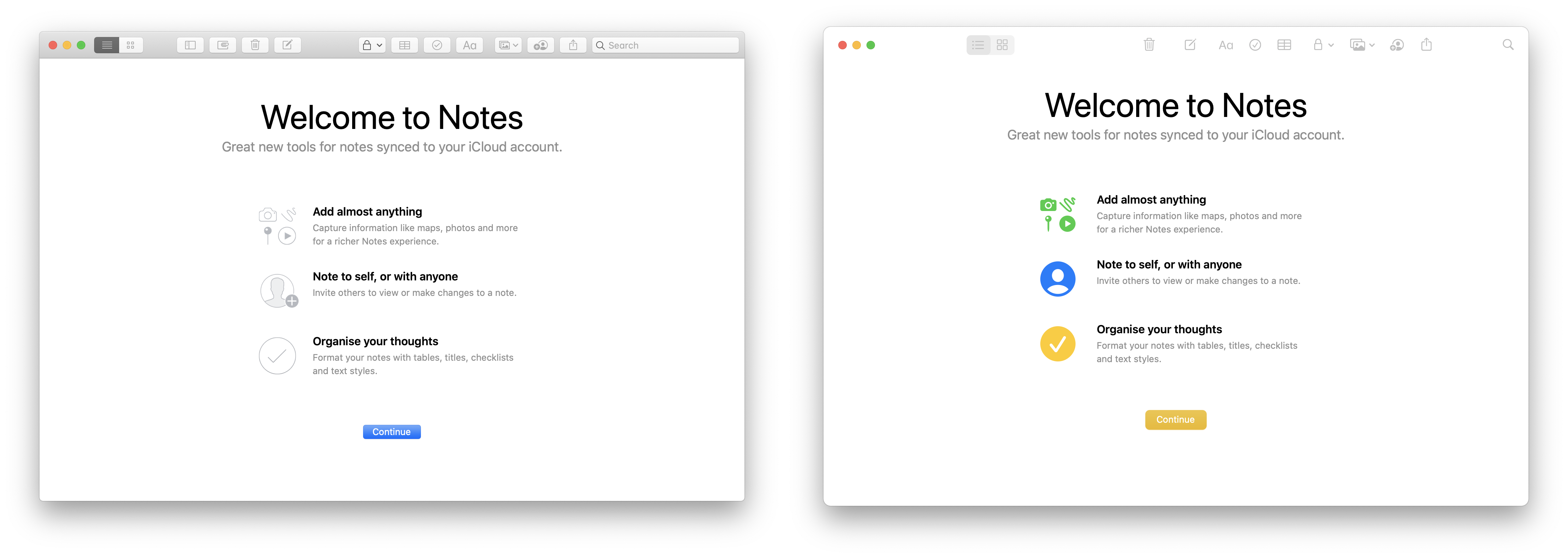
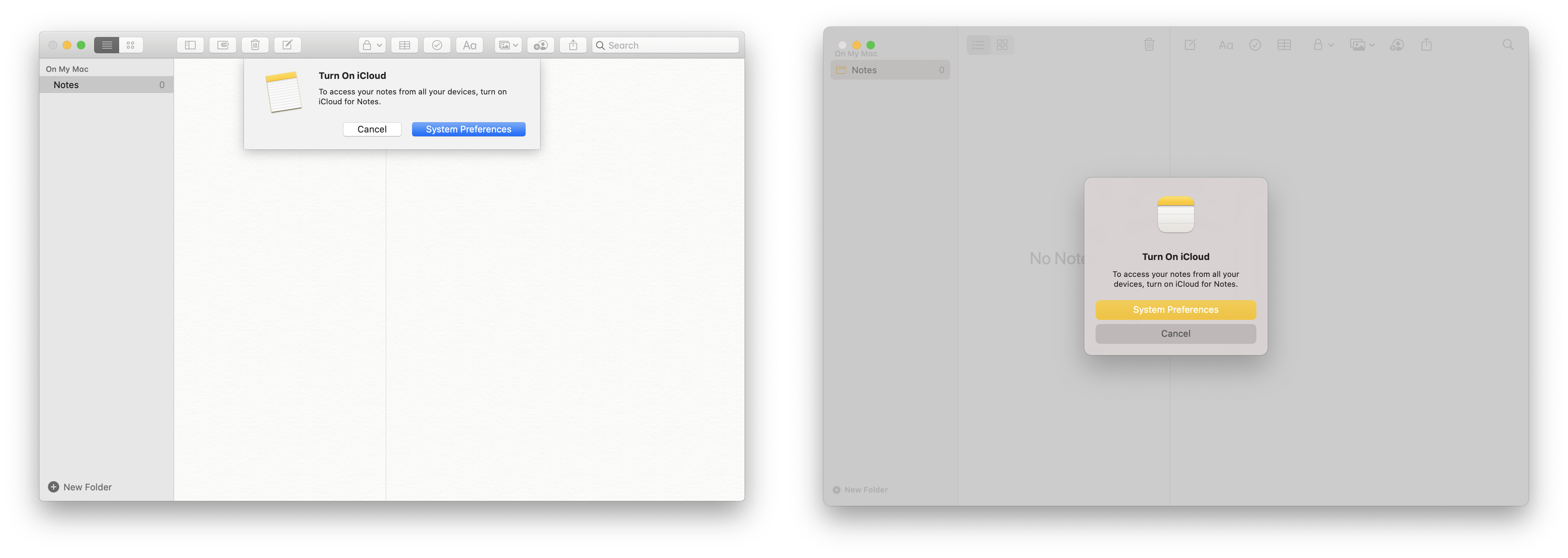
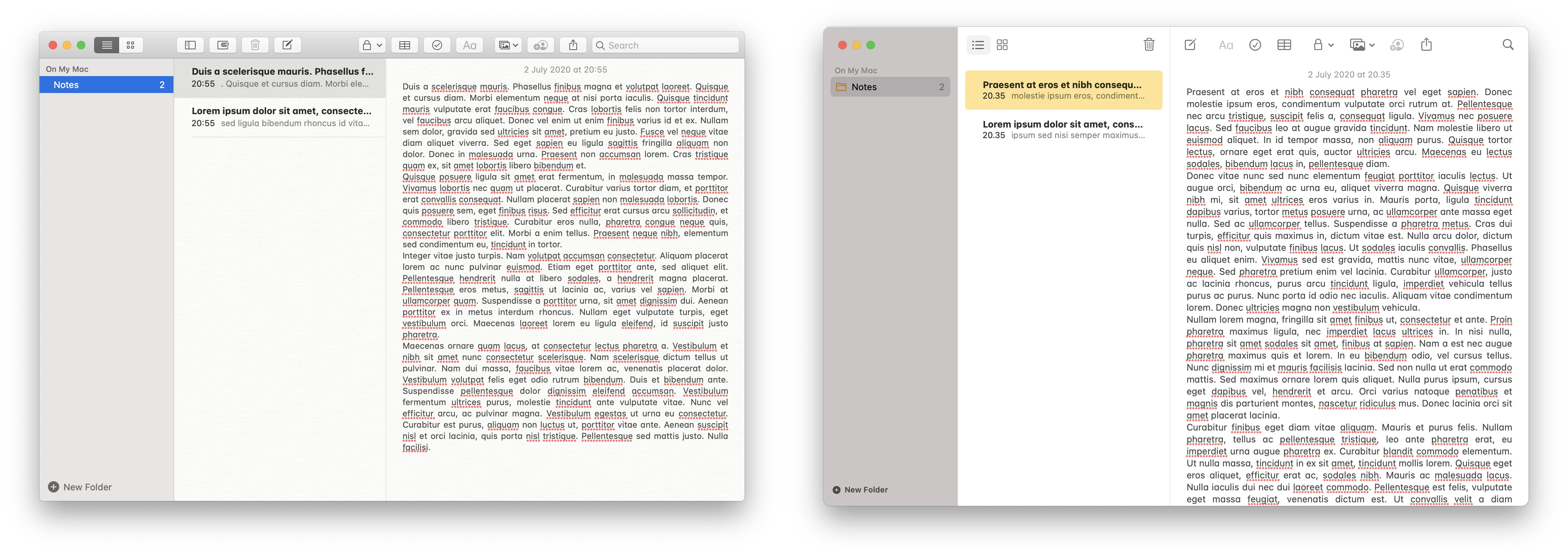
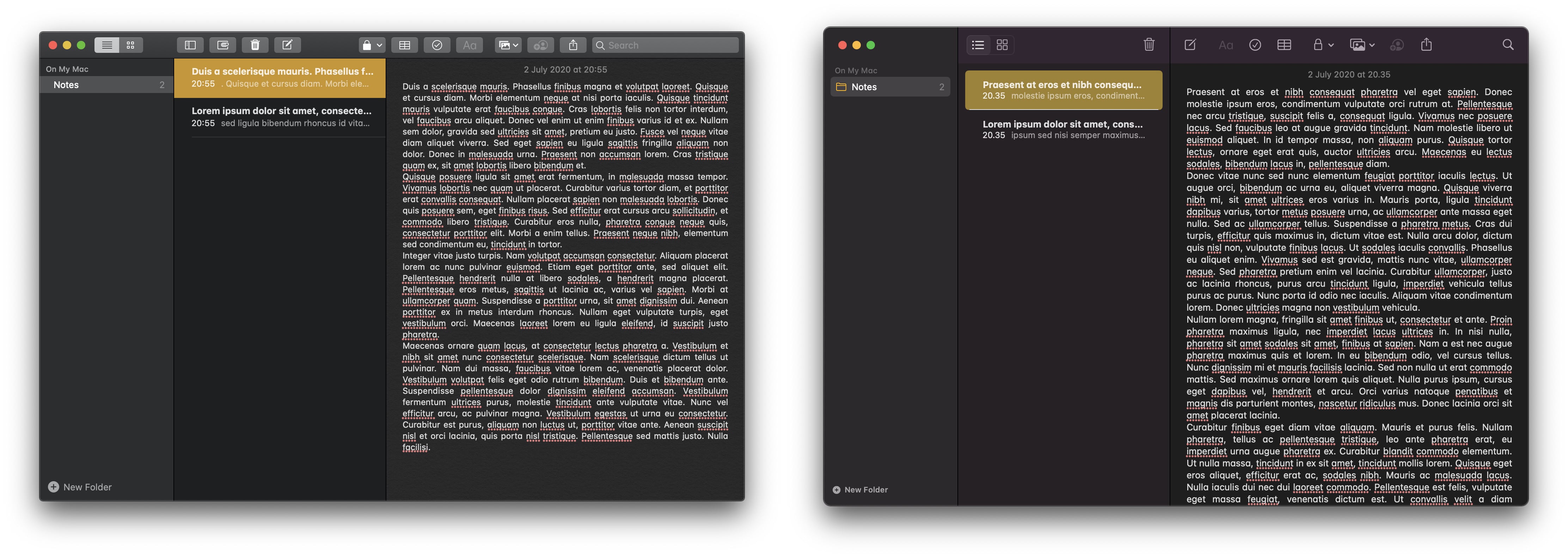
Notes
The biggest news in Notes is that after years, the Skeuomorphic paper texture has finally been retired!
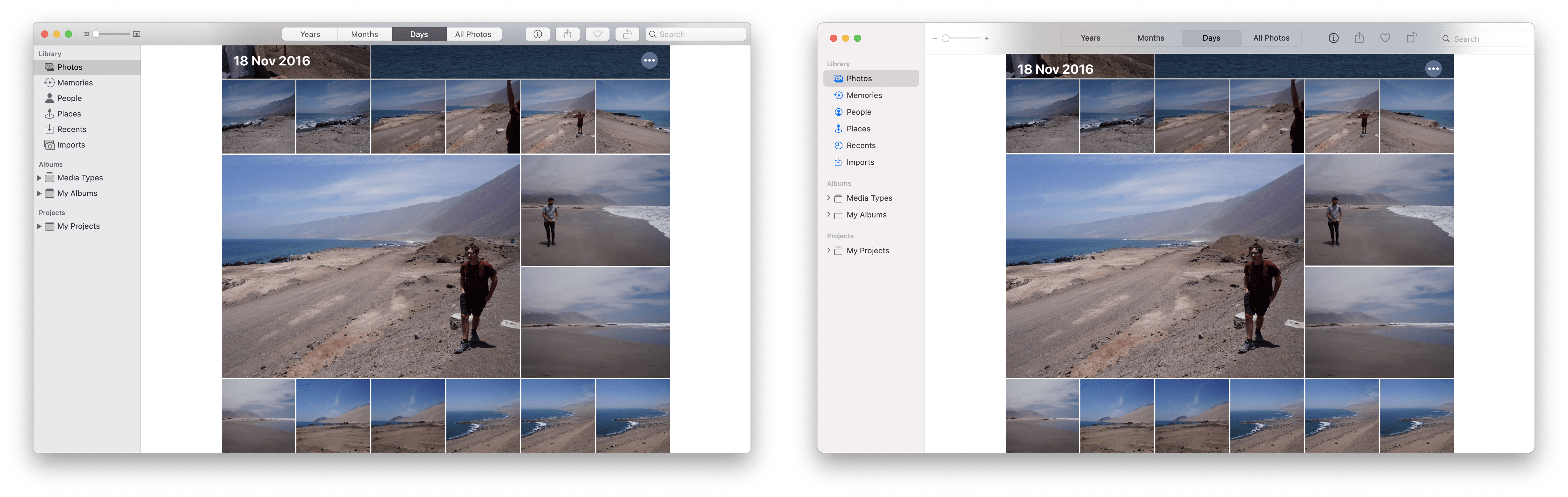
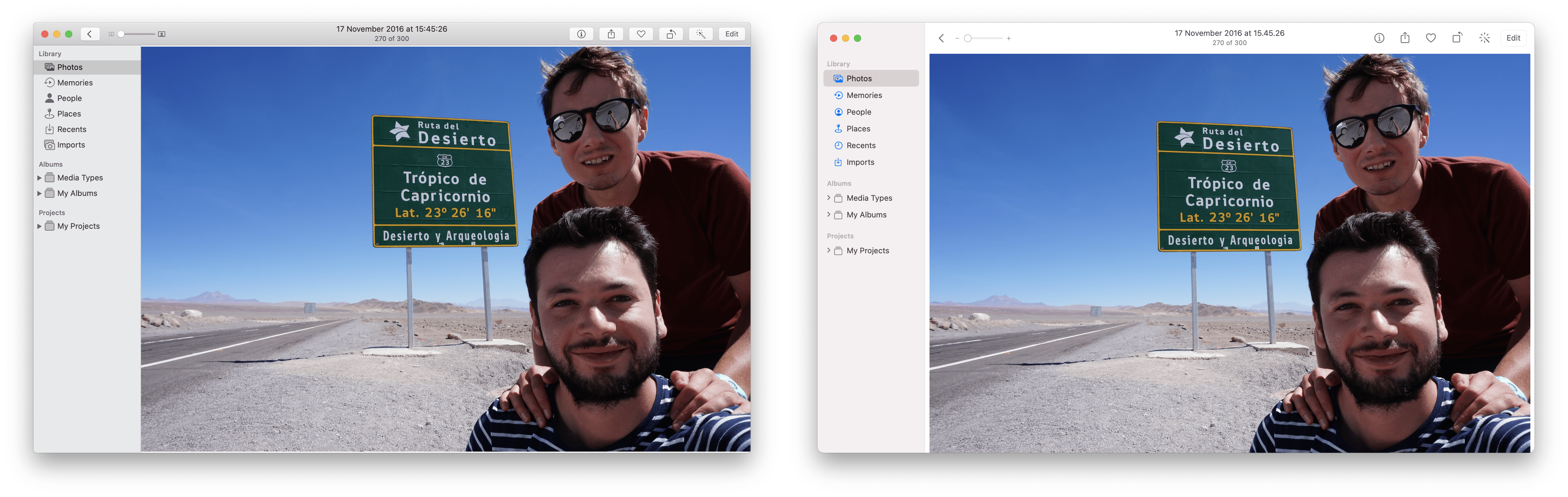
Photos
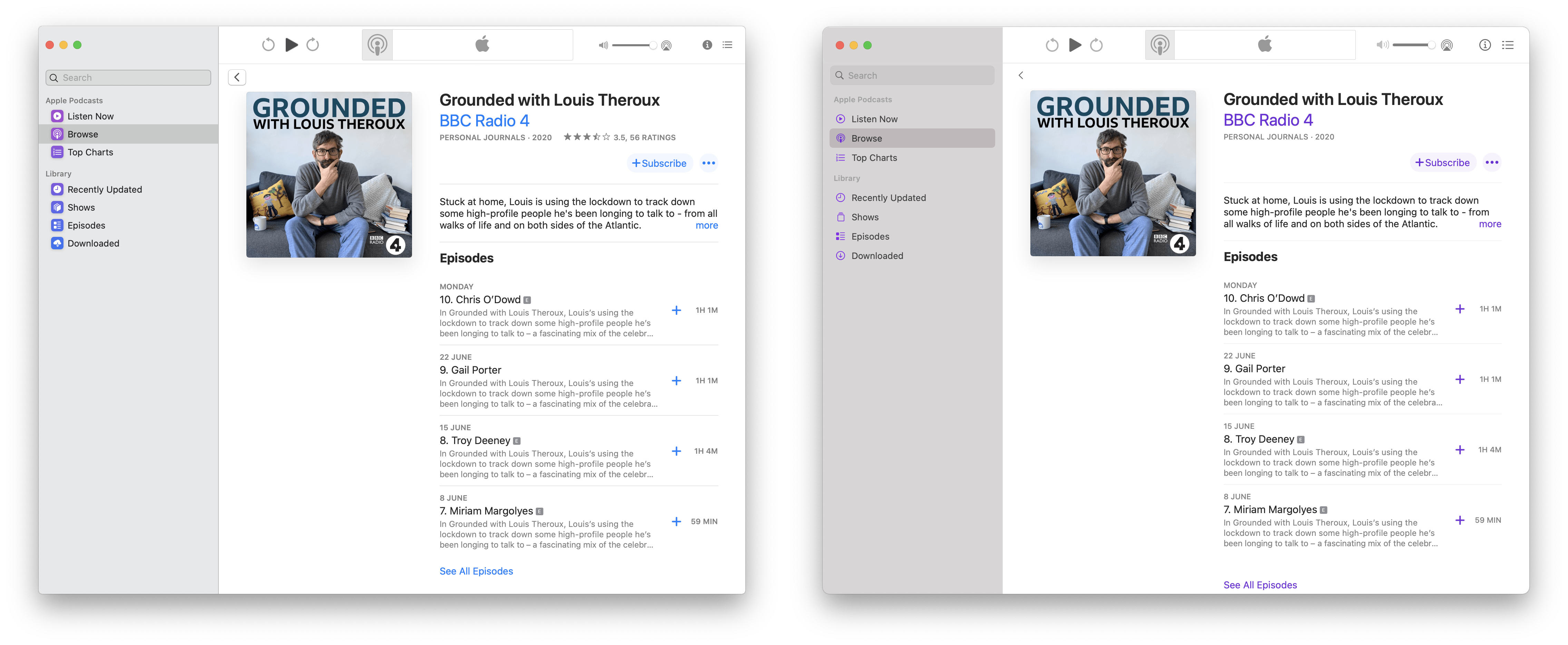
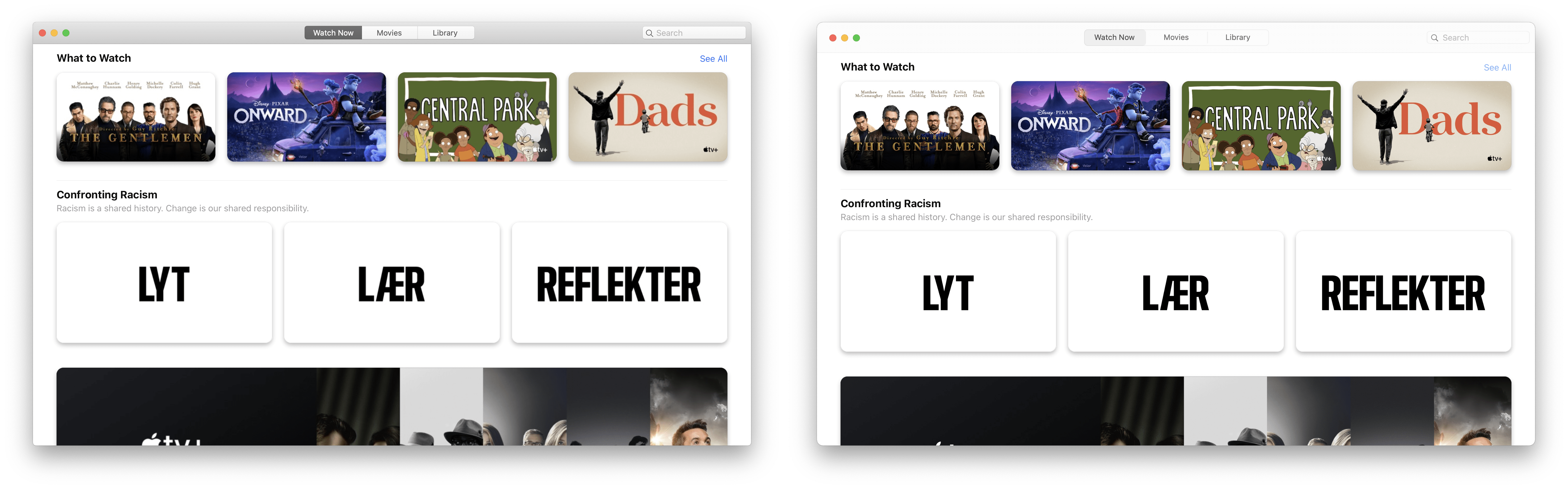
Apple Music and Podcasts
Music and Podcasts were brand new last year with the release of Catalina. It’s obvious that the new UI has been planned for a while as Apple Music and Podcasts are mostly indistinguishable from their initial Catalina release. For example both apps already include the new full height sidebar.
For me this illustrates a bigger point that Steven Sinofsky recently made on Twitter - that Apple is executing a meticulous multi-year strategy.
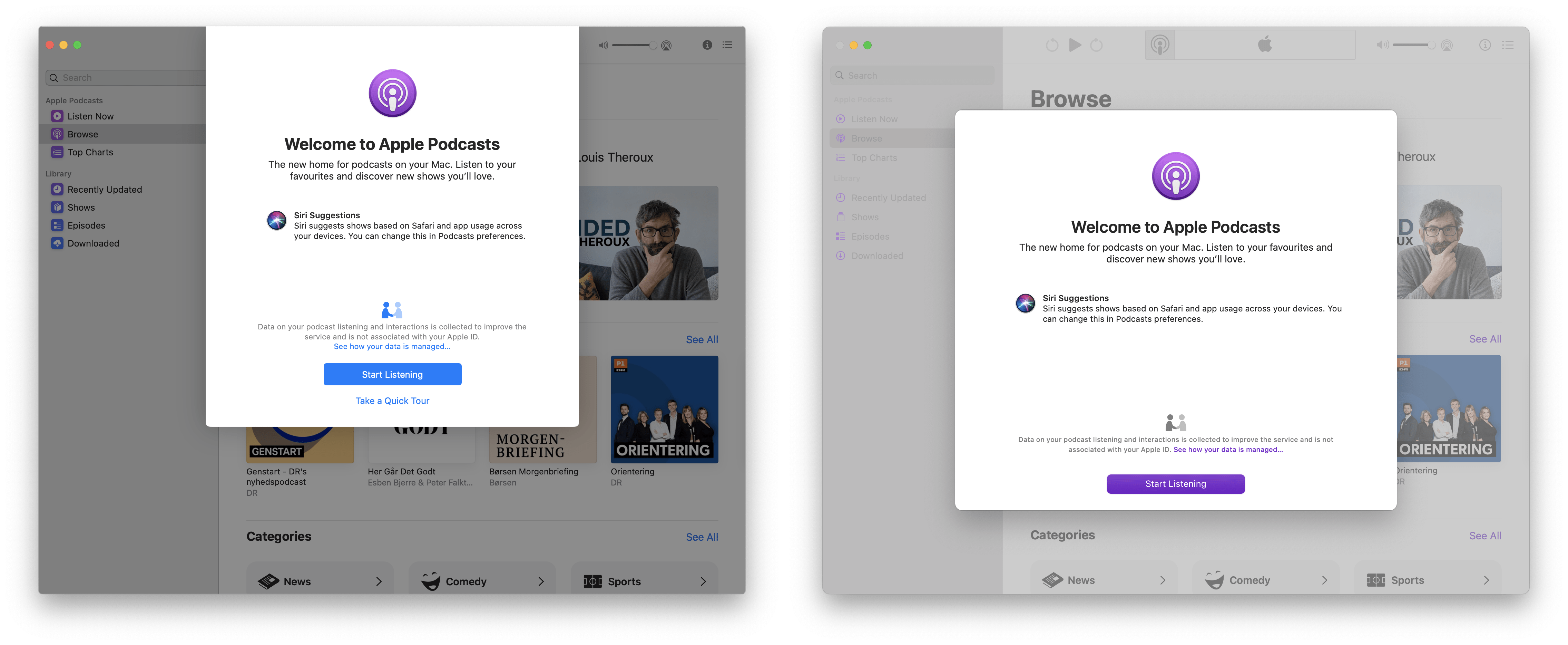
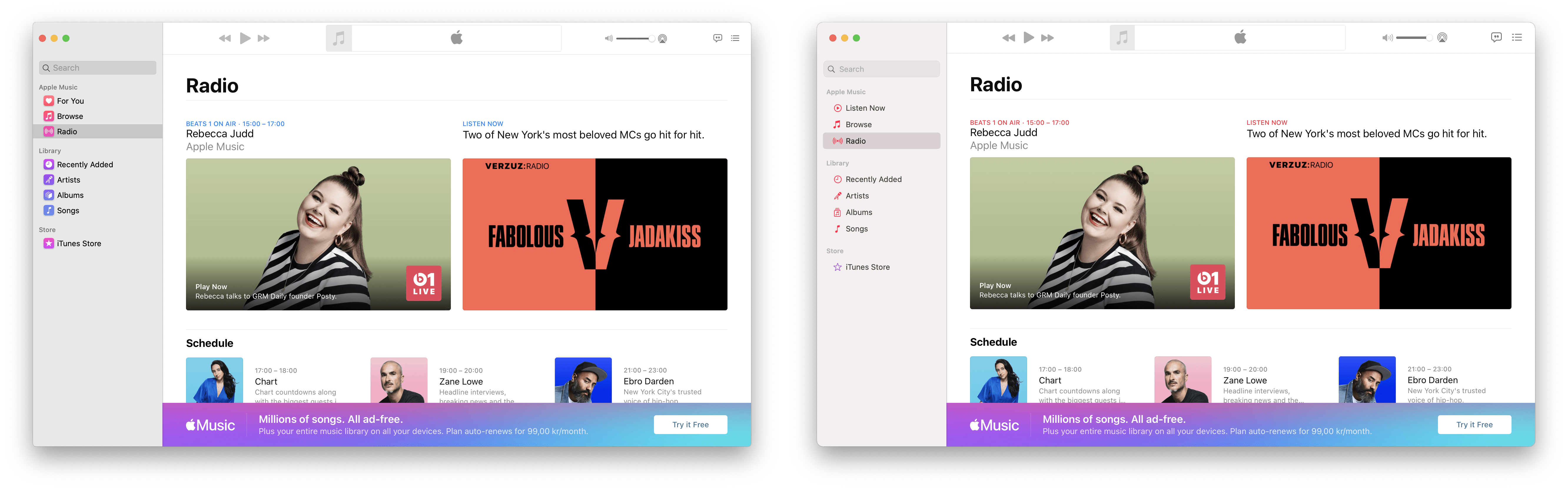
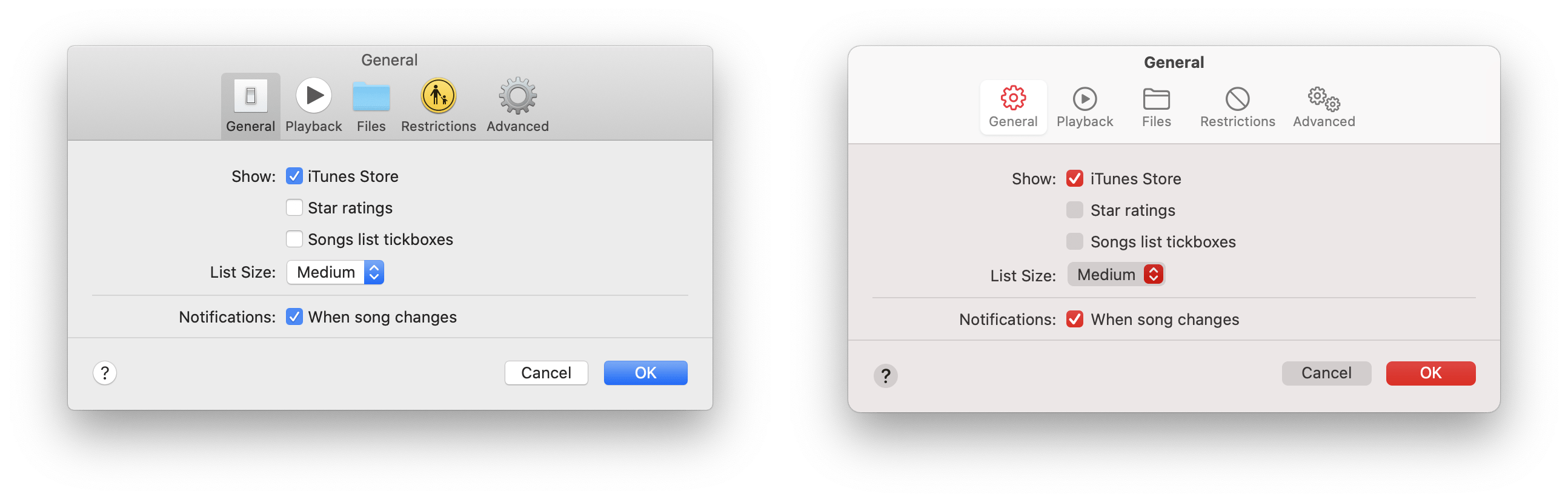
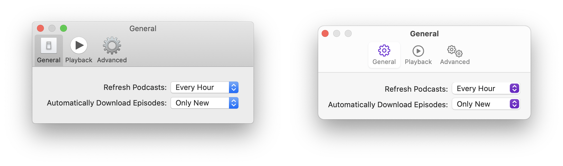
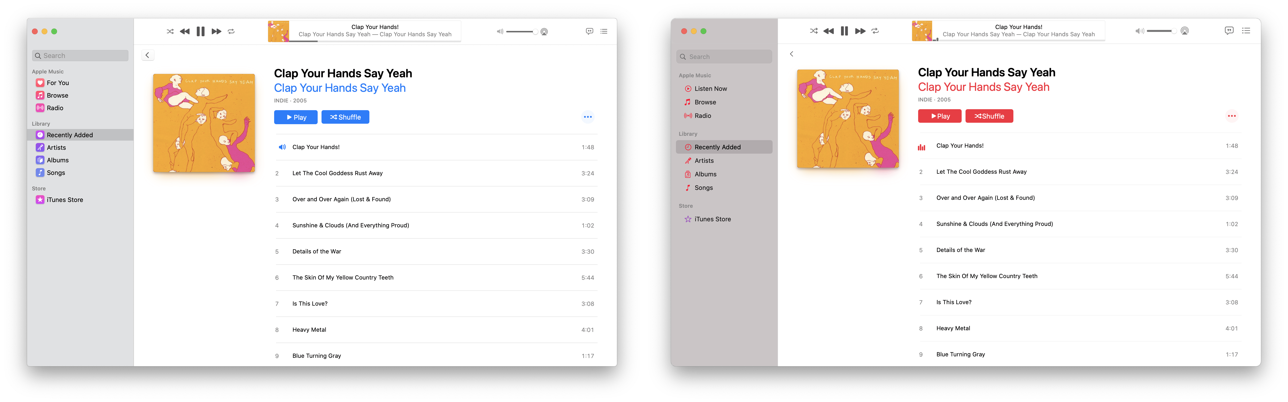
One area where changes are evident are is in preferences windows. Both apps make use of Apple’s new accent colour and new glyph icon library.
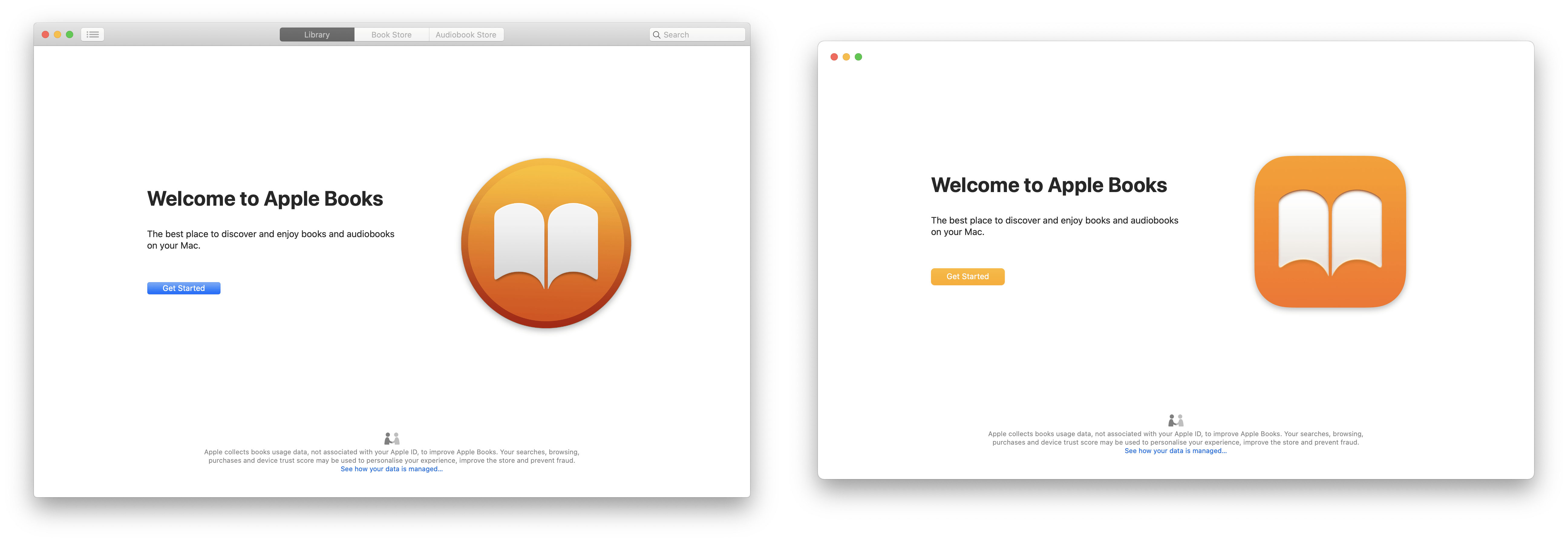
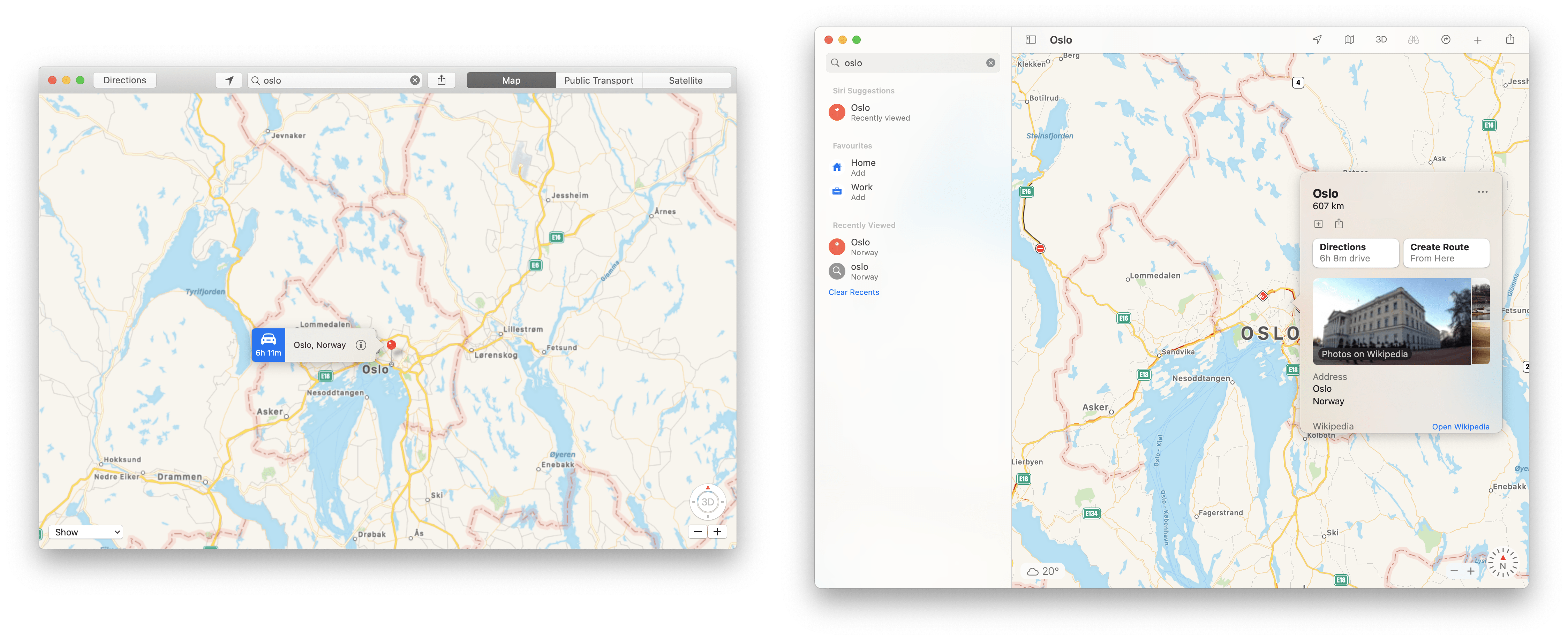
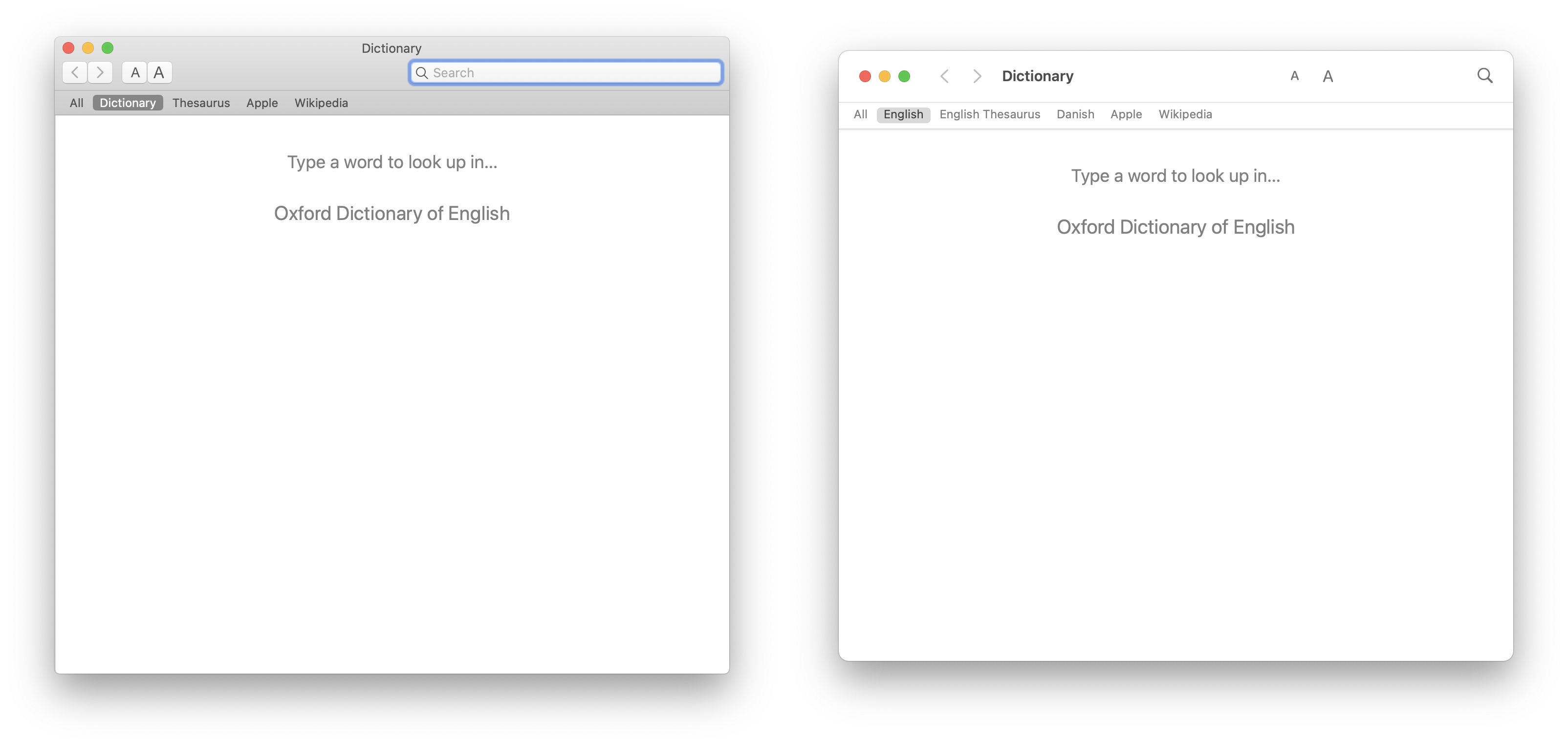
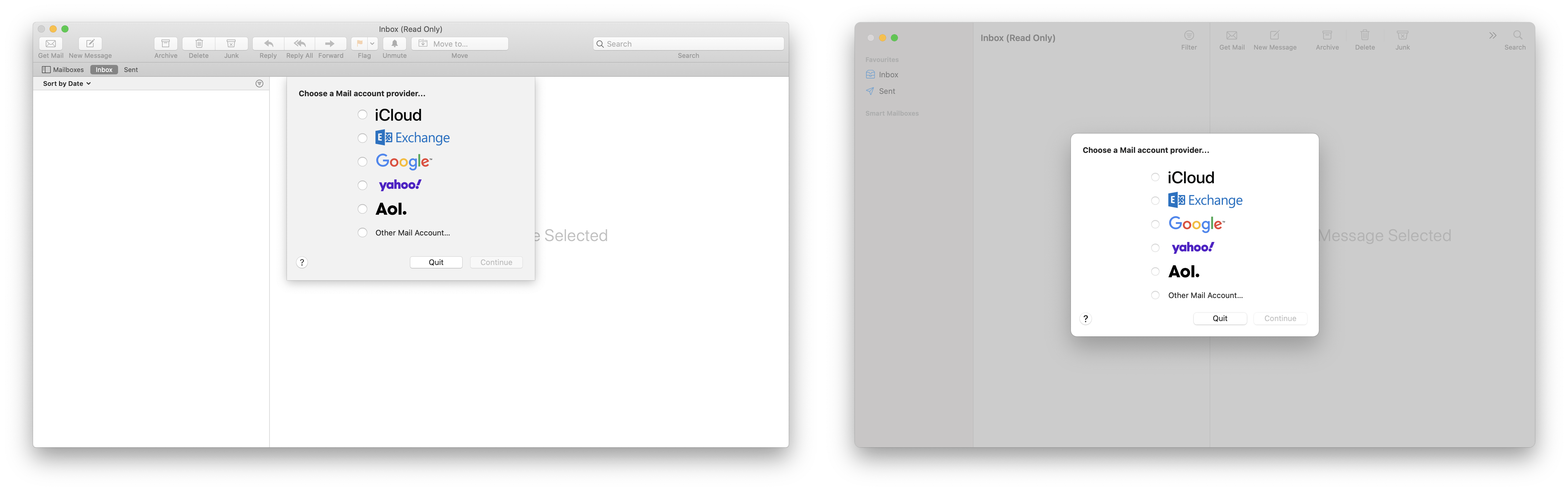
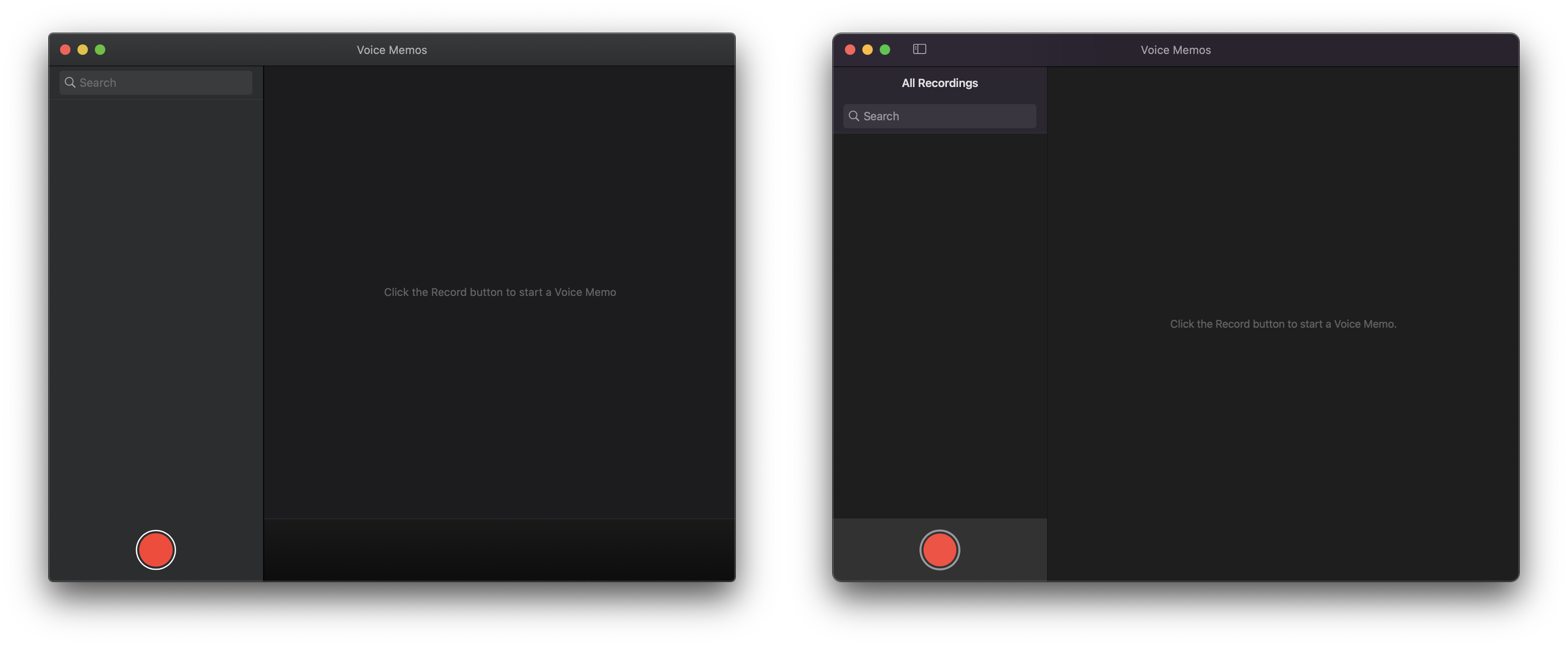
Other bundled apps
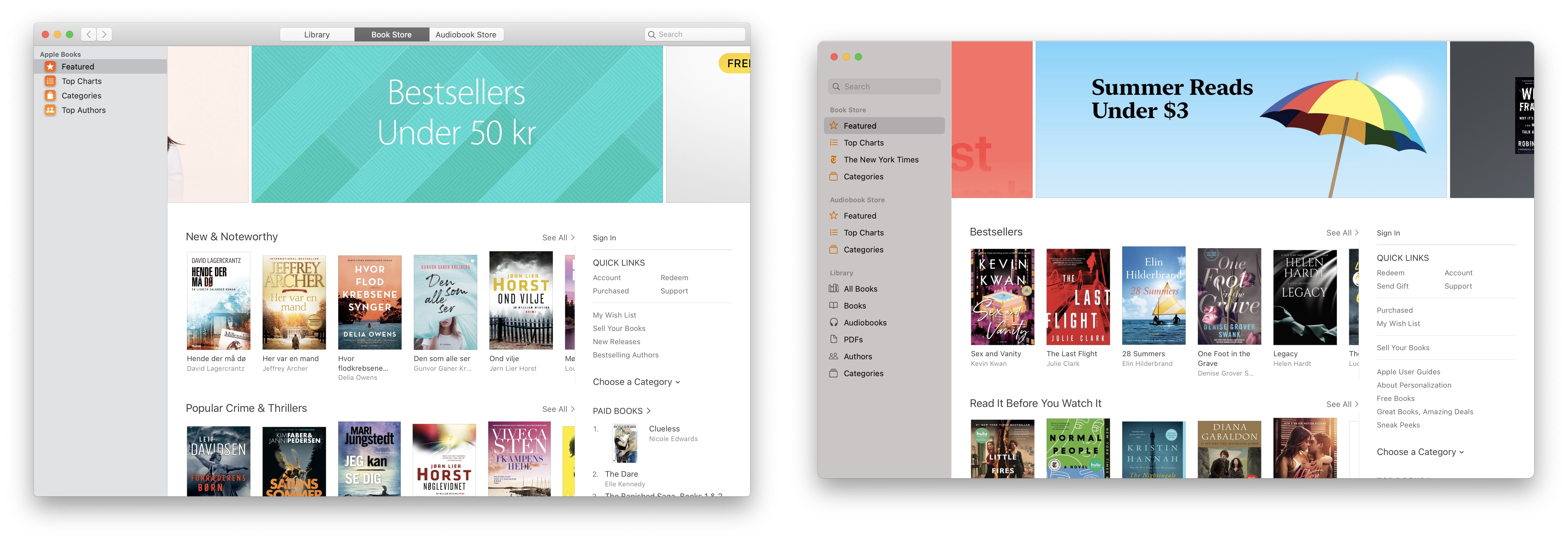
It was impossible to go into depth with every single bundled app. On the whole, the updates to Maps, Books and Mail all look solid with extensive use of the new sidebar.
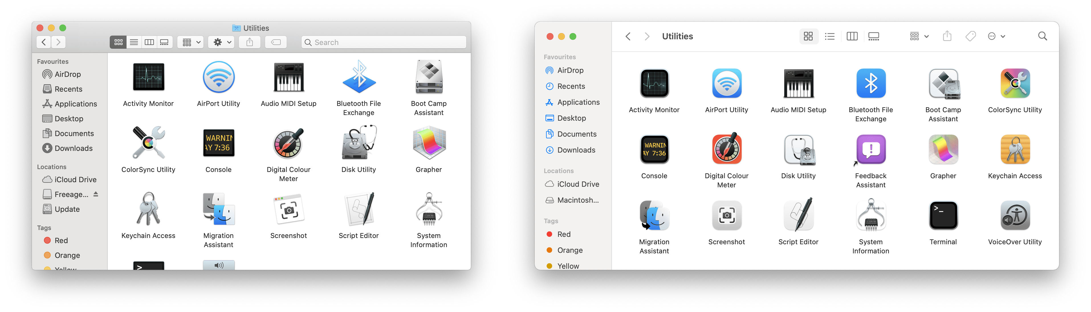
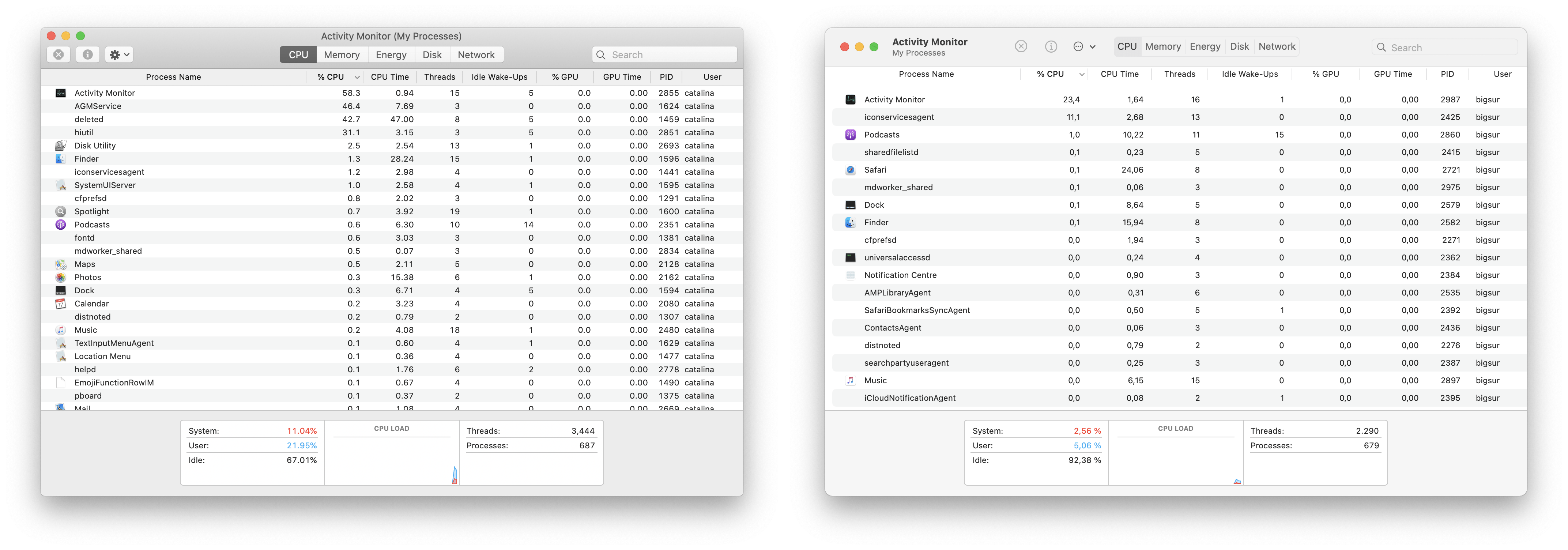
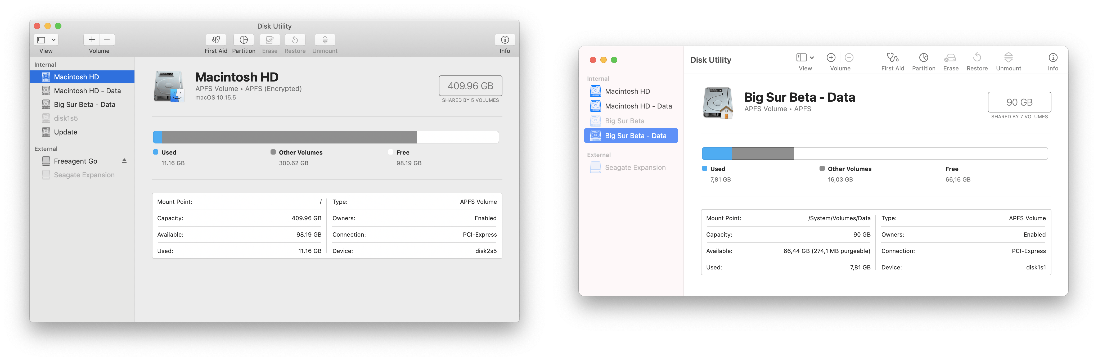
Utilities
Both Activity Monitor and Disk Utility have received a new style toolbar. As with Finder, there are no longer any rows meaning all elements are at the same level. On first impressions, I feel this is a little visually confusing and makes it harder to scan. The search field also loses a lot of its contrast.
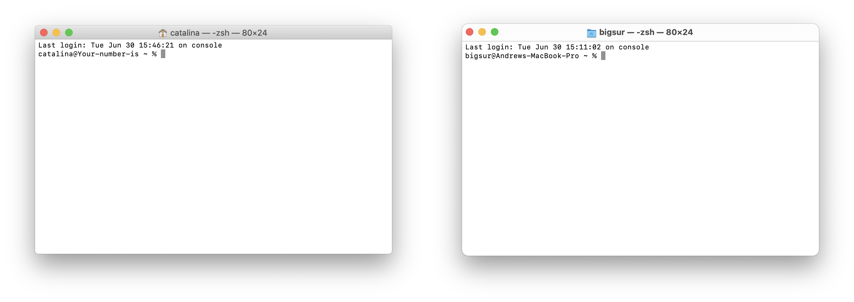
Unsurprisingly Terminal is almost unchanged.
Almost unchanged
On the subject of unchanged apps, there were a number of other apps that are so far relatively unchanged.
Siri in macOS Big Sur shows no apparent changes. I think this is a little strange considering the overhaul Siri is receiving in iOS 14. There don’t even seem to be any radius changes to the borders.
The most extreme case of no change is Stickies. It’s completely identical between both releases. What’s more, I don’t think it’s changed much since MacOS 9 judging from its weird, retro controls.
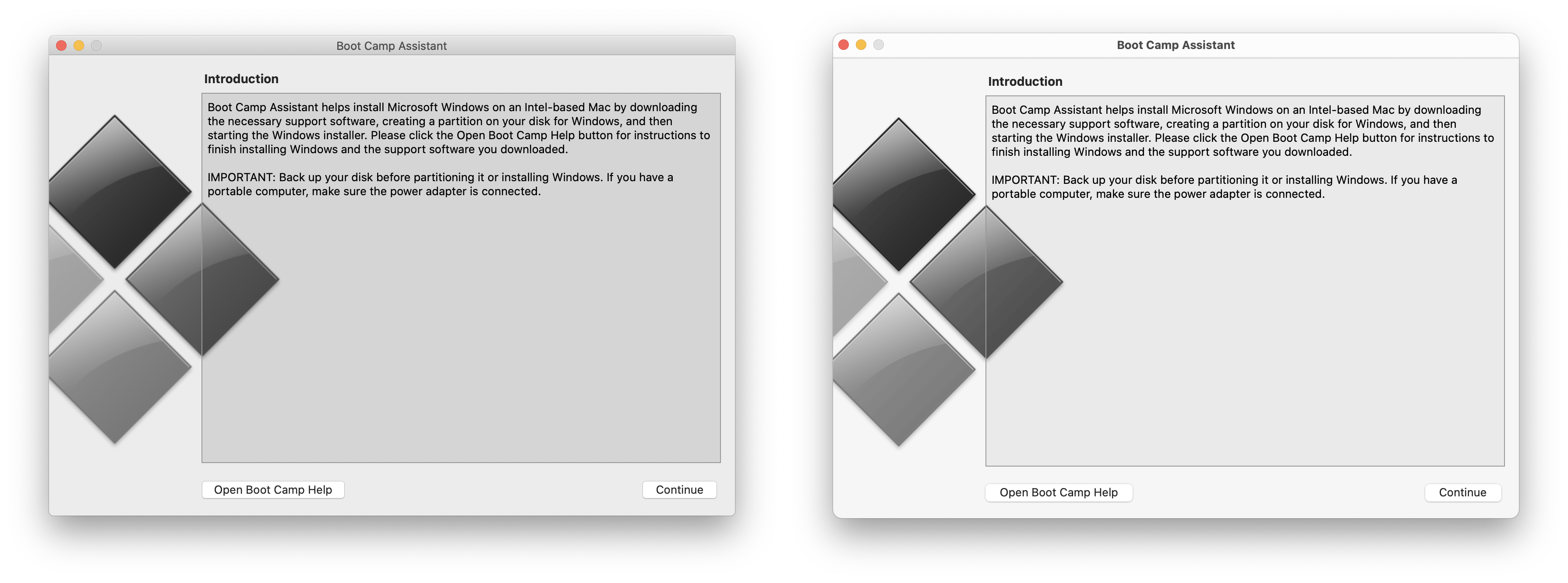

Boot Camp is also practically unchanged, although this is perhaps unsurprising given Apple’s move to Apple Silicon, so presumably Boot Camp’s days are numbered. It did receive a new icon though.
Takeaways
Overall, the UI changes in macOS aren’t as dramatic as I was expecting. Big Sur’s new UI feels like a largely incremental set of changes to make macOS feel more coherent with iOS and iPad OS. Even if there are a few teething issues and the look is a little jarring at first, this has to be a good thing in the long-term.
Having said that, Apple still has a vast amount of work to do to perfect the new macOS UI. It unsurprising as this is the first developer beta, but there are still many rough edges.
I hope in the long term they focus on creating consistent patterns: for example for the first launch experience of apps. Right now there are several different layouts and approaches to this UI. I also hope Apple don’t leave pro users behind. Right now some of the less frequently used UI elements such as status bars and path bars look a little unloved. They don’t feel well integrated into the UI and in some cases lack visual separation.
If you’re interested in reading even more about the design changes in macOS Big Sur, Cult of Mac have a comprehensive overview of the new icons.
Recommend
About Joyk
Aggregate valuable and interesting links.
Joyk means Joy of geeK