

Build a Modal Component with React
source link: https://www.tuicool.com/articles/hit/eUnyEve
Go to the source link to view the article. You can view the picture content, updated content and better typesetting reading experience. If the link is broken, please click the button below to view the snapshot at that time.
I love modals because they save a lot of time required to load a new tab.
In this post, we’re going to learn how to create an awesome reusable modal with React from scratch. These are the steps for this tutorial:
What we’ll learn
- Create a simple file structure
- Use react toggle state to build a simple modal
- Pass data between components with props
- Warn the user to pass a parameter while using the component
Tip: When using React components, share them with Bit so that they become reusable building blocks your team can easily share, use and sync across your projects. When building with a shared Lego box, you build faster. Try it:
Creating a Modal
component structure
So, first let’s add the boilerplate code.
import React from "react";
export default class Modal extends React.Component {
  render() {
    return <div>Hello Modal</div>;
  }
}
Then, let’s include the Modal
in main App
.
import React from "react";
import Modal from "./Component/Modal";
import "./styles.css";
class App extends React.Component {
  render() {
    return (
      <div className="App">
        <h1>Hello CodeSandbox</h1>
        <Modal />
      </div>
    );
  }
}
export default App;
Now inject App
component to the entry point.
import React from "react";
import ReactDOM from "react-dom";
import App from "./App";
const rootElement = document.getElementById("root");
ReactDOM.render(<App />, rootElement);
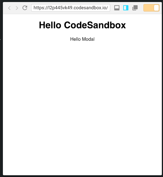
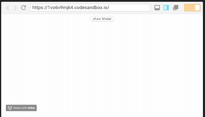
Here’s the output after initial setup.
Toggling the state of a Modal
The mechanism of the modal is to show and hide. This is quite easy to achieve in react because of the built-in toggle state.
First, create a button to toggle the state.
<button  onClick={e => {
              this.showModal();
         }}
          > show Modal </button>
Now create a showModal
function
state = {
    show: false
  };
  showModal = e => {
    this.setState({
      show: true
    });
  };
Now apply this state to Modal
component.
<Modal show={this.state.show} />
Next, make a conditional render from Modal, condition being the show
state.
Don’t forget to return null if show
is false
, this renders nothing. Render the component when show
is true
.
export default class Modal extends React.Component {
  render() {
      if(!this.props.show){
          return null;
      }
    return <div>Hello Modal</div>;
  }
}
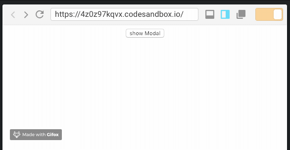
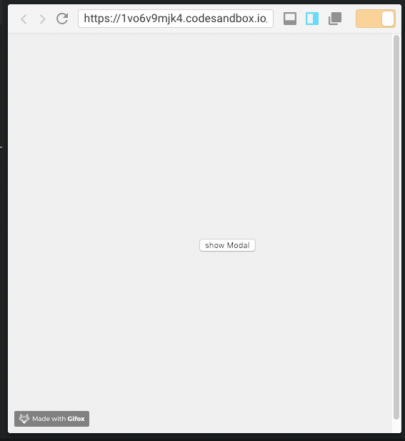
Let's click the button- the output should be something like this.
Make the content dynamic
Right now the content in Modal
is hard-coded. Let’s make it dynamic by passing a prop.
<Modal show={this.state.show}>Message in Modal</Modal>
Replace Message
with {this.props.children}
in the Modal
component.
export default class Modal extends React.Component {
  render() {
    if (!this.props.show) {
      return null;
    }
    return <div>{this.props.children}</div>;
  }
}
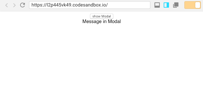
This will render whatever is passed to this component, which is just perfect for a dynamic modal.
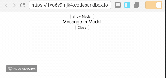
Close the modal
After opening a modal, it needs to be closed.
Let’s add a new close button.
return (
      <div>
        <div>{this.props.children}</div>
        <div>
          <button
            onClose={e => {
              this.onClose(e);
            }}
          >
            Close
          </button>
        </div>
      </div>
    );
Define the onClose
function.
onClose = e => {
    this.props.show = false;
  };
Now set the show
state to false
, which makes Modal
hide.
Wait! It does not work because show
state is defined in App
component.
So, pass a value back to App component.
onClose = e => {
    this.props.onClose && this.props.onClose(e);
  };
Now pass the whole event object back to App
component, then then trigger showModal
<Modal onClose={this.showModal} show={this.state.show}>
          Message in Modal
</Modal>
And toggle the show
state:
showModal = e => {
    this.setState({
      show: !this.state.show
    });
  };
The result hides the close button, as expected.
Styling the modal
Right now you don’t see any modal body because, well, it’s not there.
Let’s create modal.css
.
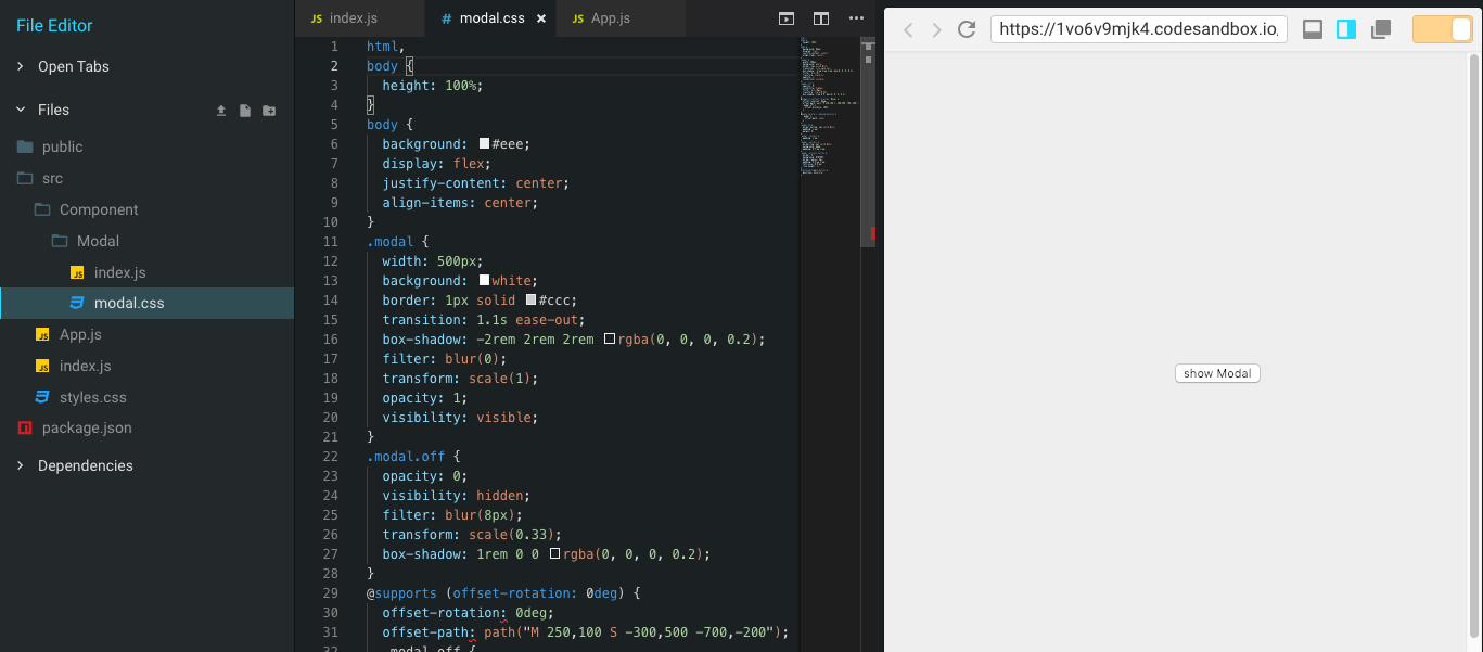
Grab the CSS snippet from Codepen here .
Also include JavaScript to Modal.js
and add a class modal
in the returning div
, and more classes as below.
import React from "react";
import "./modal.css";
export default class Modal extends React.Component {
  onClose = e => {
    this.props.onClose && this.props.onClose(e);
  };
  render() {
    if (!this.props.show) {
      return null;
    }
    return (
      <div class="modal" id="modal">
        <h2>Modal Window</h2>
        <div class="content">{this.props.children}</div>
        <div class="actions">
          <button class="toggle-button" onClick={this.onClose}>
            close
          </button>
        </div>
      </div>
    );
  }
}
In the App
component, add a class toggle-button
to the button.
<div className="App">
        <button
          class="toggle-button"
          id="centered-toggle-button"
          onClick={e => {
            this.showModal(e);
          }}
        >
Now, the result! Isn’t it beautiful? :nail_care:
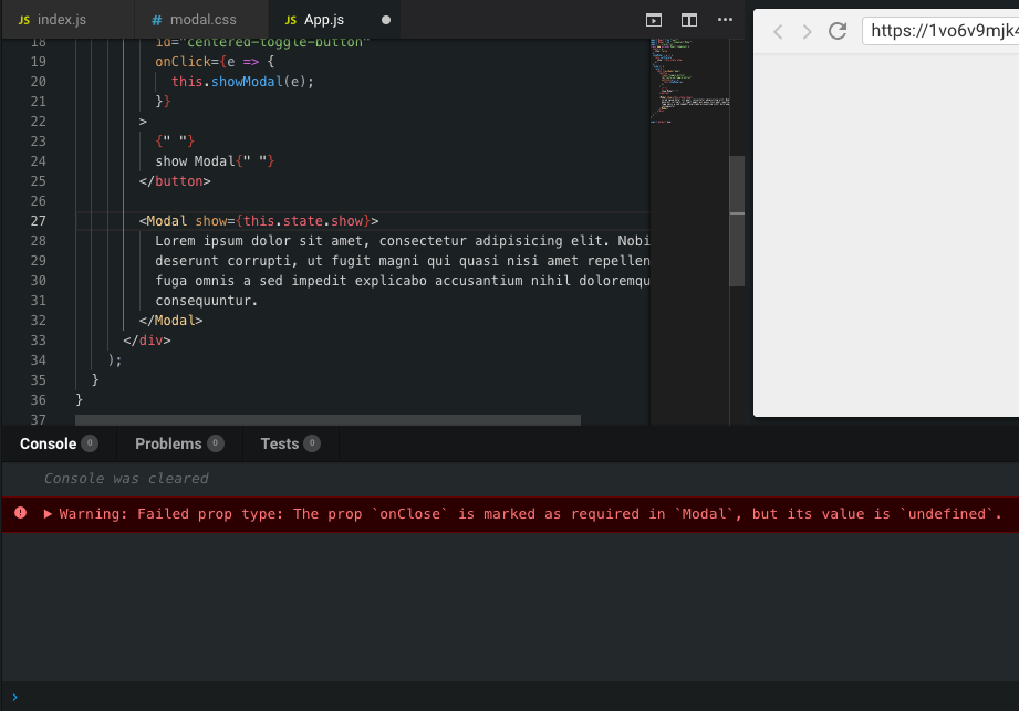
Require onClose
If the component that calls Modal
does not pass onClose
, the Modal
won't close as the show
state doesn't have any effect. To fix this, warn the component to pass the onClose.
Import prop-types
.
import PropTypes from "prop-types";
Add the following to the bottom of the file, outside the class.
Modal.propTypes = {
  onClose: PropTypes.func.isRequired,
  show: PropTypes.bool.isRequired
};
This results in a warning as below.
Recap
In this tutorial, you learned how to implement a simple modal component that you created using a div and used a toggle state to show and hide the modal. We went through the different steps from creating the file structure to styling our modal. You can find the full code on GitHub here:
Hope you liked this post, and please feel free to drop a few :clap: and comment below to ask me anything! I’m always happy to talk and help.
Recommend
About Joyk
Aggregate valuable and interesting links.
Joyk means Joy of geeK