

Nested LazyColumn in Jetpack Compose
source link: https://blog.kotlin-academy.com/nested-lazycolumn-in-jetpack-compose-79cc5d56c603
Go to the source link to view the article. You can view the picture content, updated content and better typesetting reading experience. If the link is broken, please click the button below to view the snapshot at that time.

Nested LazyColumn in Jetpack Compose
When displaying groups of elements, we generally use columns and rows. But when it comes to displaying long lists, compose provides efficient alternatives like LazyColumn and LazyRow, which only render visible items in the screen.
This lazy loading approach improves performance and reduces memory consumption.
Before implementing Nested LazyColumn, let’s briefly go through some basics about available components to render large list.
I. LazyColumn & LazyRow
When rendering large datasets, we often use LazyColumn for vertical arrangements and LazyRow for horizontal.
Similar to RecyclerView, it support reverse layout, orientation adjustment, multiple view types, etc.
LazyColumn {
        items(data) { item ->
            Box(
                modifier = Modifier
                    .height(100.dp)
                    .fillMaxWidth()
                    .background(Color.Magenta)
                    .padding(16.dp)
            )
            Spacer(modifier = Modifier.padding(8.dp))
        }
}


LazyRow {
        items(data) { item ->
            Box(
                modifier = Modifier
                    .width(100.dp)
                    .height(200.dp)
                    .background(Color.Magenta)
                    .padding(16.dp)
            )
            Spacer(modifier = Modifier.padding(8.dp))
        }
    }
Index Position in LazyList
LazyColumn and LazyRow provide an itemsIndexed function that allows us to access the index number of each item in the list.
  LazyColumn {
      itemsIndexed(items = dataList) { index, data ->

if (index == 0) {

}else{

}
      }
  }
Unique ID for LazyList
The key parameter in the LazyList ensures that each item in the list has a stable and unique key, which is essential for efficient list updates and performance optimization.
LazyColumn {
        items(items = allProductEntities, key = { item -> item.id }) { product ->
            ProductItem(product) {
                onProductClick(product.id.toString())
            }
        }
    }
Multiple ViewType
If we want to display different view types, such as headers, footers, or items with distinct UI representations, we can use the index or check view-type from the list to display it accordingly.
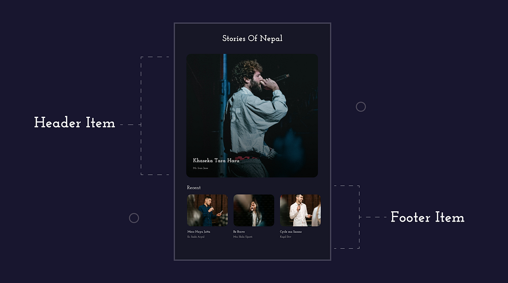
LazyColumn {
        itemsIndexed(items = dataList) { index, data ->

if (index == 0) {
                HeroCard(data)
            } else {
                when (data.categoryType) {

CategoryType.Recent -> {
                        RecentItem(data) {
                            onRecentItemClick(data.id))
                        }
                    }

CategoryType.Popular -> {
                        PopularItem(data) {
                            onPopularItemClick(data.id))
                        }
                    }

else -> {
                        TrendingItem(data) {
                            onTrendingItemClick(data.id)
                        }
                    }

}
            }
        }
    }
Moreover, If there’s a need to append additional items to the list or add different components, we can use item function inside LazyList.
 LazyColumn {
        item {
            HeroCardItem()
        }
        items(data) { item ->
            Box(
                modifier = Modifier
                    .fillMaxWidth()
                    .height(200.dp)
                    .background(Color.Magenta)
                    .padding(16.dp)
            )
            Spacer(modifier = Modifier.padding(8.dp))
        }
        item {
            FooterCardItem()
        }

}

@Composable
fun HeroCardItem() {
    Column {
        Box(
            modifier = Modifier
                .height(500.dp)
                .fillMaxWidth()
                .padding(16.dp)
        ){
           ...
        }
        Spacer(modifier = Modifier.padding(8.dp))
    }
}

@Composable
fun FooterCardItem() {
    Column {
        Box(
            modifier = Modifier
                .height(100.dp)
                .fillMaxWidth()
                .padding(16.dp)
        ){
           ...
        }
        Spacer(modifier = Modifier.padding(8.dp))
    }
}
II. LazyGrid
With Compose, we can easily create grids using the Grid composable and its variants, such as LazyVerticalGrid and LazyHorizontalGrid with lazy loading capabilities.
We can define rows and columns in a grid by using the following types:
columns for LazyVerticalGrid and rows for LazyHorizontalGrid
— Adaptive: Adjusts the size of rows or columns based on content and available space.
--> (columns = GridCells.Adaptive(minSize = 128.dp))
--> (rows = GridCells.Adaptive(minSize = 128.dp))
— FixedSize: Specifies a fixed size for rows or columns.
--> (columns = GridCells.FixedSize(100.dp))
--> (rows = GridCells.FixedSize(100.dp))
— Fixed: Sets a fixed number of rows or columns.
--> (columns = GridCells.Fixed(4))
--> (rows = GridCells.Fixed(4))
--> (columns = StaggeredGridCells.Fixed(2)),
@Composable
fun ExampleVGrid(data: List<String>) {

LazyVerticalGrid(
        columns = GridCells.Adaptive(minSize = 128.dp),
        contentPadding = PaddingValues(8.dp)
    ) {
        items(data.size) { index ->
            Card(
                modifier = Modifier
                    .padding(4.dp)
                    .fillMaxWidth(),
            ) {
                Text(
                    text = data[index],
                    fontWeight = FontWeight.Bold,
                    textAlign = TextAlign.Center,
                    modifier = Modifier.padding(16.dp)
                )
            }
        }

}

}
III. Flow Layout
Flow layout helps us arrange our elements in a natural flow. We have FlowColumn and FlowRow to arrange vertically and horizontally.
Note:
FlowRowandFlowColumnare experimental.
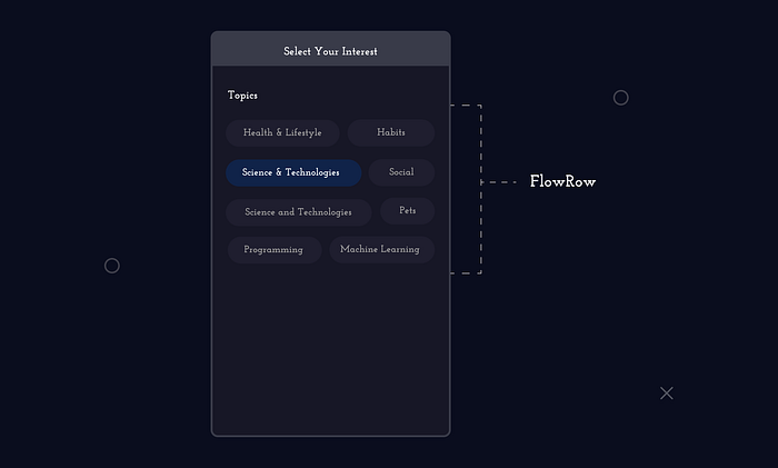
Read more about FlowLayout here.
Okay, now let’s start implementing the nested lazy list.
Nested LazyList
By nesting LazyColumn or LazyRow components within each other, we can create hierarchical UI layouts, which we call NestedLazyColumn or NestedLazyRow.
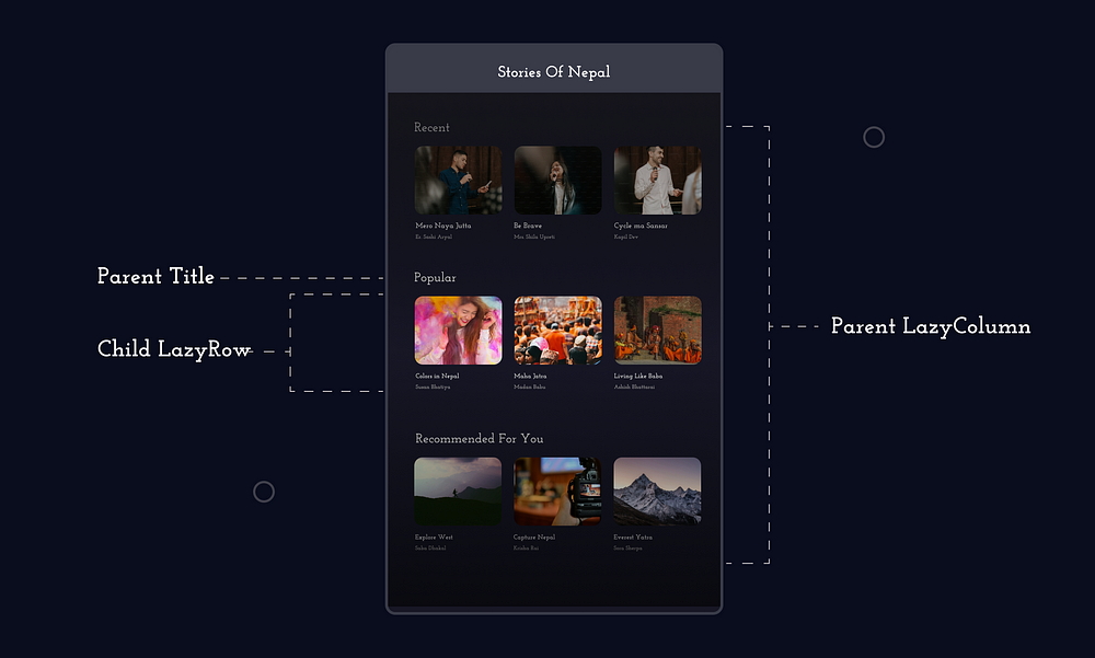
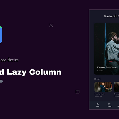
Here, LazyColumn is used as the main container to display a list of categories vertically, while LazyRow is nested within each item of the LazyColumn to display the stories card horizontally.
We can easily create these types of nested layouts with the following code:
Suppose we have an API which will return all categories with its events,
{
  "categories": [
    {
      "name": "Recent",
      "events": [
        {
          "title": "Spring Music Festival",
          "organizer": "Music Events Inc.",
          "image": "spring_music_festival.jpg"
        },
        ....
      ]
    },
    {
      "name": "Popular",
      "events": [
        {
          "title": "Food Truck Rally",
          "organizer": "Local Food Association",
          "image": "food_truck_rally.jpg"
        },
        ...
      ]
    },
    ....
  ]
}
Let’s make a data class for this JSON. We can use Gson or Kotlin Serialization to help us in parsing.
data class Event(
    val title: String,
    val organizer: String,
    val image: String
)

data class CategoryWithEvents(
    val name: String,
    val events: List<Event>
)
Follow the code from repository, where I’ve used NetworkBoundResource to retrieve both local database and API data within a single function. Let’s skip these and move to rendering UI.
@Composable
fun NestedLazyColumnExample(allCategoryEvents: List<CategoryWithEvents>) {
    LazyColumn(
        state = listState
    ) {
        items(allCategoryEvents){ categoryEvents ->

CategoryHeader(categoryEvents.categoryName)

LazyRow {
                items(categoryEvents.event,
                      key = { event -> event.id }){ event ->

EventItem(data = event) {

}
                }
            }
        }
    }
}

@Composable
fun EventItem(event: List<Events>, onEventClick : (String) -> Unit){

Card(
      modifier = Modifier
          .padding(MaterialTheme.dimens.regular)
          .width(200.dp)
          .fillMaxHeight()
          .clickable {
              onEventClick(eventEntity.id.toString())
          },
      shape = MaterialTheme.shapes.medium
    ) {
        .....
      }
}

@Composable
fun CategoryHeader(title: String) {
    Text(text = title, modifier = Modifier.padding(9.dp))
}
And Done, Our Nested LazyColumn with LazyRow is completed.
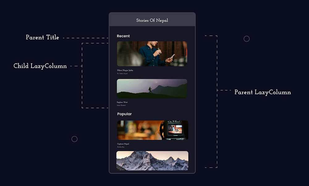
But what happens if we nest LazyColumn?
LazyColumn(
    state = listState
) {
    items(allProductEntities) { allProducts ->
        ExploreHeader(allProducts.categoryName)
        LazyColumn {
            items(allProducts.products, key = { product -> product.id }) { product ->
                ExploreItem(productEntity = product) {

}
            }
        }
    }
}
If we nest LazyColumn and don't define the height of the nested column, we will get the following error:
java.lang.IllegalStateException: Vertically scrollable component was measured
with an infinity maximum height constraints, which is disallowed. One of the common
reasons is nesting layouts like LazyColumn and Column(Modifier.verticalScroll()).
...
Avoid The Limitation of LazyColumn
To address this issue, various techniques can be used:
1. Using PreDefined or Dynamic Height
We can define the height of the nested composable items. This works fine, but the nested column will have a fixed height, and the content will scroll to that fixed height.
 LazyColumn(
        state = listState
    ) {
        items(allProductEntities) { allProducts ->
            ExploreHeader(allProducts.categoryName)

LazyColumn(modifier = Modifier.height(550.dp)) {
                items(allProducts.products) { product ->
                    ExploreItem(productEntity = product) {

}
                }
            }
        }
    }
I’ve noticed some developers estimating dynamic height of the nested column. They create a logic to determine the dynamic height of the LazyColumn. I’m unsure of its practicality and haven’t tested it myself. If you’ve experimented with it, feel free to mention your findings in the comments.
2. Replacing LazyColumn with Column Only
Replacing it with a Column may result in losing lazy loading of items, impacting the performance of the list and making it less optimal.
allEvents.events.forEach{ event ->
        Column {
            EventItem(eventEntity = event) {

}
        }
}
3. Using LazyListScope:
@Composable
fun ExploreList(allEventCategories: List<CategoryWithEvents>, onEventClick: (String) -> Unit) {
    ExploreContent(allEventCategories, onEventClick)
}

@Composable
fun ExploreContent(allEventCategories: List<CategoryWithEvents>, onEventClick: (String) -> Unit) {
    val listState = rememberLazyListState()
    LazyColumn(
        state = listState
    ) {
        allEventCategories.map { (categoryName, eventList) ->
            stickyHeader {
                ExploreHeader(categoryName)
            }
            EventItem(eventList, onEventClick)
        }
    }
}

// LazyListScope Item

fun LazyListScope.EventItem(
    eventList: List<Event>,
    onEventClick: (String) -> Unit
) {
    items(eventList) { eventData ->
        Card(
            modifier = Modifier
                .padding(MaterialTheme.dimens.regular)
                .fillMaxWidth()
                .fillMaxHeight()
                .clickable {
                    onEventClick(eventData.title)
                },
            shape = MaterialTheme.shapes.medium
        ) {
            Column(
                Modifier.fillMaxWidth(),
            ) {
                AsyncImage(
                    model = eventData.image,
                    contentDescription = eventData.title,
                    modifier = Modifier
                        .background(MaterialTheme.colorScheme.secondaryContainer)
                        .fillMaxWidth()
                        .height(150.dp),
                    contentScale = ContentScale.Crop,
                )

Column(
                    Modifier.padding(10.dp),
                ) {
                    Text(
                        text = eventData.title,
                        style = appTypography.bodyMedium,
                        maxLines = 1,
                        color = MaterialTheme.colorScheme.onTertiaryContainer,
                        modifier = Modifier.padding(8.dp)
                    )
                    // Other UI...
                    Spacer(modifier = Modifier.height(8.dp))
                }
            }
        }
    }
}
That concludes today’s episode. Thank you.
If you’re new to Jetpack Compose, there’s a beginner’s tutorial series waiting for you.


Keep learning, Keep composing...

Recommend
About Joyk
Aggregate valuable and interesting links.
Joyk means Joy of geeK