

Angular PrimeNG Slide Menu Basic
source link: https://www.geeksforgeeks.org/angular-primeng-slide-menu-basic/
Go to the source link to view the article. You can view the picture content, updated content and better typesetting reading experience. If the link is broken, please click the button below to view the snapshot at that time.
Angular PrimeNG Slide Menu Basic
Angular PrimeNG is an open-source framework with a rich set of native Angular UI components that are used for great styling and this framework is used to make responsive websites with very much ease. In this article, we will see how to use SlideMenu Basic inAngular PrimeNG.
SlideMenu component is used to display the menu list in the form of the sliding animation which helps to see the menu items in a stepwise manner. By default, the Slide Menu is inline.
Angular PrimeNG Slide Menu Basic Properties:
- model: It is an array of menu items. It is of array data type & the default value is null.
- viewportHeight: It is the height of the scrollable area, a scrollbar appears if a menu height is longer than this value. It accepts the number data type as input & the default value is 175.
Syntax:
<p-slideMenu #menu
    [model]="gfg"
    [viewportHeight]="...">
</p-slideMenu>
Creating Angular application & module installation:
Step 1: Create an Angular application using the following command:
ng new appname
Step 2: After creating your project folder i.e. appname, move to it using the following command.
cd appname
Step 3: Install PrimeNG in your given directory.
npm install primeng --save
npm install primeicons --save
Project Structure: After complete installation, it will look like the following:

- Run the below command to see the output.
ng serve --open
Example 1: Below is the example code that illustrates the use of the Angular PrimeNG SlideMenu Basic.
- app.component.html
<h2 style="color: green">GeeksforGeeks</h2> <h5>PrimeNG SlideMenu Basic</h5> <p-slideMenu #menu [model]="gfg" [viewportHeight]="150"> </p-slideMenu> |
- app.component.ts
import { Component } from "@angular/core"; import { MenuItem } from "primeng/api"; @Component({ selector: "app-root", templateUrl: "./app.component.html", }) export class AppComponent { gfg: MenuItem[]; ngOnInit() { this.gfg = [ { label: "HTML", items: [ { label: "HTML 1", }, { label: "HTML 2", }, ], }, { label: "Angular", items: [ { label: "Angular 1", }, { label: "Angular 2", }, ], }, ]; } } |
- app.module.ts
import { NgModule } from "@angular/core"; import { BrowserModule } from "@angular/platform-browser"; import { BrowserAnimationsModule } from "@angular/platform-browser/animations"; import { AppComponent } from "./app.component"; import { SlideMenuModule } from "primeng/slidemenu"; import { ButtonModule } from "primeng/button"; @NgModule({ imports: [ BrowserModule, BrowserAnimationsModule, SlideMenuModule, ButtonModule, ], declarations: [AppComponent], bootstrap: [AppComponent], }) export class AppModule {} |
Output:

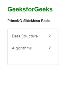
Example 2: Below is another example code that illustrates the Angular PrimeNG SlideMenu Basic using some different item values.
- app.component.html
<h2 style="color: green">GeeksforGeeks</h2> <h5>PrimeNG SlideMenu Basic</h5> <p-slideMenu #menu [model]="gfg" [viewportHeight]="180"> </p-slideMenu> |
- app.component.ts
import { Component } from "@angular/core"; import { MenuItem } from "primeng/api"; @Component({ selector: "app-root", templateUrl: "./app.component.html", }) export class AppComponent { gfg: MenuItem[]; ngOnInit() { this.gfg = [ { label: "Data Structure", items: [ { label: "Linked List", }, { label: "Stacks", }, ], }, { label: "Algorithms", items: [ { label: "Breadth First Search (BFS) Algorithm.", }, { label: "Depth First Search (DFS) Algorithm.", }, ], }, ]; } } |
- app.module.ts
import { NgModule } from "@angular/core"; import { BrowserModule } from "@angular/platform-browser"; import { BrowserAnimationsModule } from "@angular/platform-browser/animations"; import { AppComponent } from "./app.component"; import { SlideMenuModule } from "primeng/slidemenu"; import { ButtonModule } from "primeng/button"; @NgModule({ imports: [ BrowserModule, BrowserAnimationsModule, SlideMenuModule, ButtonModule, ], declarations: [AppComponent], bootstrap: [AppComponent], }) export class AppModule {} |
Output:
Reference: https://primefaces.org/primeng/slidemenu
“This course was packed with amazing and well-organized content! The project-based approach of this course made it even better to understand concepts faster. Also the instructor in the live classes is really good and knowledgeable.”- Tejas | Deutsche Bank
With our revamped Full Stack Development Program: master Node.js and React that enables you to create dynamic web applications.
So get ready for salary hike only with our Full Stack Development Course.
Recommend
About Joyk
Aggregate valuable and interesting links.
Joyk means Joy of geeK