

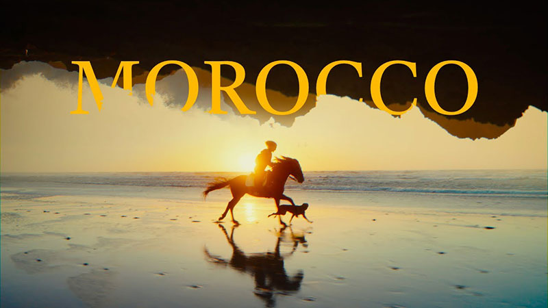
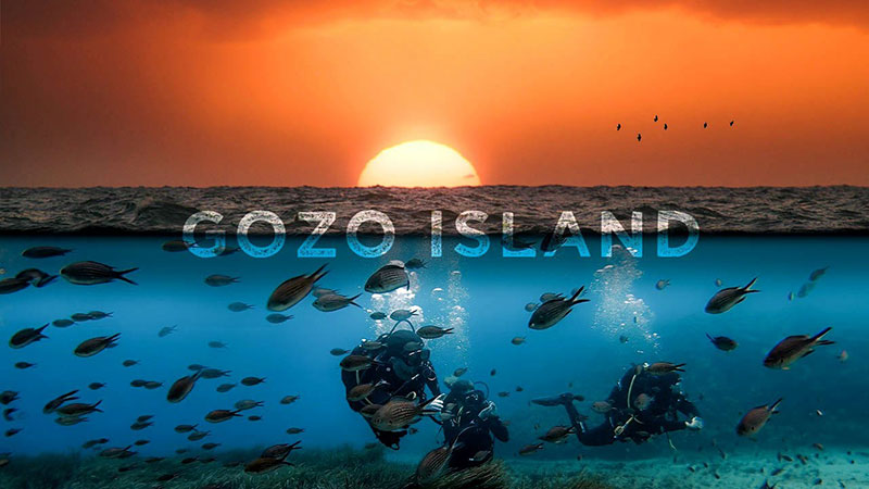
The 19 Best Fonts for YouTube Thumbnails
source link: https://www.designyourway.net/blog/best-fonts-for-youtube-thumbnails/
Go to the source link to view the article. You can view the picture content, updated content and better typesetting reading experience. If the link is broken, please click the button below to view the snapshot at that time.
The 19 Best Fonts for YouTube Thumbnails
Picture this: a bustling sea of videos, each vying for attention in the vast expanse of YouTube. In this digital arena, thumbnails stand as your silent heralds, compelling viewers with a visual whisper to click and watch. It’s here, in those critical milliseconds, that the right font can scream louder than words, tipping the scales in your favor.
Diving into this article, we’re cracking the code on the best fonts for YouTube thumbnails—the secret sauce to make your video pop in a crowd.
We’ll explore the typography design tips that catch the eye, ensure readability, and marry aesthetics with function.
Prepare to arm yourself with knowledge on display fonts that demand attention and high contrast lettering that cuts through the noise.
By the final full stop, you’ll wield the power to select typefaces that not only resonate with your brand but also with the subconscious of your potential viewer.
Let’s elevate your YouTube game, one thumbnail at a time.
The Best Fonts for YouTube Thumbnails
| Best Fonts for YouTube Thumbnails | Font Style | Readability | Personality/Vibe | Good For |
|---|---|---|---|---|
| Impact | Sans-serif | High | Bold, Assertive | Headers, attention-grabbing text |
| Bebas Neue | Sans-serif | High | Clean, Modern | Titles, captions |
| Raleway ExtraBold | Sans-serif | High | Stylish, Contemporary | Titles, especially in tech or lifestyle content |
| Roboto Black | Sans-serif | High | Modern, Strong | Versatile usage, clear readability |
| Montserrat | Sans-serif | High | Geometric, Modern | Titles, subtitles |
| Caribold | Sans-serif | High | Professional, Solid | Emphasizing specific words |
| Playlist Script | Script | Moderate | Casual, Handwritten | Personal touch, creative content |
| Lobster Two | Script | Moderate | Quirky, Friendly | Eye-catching words, not for large text blocks |
| Amatic | Handwritten | Moderate | Quaint, Artistic | Creative or casual content, not for lengthy text |
| Brock Script | Script | Low-Moderate | Elegant, Classic | Elegant touch or to imitate handwriting |
| Glacial Indifference | Sans-serif | High | Minimalistic, Clean | Modern and simplistic content |
| Oswald Stencil | Stencil | Moderate | Industrial, Bold | Headers with an impactful, military or industrial vibe |
| Bukhari Script | Script | Low | Playful, Curly | Decorative text, not ideal for readability |
Current Trends in YouTube Thumbnail Fonts
Popularity of Bold and Impactful Fonts
Alright, let’s dive into what’s hot in the world of YouTube thumbnails. You know how sometimes you’re scrolling through YouTube, and some thumbnails just jump out at you?
That’s the magic of bold and impactful fonts. They’re like the loud friends at a party – they grab your attention.
Using fonts like Impact or Bebas Neue isn’t just a trend; it’s a smart move.
Because when your thumbnail is competing with a sea of others, you want every advantage you can get. These fonts shout, “Hey, look at me!” and in the YouTube game, that’s half the battle.
Rise of Handwritten and Personalized Fonts
Now, let’s switch gears to something a bit more personal. Handwritten fonts, like Playlist Script, are like that cozy, familiar cafe you love.
They’re approachable, friendly, and add a personal touch.
When viewers see a thumbnail with a font like Amatic or Beauty and the Beast, it’s like getting a note from a friend. It feels more inviting, like you’re about to watch something from a buddy rather than a big, faceless brand.
Minimalism in Font Design
Last up in our trend talk is minimalism. Think of Raleway ExtraBold or Roboto Black – fonts that are clean, crisp, and uncluttered. They’re like that minimalist, uber-organized friend who somehow always has their life together. These fonts are all about making it easy for viewers. No fuss, no muss, just straight-up clarity.
When you use a minimalist font, you’re telling your audience, “I respect your time and attention.” It’s like clearing the clutter off the table so they can focus on what matters: your video.
Top Fonts for YouTube Thumbnails
Bold Fonts
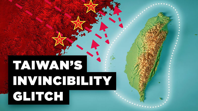
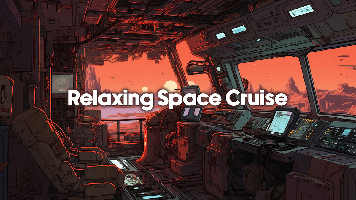
Okay, let’s get into the nitty-gritty of picking the best fonts for YouTube thumbnails, starting with the big and bold. Imagine a font that walks into a room and immediately turns heads – that’s what bold fonts do on your thumbnails.
We’re talking about fonts like Impact, with its in-your-face presence, or Bebas Neue, which is like the cool kid of typography. It’s sleek, modern, and unmissable.
Then there’s Montserrat and Caribold. They’re like the powerlifters of fonts – strong and commanding. Horsemen and Indigo are two more that pack a serious punch. These fonts don’t just whisper; they shout your message from the rooftops.
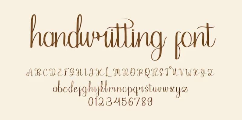
Handwritten Fonts
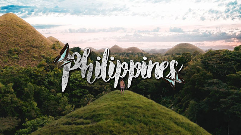
Moving on, let’s soften things a bit with handwritten fonts. These are the heartwarmers, the ones that feel like getting a handwritten letter in the mail. Playlist Script is a go-to for that personal touch, while Selina adds a dash of elegance.
Amatic is like that quirky friend who’s always fun to be around, and Frisky Puppy? Just the name makes you smile. These fonts are perfect when you want to say, “Hey, I’m relatable and friendly.”
Minimalist Fonts

Now, let’s talk minimalism. Because sometimes, less really is more. Minimalist fonts like Raleway ExtraBold and Roboto Black cut through the noise. They’re like that friend who always gets straight to the point. Glacial Indifference and Oswald Stencil are about as no-nonsense as you can get, while Amble offers a softer approach to minimalism.
Script Fonts
Last up, script fonts. They’re the artists, the ones that bring flair and style. Bukhari Script is a showstopper, and Lobster Two brings a touch of class. Brock Script and Juan Cock are like the hidden gems – not as well-known, but they pack a serious style punch.
Tips for Choosing and Using Fonts in Thumbnails
Picking the best fonts for YouTube thumbnails is a bit like a treasure hunt. You’re looking for those gems that will make your content shine. But it’s not just about finding cool fonts; it’s about how you use them. Let’s break it down.
Readability and Visibility
First things first, if your audience can’t read your thumbnail, what’s the point? You want a font that stands out, even on the smallest phone screen. Think about Impact or Montserrat. They’re like the loudspeakers of fonts – clear and impossible to ignore.
Also, remember the magic of contrast. Dark font on a light background, or vice versa, can really make your words pop. It’s like wearing a bright red hat in a sea of black ones – you’re going to get noticed.
Consistency in Font Usage
Consistency is key. Imagine if every thumbnail looked like it came from a different channel. Confusing, right? Stick to one or two fonts that reflect your brand. This way, when someone sees your thumbnail, they’ll know it’s you without even reading the title.
It’s like your signature style. Whether you’re into bold fonts like Bebas Neue or something more whimsical like Playlist Script, keeping it consistent is what builds your brand’s visual identity.
Color and Contrast
Colors are like the mood music of your thumbnails. They set the tone. Bright colors scream fun and excitement, while more muted tones might say, “This is serious stuff.”
And don’t forget about contrast! You want your font to stand out against the background. It’s like trying to spot a cat in a dark room. If the cat’s black, good luck. But if it’s white? Boom, there it is.
Pairing Fonts for Dynamic Appeal
Pairing fonts can be as tricky as pairing wine with food. Get it right, and it’s a match made in heaven. Get it wrong, and well… it’s not pretty.
A good rule of thumb? Combine a bold font with a more subdued one. Like Montserrat for your main message and Raleway for the details.
Think of it as a duet. One font is the lead singer, belting out the main message. The other is the backup vocalist, adding depth and harmony.
Common Mistakes to Avoid in Font Selection
When it comes to picking the best fonts for YouTube thumbnails, it’s not just about what you do right, but also what you shouldn’t do.
A few missteps, and you could turn a killer thumbnail into a dud. So, let’s break down those “oops” moments you’ll want to steer clear of.
Overly Complex Fonts
Ever seen a font that looks like it’s trying too hard? Swirls, shadows, all the bells and whistles? Sure, they might look fancy, but if your viewers need a magnifying glass to read your thumbnail, that’s a problem.
Complex fonts might look cool up close, but on a small screen, they can become an unreadable mess.
It’s like trying to read someone’s fancy handwriting from across the room. Stick to simpler, cleaner fonts that get your message across without the fuss.
Too Many Words or Small Text
Okay, so you’ve got a lot to say. That’s cool, but your thumbnail isn’t the place to write an essay. Cramming too many words into that tiny space is like trying to fit an elephant into a Mini Cooper. Not gonna happen without some serious squishing.
And tiny text? Forget about it. If viewers have to squint, they’ll just scroll on by. Keep it short, sweet, and big enough to read at a glance.
Lack of Contrast and Legibility
Remember, contrast is your friend. Dark font on a light background, light font on a dark background – this is the yin and yang of thumbnail design. Without it, your font is like a chameleon on a color-matching background. Invisible.
Legibility goes hand in hand with contrast. You want a font that stands out and is easy on the eyes. It’s like the difference between reading a well-lit, clear sign versus trying to decipher a faded, blurry one in the dark.
FAQ On Best Fonts For Youtube Thumbnails
What makes a font great for YouTube thumbnails?
A rockstar font for YouTube thumbnails packs a punch; it’s bold and readable. The goal? To convey your video’s vibe at a glance. Think sans-serif for clarity, and size it up so even the squinters at the back get the message. It’s not just a font—it’s your first impression.
How do I choose the right font color for my thumbnails?
Color choice is king. Aim for contrast—a shade that pops against your thumbnail’s backdrop. It’s a dance of visibility, where the right font color tango with the background ensures your text steals the spotlight. Go for bold, never bland, and watch those click-through rates climb.
Can I use custom fonts in my YouTube thumbnails?
Absolutely, custom fonts are the secret spice in the brand identity stew. Tailoring a unique font for your thumbnails can shout ‘you’ in a sea of sameness. Just ensure it’s legible and licenses are squared away—no one likes a legal party crasher.
Do I need to pay for good thumbnail fonts?
Not at all. The world’s a treasure trove of free fonts—Google Fonts and Canva have your back. There’s no shortage of slick, zero-cost options that can dazzle and deliver without dinging your wallet. Save the cash for your coffee fund; your thumbnails got you covered without it.
What about using multiple fonts in one thumbnail?
Mix it up, but don’t turn it into a typographic salad. Font pairing is a delicate art; two’s company, three’s a crowd. You want a dynamic duo that complements without the clash. Harmony’s the name of the game, leading the eye naturally and keeping the visual hierarchy intact.
How important is font size in YouTube thumbnails?
Font size is your visual megaphone—it’s gotta be loud enough to catch those eyeballs. Too tiny, and it’s lost in the shuffle. Thumbnail font size should scream “look at me” to even the most casual scroller, without drowning in a sea of excess.
Should I be concerned about font legibility on mobile devices?
You bet. These days, mobile is king, and a thumbnail that’s clear on desktop but a blurry blob on mobile won’t fly. Scale and font legibility need to play nice with even the smallest screens. Your font should be like your best mate—readable, even on the tiniest phone.
Is it better to go for bold or thin fonts?
In the thumbnail thunderdome, bold typography typically claims victory. Thin fonts might bring elegance to the table, but when you need to grab attention fast, bulk up those letters. Yet, don’t go Hulk—balance boldness with aesthetics, or risk tipping into the dreaded realm of gaudiness.
How does font style affect thumbnail click-through rate?
Style sets the stage—it’s the sizzle to your steak. Fonts that resonate with your content genre can crank up the thumbnail aesthetics and click-through rate. Horror? Creep it with gothic letters. Comedy? A splash of playful script. It’s all about matching the mood to boost those clicks.
Are there any fonts I should avoid using in thumbnails?
Just as capes are a no-go for superheroes (thanks, Edna), certain fonts are thumbnail taboos. Skip past the overused (ahem Comic Sans), the dreaded clichés, and those unruly ones that scrimp on legibility. Choose clarity and character, and you’ll sidestep the snags that snag others.
Conclusion
So, we’ve journeyed deep into the realms of typography and surfaced with a treasure trove of knowledge about the best fonts for YouTube thumbnails. It’s all about making those first few seconds count, ensnaring curiosity with fonts that speak volumes before a single play button is pressed.
Summing it up, remember:
- Clarity is non-negotiable; your message needs to pop.
- Stay true to your brand with eye-catching typefaces that tell your story.
- Keep font legibility and color contrast in mind to nail those mobile views.
- Sans-serif fonts tend to be your buddies, they’re clean and scream ‘modern’.
With the toolkit you’ve now got, those thumbnails are practically gearing up to do the heavy lifting for you. Armed with the right typography design tips and a sprinkle of creativity, you’re set to craft clickable masterpieces. Thumbnails are your silent pitch; make ’em count, and watch those views roll in.
If you enjoyed reading this article on the best fonts for YouTube thumbnails, you should check out these articles also:
Renowned for his expertise in logo design and visual branding, Bogdan has developed a multitude of logos for various clients.
His skills extend to creating posters, vector illustrations, business cards, and brochures. Additionally, Bogdan's UI kits were featured on marketplaces like Visual Hierarchy and UI8.
Recommend
About Joyk
Aggregate valuable and interesting links.
Joyk means Joy of geeK