

How to Reuse and Share React Native Components
source link: https://blog.bitsrc.io/how-to-reuse-and-share-react-native-components-e3a7d2e5f786
Go to the source link to view the article. You can view the picture content, updated content and better typesetting reading experience. If the link is broken, please click the button below to view the snapshot at that time.
How to Reuse and Share React Native Components
Managing individual components can be challenging. Here’s how you can build and share reusable React Native components in a manageable way.

React Native is one of the go-to frameworks for modern cross-platform application development. It allows developers to build applications that run on both iOS and Android platforms using a single codebase written in JavaScript. Furthermore, it encourages developers to follow component-driven development to align with modern software development principles, such as modularity, reusability, and maintainability.
However, managing many individual components can be challenging without proper techniques and tools. Hence, it’s essential to get familiar with React Native ecosystem to handle large-scale applications effectively.
Also, recently, I came across Bit, an open-source toolchain that helps you design, build, test, and version components independently. With Bit, developing complex applications involving multiple reusable components becomes easy and streamlined.
In this article, I will explain how you can use Bit to build 100% reusable React Native components, regardless of whether you are a solo developer or part of a team.
What is Bit?
As mentioned above, component-based development is one of the key features of React Native development. Hence, more often than not, you try to ensure that these components are loosely coupled and highly reusable through a design system such as the ATOMIC design system. But, if you think about it, you’re still working inside a single monolith application. To make a change to a single component, you’d need to recreate the entire application locally and release a new version of the new monolith entirely.
This is where tools like Bit come into the picture. Bit enables component-driven development by providing an independent and distributed environment for each component to be designed, developed, tested, versioned and documented.
Consider the screenshot shown below:
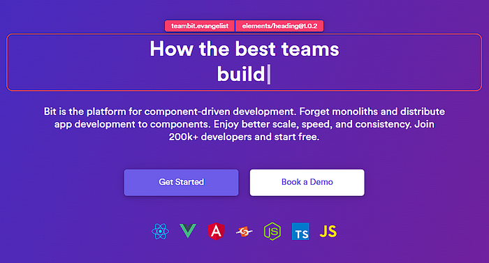
The header highlighted in red is an independent Bit component that’s stored in Bit’s cloud platform. Bit’s entire website is built with such independent components which can be shared and reused across multiple projects.
In a nutshell, Bit provides an efficient and scalable way to manage and share components, allowing teams to focus on building innovative and high-quality software.
Learn more:
Tutorial: Building Scalable React Native Apps with Independent Bit Components
This tutorial explores how to build scalable React Native apps using Bit. Discover the power of component-based…
So, let’s take a look at how you can develop React Native components and also share them across multiple projects using Bit!
Before you get started, make sure to go through this guide and the official Bit documentationto get an idea of Bit Scopes, Components, and Component-Driven Development.
Step 01 — Getting Started
Before moving forward, you’ll need to install the Bit CLI using the command:
npx @teambit/bvm install
Next, you’ll need to verify that the CLI has been installed successfully by running the command:
bit --version
If you’ve installed Bit correctly, you should see the screenshot below.
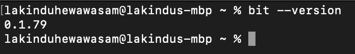
Figure: Installing Bit successfully
Finally, you’ll need a Bit account to build your React Native components. Therefore, create an account with this link.
Step 02 — Setting up the development environment
Next, you’ll have to create a Bit workspace to help build a React Native component that we can share across our projects!
To do so, run the command:
bit new react-native my-workspace --env teambit.react/react-native-env --default-scope lakindu2002.react-native-design && cd my-workspace && bit install @teambit/react.react-native-env
Be sure to replace lakindu2002 with your Bit username and react-native-design with your scope name. If you're unfamiliar, a scope is a collaboration server that lets your team store and collaborate with components in the cloud.
After you’ve created your workspace, run the command bit start to launch the development server. You should see the output below if you've done this step correctly.
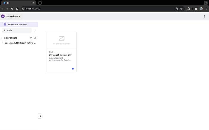
Figure: Launching the Bit Workspace
Step 03 — Creating a React Native Component
If you’ve made it to step 03, you can officially start building a shareable and reusable React Native component using Bit. To do so, you’ll first have to create a component. This can be done using the command:
bit create react-native design/button
Here is what it all means:
- The
react-nativepart is the template. You can specify others like HTML, Node, Angular, or React. - The
design/buttonpart is the folder where our component will be created. You can look at the root of your project. You should see a folder called<scope>(in our case,react-native-design) inside the folder calleddesign, and inside it, another one calledbutton. Here is where we’ll be working in a minute.
After running the command, you’ll see the output below.
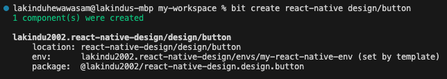
Figure: Creating the React Native component successfully
The folder structure for the newly created component looks like this:
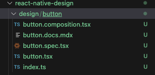
Figure: Folder structure for the component
By default Bit has made several files:
button.docs.mdx: Here's where you'll define the documentation for your component and include a guide on using the component effectively.button.composition.tsx: Here’s where you’d add examples showcasing how consumers can use your component.button.spec.tsx: Here's where you'll define the test cases that help test your component,button.tsx: Here's where you'll define the actual Button component.index.ts: Here's where you'll define your exports for the component so that it'll be reusable across different projects.
For Step 03, let’s focus on the button.tsx file. Open the button.tsx file and include the code shown below.
import React = require('react');
import { Button as ReactNativeButton } from 'react-native';

export type ButtonProps = {
  /**
   * the label to be shown on the button
   * @default "Hello World"
   */
  label?:string,

/**
   * the callback function triggered when the button is pressed
   * @default undefined
   * @returns void
   */
  onClick?:()=>void;
};

export function Button({ label = "Hello World", onClick }: ButtonProps) {
  return (
    <ReactNativeButtontitle={label}onPress={onClick}
    />
  );
}
It’s a simple and generic declaration of a Button component that accepts a click listener and a label to show. Next, save the code and visit your development server to see the component.
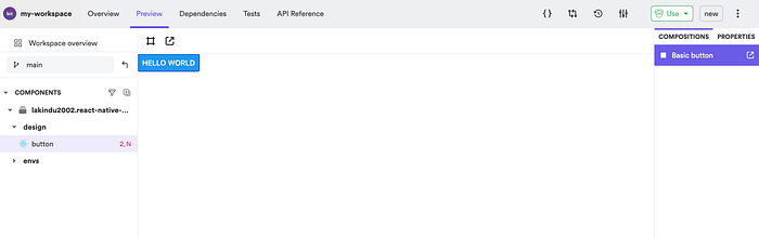
Figure: Viewing the newly created component
Step 04 — Testing the React Native Component
After you’ve developed your component, you’ll need to ensure that it is error-free before others can use your reusable component. To do so, Bit encourages you to define test cases that Bit will execute whenever you create a new version of your component or build it. Therefore, you can add your test cases by adding the following code to the button.spec.tsx file:
import React from 'react';
import { render } from '@testing-library/react-native';
import { BasicButton } from './button.composition';

it('should render with the correct text', () => {
  const { getByText } = render(<BasicButton />);
  const rendered = getByText('Hello World');
  expect(rendered).toBeTruthy();
});
The test case above utilizes the BasicButton composition (defined in button.composition.tsx to ensure the Button correctly uses the label prop. This helps ensure the Button is rendered with the correct label.
Next, run bit test to test your component.
Step 05 — Sharing the React Native Component
Next, you’re ready to share your component with the world so that anyone can start using it in their React Native project! To do so, you’ll first need to create a Scope on Bit using the same name you provided in Step 02. Visit https://bit.cloud/~create-scope to make your scope. You’ll see the output shown below.
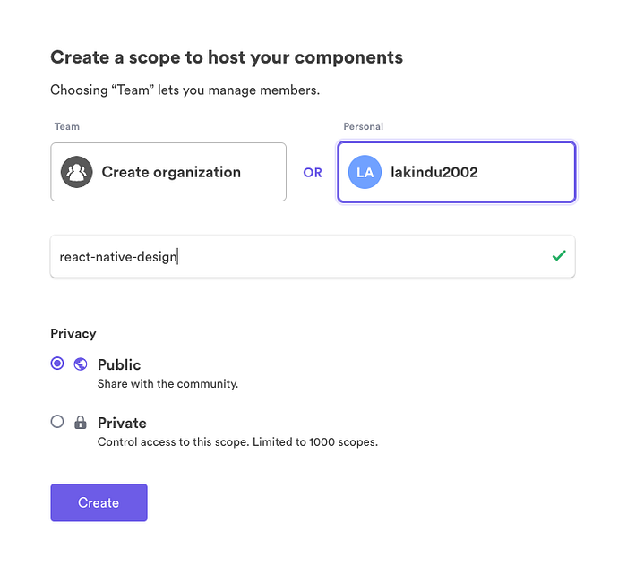
Figure: Creating a Bit Scope
Next, log into your Bit account through the CLI using bit login.
Now, you’ll have to “tag” our component, which would be the equivalent of running git add and git commit together, as shown below.
bit tag
The output is going to be very verbose, but if, at the end of it, you see these lines, it means you got it working:
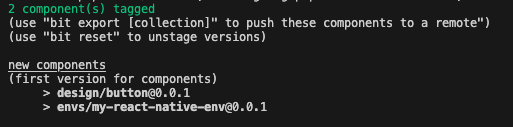
Figure: Tagging the Components
Note: With Bit, you can also compare two component versions, giving you a unified view of all the changes in the different versions.
The next step of this process to help you share your reusable component is uploading them to Bit.cloud. This can be accomplished via a simple command:
bit export
This will ship your component to the cloud and make it shareable across the entire React Native developer community! If your component has been exported successfully, you’ll see the output:
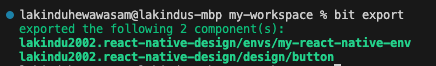
Figure: Exporting the components
And if you go to Bit.cloud, you should see the component live like this:
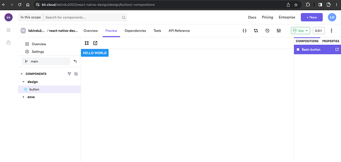
Figure: Viewing the exported components
That’s our component, and it’s ready to be used by anyone!
You can learn more about extracting and reusing pre-existing components here.
Step 06 — Re-using the React Native Component
Now for a practical example of how to find a suitable component and how to make use of it, let’s try and find our component in Bit.cloud and then figure out how we can add it to a new project.
Let’s go to Bit.cloud, and enter the word “button” on the top search bar. You should see something similar to this:
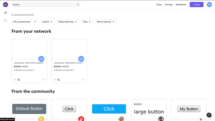
Figure: Searching for a component
Your matching components will appear first, but you should also be able to see mine if you browse the community results.
I’m going to pick my component, which means I should see something like this:
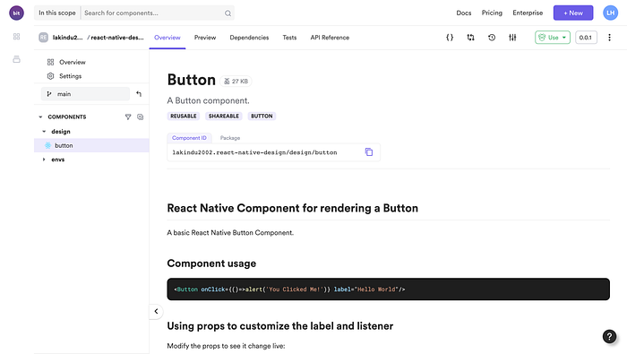
Figure: Viewing my own component on Bit Cloud
Now to use it, we have several options. If you click on the top right “Use” button, you’ll see them:
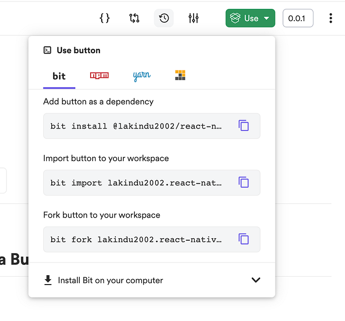
Figure: Different ways of reusing the component
You can use Bit itself to install it; you can also use NPM, Yarn, or even PNPM. You’ll get all the necessary info if you click each option’s tab.
For this example, I’m going to stick to Bit. When you install the component onto a Bit workspace using Bit, you can consume the component as a third-party dependency, which means that you can consume this component in literally any React Native project across the world! This showcases the power of reusability and shareability with Bit.
To install the component using Bit, run the following command on any workspace:
bit install @lakindu2002/react-native-design.design.button
Next, open any React Native component in your Bit Workspace and use the component just like you’d use a third-party library, as shown below.
import { Text, StyleSheet } from 'react-native';
import { Button } from '@lakindu2002/react-native-design.design.button';

export type HelloProps = {
  /**
   * a text to be rendered in the component.
   */text: string
};

const styles = StyleSheet.create({
  text: {},
});

export function Hello({ text }: HelloProps) {
  return (
    <><Text style={styles.text}>
        {text}
      </Text><Button label="HelloWorld" onClick={()=>alert('Using from page')}/>
    </>
  );
}
And it’s as simple as that! Plus, if you’re building a React Native app using the React Native CLI or Expo, you can install your reusable and shareable Bit components using your NPM or Yarn using the command:
# Configure as a scoped respository
npm config set '@lakindu2002:registry' https://node.bit.cloud

# NPM
npm i @lakindu2002/react-native-design.design.button

# Yarn
yarn add @lakindu2002/react-native-design.design.button
And you can import it onto your React Native app as a third-party module, and reuse your shareable React Native components!
Recommend
About Joyk
Aggregate valuable and interesting links.
Joyk means Joy of geeK