

The ING Logo History, Colors, Font, and Meaning
source link: https://www.designyourway.net/blog/ing-logo/
Go to the source link to view the article. You can view the picture content, updated content and better typesetting reading experience. If the link is broken, please click the button below to view the snapshot at that time.
The ING Logo History, Colors, Font, and Meaning
ING Logo, right? You know, that bold orange lion, that icon of strength and pride?
It’s so much more than just a logo.
- It’s the face of a brand.
- It’s a promise to the customer.
- It’s a symbol of trust and reliability.
So, how do they do it? How do they create such a powerful symbol that speaks volumes about the company and its values?
Well, grab a cup of joe, sit back and prepare to dive into the fascinating world of graphic design. We’re about to deconstruct the mighty lion and peel back the layers to reveal the essence of its design.
From the boldness of its color, the simplicity of its lines, to the hidden meaning in its form – each element plays a crucial role in crafting the visual language that we recognize as the ING Logo.
And, if you’re keen, stick around. We’ll discuss how you too can create a logo that roars as loud as the ING’s lion. A logo that’s not just a graphic but a powerful story. A logo that’s not merely seen but felt.
Let’s get this journey started, shall we? The adventure of a lifetime is just a scroll away.
Get 300+ freebies in your inbox!
Subscribe to our newsletter and receive 300+ design resources in your first 5 minutes as a subscriber.
The Meaning Behind the ING Logo
A Symbol of Strength and Unity
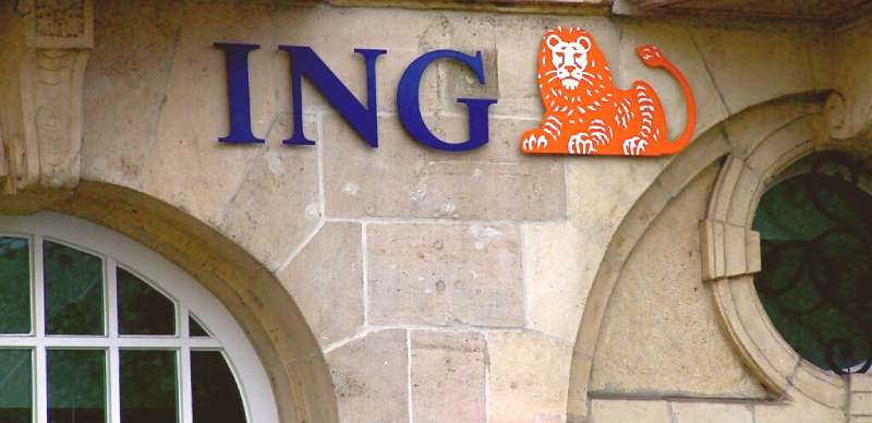
When you gaze upon the ING logo, you’re not just seeing a brand. It’s a tapestry, filled with history and national pride. Picture it, an emblematic lion, basked in orange.
The Lion. It’s sophisticated and traditional. It shows ING’s rich heritage. It sets us apart, makes us unique among banking and insurance providers. It’s our past, present, and future.
The Orange Hue: A Nod to the Dutch Roots
Then there’s the color. Oh, that distinctive orange! Did you know it’s a nod to ING’s Dutch roots?
Yep, you guessed it right.
The color orange is closely associated with the Dutch Royal family, which belongs to the House of Orange-Nassau. Hence, the bright orange of the ING logo is a way to pay tribute to the bank’s heritage. Pretty cool, eh?
The History of the ING Logo
Brought to Life in the Late 20th Century
The ING logo, as we know it today, didn’t always look this way. The story of its birth is tied to the merger of Nationale-Nederlanden and NMB Postbank Group in the 90s.
The task was to create a logo that represented this new entity, something that carried forward the legacy of the two companies while also marking a fresh start. That’s when the idea of the lion and the circle was born.
Embracing Change with Time
Over the years, the logo has gone through several changes, each modification subtly enhancing its appearance. Remember, change is inevitable, even for logos. Each modification, each tweak, was made with the intention of making the logo more modern, more appealing to the changing times and tastes.
The Colors of the ING Logo
The Power of Orange
As we already discussed, the orange in the ING logo is a tribute to its Dutch roots. But there’s more to it than just that.
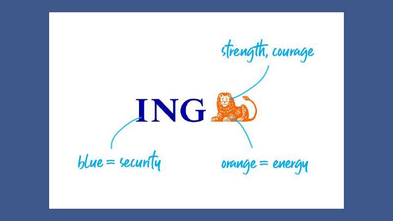
Orange is also a color that represents energy, warmth, and the sun. It’s a color that stands out, that grabs attention. It’s vibrant, it’s dynamic. Just like the financial world, wouldn’t you say?
The Choice of Blue
Then there’s the blue. A calming counterpoint to the vibrant orange. Blue is a color that symbolizes trust, loyalty, and confidence. Qualities that are absolutely vital in the financial world, right?
The Font Used in the ING Logo
A Display of Modernity and Simplicity
When it comes to the font used in the ING logo, it’s all about simplicity and modernity. The typeface is clean, sans-serif, with no extra flourishes or frills. Just like the logo itself, the font is a statement of strength and straightforwardness.
Easy to Read, Easy to Remember
The font is not just about looking good. It’s also about being easy to read and easy to remember. After all, you want people to remember your brand, don’t you? The font used in the ING logo does exactly that. It’s bold, it’s recognizable, and it sticks in your mind.
Advertisement
The Design Process of the ING Logo
The Birth of the Lion and the Circle
It all started with an idea: a lion, a circle, and a clean, simple font. This was the initial concept that was brainstormed. The lion, a symbol of strength and authority, was a natural choice, given the bank’s Dutch heritage.
The circle, a symbol of unity and wholeness, was added to represent the unified nature of the newly merged entity.
But it wasn’t just about choosing the elements. It was also about how these elements interacted with each other. The positioning of the lion within the circle, the size of the circle in relation to the lion, every tiny detail was meticulously considered and tweaked until it was just right.
The Evolution of the Design
As the years went by, the logo evolved, but the core elements remained the same. The changes were subtle: a slight modification in the hue of the orange, a minor adjustment in the thickness of the circle, a small shift in the positioning of the lion. Each change was made with the intention of keeping the logo relevant and appealing in a changing world.
The Impact of the ING Logo
Recognizability and Consistency
The ING logo, with its distinctive design and color scheme, is instantly recognizable. And that’s a big deal in the world of branding. A distinctive, memorable logo is key to building a strong brand identity.
The consistency of the logo, despite minor changes over the years, has also played a significant role in establishing ING as a reliable and trusted brand. The logo serves as a visual reminder of the brand and its values, creating a sense of familiarity and trust among customers.
A Symbol of Dutch Heritage
In addition to its recognizability, the logo also serves as a powerful symbol of ING’s Dutch heritage. The orange lion, a nod to the Dutch Royal family, is a constant reminder of the bank’s roots. It’s a symbol of pride, a symbol of heritage, a symbol that tells a story.
So the next time you see the ING logo, take a moment to appreciate the thought and creativity that went into its design. It’s not just a logo, it’s a piece of art, a story, a symbol of strength and unity.
FAQ on the ING Logo
What’s the history behind the ING logo?
Ah, the story behind the ING logo, now that’s interesting. When the Dutch banking group Internationale Nederlanden Groep came into existence in 1991, they needed an image. So, they chose an abstract, lion-like symbol.
This modern-looking, orange lion was a nod to the Dutch roots of the company, and the lion in the Netherlands’ coat of arms. But it’s also a symbol of power and courage. It’s like they’re saying, “Trust us, we’ve got this.”
Why is the ING logo orange?
Right, why orange, you ask? Orange is a big deal in the Netherlands. It’s tied to the Dutch Royal family, the House of Orange-Nassau. So, it’s pretty much the national color. It’s also a vibrant and energetic hue, don’t you think?
When you see the orange ING logo, it screams, “We’re different, we’re energetic, we’re trustworthy.” It’s a color that stands out in the world of corporate blue and gray.
What does the lion symbolize in the ING logo?
So, about that lion. It’s not just there because it looks cool. The lion is a national symbol of the Netherlands, a symbol of courage, strength, and pride. But there’s more to it.
In a financial context, it represents leadership, power, and protection – kind of what you’d want from a bank, right? The ING lion isn’t just a logo, it’s a statement of intent, a promise to their customers.
Who designed the ING logo?
The credit for the ING logo goes to Landor Associates. They’re a global branding agency, and they’re pretty good at what they do. The logo was designed in 1991 when ING was formed. And, despite the passing of years, it’s stood the test of time. It’s modern, it’s bold, and it’s recognizable. They really nailed it, don’t you think?
Has the ING logo changed over the years?
This is a common question and the answer is – not much, really. Since its inception, the ING logo has pretty much stayed the same. Sure, there’ve been small tweaks here and there, mostly to keep it fresh and in line with digital requirements.
But the core design, the orange lion, has been a constant. It’s become an iconic symbol, a beacon of stability in the ever-changing world of finance.
Why is the ING logo so simple?
You might think the ING logo is simple, but that’s exactly the point. It’s all about clarity and recognition. The lion, the color, the font, all come together to form an image that’s easy to remember.
And in the world of branding, that’s a win. It’s a logo that communicates its message instantly, and that’s not as easy as it seems.
What does the font of the ING logo signify?
The font of the ING logo is clean, modern, and bold. It’s legible at a glance and has a certain energy to it. It complements the lion symbol perfectly. The uppercase letters suggest authority and reliability, which are important values in banking.
But they’ve also managed to keep it friendly and approachable. So, it’s like they’re saying, “We’re strong and reliable, but we’re also here for you.”
Is there any hidden meaning in the ING logo?
Well, there’s no secret Morse code in the ING logo, if that’s what you mean. But, like any good logo, it’s loaded with symbolism. The lion stands for power and protection. The color orange represents energy and trust.
And the bold, clear font signifies authority and approachability. So, while there’s no hidden message, there’s a lot of thought behind every element. It’s a logo that tells a story about who ING is and what they stand for.
How does the ING logo align with the company’s values?
Great question. The ING logo is a reflection of the company’s values. The lion, a symbol of strength and protection, signifies their commitment to safeguarding their customers’ assets. The vibrant orange color shows their energetic approach to banking.
And the clear, bold font signifies their transparency and reliability. They’ve used visual elements to convey their values and mission, which is pretty neat, if you ask me.
Is the ING logo protected by copyright?
Yes, absolutely. Like all logos, the ING logo is protected by copyright laws. This means that it can’t be used without explicit permission from ING. It’s their identity, their brand, and they have every right to protect it.
Unauthorized use can lead to legal consequences. So, if you’re thinking of using it for any reason, better ask them first. It’s always better to be safe than sorry, right?
Ending thoughts on the ING Logo
We’ve got the ING Logo. This ain’t just your average image, oh no, it’s a masterstroke, a symphony in pixels.
Stripped back to basics, what do we see?
- A vibrant orange lion,
- A sleek typeface,
- and a white backdrop that screams “simplicity.”
Like a splash of color on a blank canvas, this logo is a beacon in the financial world.
But you know what?
There’s a lot more going on beneath the surface.
Every curve, every line, they all harmonize, telling a story of resilience, strength and financial prowess. It’s like a well-tuned guitar string, resonating long after the strum.
The ING Logo isn’t just about the brand. It’s a melody of design principles, playing a tune that captures the essence of ING’s identity.
So there we have it, folks.
Our journey ends, but the ING Logo lives on, a testament to the power of thoughtful design. It’s more than a visual cue. It’s a symphony in design, and a maestro in the world of banking.
If you enjoyed reading this article about the ING logo, you should read these as well:
Recommend
-
7
The JP Morgan Chase Log...
-
25
The Barclays Logo...
-
19
The BNP Paribas Logo...
-
5
The UBS Logo History,...
-
4
The Standard Charte...
-
3
The UniCredit Logo...
-
5
The HSBC Logo Hist...
-
6
The Deutsche Bank L...
-
8
The Citigroup Logo...
-
7
The Societe General...
About Joyk
Aggregate valuable and interesting links.
Joyk means Joy of geeK