

From Bright to Dim: How Light and Dark Adaptation Shape our Visual Experience
source link: https://uxplanet.org/from-bright-to-dim-how-light-and-dark-adaptation-shape-our-visual-experience-949053c4dacb
Go to the source link to view the article. You can view the picture content, updated content and better typesetting reading experience. If the link is broken, please click the button below to view the snapshot at that time.
From Bright to Dim: How Light and Dark Adaptation Shape our Visual Experience
The incredible human visual system allows us to explore and understand the world around us. One of its remarkable abilities is the power to adapt to different lighting conditions, which we call light and dark adaptation. These adaptations help us see clearly in various lighting situations, from bright daylight to cozy dimly lit rooms. This phenomenon has a significant impact on designing user interfaces (UI) in a way that makes them user-friendly and accessible.
Light sensitivity and contrast sensitivity are two aspects affected by this process. While many devices automatically adjust for ambient light, it’s important to consider personalization settings that give users the freedom to tweak brightness and contrast according to their preferences.
Light sensitivity
Also known as photophobia, is a condition where bright lights can be bothersome and cause a decrease in visual clarity, especially in well-lit environments. Migraines, corneal abrasions, conjunctivitis, or conditions like cerebral and blue cone monochromacy can trigger it. Surprisingly, about 80% of people who experience migraines also have light sensitivity.
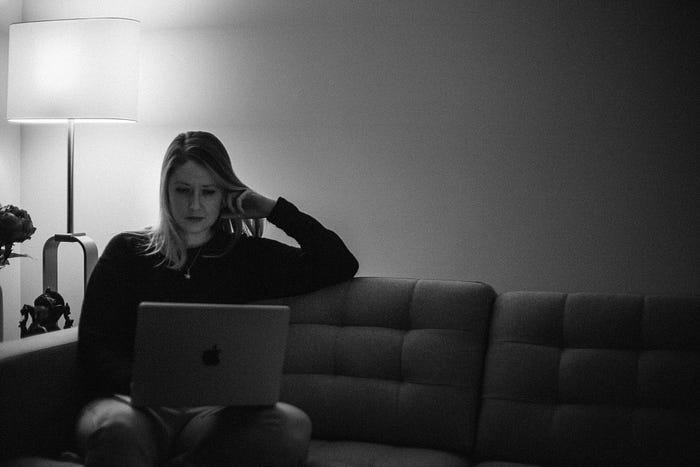
For example, imagine a user with light sensitivity who frequently experiences migraines. When using a UI with high contrast, the bright lights emitted from the screen can cause discomfort and worsen their symptoms. By incorporating a dark mode or offering dark color themes, the UI reduces the amount of emitted light, making it easier on their eyes and providing a more comfortable experience.
Contrast sensitivity
It refers to our ability to distinguish objects from their backgrounds. It can be influenced by factors like lighting intensity and spatial frequency, with thresholds varying among individuals due to factors such as cataracts or optic nerve damage.
For instance, consider a user with cataracts who has reduced contrast sensitivity. If a UI design uses low contrast between text and background, it might make it challenging for them to read or distinguish the content clearly. Following the Web Content Accessibility Guidelines (WCAG) 1.4.3 (contrast minimum) ensures that text and components are visible to most users with normal vision, accommodating those with varying contrast sensitivity levels.
Moreover, typography plays a crucial role in contrast perception. Let’s say a UI utilizes thin and light fonts with low contrast against the background. Users with reduced contrast sensitivity, particularly those with visual impairments or older adults, might find it difficult to read. To enhance readability, using higher contrast colors for lighter font weights or smaller text can improve the user experience for such individuals.
It’s important to note that not everyone has the same level of contrast sensitivity. Some users may benefit from higher contrast than the recommended minimums, while others might find high-contrast interfaces overwhelming. Providing personalization settings that allow users to adjust contrast can cater to their individual needs. This customization empowers users to optimize the UI based on their unique requirements, making the interface more inclusive and accessible to a wider range of users.
Understanding the concepts of light and dark adaptation is crucial for designing friendly and accessible user interfaces. By considering the impact of light sensitivity and contrast sensitivity, we can create interfaces that are comfortable, readable, and enjoyable for a wide range of users. Incorporating features like dark modes, following accessibility guidelines, and providing personalization settings are essential steps toward ensuring inclusive UI design.
Subscribe to learn more
Thanks for reading! If you want to learn more about other design topics, sign up to Medium to read more of my stories.
Feel free to subscribe to me via email or connect with me on LinkedInInstagram and Dribbble if you’d like to chat or just to say hi!
Recommend
About Joyk
Aggregate valuable and interesting links.
Joyk means Joy of geeK