

A war on stars: alternate rating systems besides 5 stars
source link: https://uxdesign.cc/a-war-on-stars-ad7fe1c6799b
Go to the source link to view the article. You can view the picture content, updated content and better typesetting reading experience. If the link is broken, please click the button below to view the snapshot at that time.
A war on stars: alternate rating systems besides 5 stars
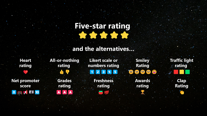
But how was it that the 5-star rating became the de facto measure? And what if there is room for something else? In this article, I would like to provide a short curation of the various other forms of ratings. (source: Yeo)
When John Green wrote Anthropocene Reviewed in 2021, he wasn’t writing his next best-selling fiction book, similar to The Fault in Our Stars. Instead, he picked certain memorable subjects and gave them a 5-star rating. Why wouldn’t he do so when everything seems to have a rating? Even lampposts have ratings too. Additionally, it seems that everyone is doing so too. This was his catharsis for releasing his emotions and expressing himself. A very familiar expression across various mediums for most of us too.
Haven’t we been exposed to all sorts of rating systems, particularly the ⭐⭐⭐⭐⭐? Since the first publication of the Baedeker Travel Guides, stars have been extensively used, from hotels to restaurants. It wasn’t until e-commerce platforms like eBay and Amazon started experimenting with user-based ratings that things really started taking off. Just like the billions of stars in the universe, we now have billions of star ratings across the digital universe.
But how was it that the 5-star rating became the de facto measure? And what if there is room for something else? In the confines of this article, which represents the digital exhibition of ratings, I would like to provide a short curation of the various other forms of ratings. In a way, you can see these different expressions as a war or melee among the stars. A defiant act against a likely tyranny.
1. Heart ratings
One love. The single heart given by the user on social media platforms. The same logic applies to a thumb or some other emoji reaction. Adding a heart increases the “reaction” to a post. Not clicking on the icon means the absence of a reaction. So the more hearts, the higher the reactions and thus the ratings of the post. The only catch is that each person is entitled to one heart. And why hearts? It’s to show appreciation, especially for new users.
Common sightings: Instagram, Twitter
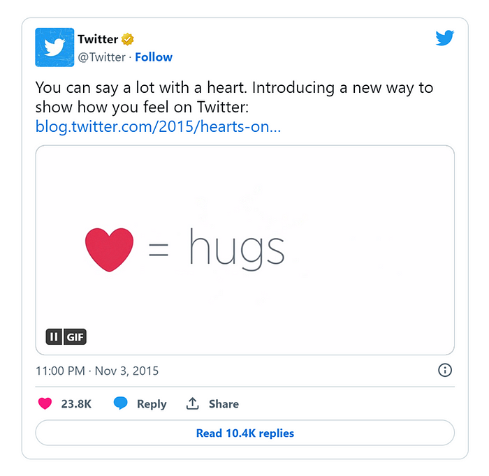
According to Twitter, the heart is a universal symbol that resonates across languages, cultures, and time zones. The heart is more expressive, enabling you to convey a range of emotions and easily connect with people. (source: Twitter)
2. All-or-nothing rating
Also known as a binary or all-or-nothing system, this would be the next most common type of rating after the stars. As the name suggests, research has shown that users tend to take extreme measures. Such behavior, though inaccurate, helps ease the cognitive load of users as they select a yay or nay rating. Additionally, having two sides to ratings appears to give a “weighted” perspective by also giving a rating of approval or disapproval.
Common sightings: YouTube, Netflix, Reddit
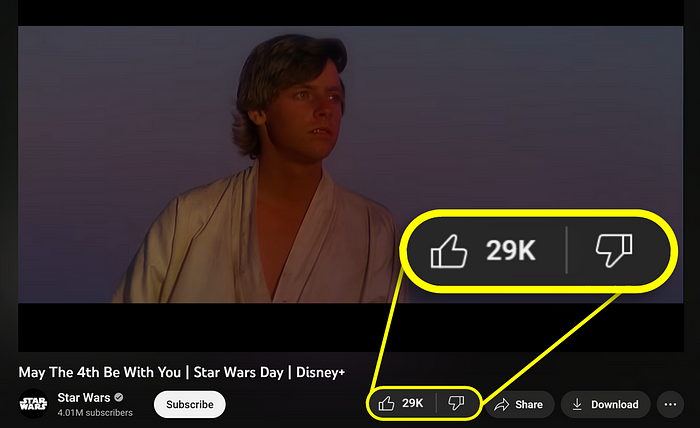
Also known as a binary or all-or-nothing system, this would be the next most common type of rating after the stars. (source: Youtube)
3. Likert scale or numbers rating
Intentionally plain vanilla. Despite being one of the plainest, just like vanilla, they are one of the most popular forms of ratings used in the industry. Named after social scientist Rensis Likert, the rating has three unique features. Firstly, there is more range with a 5-point scale while maintaining the symmetry of positive and negative values. The second feature is that a zero value is established, offering the choice of neutrality to the user. The last feature is that Likert scales tend to come with descriptors, typically in the range of selected words such as strongly disagree, disagree, neutral, agree, and strongly agree in sequence. It is important to adhere to industry norms when using Likert scales. This is where Jakob’s law applies: the use of familiar patterns in design in order to facilitate the user experience.
Common sightings: surveys, questionnaires
Likert scales are one of the most popular forms of ratings used in the industry (source: Maze)
4. Smiley ratings
Instead of numbers or stars, how about using smileys? If stars are associated with quality (i.e., 5-star hotels), faces represent the level of happiness. Obviously, smiles are universal and relatable, but more importantly, smileys can generate feelings in the user. Tugging at the emotional string, there is a chance that results are swayed towards a positive rating, especially when there is a person providing a service. Fewer people will want to put someone down unless the experience was really horrible.
Common sighting: service rating at amenities such as toilets
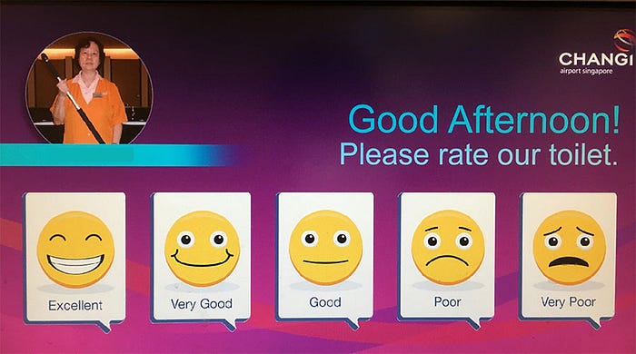
The world’s most awarded airport, Changi Airport, uses smilie rating to accumulate feedback for performance and improvement. (source: Changi Airport)
5. Traffic light rating
Ahh, color theory. One of the most heavily contested and highly debated topics among designers, the meaning of colors, is a very subjective discussion. Yet when a sequence of red, yellow, and green is placed together, an immediate association with the traffic light comes about. Red means stop or danger (it was also scientifically chosen), while green means go or growth. And yellow is the transition between the two signals. Interestingly, negative, neutral, and positive values can also be associated with the respective colors. When combined, a heightened awareness may be observed among users, which is also why UX/UI makes use of these colors to apply various states to their components. Having a full view of the rating systems gives the user a gauge of the situation.
Common sightings: COVID alert levels, energy labels, food labels
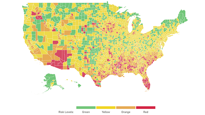
Traffic light colours can be used to call out heightened awareness of danger and attention. The above example is obtained from Harvard Global Health Institue and Microsoft AI, displaying an interactive map and dashboard to visualize the different levels of coronavirus outbreak in different regions. (source: NPR)
6. Net promoter score 0️⃣🥅📢🎼🔟
Writers, such as Flavio Lamenza and Vikram Goyal have broached the topic extensively. Simply put, the golden question is as follows, “On a scale from 0 to 10, how likely are you to recommend this product or company to a friend or colleague?” The Net Promoter Score (NPS) attempts to measure customer loyalty, satisfaction, and enthusiasm with a single value. The higher the number, the better the rating, and the more advocates there are. However, when the number is negative, there will be more detractors against the product or brand. Having more detractors than advocates can send the wrong message about the product to their management, especially if the organization is unforgiving with poor results. This results in companies “gaming” the rating system by adopting smilie tactics or colors to nudge users to give higher ratings.
Common sightings: end-of-experience survey, brand survey
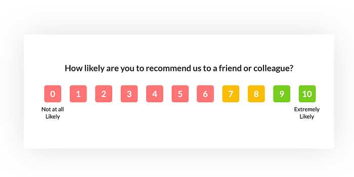
When NPS includes colours to their rating system, it nudges users to choose colours in 3 broad categories, rather than 11 values, thereby creating a form of selection bias. (source: Zonka)
7. Grades rating️️
Letter grades started making their appearance at Mount Holyoke College in 1897, where students were given A-D and F grades for their tests. Since then, letters have often been used to associate excellence with schools. Some other symbols started appearing, such as + or *, mainly in the A grades, to show added recognition among the other A grade students. Nostalgia could play a role in this type of rating system. Alternatively, rigor and achievement with empirical evidence may also be derived from good grades. From a UX perspective, such rating systems are uncommon on interfaces, and other visual representations are preferred over letters.
Common sightings: tests, especially in academia, restaurant health, credit ratings
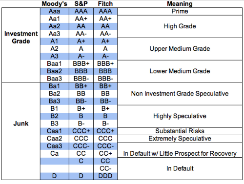
From a UX perspective, such rating systems are uncommon on interfaces, and other visual representations are preferred over letters. (source: WEF)
8. Freshness rating
Probably the freshest of the lot, the freshness rating originates as a set of aggregated movie ratings based on the reviews of a recent screening. Rotten Tomatoes will then reflect the overall score of the movie in the following categories: A "fresh" rating is when at least 60% of ratings from film critics are positive. The green splat represents the "rotten" rating of anything lower. Rotten tomatoes also introduce the same mechanism for the audience to rate, represented by a box of popcorn. In this rating, the users see and experience the power of the story through the visualization of the tomato. Even the name "Rotten Tomatoes" is associated with an act of disapproval when people throw rotten tomatoes out of disappointment. Designers ought to take a leap of faith to try new rating systems, especially when there are new or disruptive standards to be made. Could accuracy ratings on AI platforms be one such rating? Could an AI rate an AI?
Common sightings: innovative disruptive platforms, from niche to mass platforms

A “fresh” rating is when at least 60% of ratings from film critics are positive. The green splat represents the “rotten” rating of anything lower. Rotten tomatoes also introduce the same mechanism for the audience to rate, represented by a box of popcorn. (source: Rotten Tomatoes)
9. Awards rating
And the award goes to... These ratings often grab attention and recognition. Hence, the rating is limited to a few recipients to maintain prestige. Even so, as a platform grows, so do good ratings and awards, such that it would come to the point where awards are even given out to the award winners, ala “the best of the best” or “greatest of all times (GOAT)”. A common observation about these awards is the use of superlatives. Another is its unique yet replicable design through various products or features. Some companies may create a reusable badge component for its users, with the appropriate guidelines for its behavior, anatomy, and usage. Though subtle, one thing remains clear: an evaluation was done so that the award of limited quantity can be dispensed to the rightful recipient.
Common sightings: on various platforms with content, users, or both. My favorites are Rotten Tomatoes, Airbnb Superhost and Medium
These ratings often grab attention and recognition, as an evaluation was done so that the award of limited quantity can be dispensed to the rightful recipient (source: airbnb)
10. Clap rating
We round back up to the familiar mechanism of hitting an icon to give a rating. Yet, the clap rating uniquely originates from the Medium platform. When someone claps, they do so with a “round of applause.” It is therefore delightful to see both the animated response of a clap, as well as being able to go beyond a single clap (this number is capped at 50 to avoid inflation). But more than anything, the rating system matches the real world, creating a comfortable acceptance of the new, established mental model.
Common sighting: Medium
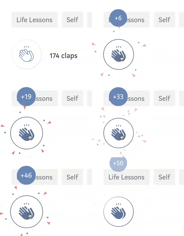
Clapping is a rating system that matches the real world, creating a comfortable acceptance of the new, established mental model. (source: Medium)
Are five stars all that bad?
A Harvard Business Review article exposes the downside of the 5-star rating, which has become the industry standard for digital platforms. They are fundamentally not able to separate or differentiate good from great products due to selection biases and extreme experiences. The variation in quality, right down to a 0.1 difference, is also apparent on different platforms across industries. In other words, the same 4.5 rating may differ from one platform to another, depending on various factors. The likely outcome is a poorer user experience due to the further questioning and verification of the rating.
But there is hope for the stars, and the solution is pretty straightforward: qualify the ratings given by providing a review with sufficient words and content. “Very few people write reviews. It’s about 1.5 percent, or 15 people out of 1,000,” says Dr. Duncan Simester, a marketing professor at MIT Sloan School of Management. Part of the reason is because such actions can be time-consuming. Nevertheless, by contextualizing and explaining their thoughts, reviewers can give potential users a deeper understanding of the experience. Among the many platforms that cater to written reviews, Google Local Guides and StoryGraph do them best.
Here’s why:
Google Local Guides uses gamification to incentivize higher quality reviews. In order to prompt action, make the experience rewarding and fun. That seems to be the formula for Google whenever a user starts writing. As always, it starts with the 5-star ratings, but as the users discover the rest of the features, they soon realize that the more information they provide, the more points they get to earn themselves a local guide badge. As the points rack up, the user levels up and gains more badges. And so while the reviewer treats their entries like a game, the spectator benefits because they are able to read the higher-quality reviews left behind. The moral of the story is that stickiness and quality content can be created as long as they are fun.
The moral of the story is that stickiness and quality content can be created as long as they are fun.
Storygraph is the new kid on the block that plans to take over the incumbent, Goodreads. And even in the war of stars between the two apps in their respective marketplaces, Storygraph has done way better than Goodreads over at the Android Play Store in 2023. So why is that the case? Among the many good examples of user experience, one feature stands out: the ability to view good-quality reviews. Not only is the content richer and filled with well-defined categories that describe a book clearly, but it offers a user a very simple and elegant solution to reviews: to filter “reviews with written explanations.” The Storygraph founders understood this behavior very well: readers and reviewers could essentially be the same persona, and knowing more about a potential book before further exploring it benefits both parties. As it is written in their motto, “Because life’s too short for a book you’re not in the mood for.”
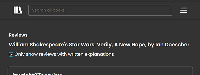
The Storygraph founders understood this behavior very well: readers and reviewers could essentially be the same persona, and knowing more about a potential book before further exploring it benefits both parties. As it is written in their motto, “Because life’s too short for a book you’re not in the mood for.” (source: Storygraph)
Recommend
About Joyk
Aggregate valuable and interesting links.
Joyk means Joy of geeK