

The UX of a Coconut Sucks
source link: https://uxplanet.org/the-ux-of-a-coconut-sucks-93bf6084f81e
Go to the source link to view the article. You can view the picture content, updated content and better typesetting reading experience. If the link is broken, please click the button below to view the snapshot at that time.
The UX of a Coconut Sucks
UX Lessons from Nature’s design flaws
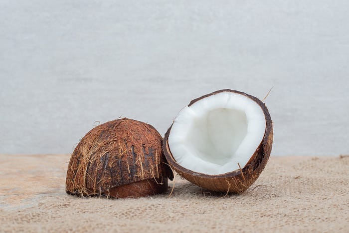
I’ve been an end-user of Coconut for a while now. Although I’m quite impressed by the number of possible use cases for this unassuming product, I have to admit: the user experience sucks.
For starters, it’s not intuitively clear what category this product falls under. What the hell were the stakeholders doing by naming it ‘coco-NUT’ when it is, in fact, a fruit? I’m not sure if this is simply a case of poor brand identity or a flat-out deceptive design pattern. Either way, it doesn’t create a great first impression.
And just in case you’re wondering why I’m calling out this seemingly innocuous product, I’ll tell you.
So, I recently tried to manually upgrade my current version of Coconut to a more stable version — coconut oil. Boy was I in for a tough battle. After several minutes of wrestling with the interface; tugging and prying my way through the content like an explorer on a treasure hunt, I had little more than sore fingers to show for my effort. It was at this point I began to realize just how bad the UX of this product is.
For the uninitiated, a product can be said to have a good user experience if it meets certain UX criteria. The most basic of these criteria include ease of use, intuitiveness, and accessibility. Well, good ol’ Coconut doesn’t even meet the most relaxed standards of these criteria.
Ease of use
UX experts agree that the first requirement of a good user experience is to meet the user’s needs without fuss.
Well, Coconut fails woefully at this.
I don’t know about you, but having to apply brute force before accessing a product’s content isn’t exactly my idea of a great onboarding experience. And the UX only goes downhill from there.
After successfully gaining access, you are left to navigate the complex task of extracting the content you need without any ergonomic cues. Maybe this wouldn’t have been so bad if there were some error prevention mechanisms in place to prevent losses of various types, including blood.
But, I guess usability wasn’t the top priority in Coconut’s creation process.
Unintuitive design
As any UXer will tell you, a design can only be said to be intuitive if a user can understand and use the product without consciously thinking about it.
Well, Coconut’s interface isn’t exactly the most figure-outable.
I’ve been using this product for many years, but I still haven’t figured out how to navigate the interface without making a mess of the system. This product rolls when I want it to stay still, remains shut when I’m desperately trying to open it, and releases its content when I least expect it to.
True, the design shows some “outside-the-box” thinking — a highly coveted skill in the design world. (Who would have thought such diverse states of matter could cohabit in one product without messing with one another?). However, intuitiveness seems to have been thrown out the window in favor of creativity.
Lack of accessibility
In the UX world, we say that a product is accessible if it can be used by a wide range of individuals, including those with disabilities and impairments.
Well, this product audaciously violates every accessibility standard known to man.
Tell me, why do I have to arm myself with a knife and a hammer to access Coconut’s content? This might not be too much of a struggle for me. But imagine how challenging this process would be for people with mobility impairments. The process isn’t any easier for people with visual impairments either.
With such glaring accessibility issues, one can’t help but wonder if any user research took place before this thing was designed.
Although this might seem like a severe case of coconut-bashing, it’s not. Despite the negative aspects of its user experience, this product has inherent values that keep users like me coming back. From its miraculous benefits to the skin and hair to its unique rehydration qualities, the list is endless. Beyond that, one of its upgraded versions — coconut milk, has been a lifesaver as merely looking at lactose is enough to throw my system off for days.
Having said that, it’s worth mentioning that if there’s ever a new product that provides exactly the same value as Coconut, minus the fuss, I’d happily jump ship. Yes, I’m not that loyal after all.
This should serve as a reminder to every designer. As we strive to provide value to our users through our products, we should also pay close attention to how interacting with these products make the users feel.
Recommend
About Joyk
Aggregate valuable and interesting links.
Joyk means Joy of geeK