

Kickstarting your accessibility champions team
source link: https://uxdesign.cc/kickstarting-your-accessibility-champions-team-4196cbb771a9
Go to the source link to view the article. You can view the picture content, updated content and better typesetting reading experience. If the link is broken, please click the button below to view the snapshot at that time.
Kickstarting your accessibility champions team
For most teams and companies, accessibility is an afterthought. An “oh sh*t” at the end of a product or content cycle. But it doesn’t have to be that way.
What if everyone in your organization cared about accessible design? What if everyone, from upper management to juniors, strove to make your product more accessible?
Setting up an accessibility champions team (ACT) to promote thinking about diversity and accessibility worked way better than I expected it to. In this article, I will talk more about ACTs, how to set them up, and why they are important.
We will cover:
- What is accessibility championing?
- Different types of accessibility championing structures
- How to set up an Accessibility Champions Team (ACT)
- Internal documentation
- Hiring people with physical limitations
- Simulate physical limitations
- Closing thoughts
- Bonus: Add to your feed
1. What is accessibility championing?
Championing is the idea that a member promotes an idea or methodology. You might have UX champions, or data champions, or design thinking champions, etc.
Accessibility champions are individuals who acknowledge the needs of users with different bodies, cultures, and environments and (try to) know how to meet those needs. More often than not, they will know Web Content Accessibility Guidelines (WCAG) quite well. An accessibility champion may do the following:
- Promote alternative methods of doing something to make it more accessible.
- Be consulted on projects to ensure that they will meet the WCAG guidelines.
- Promote thinking about all customers by sharing cool or useful media.
2. Different types of accessibility champion structures
There are three main types of accessibility champion structures that you might find in most companies.
Approach 1: No champion
This is probably where most companies are, and that is understandable. At best, people might talk about accessibility, but nothing will come from it.
Approach 2: One accessibility champion
This is when you have one or two senior team members who preach accessibility. They may bring it up in meetings, conversations, and documentation, or use it to justify a design decision. And while this sounds like enough, it never is.
Senior managers or individual contributors have so much on their plate, and they can’t sit in every marketing/interface design/graphic design/ engineering/sales/ video production meeting.
After a while, they will feel frustrated because they aren’t getting heard and no one is taking them seriously. They will ask graphic designers to check their contrast, they will ask writers to add alt text to images, they will ask product design teams not to rely on drag functionality. All to no avail and apathy. It's kind of like shouting into the void and expecting the void to shout back.
These one-person advocates are absolute champions but usually have been set up for failure despite the best intentions. This approach doesn’t work for the following reasons:
- One champion will never be able to attend all meetings.
- One champion will almost never be taken seriously.
- One champion won’t be able to remember all guidelines.
- Unless it is their only job, one champion will get burnt out and disinterested.
- One champion won’t be able to spot every shortcoming.
Approach 3: Accessibility Champions Team
In this approach, every team has its own champion who becomes an internal authority. They are able to spot issues, ask the right questions and check the quality of anything before it goes out.
Because their knowledge becomes so niché to their area of focus; they will know all the best testing tools and plugins, they will be able to give more considered advice, and they will be converting inside their team as opposed to from outside it.
The advantages of this approach are:
- With more people covering more ground, issues are likely to be identified early on.
- It is more difficult to not take a team of people seriously.
- You will have niché experts in each field.
- A culture of caring about accessibility gets started from the ground up.
- The process of converting happens from internal teams as opposed to external influences which tend to get more pushback.
3. How to setup your Accessibility Champions Team (ACT)
Nothing good ever comes easy, but luckily, if done the right way, setting up your ACT shouldn’t take too much buy-in.
Stage 1: Get Buy-in from managers
As part of your weekly/monthly managers' meeting, bring up the idea of an ACT, and ask the different managers to appoint someone from their team to be their champion.
If you need help selling the idea, here is a quick elevator pitch:
An Accessibility Champions Team (ACT) is made up of individuals from different teams who champion the idea of accessibility within their own departments. These individuals will be able to sit in reviews and quickly identify issues and areas for improvement. This is a bottom-up approach, which will hopefully make our product/service more accessible to all users, as well as create a more empathetic company culture.
These individuals will be responsible for maintaining accessibility documentation related to their department, attending a few meetings initially, and will later be consultants for how to make content more accessible. I suggest choosing someone who you think is ready to take on more non-managerial type responsibility.
Stage 2: Select the champions
It is important that each manager selects their own champion. This helps them to, a) delegate, and b) not become a bottleneck later on. Some guidelines on selecting the ideal ACT members:
- Ideally, one person per department or team. For a larger team, two or more might be needed.
- Choose someone who is ‘almost’ ready for more responsibility, and is eager to prove themselves.
- Someone who has been around a while and won’t disappear in a year.
- Ideally, someone who is mid-ish level.
- Someone who works well in a team, and is enthusiastic. You want the person who puts “Accessibility Champion” on their CV and not the person who complains about having too much work.
Once the champion has been selected, their manager will have to speak to them about what the role entails. Ideally, they should do this in person, but if not; here is a slack-ready description of the role that the other managers can copy and paste:
Hi [name], I’ve got some exciting news! We are creating a company-wide Accessibility Champions Team (ACT), and each department needs a representative. Due to how hard you have worked this last year, and how much you care about our customers; I’ve selected you if you are up for more responsibility. The role will entail a bit of documentation work initially to get up to scratch (we will shift your other priorities), but from there on, you would take on a more consultatory-type role. Let me know if you are interested.
The trick here is to make the champion feel special for being selected and eager to prove themselves.
Give the managers a deadline (e.g. 2 weeks) to pick a champion for their team.
Stage 3: Sharing cool stuff (Optional)
Create a slack channel (e.g. #accessibility) and start inviting members as the champions are selected. Before the kick-off meeting, you can start peppering cool articles, videos, and (god save us all) TikTok videos into the channel.
It's up to you if you want to make a private or public channel. We made two channels, one for coordinating the documentation and one for sharing cool stuff which anyone can join, but it is up to you.
I love this video by Kristy Viers because it shows how different the Twitter experience is for non-sighted users, and really gets people thinking.
I have added more articles and media at the bottom of this article in the bonus section if you need help finding cool stuff to share.
Stage 4: Kick-off meeting
Set a kick-off meeting after the above-mentioned deadline and invite all the champions. The point of this meeting is to, a) hobnob with the other champions, b) learn what the hell accessibility is. You might also want to include someone who is a project manager to help run the upcoming documentation steps.
A rough agenda for your meeting could be:
- Introduce the different champions
- (Discussion) What does accessibility mean?
- (Presentation) What is the WCAG?
- (Presentation/Discussion) Why will making the product/content/services more accessible help the company and customers?
- (Presentation) What is accessibility documentation, and why should we have our own standards?
- (Discussion) What would be the best way to record our documentation and rules? Google Docs, Checklists, Notion, Posters on the wall?
- (Instruction) Allocate tasks and talk about rough deadlines and responsibilities.
Stage 5: Documentation kick-off
Naturally, most of the people selected have never thought about accessibility before. Which means — homework. Each champion has to create documentation suitable for their team or department. In teams with more than one representative, they will have to work together.
The point of creating documentation is twofold. While it is useful to have the rules and guidelines documented, it is more useful for someone to embody those rules and have the knowledge to implement them. Kind of a learn-by-doing/taking responsibility thing.
Rules should be set by the ACT about how best to set up the database or documentation and what works best for your team. The most important thing is that it is all together, and easy to access by anyone.
If you consider yourself a documentation nerd; this time, you will need to back off. It's more important that the champions document for themselves, and learn in the process and not that they do it the way YOU would like it to be done. (Yes, I am looking at you Becky — learn to use f**king heading styles!).
I will go into more detail about how my team set up their documentation in section 4.
Stage 6: Into the wild
With their homework done, the champions are then released back into the wild. They should now able to attend the relevant meetings and spot and identify elements than need improvement.
You will know this strategy is working when the ACT members start correcting their managers. Their managers then have to start brushing up on their knowledge to avoid embarrassment.
And if that isn’t a sneaky way of getting people to care — I don’t know what is!
Follow-ups and demos
Follow-ups can be meetings or tasks or exercises to keep accessibility top of mind. This doesn’t have to be all the time, maybe a few times a year. The point is to keep continuous discussions within your team.
Ideas for demos:
- Watch recordings of user testing with someone who has a physical impairment.
- Demo using a screen reader on your site.
- Use some ideas from: 6. Simulate physical limitations section below.
- Eat at a dark dining restaurant.
- Just keep sharing cool media on the accessibility channel
4. Documentation
You can document any way you want, but if you need help thinking about it, in this section I will describe how my team set it up.
Writing documentation is hard, mostly because there are so many overlaps. Sure, you can ⌘+C ⌘+V passages from WCAG, but how does that apply to your company and projects?
The way we did it, which worked well for us was as follows:
Break it up into “rules” and “projects/content”. One project can have many rules applied to it, and one rule can be applied to many projects.
Content
This type of documentation is only really useful if you are a content producer, such as a news site, blog, recipe site, learning content, retail, etc.
These pages should be more “quick checklists” than learning documents. They should be used to help onboard new team members, but also to quickly do quality assurance.
In the example above, you can see how the writer and the illustrator both have their own checklists. There aren’t a lot of rules, so chances are that after a while, they will remember them without having to double-check. If they were to click on one of the links, it would take them to the rules documentation. This is especially useful for new joiners.
Rules
Your rules documentation should be informative, practical, and keep in mind the people who are writing the documentation for.
Tip for writing good rule documents:
- Why. Describe why the rule is in place.
- Targetmarket-specific rules. Make the rules specific to your product and target market. e.g. you might insist on using stricter contrast ratios because your target market is older. Or you might focus more on red-green blindness if your target market is primarily men. Or have more in-depth alt-text rules because your target market lives in data-poor areas.
- Minimum requirements. What are your minimum requirements (e.g. A, AA, or AAA) and what are your ideal company requirements?
- Give visuals. Graphics and screenshots are easier to process for visual learners.
- Bonus: Include a stat about how many people will be helped with this update.
5. Hiring people with physical limitations
I was initially going to write personal stories about how working with various disabled colleagues has made me a better designer/person, but it sounded self-congratulatory, so I decided to remove it.
But what I will say is this: I’ve never worked with a blind writer who left out alt text, or a color-blind designer who had issues with their contrast, or a differently-limbed person who made buttons too small, or a wheelchair user who wasn’t empathetic to others.
We know working with people who have different bodies to us makes our products and designers better, and I would encourage you to invite them to join your team. And if you still don’t believe me here is what a few other people say:
6. Simulate physical limitations
Below are some exercises you can do to simulate real limitations.
- 2G Tuesdays. Facebook announced that on Tuesdays, employees who opt-in to the program will have to work with 2G internet so that they can empathize with users in developing nations who use the website on 2G mobile networks. Read more.
- Screenreaders. There are a couple of different screenreaders that you can use or try out, all with different pros and cons. See some options.
- Color Blind Plugins. There are a few plugins for Figma that help you simulate what your screens look like to the different types of color-blind users. I’m a fan of the Color Blind Plugin for Figma, and the graphic designers I work with use Sim Daltonism and Contrast for Adobe Illustrator.
- One hand. Sit on your hand, or put it behind your back. How do you type with only one hand? How do you move the cursor around with one hand? This simulates permanent limitations (e.g. amputees), temporary limitations (e.g. broken arm), or situational limitations (e.g. holding a baby…. or, in my case a cat).
- Vision-impairing glasses. You can buy glasses that mimic different vision impairments such as near/far sighted and color blindness. I haven’t used these myself, but they look pretty cool: Visualeyes Vision Simulator Glasses.
- Mute. This is an obvious one, but if you are designing interactive experiences that rely on sound, try muting it.
- Bandage your hands. This can be done to mimic what it is like to use a computer or phone with arthritis or other fine-motor-limiting disabilities.
7. Closing thoughts
Building your own ACT might be difficult, but to be honest, I thought it would be a lot hard than it was. Unsurprisingly, it turns out, giving good people more responsibility makes all teams even better.
If we knew how much of an impact setting up the ACT team would have, we would have set it up ages ago.
8. BONUS: Add to your feed
Another thing that I like to do, is follow differently-abled creators (on social media) to learn more about their life and how they approach everyday problems. Below are some of the people I follow based on my interests, but there are loads more. If you know of any good content creators — mention them in the comments!
Note: The point of following differently-abled people is to learn about their life and how the creative ways that they approach everyday problems, and to think about those problems when you are designing. The point is to build empathy for your customers. Avoid thinking about these creators as Inspiration Porn.
Instagram and TikTok: The Blind Woodsman
https://www.tiktok.com/@theblindwoodsman/https://www.instagram.com/theblindwoodsman
This is a really wholesome channel, PLUS you get to learn about woodworking. Win-win all-round.
YouTube: Living with one Hand
https://www.youtube.com/@livingwithonehand9803https://twitter.com/BHYRights
Britt H Young has a lovely channel about what it is like living with only one arm and answers all the questions you would be too embarrassed to ask. How do you ride a bike with one hand? Why don’t some people wear prosthetics? How do you get ready in the morning with one hand? etc.
YouTube: Stump Kitchen
https://www.youtube.com/@StumpKitchen
Stump Kitchen is about following your heart, celebrating diverse bodies, and cooking vegan and gluten-free recipes. She talks about food and recipes, but also softer things like parenting with a limb difference and one-limb hacks.
Podcasts and Podcast Episodes
- 99% Invisible (aka 99PI) — E452: The Lows of High Tech. Every designer should listen to 99PI, but this episode especially.
- Seen And Not Heard. Okay, so this is cheating, as it is a fictional story, but I think it is really well done and explains the loneliness of later-in-life hearing loss.
- Allusionist — E132 Additions and Losses. Helen Zaltzman interviews Christa Couture, specifically about language and how we convey sympathy.
Articles
Extended descriptions
Medium doesn’t support extended descriptions, so I have written it out here for the images in this article.
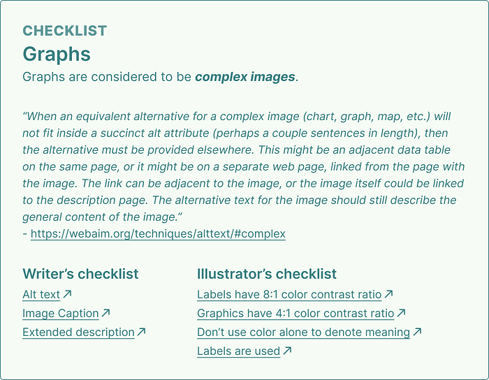
Checklist image
Graphs
Graphs are considered to be complex images.
“When an equivalent alternative for a complex image (chart, graph, map, etc.) will not fit inside a succinct alt attribute (perhaps a couple sentences in length), then the alternative must be provided elsewhere. This might be an adjacent data table on the same page, or it might be on a separate web page, linked from the page with the image. The link can be adjacent to the image, or the image itself could be linked to the description page. The alternative text for the image should still describe the general content of the image.” — https://webaim.org/techniques/alttext/#complex
Writer’s checklist
- Alt text
- Image Caption
- Extended description
Illustrator’s checklist
- Labels have 8:1 color contrast ratio
- Graphics have 4:1 color contrast ratio
- Don’t use color alone to denote meaning
- Labels are used
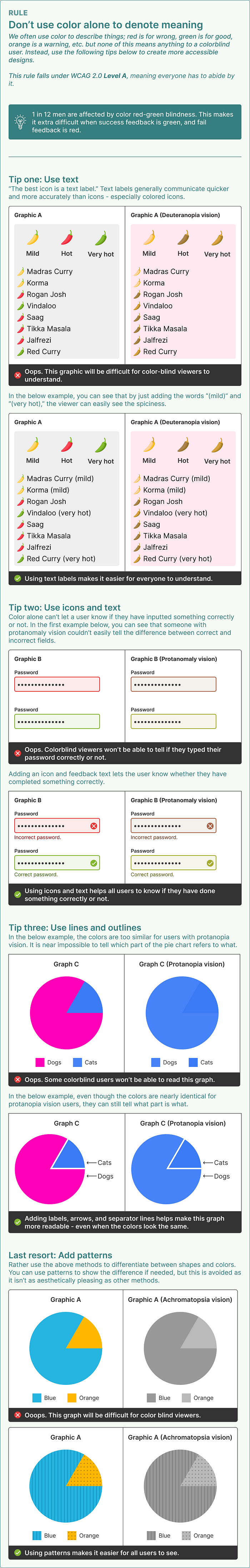
Rules image
Don’t use color alone to denote meaning
We often use color to describe things; red is for wrong, green is for good, orange is a warning, etc. but none of this means anything to a colorblind user. Instead, use the following tips below to create more accessible designs.
This rule falls under WCAG 2.0 Level A, meaning everyone has to abide by it.
1 in 12 men are affected by color red-green blindness. This makes it extra difficult when success feedback is green, and fail feedback is red.
Tip one: Use text
“The best icon is a text label.” Text labels generally communicate quicker and more accurately than icons — especially colored icons.
Tip two: Use icons and text
Color alone can’t let a user know if they have inputted something correctly or not. Adding an icon and feedback text lets the user know whether they have completed something correctly.
Tip three: Use lines and outlines
Use lines, to clearly separate shapes and colors. Use arrows and text to clearly label them.
Last resort: Add patterns
Rather use the above methods to differentiate between shapes and colors. You can use patterns to show the difference if needed, but this is avoided as it isn’t as aesthetically pleasing as other methods.
Recommend
About Joyk
Aggregate valuable and interesting links.
Joyk means Joy of geeK