

Angular Drag’n Drop With Query Components and Form Validation
source link: https://dzone.com/articles/angular-dragn-drop-with-query-components-and-form-validation
Go to the source link to view the article. You can view the picture content, updated content and better typesetting reading experience. If the link is broken, please click the button below to view the snapshot at that time.
Angular Drag’n Drop With Query Components and Form Validation
In this article, readers will learn how to integrate Drag'n Drop with form fields in components and nested form validation by using guide code and visuals.
The AngularPortfolioMgr project can import the SEC filings of listed companies. The importer class is the FileClientBean and imports the JSON archive from “Kaggle.”
The data is provided by year, symbol, and period. Each JSON data set has keys (called concepts) and values with the USD value. For example, IBM’s full-year revenue in 2020 was $13,456.
This makes two kinds of searches possible. A search for company data and a search for keys (concepts) over all entries.
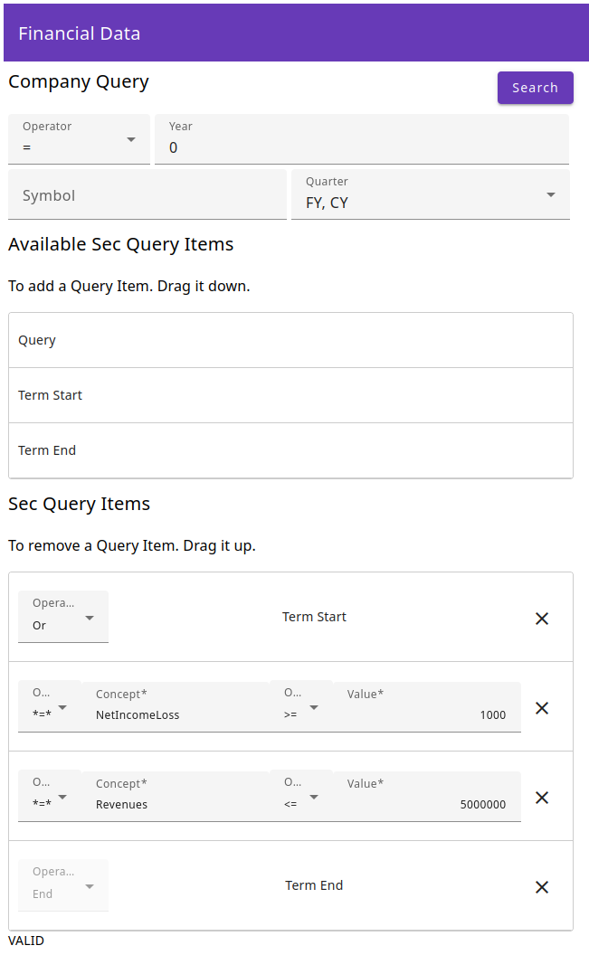
The components below “Company Query” select the company value year with operators like “=,” “>=,” and “<=” (values less than 1800 are ignored). The symbol search is implemented with an angular autocomplete component that queries the backend for matching symbols. The quarters are in a select component of the available periods.
The components below “Available Sec Query Items” provide the Drag’n Drop component container with the items that can be dragged down into the query container. “Term Start” is a mathematical term that means “bracket open” as a logical operator. The term “end” comes from mathematics and refers to a closed bracket. The query item is a query clause of the key (concept).
The components below “Sec Query Items” are the search terms in the query. The query components contain the query parameters for the concept and value with their operators for the query term. The terms are created with the bracket open/close wrapper to prefix collections of queries with “and,” and “or,” or “or not,” and “not or” operators.
The query parameters and the term structure are checked with a reactive Angular form that enables the search button if they are valid.
Creating the Form and the Company Query
The create-query.ts class contains the setup for the query:
@Component({
  selector: "app-create-query",
  templateUrl: "./create-query.component.html",
  styleUrls: ["./create-query.component.scss"],
})
export class CreateQueryComponent implements OnInit, OnDestroy {
  private subscriptions: Subscription[] = [];
  private readonly availableInit: MyItem[] = [
     ...
  ];
  protected readonly availableItemParams = {
    ...
  } as ItemParams;
  protected readonly queryItemParams = {
    ...
  } as ItemParams;
  protected availableItems: MyItem[] = [];
  protected queryItems: MyItem[] = [
    ...
  ];
  protected queryForm: FormGroup;
  protected yearOperators: string[] = [];
  protected quarterQueryItems: string[] = [];
  protected symbols: Symbol[] = [];
  protected FormFields = FormFields;
  protected formStatus = '';
  @Output()
  symbolFinancials = new EventEmitter<SymbolFinancials[]>();
  @Output()
  financialElements = new EventEmitter<FinancialElementExt[]>();
  @Output()
  showSpinner = new EventEmitter<boolean>();

  constructor(
    private fb: FormBuilder,
    private symbolService: SymbolService,
    private configService: ConfigService,
    private financialDataService: FinancialDataService
  ) {
    this.queryForm = fb.group(
      {
        [FormFields.YearOperator]: "",
        [FormFields.Year]: [0, Validators.pattern("^\\d*$")],
        [FormFields.Symbol]: "",
        [FormFields.Quarter]: [""],
        [FormFields.QueryItems]: fb.array([]),
      }
      , {
	validators: [this.validateItemTypes()]
      }
    );
    this.queryItemParams.formArray = this.queryForm.controls[
      FormFields.QueryItems
    ] as FormArray;
    //delay(0) fixes "NG0100: Expression has changed after it was checked" exception
    this.queryForm.statusChanges.pipe(delay(0)).subscribe(result => this.formStatus = result);
  }

  ngOnInit(): void {
    this.symbolFinancials.emit([]);
    this.financialElements.emit([]);
    this.availableInit.forEach((myItem) => this.availableItems.push(myItem));
    this.subscriptions.push(
      this.queryForm.controls[FormFields.Symbol].valueChanges
        .pipe(
          debounceTime(200),
          switchMap((myValue) => this.symbolService.getSymbolBySymbol(myValue))
        )
        .subscribe((myValue) => (this.symbols = myValue))
    );
    this.subscriptions.push(
      this.configService.getNumberOperators().subscribe((values) => {
        this.yearOperators = values;
        this.queryForm.controls[FormFields.YearOperator].patchValue(
          values.filter((myValue) => myValue === "=")[0]
        );
      })
    );
    this.subscriptions.push(
      this.financialDataService
        .getQuarters()
        .subscribe(
          (values) =>
            (this.quarterQueryItems = values.map((myValue) => myValue.quarter))
        )
    );
  }
First, there are the arrays for the RxJs subscriptions and the available and query items for Drag’n Drop. The *ItemParams contain the default parameters for the items. The yearOperators and the quarterQueryItems contain the drop-down values. The “symbols” array is updated with values when the user types in characters (in the symbol) autocomplete. The FormFields are an enum with key strings for the local form group.
The @Output() EventEmitter provides the search results and activate or deactivate the spinner.
The constructor gets the needed services and the FormBuilder injected and then creates the FormGroup with the FormControls and the FormFields. The QueryItems FormArray supports the nested forms in the components of the queryItems array. The validateItemTypes() validator for the term structure validation is added, and the initial parameter is added. At the end, the form status changes are subscribed with delay(0) to update the formStatus property.
The ngOnInit() method initializes the available items for Drag’n Drop. The value changes of the symbol autocomplete are subscribed to request the matching symbols from the backend and update the “symbols” property. The numberOperators and the “quarters” are requested off the backend to update the arrays with the selectable values. They are requested off the backend because that enables the backend to add new operators or new periods without changing the frontend.
The template looks like this:
<div class="container">
  <form [formGroup]="queryForm" novalidate>
    <div>
      <div class="search-header">
        <h2 i18n="@@createQueryCompanyQuery">Company Query</h2>
        <button
          mat-raised-button
          color="primary"
          [disabled]="!formStatus || formStatus.toLowerCase() != 'valid'"
          (click)="search()"
          i18n="@@search"
        >
          Search
        </button>
      </div>
      <div class="symbol-financials-container">
        <mat-form-field>
          <mat-label i18n="@@operator">Operator</mat-label>
          <mat-select
            [formControlName]="FormFields.YearOperator"
            name="YearOperator"
          >
            <mat-option *ngFor="let item of yearOperators" [value]="item">{{
              item
            }}</mat-option>
          </mat-select>
        </mat-form-field>
        <mat-form-field class="form-field">
          <mat-label i18n="@@year">Year</mat-label>
          <input matInput type="text" formControlName="{{ FormFields.Year }}" />
        </mat-form-field>
      </div>
      <div class="symbol-financials-container">
        <mat-form-field class="form-field">
          <mat-label i18n="@@createQuerySymbol">Symbol</mat-label>
          <input
            matInput
            type="text"
            [matAutocomplete]="autoSymbol"
            formControlName="{{ FormFields.Symbol }}"
            i18n-placeholder="@@phSymbol"
            placeholder="symbol"
          />
          <mat-autocomplete #autoSymbol="matAutocomplete" autoActiveFirstOption>
            <mat-option *ngFor="let symbol of symbols" [value]="symbol.symbol">
              {{ symbol.symbol }}
            </mat-option>
          </mat-autocomplete>
        </mat-form-field>
        <mat-form-field class="form-field">
          <mat-label i18n="@@quarter">Quarter</mat-label>
          <mat-select
            [formControlName]="FormFields.Quarter"
            name="Quarter"
            multiple
          >
            <mat-option *ngFor="let item of quarterQueryItems" [value]="item">{{
              item
            }}</mat-option>
          </mat-select>
        </mat-form-field>
      </div>
    </div>
...
</div>
First, the form gets connected to the formgroup queryForm of the component. Then the search button gets created and is disabled if the component property formStatus, which is updated by the formgroup, is not “valid.”
Next, the two <mat-form-field> are created for the selection of the year operator and the year. The options for the operator are provided by the yearOperators property. The input for the year is of type “text” but the reactive form has a regex validator that accepts only decimals.
Then, the symbol autocomplete is created, where the “symbols” property provides the returned options. The #autoSymbol template variable connects the input matAutocomplete property with the options.
The quarter select component gets its values from the quarterQueryItems property and supports multiple selection of the checkboxes.
Drag’n Drop Structure
The template of the cdkDropListGroup looks like this:
    <div cdkDropListGroup>
      <div class="query-container">
        <h2 i18n="@@createQueryAvailableSecQueryItems">
          Available Sec Query Items
        </h2>
        <h3 i18n="@@createQueryAddQueryItems">
          To add a Query Item. Drag it down.
        </h3>

        <div
          cdkDropList
          [cdkDropListData]="availableItems"
          class="query-list"
          (cdkDropListDropped)="drop($event)">
          <app-query
            *ngFor="let item of availableItems"
            cdkDrag
            [queryItemType]="item.queryItemType"
            [baseFormArray]="availableItemParams.formArray"
            [formArrayIndex]="availableItemParams.formArrayIndex"
            [showType]="availableItemParams.showType"></app-query>
        </div>
      </div>

      <div class="query-container">
        <h2 i18n="@@createQuerySecQueryItems">Sec Query Items</h2>
        <h3 i18n="@@createQueryRemoveQueryItems">
          To remove a Query Item. Drag it up.
        </h3>

        <div
          cdkDropList
          [cdkDropListData]="queryItems"
          class="query-list"
          (cdkDropListDropped)="drop($event)">
          <app-query
            class="query-item"
            *ngFor="let item of queryItems; let i = index"
            cdkDrag
            [queryItemType]="item.queryItemType"
            [baseFormArray]="queryItemParams.formArray"
            [formArrayIndex]="i"
            (removeItem)="removeItem($event)"
            [showType]="queryItemParams.showType"
          ></app-query>
        </div>
      </div>
    </div>
The cdkDropListGroup div contains the two cdkDropList divs. The items can be dragged and dropped between the droplists availableItems and queryItems and, on dropping, the method drop($event) is called.
The droplist divs contain <app-query> components. The search functions of “term start,” “term end,” and “query item type” are provided by angular components. The baseFormarray is a reference to the parent formgroup array, and formArrayIndex is the index where you insert the new subformgroup. The removeItem event emitter provides the query component index that needs to be removed to the removeItem($event) method. If the component is in the queryItems array, the showType attribute turns on the search elements of the components (querItemdParams default configuration).
The drop(...) method manages the item transfer between the cdkDropList divs:
  drop(event: CdkDragDrop<MyItem[]>) {
    if (event.previousContainer === event.container) {
      moveItemInArray(
        event.container.data,
        event.previousIndex,
        event.currentIndex
      );
      const myFormArrayItem = this.queryForm[
        FormFields.QueryItems
      ].value.splice(event.previousIndex, 1)[0];
      this.queryForm[FormFields.QueryItems].value.splice(
        event.currentIndex,
        0,
        myFormArrayItem
      );
    } else {
      transferArrayItem(
        event.previousContainer.data,
        event.container.data,
        event.previousIndex,
        event.currentIndex
      );
      //console.log(event.container.data === this.todo);
      while (this.availableItems.length > 0) {
        this.availableItems.pop();
      }
      this.availableInit.forEach((myItem) => this.availableItems.push(myItem));
    }
  }
First, the method checks if the event.container has been moved inside the container. That is handled by the Angular Components function moveItemInArray(...) and the fromgrouparray entries are updated.
A transfer between cdkDropList divs is managed by the Angular Components function transferArrayItem(...). The availableItems are always reset to their initial content and show one item of each queryItemType. The adding and removing of subformgroups from the formgroup array is managed in the query component.
Query Component
The template of the query component contains the <mat-form-fields> for the queryItemType. They are implemented in the same manner as the create-query template. The component looks like this:
@Component({
  selector: "app-query",
  templateUrl: "./query.component.html",
  styleUrls: ["./query.component.scss"],
})
export class QueryComponent implements OnInit, OnDestroy {
  protected readonly containsOperator = "*=*";
  @Input()
  public baseFormArray: FormArray;
  @Input()
  public formArrayIndex: number;
  @Input()
  public queryItemType: ItemType;
  @Output()
  public removeItem = new EventEmitter<number>();
  private _showType: boolean;
  protected termQueryItems: string[] = [];
  protected stringQueryItems: string[] = [];
  protected numberQueryItems: string[] = [];
  protected concepts: FeConcept[] = [];
  protected QueryFormFields = QueryFormFields;
  protected itemFormGroup: FormGroup;
  protected ItemType = ItemType;
  private subscriptions: Subscription[] = [];

  constructor(
    private fb: FormBuilder,
    private configService: ConfigService,
    private financialDataService: FinancialDataService
  ) {
    this.itemFormGroup = fb.group(
      {
        [QueryFormFields.QueryOperator]: "",
        [QueryFormFields.ConceptOperator]: "",
        [QueryFormFields.Concept]: ["", [Validators.required]],
        [QueryFormFields.NumberOperator]: "",
        [QueryFormFields.NumberValue]: [
          0,
          [
            Validators.required,
            Validators.pattern("^[+-]?(\\d+[\\,\\.])*\\d+$"),
          ],
        ],
        [QueryFormFields.ItemType]: ItemType.Query,
      }
    );
  }
This is the QueryComponent with the baseFormArray of the parent to add the itemFormGroup at the formArrayIndex. The queryItemType switches the query elements on or off. The removeItem event emitter provides the index of the component to remove from the parent component.
The termQueryItems, stringQueryItems, and numberQueryItems are the select options of their components. The feConcepts are the autocomplete options for the concept.
The constructor gets the FromBuilder and the needed services injected. The itemFormGroup of the component is created with the formbuilder. The QueryFormFields.Concept and the QueryFormFields.NumberValue get their validators.
Query Component Init
The component initialization looks like this:
  ngOnInit(): void {
    this.subscriptions.push(
      this.itemFormGroup.controls[QueryFormFields.Concept].valueChanges
        .pipe(debounceTime(200))
        .subscribe((myValue) =>
          this.financialDataService
            .getConcepts()
            .subscribe(
              (myConceptList) =>
                (this.concepts = myConceptList.filter((myConcept) =>
                  FinancialsDataUtils.compareStrings(
                    myConcept.concept,
                    myValue,
                    this.itemFormGroup.controls[QueryFormFields.ConceptOperator]
                      .value
                  )
                ))
            )
        )
    );
    this.itemFormGroup.controls[QueryFormFields.ItemType].patchValue(
      this.queryItemType
    );
    if (
      this.queryItemType === ItemType.TermStart ||
      this.queryItemType === ItemType.TermEnd
    ) {
      this.itemFormGroup.controls[QueryFormFields.ConceptOperator].patchValue(
        this.containsOperator
      );
      ...
    }
    //make service caching work
    if (this.formArrayIndex === 0) {
      this.getOperators(0);
    } else {
      this.getOperators(400);
    }
  }


  private getOperators(delayMillis: number): void {
    setTimeout(() => {
      ...
      this.subscriptions.push(
        this.configService.getStringOperators().subscribe((values) => {
          this.stringQueryItems = values;
          this.itemFormGroup.controls[
            QueryFormFields.ConceptOperator
          ].patchValue(
            values.filter((myValue) => this.containsOperator === myValue)[0]
          );
        })
      );
      ...
    }, delayMillis);
  }
First, the QueryFormFields.Concept form control value changes are subscribed to request (with a debounce) the matching concepts from the backend service. The results are filtered with compareStrings(...) and QueryFormFields.ConceptOperator (default is “contains”).
Then, it is checked if the queryItemType is TermStart or TermEnd to set default values in their form controls.
Then, the getOperators(...) method is called to get the operator values of the backend service. The backend services cache the values of the operators to load them only once, and use the cache after that. The first array entry requests the values from the backend, and the other entries wait for 400 ms to wait for the responses and use the cache.
The getOperators(...) method uses setTimeout(...) for the requested delay. Then, the configService method getStringOperators() is called and the subscription is pushed onto the “subscriptions” array. The results are put in the stringQueryItems property for the select options. The result value that matches the containsOperator constant is patched into the operator value of the formcontrol as the default value. All operator values are requested concurrently.
Query Component Type Switch
If the component is dropped in a new droplist, the form array entry needs an update. That is done in the showType(…) setter:
  @Input()
  set showType(showType: boolean) {
    this._showType = showType;
    if (!this.showType) {
      const formIndex =
        this?.baseFormArray?.controls?.findIndex(
          (myControl) => myControl === this.itemFormGroup
        ) || -1;
      if (formIndex >= 0) {
        this.baseFormArray.insert(this.formArrayIndex, this.itemFormGroup);
      }
    } else {
      const formIndex =
        this?.baseFormArray?.controls?.findIndex(
          (myControl) => myControl === this.itemFormGroup
        ) || -1;
      if (formIndex >= 0) {
        this.baseFormArray.removeAt(formIndex);
      }
    }
  }
If the item has been added to the queryItems, the showType(…) setter sets the property and adds the itemFormGroup to the baseFormArray. The setter removes the itemFormGroup from the baseFormArray if the item has been removed from the querItems.
Creating Search Request
To create a search request, the search() method is used:
  public search(): void {
    //console.log(this.queryForm.controls[FormFields.QueryItems].value);
    const symbolFinancialsParams = {
      yearFilter: {
        operation: this.queryForm.controls[FormFields.YearOperator].value,
        value: !this.queryForm.controls[FormFields.Year].value
          ? 0
          : parseInt(this.queryForm.controls[FormFields.Year].value),
      } as FilterNumber,
      quarters: !this.queryForm.controls[FormFields.Quarter].value
        ? []
        : this.queryForm.controls[FormFields.Quarter].value,
      symbol: this.queryForm.controls[FormFields.Symbol].value,
      financialElementParams: !!this.queryForm.controls[FormFields.QueryItems]
        ?.value?.length
        ? this.queryForm.controls[FormFields.QueryItems].value.map(
            (myFormGroup) => this.createFinancialElementParam(myFormGroup)
          )
        : [],
    } as SymbolFinancialsQueryParams;
    //console.log(symbolFinancials);
    this.showSpinner.emit(true);
    this.financialDataService
      .postSymbolFinancialsParam(symbolFinancialsParams)
      .subscribe((result) => {
        this.processQueryResult(result, symbolFinancialsParams);
        this.showSpinner.emit(false);
      });
  }

  private createFinancialElementParam(
    formGroup: FormGroup
  ): FinancialElementParams {
    //console.log(formGroup);
    return {
      conceptFilter: {
        operation: formGroup[QueryFormFields.ConceptOperator],
        value: formGroup[QueryFormFields.Concept],
      },
      valueFilter: {
        operation: formGroup[QueryFormFields.NumberOperator],
        value: formGroup[QueryFormFields.NumberValue],
      },
      operation: formGroup[QueryFormFields.QueryOperator],
      termType: formGroup[QueryFormFields.ItemType],
    } as FinancialElementParams;
  }
The symbolFinancialsParams object is created from the values of the queryForm formgroup or the default value is set. The FormFields.QueryItems FormArray is mapped with the createFinancialElementParam(...) method.
The createFinancialElementParam(...) method creates conceptFilter and valueFilter objects with their operations and values for filtering. The termOperation and termType are set in the symbolFinancialsParams object, too.
Then, the finanicalDataService.postSymbolFinancialsParam(...) method posts the object to the server and subscribes to the result. During the latency of the request, the spinner of the parent component is shown.
Conclusion
The Angular Components library support for Drag’n Drop is very good. That makes the implementation much easier. The reactive forms of Angular enable flexible form checking that includes subcomponents with their own FormGroups. The custom validation functions allow the logical structure of the terms to be checked. Due to the features of the Angular framework and the Angular Components Library, the implementation needed surprisingly little code.
Recommend
About Joyk
Aggregate valuable and interesting links.
Joyk means Joy of geeK