

Understanding typography: Giambattista Bodoni and the invention of modern type
source link: https://uxdesign.cc/understanding-typography-giambattista-bodoni-and-the-invention-of-modern-type-76b1fe6c82df
Go to the source link to view the article. You can view the picture content, updated content and better typesetting reading experience. If the link is broken, please click the button below to view the snapshot at that time.
Understanding typography: Giambattista Bodoni and the invention of modern type
Invoking royalty and fashion across four centuries.
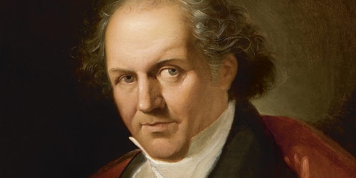
Giuseppe Lucatelli, Portrait of Bodoni, 1805–6, Parma, Museo Glauco Lombardi
Over the course of roughly 300 years, Roman typefaces transitioned from what we classify as “old style”—as epitomized by the work of Claude Garamond and William Caslon—to the transitional (John Baskerville, etc.) and, finally, the Didone or “modern” face.
While transitional typefaces — when compared to their old-style predecessors — differed in their highly contrasting thick-to-thin strokes, casters of modern typefaces took this contrast to even further extremes; the first of which was cut by Firmin Didot in the 1780s.
Firmin Didot: 10 things to know about - TypeRoom
1. Firmin Didot (14 April 1764 - 24 April 1836) was a French printer, engraver, and type founder.Born in Paris into a…
Of the aforementioned type designers, all save Garamond worked roughly during the same era, and it is generally agreed that the influence of all four directly inspired the casting of one of the most influential and recognized typefaces in history (Hint: Check the title of this article).
Today, like Garamond, numerous typefaces bear the name of Giambattista Bodoni, a late eighteenth/early nineteenth-century Italian punchcutter who became the most widely-admired printer of his time. And just like the Garamonds of today, most modern Bodoni faces tend to emulate his style rather than the actual letterforms that he cut.
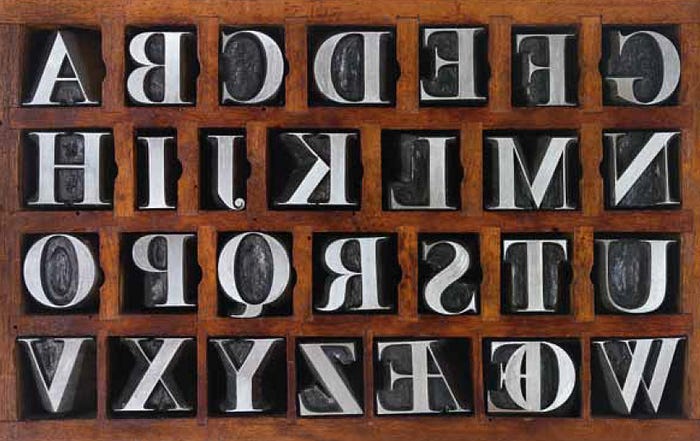
An example of metal-cast Bodoni characters. Image source: Museo Bodoniano.
Sometimes called “The Father of Modern Type” and “The King of Printers,” Bodoni’s early work (roughly the 1760s–80s) borrowed heavily from popular old style and transitional faces of the time, and from John Baskerville in particular.
An admirer of Baskerville’s work during the 1750s–60s, Bodoni was so moved to travel from Italy to France to study typecasting under him. An unfortunate illness halted this partnership and Bodoni, instead, found himself appointed — by the prime minister and Duke Ferdinand I — to direct the new printing office in Parma, Italy (which was modeled after the famous Paris Imprimerie Royale). Not a bad consolation prize.
Understanding typography: John Baskerville and the King’s Roman
Tracing the development of transitional serif letterforms and the impact of the Baskerville typefaces
In his new post, Bodoni became impassioned about cutting new letterforms and showing them off as a way to impress European royalty and secure financial support for his type addiction.
During this period in printing, books were judged more for their decoration and engraved illustrations rather than the design of their text. It was Bodoni’s dedication to correct this that led him to the work of Didot, and, eventually, to produce his most revered typeface—for which he borrowed heavily from both Baskerville and Didot—know as Bodoni; the original as cast in 1798.
“The more classical the book the more appropriate it is for the beauty of the characters to shine out on their own.” —Giambattista Bodoni
Bodoni and his roman and italic types
A discussion on their origins and development and a detailed look at their features. Type photography by Riccardo…
The original Bodoni typeface has several defining characteristics, including vertical stresses and emphasis, and unbracketed, hairline serifs. Stand-out letterforms include the differences between the capital C and its lowercase counterpart (with the C showing both top and bottom serifs while the lowercase features a large ball terminal), a slight hook in the capital J, curved tail on the capital R, and a centered tail beneath the capital Q. Extreme contrast in stroke weight and thinness of the serifs make modern Bodoni faces difficult to set at small sizes.
Detail highlighting the unique form and thin-tallness of Bodoni’s letterforms
And Bodoni is tall—especially for a non-condensed face—due to its extreme thinness. If you were putting together an all-star basketball team of roman typefaces, Bodoni would be your starting center.
But it’s the extreme variance between thick and thin that gives Bodoni its body and bold presence, and makes it a marvel of late-eighteenth century typecasting. Punchcutting such fine serifs required enormous skill and careful handling, but Bodoni was a perfectionist above all. He was known to cut several variants of one size just to fit a single title page of a book, and an inventory of his work in 1840 showed nearly 26,000 punches and roughly 55,000 matrices (all of which are preserved, today, in Parma’s Museo Bodoniano). This was an incredible feat even for a designer with assistants as it took upward of four hours to cut a single steel punch.
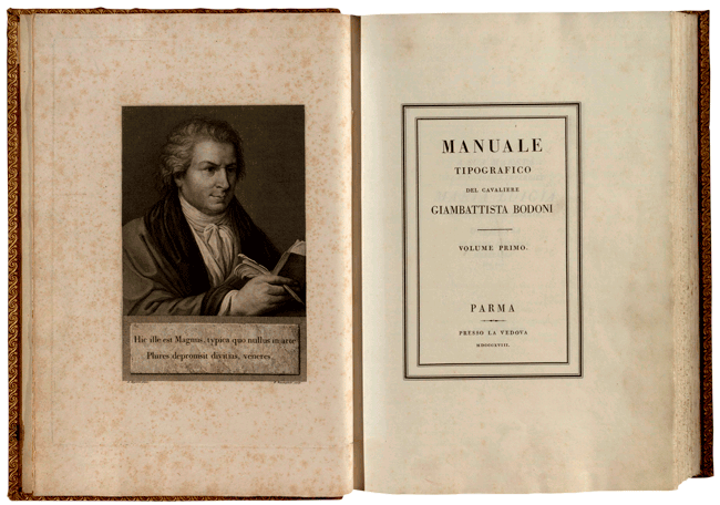
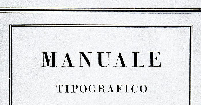
Manuale tipografico del cavaliere Giambattista Bodoni, 1818. Image source: Museo Bodoniano.
Bodoni’s theory on typecasting is best expressed in his own words, taken from the Manuale Tipografico (Manual of Typography) published posthumously as two volumes in 1818:
It is proper here to offer the [three] different heads under which it seems to me are derived the beauties of type, and the first of these is regularity — conformity without ambiguity, variety without dissonance, and equality and symmetry without confusion…From the perfection of the punches in the beginning comes the polish of the well-cast letter which should shine like a mirror on its face.
Bodoni is a very stately typeface, and its contrasting strokes made it a perfect fit for the fashion industry in the 20th century, being used by Vogue magazine since its inception and even by Lady Gaga for her trademark. It can also be found on many book jackets and logos for both universities and hotels, including Hilton properties.
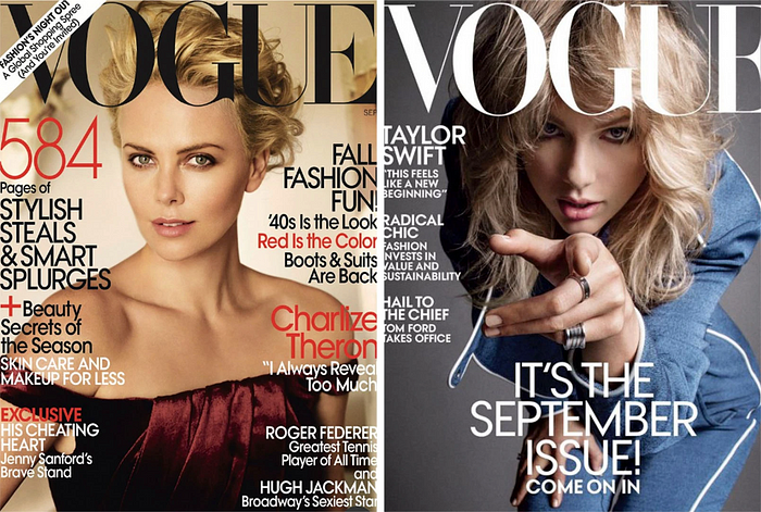
Bodoni is still in use today for Vogue’s workmark and masthead
If you were a fan of grunge rock in the 1990s you were more than likely introduced to Bodoni through an unlikely—and should-have-been unfitting— source: The wordmark for the band Nirvana. Set in Bodoni Extra Bold, this trademark appeared in every album, poster, T-shirt, and other piece of merchandise produced by the band beginning with their debut release Bleach and continuing into the present day, well after their disbandment in 1994 following the death of Kurt Cobain. It’s a band logo that shouldn’t work — relying entirely on the character of Bodoni to pull it off — but continues to be well recognized today.

Bodoni’s letterforms immortalized. Children of the 90s will also recognize Bodoni’s letterforms in the Calvin Klein “CK” logo.
During his career, Bodoni wrote of “the beautiful contrast as between light and shade which comes naturally from any writing done with a well-cut pen held properly in the hand.” When speaking of the pen, his predecessors would have been referring to the broad nib pen that influenced the stroke of old style typography.
Bodoni, however, was a punchcutter to the core and referring, rather, to the tools a type designer used to cut punches. Bodoni inflicted in his letterforms the crisp contrast and sharp edges that resulted from an engraving burin, reflecting a style that was influenced by process: A new development in type design.
There have been many revivals of Bodoni over the years, with ATF Bodoni and Brauer Bodoni being two of the most successful. Today, standard Bodoni weights include roman or book, bold, and extra bold, conforming to the original upright letterforms that he cast. While Bodoni cut several italics during his career, it is well agreed that most Bodoni italics don’t represent the best offerings available today.
And so, paired with its difficult legibility at small sizes, it is common practice to use Bodoni primarily as a display face.
Recommend
About Joyk
Aggregate valuable and interesting links.
Joyk means Joy of geeK