

How to change SwiftUI Button Size
source link: https://sarunw.com/posts/swiftui-button-size/
Go to the source link to view the article. You can view the picture content, updated content and better typesetting reading experience. If the link is broken, please click the button below to view the snapshot at that time.
There are two ways we can control a button size.
How to change a button size using .controlSize modifier
You can change the size of a SwiftUI Button by using controlSize(_:).
There are four sizes to choose from
Here is an example of a large bordered prominent style button.
Button("Large Button") {

}
.buttonStyle(.borderedProminent)
.controlSize(.large)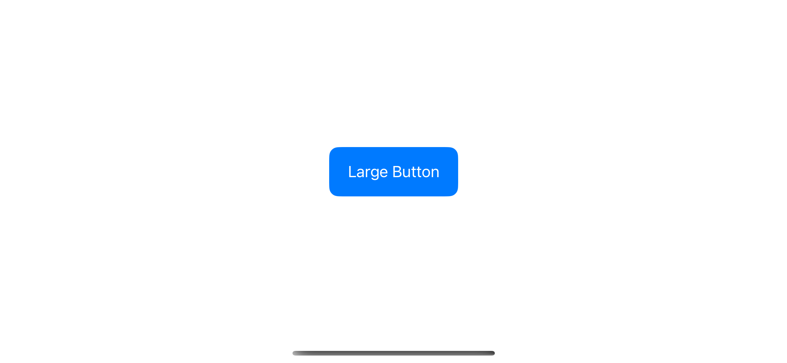
A bordered prominent button style with a large control size.
The control size can affect many aspects of a button. As you can see in the following example, it can affect padding, text size, and corner radius.
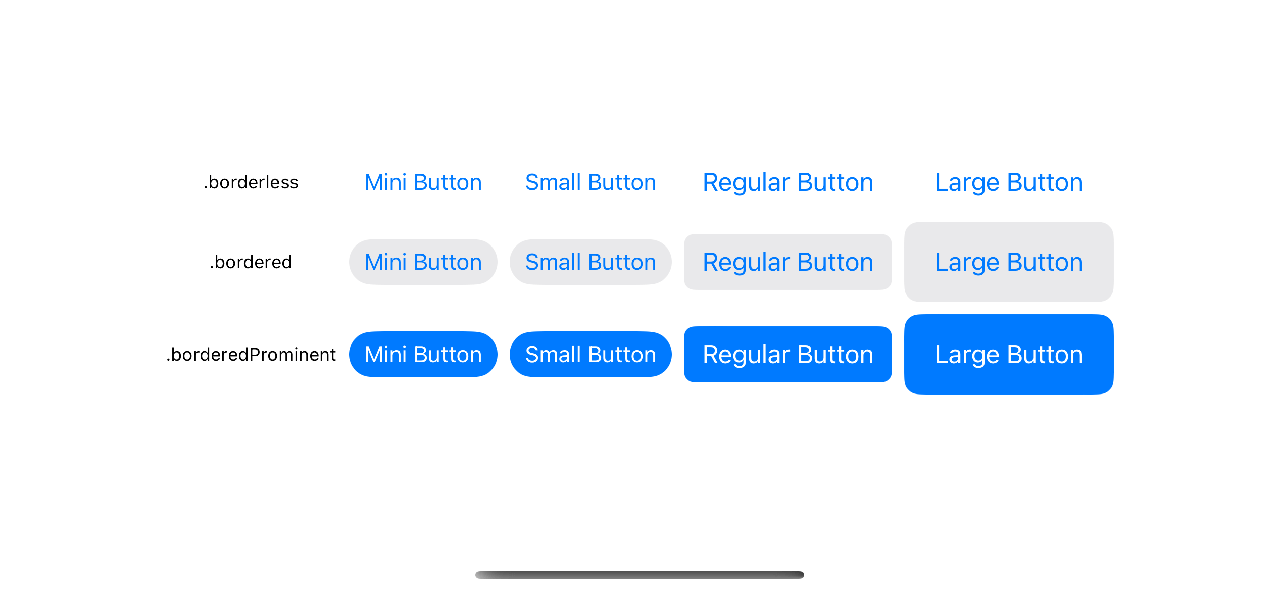
The control size can affect many aspects of a button.
You might see that there is no noticeable different between the mini and small control sizes. ControlSize just convey our intention, but it is up to SwiftUI to decide how it looks depending on the context.
The following example is the different control sizes on macOS. As you can see, the mini size is smaller than small on this platform.
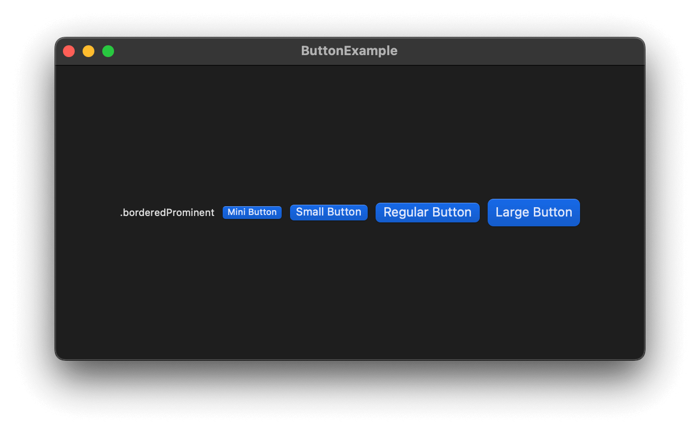
An example of different control sizes on macOS.
How to change a button size manually
Using controlSize is a quick and easy way to control the size of a button.
But as you see, you are giving up control to SwiftUI. If you want more control over the size you have to do it in a button label.
I usually use padding and frame to control the size of a button. But you can use anything you can think of. The label size determines the button size.
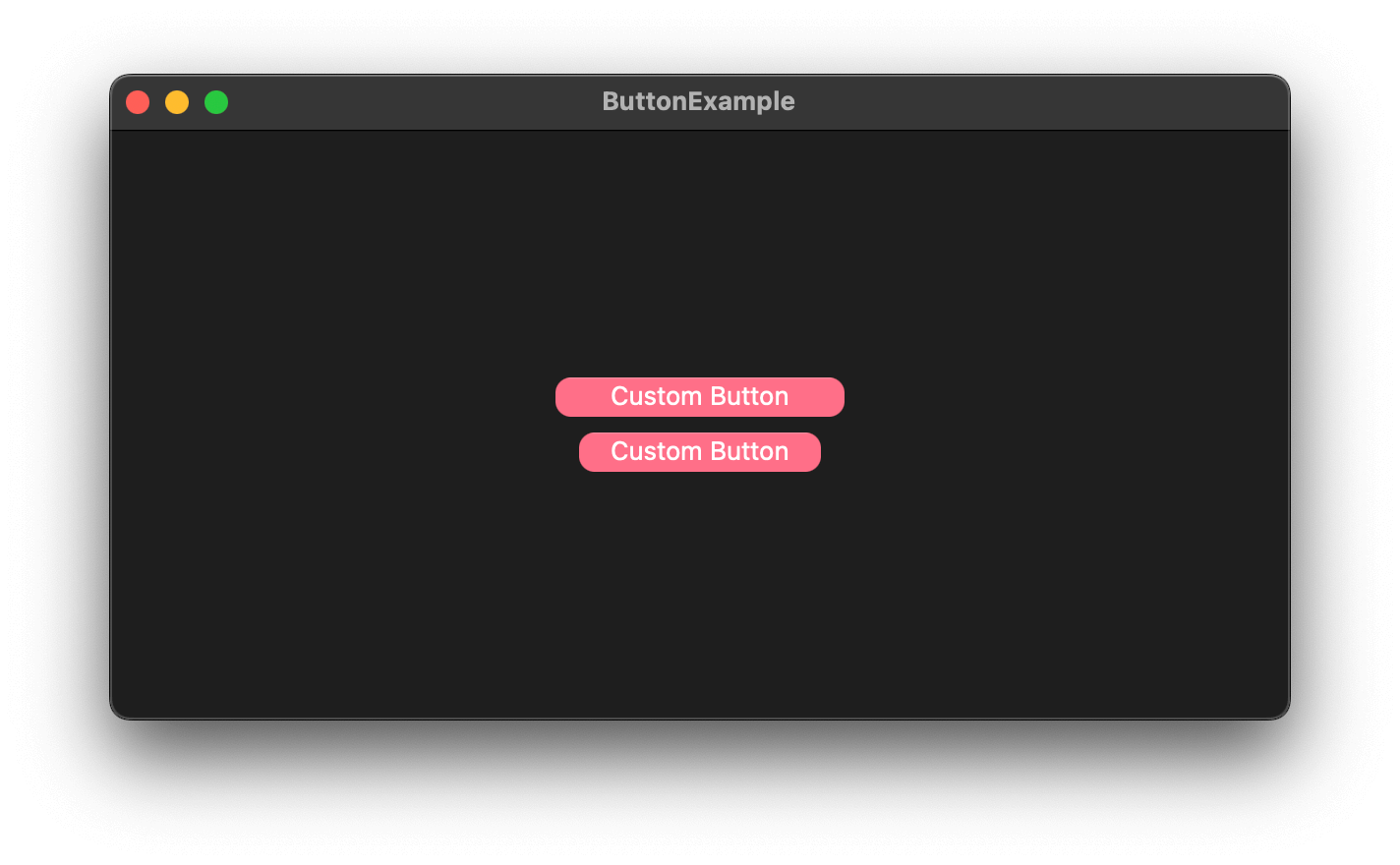
Here is an example where we control button sizes using .padding and .frame.
VStack {
    Button {

} label: {
        Text("Custom Button")
            .padding(.horizontal, 20)
            .padding(.vertical, 8)
            .foregroundColor(.white)
            .background(.pink)
            .cornerRadius(8)
    }

Button {

} label: {
        Text("Custom Button")
            .padding(.horizontal, 8)
            .frame(height: 44)
            .foregroundColor(.white)
            .background(.pink)
            .cornerRadius(8)
    }
}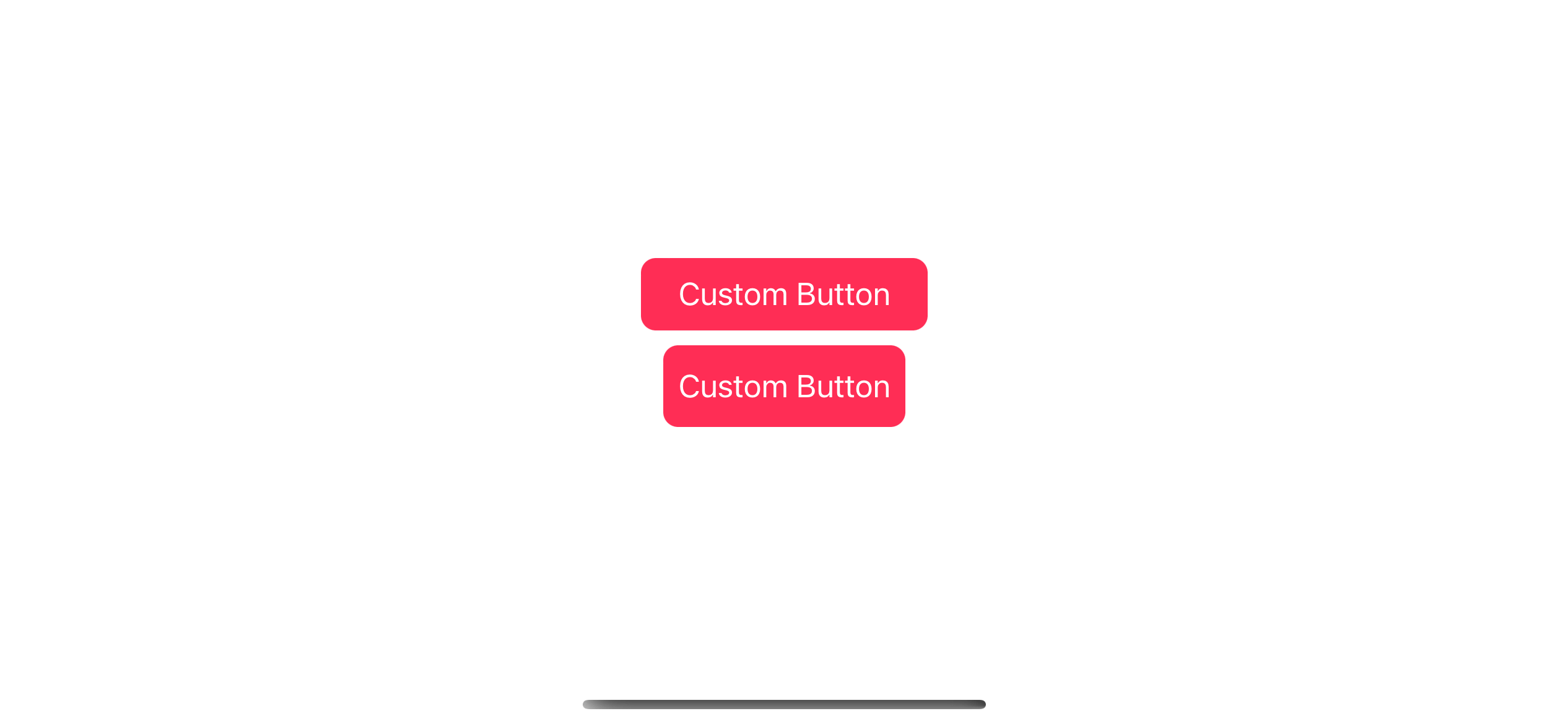
The use of padding and frame to control button sizes.
Caveat
Normally, button size and tappable area are determined by the button content, but that is not entirely true.
Some button styles might decide to override that. One example is the .bordered button style on macOS.
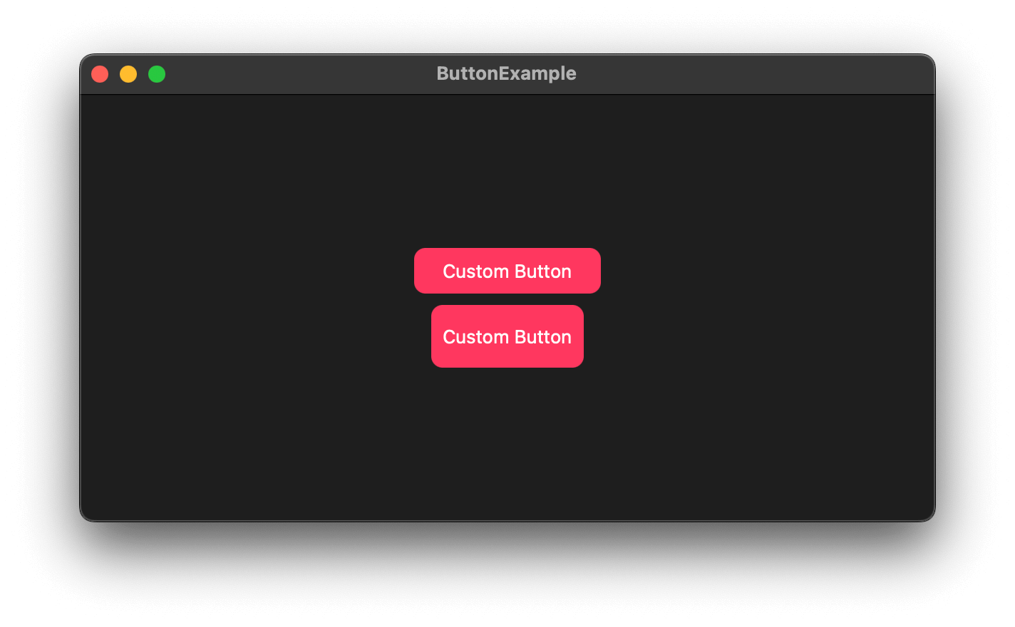
If you run the code in the previous section on macOS, this is what you will get.
A bordered button style on macOS has a fixed height.
As you see, the button's height is overridden by the .bordered button style (The default style for macOS).
To fix this, you have to opt out of the problematic style. You can create your own style or use .plain button style.
VStack {
    Button {

} label: {
        Text("Custom Button")
            .padding(.horizontal, 20)
            .padding(.vertical, 8)
            .foregroundColor(.white)
            .background(.pink)
            .cornerRadius(8)
    }
    .buttonStyle(.plain)

Button {

} label: {
        Text("Custom Button")
            .padding(.horizontal, 8)
            .frame(height: 44)
            .foregroundColor(.white)
            .background(.pink)
            .cornerRadius(8)
    }
    .buttonStyle(.plain)
}
Buttons with plain button styles on macOS.
Recommend
About Joyk
Aggregate valuable and interesting links.
Joyk means Joy of geeK