

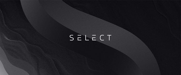
SELECT Development Case Study: an app for a VIP membership club
source link: https://uxplanet.org/select-development-case-study-an-app-for-a-vip-membership-club-2bd9c3a80950
Go to the source link to view the article. You can view the picture content, updated content and better typesetting reading experience. If the link is broken, please click the button below to view the snapshot at that time.
SELECT Development Case Study: an app for a VIP membership club
SELECT is a private membership community with benefits for business and recreational travelers, nightlife aficionados, restaurant connoisseurs, and people with an active social life. To match the tech company trends and segue into the bank card business without losing contact with their long-time audience, SELECT needed new branding and a total remake of the mobile application. How do you do that while onboarding new members, getting app downloads every day, and holding events all on the verge of a pandemic? Read the story below.
Mission
Carlo Cisco, the founder of SELECT, approached us with an initial task of creating a unified brand concept. The company needed a modern and complete look before applying it to all the products including a mobile app, a website, a metal membership card, and all sorts of brand collateral.
Challenge
It is always particularly challenging to tap into a brand that has an established audience because a brand is not a logo, it’s not even a product it sells. A brand is a person’s gut feeling about a product and the way it can affect their image of themselves. In that regard, the more users are familiar with a brand, the more brands there are to redesign. In the case with SELECT, there were hundreds of members and the first thing we had to explore is what the brand is for all of them.
The scope of our involvement beyond branding was a mobile app and a website redesign as well. Oddly enough, the website was the easiest to plan and prepare for while it took the biggest portion of work in terms of design and development.
The challenge with the app we faced right away was a huge variability of phones the current app had been installed on. Because this was a redesign project, we got a lot of insights from the client and had to design features in a way that the new app would not alienate any of the existing users.
Process
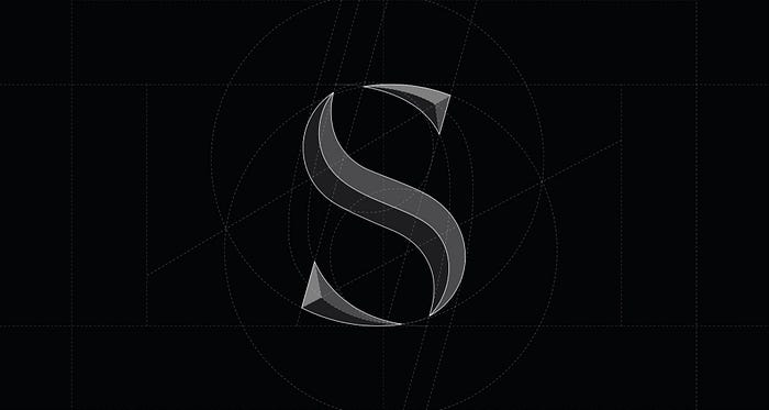
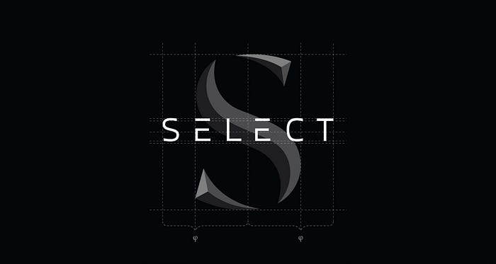
To give SELECT a new look, we took inspiration from nature and the way it can be interpreted in human-made design. This gave us a luxurious feel of the natural shapes inherited by some of the most expensive products on the market.
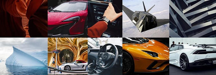
This stylescape got us thinking in the direction of combining raw, yet monumentally beautiful curved shapes as if created by water erosion and a definitive futuristic tech element to balance out the tranquility.
The first iteration lacked the technological aspect, so the second round came out more in line with a futuristic hi-tech culture.
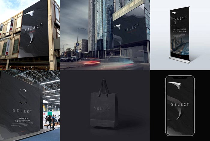
After taking the new branding through a bunch of large and small-scale contexts, we knew we were on to something.
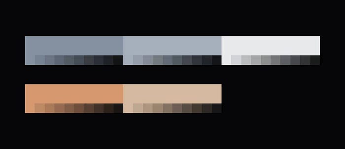
Guys at SELECT liked the idea behind the new branding despite being concerned about the overall dark theme. To make sure it does not affect accessibility while maintaining the image, we came up with a comprehensive system of accentuated colors that can be used for a variety of contexts.
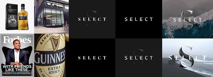
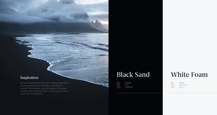
We maintained the bond with nature by introducing a texture inspired by the black sand of Iceland and white northern sea foam.
The rest of the branding job was focused on refining the logo, adding branding collateral guidelines, and making sure the new look is solid as a rock and wholesome as titanium alloy.
All the guidelines were then packed into a Brand Style Book that was shipped to a client a week before the production of ads, stickers, and merch for SELECT began in New York.
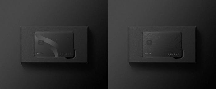
Sometimes a new look takes time to sink in even with the client, let alone loyal customers. This manifests in involuntary delays and procrastination in introducing the new look. Luckily for us, as we were finishing the style guide, we got a green light to redesign the SELECT membership card.
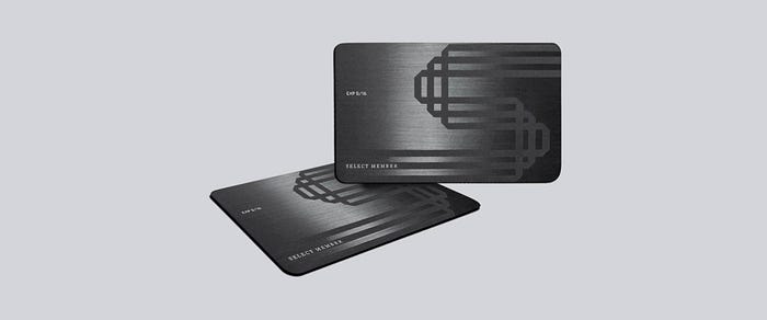
The card had to remain black, maintain some texture to it, represent the luxurious, modern, and hi-tech values of the brand. The new card was also expected to receive a huge update in form of an EMV chip as part of the SELECT’s 2020 debit card innovation.
The current trends for the vertical alignment and unusual physical elements of bank cards got us thinking about the level of detail manufacturers can perform and the UX of today’s cards.
Turns out, most POS terminals are contactless, wallets are declining, and the manufacturers can create masterpieces with laser plotters.
We based our concepts on the idea of extending the brand values to all the touchpoints and making the experience consistent.
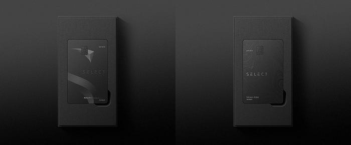
Eventually, the new card kept horizontal layout, gained nano-texture, and a definitive packaging.
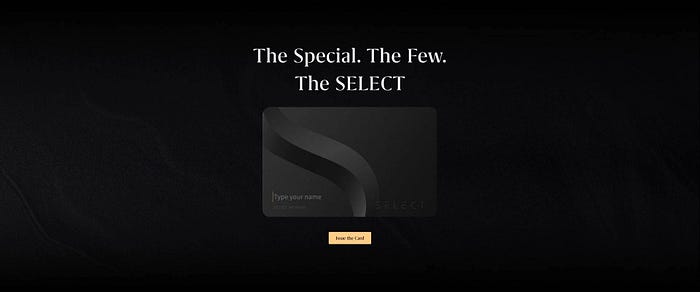
We later used the card as an interactive element for the website prototype.
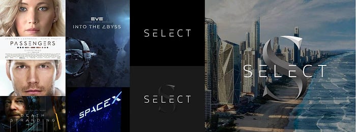
With the new branding having been tested on some tangible products, it was time to apply it in a digital realm, SELECT’s most significant touchpoint with its users — the app.
The existing app had technical issues coupled with outdated design and compromised usability.
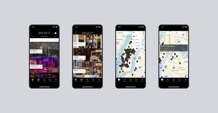
Nevertheless, it had a large count of daily users that we had to onboard to the new app painlessly and in a timely fashion.
The new app received a true dark theme, a set of new icons, a custom map, and an updated user concierge feature. These design solutions were also used for the redesign of the Android application.
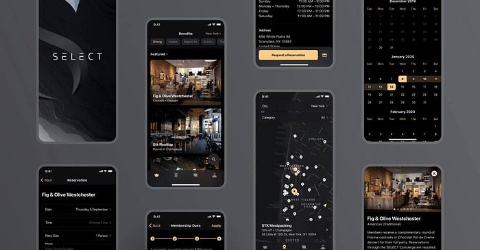
The new branding applied successfully and proved to be a powerful tool in the company’s new marketing campaign. Currently, both the iOS and Android apps have a 5-star rating on the stores and a very low bounce rate.
The design and production of the app took less than 4 months and the process naturally transformed into a website redesign project which we’ll update this case study with once the new website is launched.
For a company that has so much to do with traveling and going out, New York-based SELECT took a hit during the 2020 pandemic, however, it gave a company a chance to recuperate and prepare for the bank card release as the quarantine is slowly getting lifted.
The case with SELECT became one of our most promising collaborations and daring efforts. We have been lucky to have a client of this caliber considering the social impact they are having on this post-pandemic world.
App development technology stack
Programming language
The app was written in Swift, the primary language for developing modern iOS applications. Swift is 2.6x faster than its predecessor — Objective-C — and has simpler syntax, making it useful in saving cost by reducing the execution time.
Technologies and libraries
iOS SDK, UIKit, CoreLocation, CoreData, Foundation, UserNotifications, Google Maps, Stripe, Intercom, R.swift, Toolbox.
Toolkit: Xcode, Swiftlint, CocoaPods.
CI tool: Bitrise.
Crafting a brand that fits the persona
SELECT creates relationships between its members and well-known brands and does it with style. The SELECT team takes its mission very seriously and claims to always work tirelessly to improve the lives of the community’s members. We at Shakuro focused on delivering branding, design, and development solutions that would be able to stand out and fit the brand due to their high-quality code and optimized design.
Because it’s our belief that branding that ties back to the company’s services highlights its unique position on the market, reinforces its value, and gains a new perspective. At the moment, SELECT is storming the financial industry and promising something disruptive.
Recommend
About Joyk
Aggregate valuable and interesting links.
Joyk means Joy of geeK