

This Component Library Promises to Reduce Development Times
source link: https://blog.bitsrc.io/this-component-library-promises-to-reduce-development-times-68de4148b3d5
Go to the source link to view the article. You can view the picture content, updated content and better typesetting reading experience. If the link is broken, please click the button below to view the snapshot at that time.
This Component Library Promises to Reduce Development Times
A Look at Grommet: Does it really help with development times? Let’s find out!

Reducing development time, that’s a bold statement. One that way too many tools have claimed in the past, but not one that many have actually achieved.
Grommet is another component library/framework (they call themselves frameworks, we’ll see about that) that is adamant to make you think that by using them, you’ll be able to develop your web apps much faster.
Let’s put that to the test, shall we?
What is Grommet?
After testing it for a bit, and giving their documentation a review, I can tell you that Grommet is a react-focused component library.
That’s it, that’s all there is to it.
I know they claim to also be a “framework”, but honestly, I don’t see it yet.
Perhaps in the future, once they iron out some issues, they might earn the “framework” status, but right now, we’re safe sticking to the list of components available.
Why do I say that? What issues do they have to iron out? Well, you see, the team behind Grommet actually offers you three things:
- A component library you can use to create nice-looking React applications.
- An icon library for you to spice the UI even further. They have a nice collection and a somewhat nice online search for them.
- An application designer app that allows you to, in theory, create your own app (or at least the presentation) visually using its own components.
If you look at that list, yes, in theory, I could call this something more than a component library. The problem? The app designer doesn’t really work, I had multiple issues with white screens whenever a click caused a JS error. I was not able to create something, there was barely any help around it and I couldn’t even find a way to export my creations.
So for the purpose of this article, I’m going to ignore the app designer, once they make it stable and usable enough, we’ll come back to it.
Let’s instead, see what’s it like to implement a UI with the list of components provided by Grommet.
Did you like what you read? Consider subscribing to my FREE newsletter where I share my 2 decades’ worth of wisdom in the IT industry with everyone. Join “The Rambling of an old developer” !
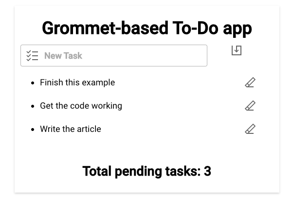
Building a To-Do app
Believe it or not, I think To-Do apps are the best way to field-test a new component library, you can play around with layout components as well as some input ones and see what listing options and buttons/icons are there.
It has it all! So let’s build our Grommet-powered To-Do app. The end result will look like this:
So let’s start with the basics, let’s install Grommet into an existing React app. For that, all you need is the following line:
npm install grommet grommet-icons styled-components --save
After that, we’ll start with the outside container: a Box
We’ll create a Box to contain our entire app and make sure it’s centered. For that we’ll set a width of “large”, give it a “small” pad and we’ll make sure the container is centered by giving it a “center” align .
As you can see, we have very “intuitive” pre-set size-related values. Personally, I don’t like it because I can’t really tell what “small” or “large” mean in this context without having to look it up on the documentation. I think the intention is good, but the result isn’t. I much rather use something like “50%” or “width-300” that might not be as “human readable” as the current options, but are far more understandable.
I will also add an inner Box with an elevation of “small” (see what I mean here?) to give our app a bit of a small shadow.
Then I’ll set up the input box with the button next to it, this part:
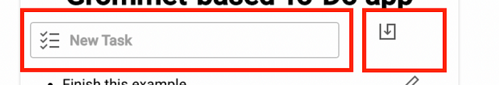
For this I will use the next layout-related component: the Grid
Now, I’ve used grids with other component libraries, and I’ve never seen an approach like Grommet’s.
You see, you can define the sizes of all your columns and rows and then you can define named areas within the grid that can span through multiple cells from in the grid.
Look at this example:
In my case, since all I need are two cells, I’ll define an “input” cell and a “button” cell. With the first one being larger than the last one, both horizontally , one next to each other.
I can then assign the inner elements of the Grid to each grid area using the gridArea attribute like this:
This is definitely a different way of organizing a Grid and its internal elements, but I really enjoyed the process while doing it. Props to the folks from Grommet, laying your grid like this is very straightforward and intuitive.
For the list of to-do items, I’ve decided to go with a standard ul/li combo, since the DataTable component, while very interesting, seemed like an overly complex way of solving this problem.
Dealing with inputs
Input fields, both for text and buttons were very standard and did not pose a problem when using them.
That said, they didn’t revolutionize the way we deal with them either. You can specify a lot of normal attributes for input fields, and they will render quite nicely. I was not able to use React refs with them, like with other input fields, so I added the onChange event handler to update the inputText state variable and use that instead of the ref’s value when I save the new task.
Using icons
Finally, I used a few icons here and there to make the whole thing look nicer. That was also quite easy and nice.
Their site has a very handy icon search feature that works great:
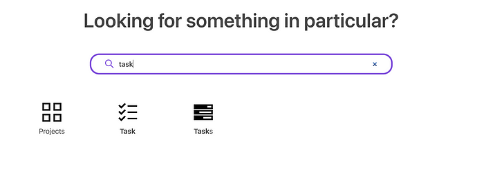
You then simply take the name of the icon and import it from the grommet-icons package. Simple!
Summary
Let’s summarize my experience.
I was perfectly able to create a To-Do app and make it look good enough through the default components.
The good parts
After playing around with Grommet for a couple of days, I definitely liked a few things:
- The
Gridlayout system is quite nice. I definitely recommend it, and by the looks of it, theirDataTablecomponent follows a similar pattern. - Their docs are good. They have detailed specs-like documentation, where you are shown all potential attributes each component is using.
- Their icon searcher is easy to use and the whole icon-system is simple and powerful.
- Their list of components is quite extensive and you have some interesting and advanced ones to use.
- The whole thing is easily themeable. While I did not take advantage of it in this review, they make it very simple to theme your app.
Of course, not everything is great, so let’s also see what’s not so great about Grommet.
The not-so-good parts
I don’t think there are many “bad” parts with this library, but I did find some issues:
- Their app designer, while in theory, very interesting, wasn’t working stable enough to make use of it.
- Their documentation is lacking examples. They have nice specs, but lack examples to showcase the full power of their components. Other libraries, like Material UI, have fantastic examples that give you a great idea of what you can do with their components.
- And to be honest, I didn’t feel like my development times were decreased or improved in any way, as advertised. Maybe if the app designer had worked as intended, the results would’ve been different.
Overall, I really enjoyed using Grommet, but not more than when using other component libraries like it (read Material UI for instance).
If they manage to get their app designer working properly and add the missing examples to their documentation, then I would really call this library a must-use for any React developer.
Have you used Grommet before? What has your experience been like?
Build apps with reusable components like Lego
Bit’s open-source tool help 250,000+ devs to build apps with components.
Turn any UI, feature, or page into a reusable component — and share it across your applications. It’s easier to collaborate and build faster.
Split apps into components to make app development easier, and enjoy the best experience for the workflows you want:
→ Micro-Frontends
→ Design System
→ Code-Sharing and reuse
→ Monorepo
Recommend
About Joyk
Aggregate valuable and interesting links.
Joyk means Joy of geeK