

6 UI Mistakes To Avoid: A UI audit of DrinkPrime App
source link: https://uxplanet.org/6-ui-mistakes-to-avoid-a-ui-audit-of-drinkprime-app-6a8cf0f05c83
Go to the source link to view the article. You can view the picture content, updated content and better typesetting reading experience. If the link is broken, please click the button below to view the snapshot at that time.
6 UI Mistakes To Avoid: A UI audit of DrinkPrime App
UI/UX learnings from a real-world, commercial app.
DrinkPrime is an Indian start-up in the drinking water space that provides subscription-based access to clean, safe drinking water to homes and offices, via tech-enabled water purifiers. Users interact with the installed devices (purifiers) via the DrinkPrime app installed on their phones, and all the data related to water consumption, maintenance cycles, subscription and payment details, etc. is surfaced on the app.
I am myself a user of the service and I am largely a satisfied customer. However, I feel there are certain areas in the app interface that could be revisited.
My aim of writing this micro case-study is to look at the usability of the current app and try to come up with suggestions to improve the experience of users. Some of the suggestions might come across as insignificant at first glance, but in UX it’s often the little details that can make or wreck your experience. For this post, I have looked at the native Android DrinkPrime app. As said earlier, this is a real-world, commercial app that customers are using daily.
Disclaimer: I have not been involved in the UX research behind the development of this app, and my inferences stem from an analysis of the UI itself and my own experience as a user. This is for educational purpose only, and is not meant to discredit the work of the app creators or owners in any way.
That said, let’s jump right in! Based on this small audit, here are 6 tips I would incorporate if I had to quickly rejig the interface.
#1 If it ain’t clickable, don’t make it look like a button
We should not design non-interactive visual elements with a look and feel similar to interactive buttons. It confuses users and they might tap on a non-functional ‘button’, only to realise that the tap does nothing. I found two instances of this on the DrinkPrime App.
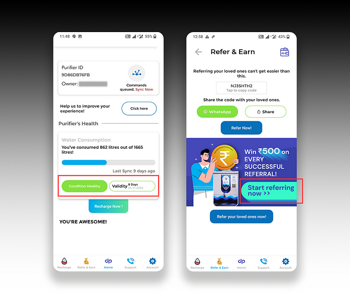
- The first one is on the homepage where it shows the condition of the water purifier. There’s a similar button-like element for validity as well. Tapping on both has the same effect: nothing.
- The second one is on the banner image on the ‘Refer & Earn’ page, which even includes an arrow on a button. Clicking on it doesn’t do anything. In fact, the image as a whole is non-interactive.
🖌 NOTE: In fairness, I must say the actual/functional buttons (‘Click Here’ and ‘Recharge Now’) have a tiny shadow at the bottom, but for most users this would still be indistinguishable because the shape of the elements appears the tiny variations.
#2 Keep only ONE button for ONE job
Avoid having two buttons with identical functionality (leading to the same destination or triggering the same action) on the same page. Another way of saying this is — don’t create 2 buttons for 1 function. Please note that I am not talking about the appearance of the buttons, rather their functionality.
In the below image, both the buttons ‘Refer Now!’ and ‘Refer your loved ones now!’ trigger the same experience, and as a user I can’t understand the difference between using the two buttons. Do I get something extra for referring my loved ones vs regular non-loved ones? 🤔
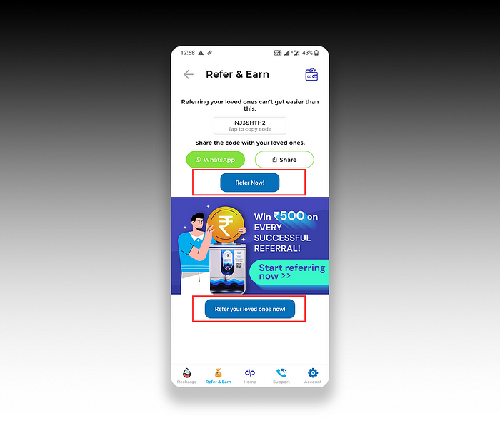
Instead, just keep one button (maybe the bottom one, with adequate spacing). And following the guidance from #1, the non-functional ‘button’ look-alike on the banner image should be removed (otherwise it will be a third element saying the same thing).
#3. Make CTAs super easy to identify. Don’t keep your users guessing!
Users shouldn’t need to guess where they need to click, which is why the crux of the text in a CTA should ideally be placed inside the button.
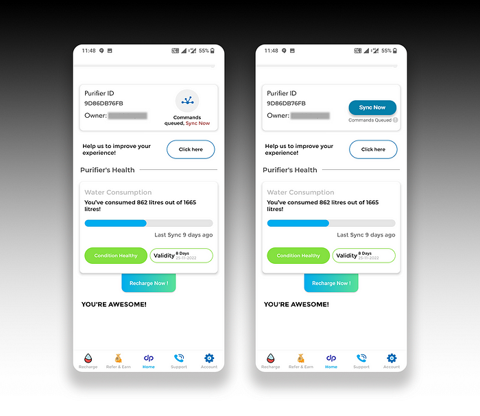
For the ‘Sync Now’ feature on DrinkPrime, the button features a graphic (which users may not always be familiar with), while the text ‘Sync Now’ placed after some additional text below the button. The colour of the ‘Sync Now’ text is different from all other text in the parent container, making it look like it’s clickable — but it’s not.
In addition, the clickable circular button doesn’t have a shadow while all other buttons on the interface have it (inconsistency). I would rather re-design the ‘Sync Now’ to make it look more like a regular button and have more prominence.
#4 Be cognizant about the brand identity of other brands while using them in your app.
If you’re using references to other brands or their products in your app, make sure you adhere to their brand guidelines.
In the ‘Refer & Earn’ tab on DrinkPrime, there is an option to share your referral code directly using WhatsApp. That’s a great feature, very handy and helpful! The button features a WhatsApp logo and is coloured green to help users immediately relate it with WhatsApp.
The issue is that it’s not the right green. WhatsApp uses a darker shade of green (#25D366) in its logo, which is distinctly different from the green used here. A simple look up could have prevented this.
Sure, maybe most users won’t notice it. But since our purpose of including this visual element is to communicate the ease of sharing over WhatsApp (an app that virtually everyone uses and recognises), it’s worthwhile to spend a little more time and get the details right!
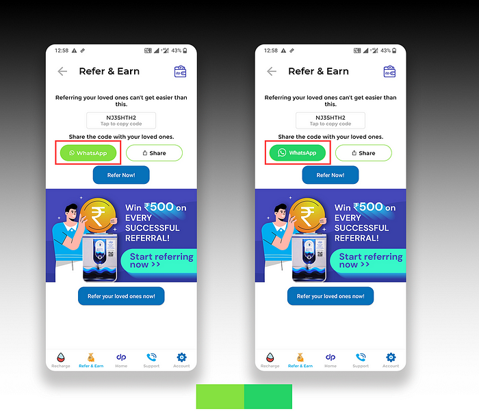
Also, I am not sure if using white against this green is okay (it has a contrast ratio of 1.98 which does not meet accessibility guidelines — the contrast ratio of the original green on the left is even worse at 1.64). Plus, I have not seen WhatsApp officially use white text on this colour anywhere. To solve for this, it’s better to use a more accessible colour for the button background, while reserving the green colour only for the circular telephone logo.
#5. Using modals should feel similar to what is experienced in other products.
Here’s something we should never forget
Users are used to using things in certain ways, and this past experience matters a lot. If something looks similar to something they’ve used in the past but doesn’t work the same way, they will get annoyed.
Every modal usually has a ‘Close’ button, and clicking/tapping anywhere outside the modal area on a website or app usually takes the user back to the previous screen. We should provide multiple ways to quickly exit a modal (since that’s what users mostly do with modals 😅).
In the DrinkPrime app, when we open the ‘Recharge’ page — a modal pops up, but there’s no close button, and tapping outside the modal doesn’t help either. This confuses the user, who then has to look at the modal closely to find closely stacked buttons at the bottom (with insufficient padding and inconsistent colour usage). Tapping on the ‘I’m Not Interested’ finally gets rid of the modal. What a pain!
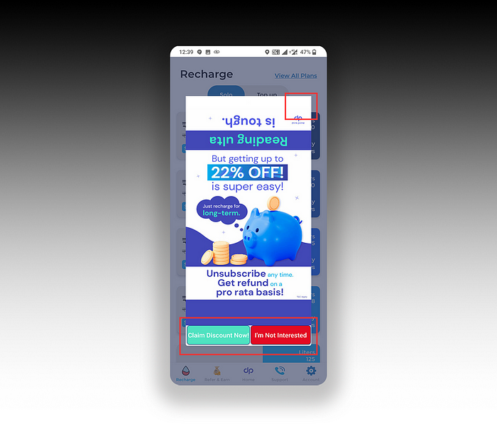
This could have been avoided with a simple close button at the top right of the modal. Also, the buttons should be redesigned so that they appear distinct and less cluttered.
#6. Pay attention to Microcopy
Ok, this one is really small. UX writing is not easy (it takes a lot of research to understand the best way to communicate something to your users), but what’s easier is avoiding common misses that can come off as amateurish.
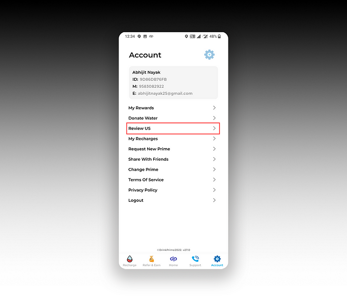
In the above screen, the ‘Review US’ should have been ‘Review Us’, unless we are reviewing the United States for some reason. Small details!
Also, while we are on this page, it’s better not to abbreviate Email and Mobile as E and M. That’s just overdoing it, and we aren’t saving a lot of space here.
And that’s it. Thank you for your patience.
Enjoyed this post? If yes, please show some appreciation by clicking on the “clap” button. Fun trivia — you can hit it up to 50 times! It helps the content reach out to more like-minded people.
If you love my work and want to support my efforts, you can buy me a coffee with ko-fi. Thank you for your kindness and generosity!
Please share your thoughts and feedback in the comments below. This will help me improve and also inspire me to create more.
I try to publish regularly on Medium. Follow this account to receive similar content in future, and click here to get each post directly in your email. You can find me on Linkedin and Twitter as well.
Recommend
About Joyk
Aggregate valuable and interesting links.
Joyk means Joy of geeK